Track
Data visualization is a critical skill in the world of data science and analytics. It transforms raw numbers and complex datasets into clear, engaging, and actionable insights.
Compelling visualizations can reveal patterns, trends, and relationships hidden in spreadsheets or databases. For data professionals, mastering data visualization is key to communicating findings effectively, making informed decisions, and driving impactful changes in various fields.
In this article, I will discuss the importance of data visualization projects for skill development and career growth. I will also provide you with project ideas of different complexity levels to build your skills progressively, from basic chart creation to time-series visualizations to geospatial maps.
These data visualization project ideas will help you upgrade your skills and grow as a data professional.
Why Work on Data Visualization Projects?
Data visualization projects offer a powerful way to enhance your skills, demonstrate your abilities, and gain practical experience with industry-standard tools. Whether you're just starting in data science or looking to advance your career, engaging in these projects can provide numerous benefits, like the following.
Building analytical skills
Working on data visualization projects can develop your critical thinking and interpretation skills. Selecting appropriate visualizations and refining your work sharpens your decision-making abilities and attention to detail.
As you create visual narratives, you're challenged to think critically about effectively communicating insights, considering factors like audience needs and potential misinterpretations.
The hands-on experience of translating data into meaningful, actionable information cultivates a deeper, more intuitive understanding of data analysis and communication, skills that are invaluable in any data-driven field.
Portfolio development
Showcasing data visualization projects in a portfolio is important for those pursuing careers in data science, analytics, or design.
A well-curated portfolio is tangible evidence of your skills and creativity, setting you apart in a competitive job market. It demonstrates your ability to work with real-world data, extract meaningful insights, and communicate complex information effectively through visual means. A concrete demonstration of skills is often more compelling to potential employers than a list of qualifications on a resume!
Additionally, a diverse portfolio highlighting various visualization techniques and tools illustrates your versatility and willingness to learn, traits highly valued in these rapidly evolving fields.
Learning visualization tools
Working on data visualization projects provides invaluable hands-on experience with popular tools like Tableau, Power BI, Matplotlib, and ggplot2. This practical experience is essential for developing proficiency and understanding the nuances of each tool.
As you tackle real-world datasets and visualization challenges, you learn to leverage each tool's strengths and work around their limitations. Through project work, you gain familiarity with the interfaces, workflows, and best practices of these industry-standard tools and learn to choose the right one for specific visualization needs.
Data Visualization with Python
Learn the key data visualization skills in Python

Data Visualization Projects for Beginners
Beginner projects focus on building foundational skills and getting started with understanding visuals.
Focus on learning tools like Excel and basic Matplotlib with easy graphs such as scatter plots, line charts, and bar charts. Starting with easy-to-understand visuals that support what you know about the data is a great way to build foundational skills in data visualization.
At this stage, consider taking a beginner's course like Understanding Data Visualization and working on some projects.
Project 1: Plotting flight costs by day of the week
This project idea involves creating one or more scatter plots using Excel to visualize airline ticket prices across different days of the week. You can work with a dataset containing flight costs for the days of the week, possibly creating multiple charts for different routes or airlines. Plot the prices using Excel's scatter plot feature, with days of the week on the x-axis and ticket costs on the y-axis.
This project is an excellent starting point for beginners. It introduces key concepts of data visualization using the widely accessible Excel software. It allows newcomers to work with real-world data that's both relatable and potentially useful in their own lives.
The project provides hands-on experience in transforming raw numerical data into a visual format that can reveal patterns in flight pricing, such as which days tend to be cheaper or more expensive for travel.
The skills and tools learned or reinforced by completing this project are:
- Using Excel to visualize data
- Data entry and organization
- Understanding of different chart types and their appropriate uses
- Data exploration and pattern recognition
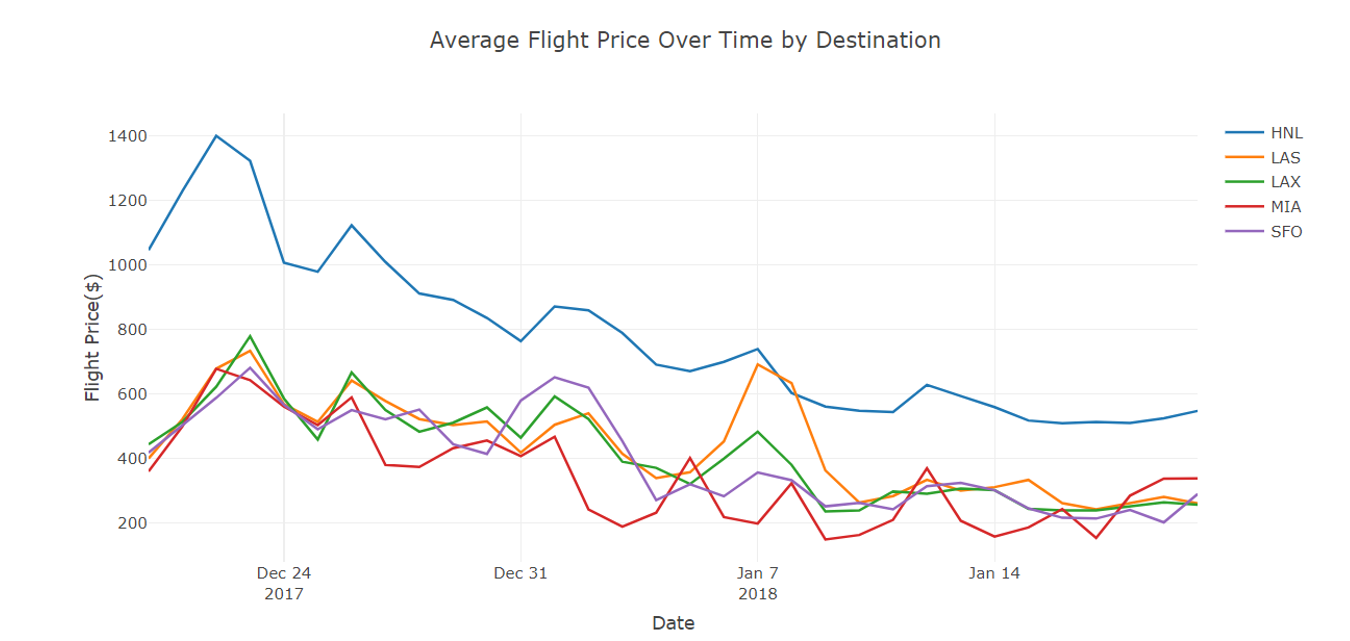
Exploring data on airline prices from TripAdvisor. Image source: NYCDataScience
Project 2: Create Phyllotaxis Art with R
If you’d like to be guided, the “Creating Floral Patterns Inspired by Phyllotaxis” project explores the intersection of mathematics, nature, and art through data visualization in R. Using the concept of phyllotaxis—the arrangement of leaves on plant stems—you’ll create visually stunning spirals that mimic natural patterns found in flowers and plants. Phyllotaxis is a prime example of how mathematical principles such as the Fibonacci sequence and the golden angle can describe natural beauty.
By the end of the project, you’ll have crafted your flower art, utilizing data visualization techniques to showcase the elegance of these natural patterns. This project is perfect for those who want to mix creativity with data science, all while deepening their understanding of mathematical models in nature.
Data visualization skills learned in this project are:
- Creating visualizations in R using tools like ggplot2
- Understanding and implementing the mathematics behind natural patterns
- Enhancing your R coding skills by generating and manipulating data to represent beautiful shapes
- Learning how transformations like rotations and scaling can be applied to create intricate designs
Project 3: Visualizing the history of Nobel Prize winners
The “Visualizing the History of Nobel Prize Winners” project explores historical data surrounding one of the world's most prestigious awards. It involves analyzing and visualizing data on Nobel Prize laureates across different categories, years, and demographics.
This project is an excellent choice for beginners because it combines data manipulation with meaningful visualization tasks using an interesting and manageable dataset.
The project allows you to practice various visualization techniques while engaging with real-world data that has cultural and historical significance. It also introduces the important concept of using data visualization to uncover and communicate potential biases, teaching critical thinking alongside technical skills.
The project is available in both Python and R.
Key data visualization skills learned in this project are:
- Creating time series visualizations to show trends over decades
- Designing bar charts and pie charts for categorical data (e.g., prize categories)
- Developing heat maps or choropleth maps for geographical analysis
- Using color effectively to represent different categories or highlight disparities
Intermediate Data Visualization Projects
Having mastered the basics, it's time to elevate your data visualization skills with more challenging projects. This section introduces intermediate-level ideas to expand your toolkit and deepen your analytical abilities.
Project 4: Comparing baseball player statistics
The “Compare Baseball Player Statistics” project offers an engaging opportunity to apply and expand foundational data visualization skills in Python using real-world sports data.
Utilizing Statcast data from Major League Baseball, you will analyze and compare home runs hit by two baseball players. This project allows you to work with multi-dimensional data, combining spatial information (hit locations and trajectories) with numerical data (exit velocity, launch angle). The appropriate visualization types must be chosen to effectively represent this complex data, including scatter plots, heat maps, and possibly even 3D visualizations.
Additionally, working with sports data adds an element of storytelling, encouraging you to use visualizations to narrate the similarities and differences between the players' home run patterns.
Key data visualization skills learned and practiced by completing this project include:
- Data cleaning and preparation of complex sports datasets
- Crafting data-driven narratives through visual storytelling
- Working with spatial data and geographic visualizations
- Understanding different chart types, such as heat maps and scatter plots, and their appropriate uses.
Project 5: Analyzing flight delays and cancellations
The “Analyzing Flight Delays and Cancellations” project offers an exciting opportunity to explore real-world aviation data from the Pacific Northwest. This project analyzes a comprehensive flight information dataset to uncover patterns and factors contributing to delays and cancellations.
You will use data wrangling techniques in Python to clean and prepare the data. Then, using Matplotlib, you will apply various visualization methods to reveal insights about airlines, airports, weather conditions, and other variables affecting flight disruptions.
This project builds on foundational data visualization knowledge by introducing more complex, multidimensional data analysis. It requires you to simultaneously work with time series data, geographical information, and multiple interrelated variables.
If you take this guided project, you’ll create advanced visualizations that effectively communicate the relationships between various factors and flight disruptions, potentially including interactive elements for deeper data exploration. This project also introduces the challenge of handling and visualizing large datasets, encouraging you to use data aggregation and summarization techniques effectively.
Key data visualization skills that this project will develop are:
- Creating time-series visualizations to show patterns in delays and cancellations over time
- Developing interactive dashboards to explore multiple aspects of flight data
- Integrating statistical analysis with visualizations (e.g., correlation heatmaps)
Project 6: Visualizing heart rate and heart disease
The "What is Your Heart Rate Telling You?" project uses the Cleveland Heart Disease dataset to explore the important issue of heart disease. In this project, you'll use R to explore the relationship between maximum exercise heart rate and heart disease risk while accounting for the effects of confounding variables. Through the application of multiple logistic regression, you'll uncover valuable insights about this complex health condition.
Learners are required to create visualizations that not only display raw data but also illustrate statistical relationships and model outcomes. You'll need to design visualizations that communicate complex statistical concepts effectively to a general audience, transforming data analysis into visual storytelling.
The project also introduces the challenge of visualizing the effects of confounding variables, pushing learners to develop more advanced, multi-variable visualizations. These visualizations will highlight the nuanced relationships between different variables and heart disease risk.
Prerequisites include knowledge of the Tidyverse and an understanding of hypothesis testing in R.
Key data visualization skills developed:
- Visualizing relationships between variables to show trends and patterns.
- Illustrating relationships among multiple variables at once, providing a clear overview of how they interact.
- Displaying model results to communicate the strength and direction of relationships from the logistic regression model.
Project 7: Global life expectancy with ggplot2
Explore gpplot2 through the “Exploring global life expectancy trends” project. Understanding ggplot2 is an integral part of being a data scientist, as it contains many foundational concepts shared in other visualization tools, such as Matplotlib.
Global life expectancy data covers a wide range of demographics, countries, and time periods. A wealth of information is waiting to be visualized in various beautiful scatter plots and diagrams.
Use this project as an opportunity to build on your understanding of ggplot2. Focus on the mechanics of creating graphics, such as the plot area, faces, and grid. Build beautiful and impactful graphics by manually adjusting graphs to tell a more complete story.
Due to this project's in-depth technical nature, you should understand ggplot2’s foundations and have some experience cleaning data with R.
This project focuses on the following key skills:
- Advanced ggplot2 customizations
- Building reusable graphics for other projects
- Understanding the mechanics of how plots are made, such as facets and grids
- Telling a story by adding more layers to simple graphs
Advanced Data Visualization Projects
Shifting from intermediate to advanced combines increasing technical abilities into more nuanced tools and better storytelling. These advanced projects focus on applying similar concepts from above to new technologies such as GeoPandas combined with more sophisticated interactivity and storytelling.
With more skill, there is more freedom to create visualizations that best fit your story. As such, these ideas will be less prescriptive and provide broader options.
Project 8: PowerBI Sankey diagram for tracking subscription flow
The Sankey diagram is a powerful tool for showcasing the flow of a population. This graphic is particularly challenging to make with traditional coding methods, so utilizing a tool such as PowerBI greatly simplifies the effort. While significant data wrangling is required to build out the proper data model, the program easily generates the Sankey chart.
This example will show how initial contacts may become subscribers without using a trial period. The focus here is building up our PowerBI DAX skills. It requires unpivoting data, creating dynamic data models, and formatting data to generate the desired graphic.
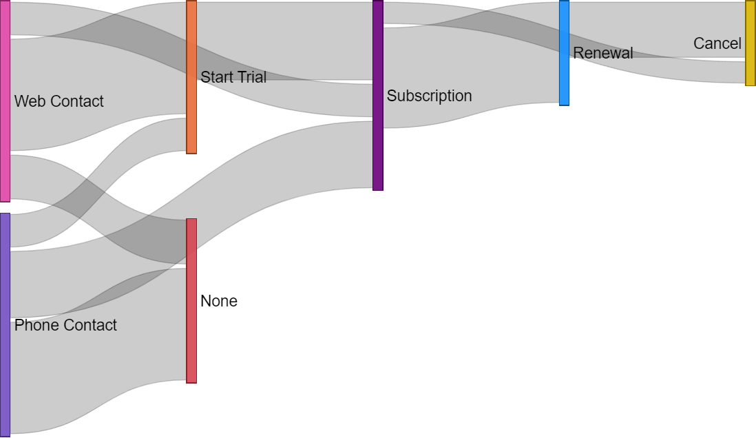
Example Sankey chart. Image source sqlbi
The skills focused on here are:
- Data wrangling
- PowerBI DAX functions
- PowerBI data modeling
- Generating Sankey charts
Project 9: Spotify Tableau dashboard
A Spotify Tableau dashboard is a great way to develop advanced skills in Tableau due to the richness of Spotify’s music data. This project builds on the knowledge gained from the intermediate project, where we classified the music.
A project like this focuses on crafting an exciting story using Spotify’s music metadata. This is a good chance to practice collecting data through Spotify’s API, organizing it, and creating a fun dashboard. It should contain selectors for filtering out by genre, artist, year, and timbre. Add a page in the Tableau story focusing on a particular song and generate a radar chart. Practice many different Tableau skills to create a fully-fledged dashboard that can interest music lovers.
The key skills practiced are the following:
- Advanced Tableau mechanics, such as radar charts and actions
- Creating Tableau stories
- Collecting data via an API
- Storytelling through data
Project 10: Ridership visualization with GeoPandas
One advanced visualization technique is utilizing spatial data. A lot of data is inherently spatial, from customer zip codes to GPS trace data. Learning a specialized package like GeoPandas in Python can give you a unique skill set.
Try a project using GeoPandas to create maps, visualizations, and spatial analysis. For instance, using a dataset like CitiBike Data can provide a great opportunity to understand how to create maps, the different kinds of map projections that exist, and how to look at data from a different perspective.
Because this is a more specialized skill, focus on analyzing geospatial data in Python first to understand how geospatial data is generally structured.
Start by making simple maps and plotting station locations using the appropriate geographic projection. Then, add data such as ridership information and busy hours to those maps. Just like our other graphics, start with the foundation and build up by adding more layers. You can even create heat maps showcasing hotspots in ridership.
The skills being honed by this project are:
- Geospatial analysis skills
- Knowledge of GeoPandas in Python
- Creating maps and understanding how maps are generated in Python
Summary Table of Data Visualization Projects
Here is a quick summary of each project and the skills developed.
|
Project name |
Skill level |
Skills developed |
Technologies |
|
Plotting flight costs by day of the week |
Beginner |
Excel visualization, data organization, pattern recognition |
Excel |
|
Create phyllotaxis art with R |
Beginner |
ggplot2, R programming, mathematical modeling |
R |
|
Visualizing the history of Nobel Prize winners |
Beginner |
Time series, categorical data, geographical visualization |
Python/R |
|
Comparing baseball player statistics |
Intermediate |
Python, sports data, visual storytelling, spatial visualizations |
Python |
|
Analyzing flight delays and cancellations |
Intermediate |
Time-series visualizations, correlations |
Python (Matplotlib) |
|
What is your heart rate telling you? |
Intermediate |
R, logistic regression, multivariable visualizations |
R |
|
Global life expectancy with ggplot2 |
Intermediate |
ggplot2 customizations, data storytelling |
R (ggplot2) |
|
PowerBI Sankey diagram for tracking subscription flow |
Advanced |
PowerBI DAX, data wrangling, Sankey charts, data modeling |
PowerBI |
|
Spotify Tableau dashboard |
Advanced |
Tableau mechanics, API data collection, radar charts, data Storytelling |
Tableau |
|
Ridership visualization with GeoPandas |
Advanced |
Geospatial analysis, GeoPandas, map visualizations, heat maps |
Python (GeoPandas) |
Conclusion
Building a data visualization portfolio is important for developing your technical and storytelling skills. Employers are looking for data professionals with the potential to generate complex analyses and effectively communicate them with stakeholders!
Keep these skills fresh by trying the projects mentioned above and brush up on your skills with various DataCamp resources:
Get certified in your dream Data Analyst role
Our certification programs help you stand out and prove your skills are job-ready to potential employers.
FAQs
What is a good way to start learning visualization techniques?
Start with the beginner projects. Things like Excel or basic Python plots are a great start.
Where can I host my portfolio of visualizations?
Hosting your visualizations on a github.io website is the perfect place as it keeps all your portfolio pieces in one location. Alternatively, you can also host your Tableau dashboards on the Tableau Public server.
What are some other visualization tools that are not covered?
Some other visualization tools that weren’t explicitly covered are the python package plot.ly, Google Charts, and D3.js. They are also great options to further expand your repertoire!
What is a good place to get datasets for visualizations?
The DataCamp projects provide the datasets for you. For others, you can often find public data sources and pick any dataset that interests you as the visualization source, for example, from Kaggle.
What are some other projects to practice with?
There are plenty more project ideas on DataCamp if you need some more inspiration. Some projects offer guidance on datasets and expose you to different technologies.
I am a data scientist with experience in spatial analysis, machine learning, and data pipelines. I have worked with GCP, Hadoop, Hive, Snowflake, Airflow, and other data science/engineering processes.


