Course
Missing data pose a problem in every data scientist's daily work. Should we impute them? If so, which method is appropriate? Or can observations with missing data points simply be dropped? To answer these questions, one would need to know what is the mechanism behind the missing data. Detecting it with statistical tests is complex and sometimes only leads to vague statements. Visualization tools, on the contrary, are easy to use and help not only to detect missing data mechanisms but also to gain insights into other aspects of data quality. In this tutorial, a set of plotting methods available in the VIM package are presented to show how they can help one get a solid grasp of what are the patterns in the way data are missing.
Missing Data Mechanisms
There might be multiple reasons why a dataset is incomplete. It is crucial to investigate what the possible causes of missing data could be, as this can impact the way we tackle the problem. For instance, if non-response in job-related surveys is the concern, one could expect the very richest and the very poorest respondents not to disclose their earnings in the questionnaire, which means the missing data points are not spread out evenly over the dataset. If this is the case, simply removing incomplete observations before performing the analysis of interest would yield biased results. On the other hand, for example, if data are missing due to a failure of the data collecting device, it might be that the locations of the missing points in the dataset are purely random.
There are three distinct patterns according to which the data can be missing. They are typically referred to as missing data mechanisms.
-
Missing completely at random (MCAR)
Under MCAR there is no systematic pattern in the location of the missing data points in the dataset: they occur entirely at random. Formally, this means that the probability of an observation being absent depends neither on the values of other variables nor on its own values. In this case, dropping incomplete observations would not introduce bias to the results of the subsequent analysis.
Example: Temperature is continuously measured by a sensor that collects the data and sends them via the Internet to a database. Due to unknown reasons, the Internet connection breaks sometimes. -
Missing at random (MAR)
Under MAR, the probability of a particular observation being missing is still independent on its own values, but it does depend on the values of other variables. In this case, removing incomplete observations makes the sample less representative.
Example: Some of the night-hours data are missing due to the sensor's maintenance works, which are always carried out overnight. -
Missing not at random (MNAR)
Under MNAR, the probability of an observation being missing depends on its own unobserved values. In this case, again, dropping incomplete data leads to a biased analysis.
Example: Sensor freezes in -20 degrees Celcius and does not measure temperature below this value.
In practice, it is tough to tell which one of the three missing data mechanisms applies in a specific case. To see this, let's plot some MNAR data. We will use the ggplot2 and gridExtra packages which we need to load before. We will also load two other packages for later use: VIM for visual analysis of missing data and dplyr for some data pre-processing. Remember to install.packages() them first if they are still missing in your workspace.
library("VIM")
library("dplyr")
library("ggplot2")
library("gridExtra")
Let's create a dataset with two uncorrelated, normally distributed variables, x and y, with some missing values in y in the right tail of its distribution, that is among its highest values. Note that we also keep the actual values, and set them to missings in a separate variable.
set.seed(2)
mnar_data <- data.frame(x = rnorm(100), y = rnorm(100)) %>%
    mutate(y_miss = ifelse(y > 1, y, NA),
           y = ifelse(is.na(y_miss), y, NA),
           x_miss = ifelse(is.na(y), x, NA))
We will now draw two scatter plots of x against y: one including the points whose y-values we pretend to be missing and one with only observed data.
grid.arrange(
  # Plot highlighting missing data points
  ggplot(mnar_data, aes(x, y)) +
    geom_point(size = 4, alpha = 0.6) +
    geom_point(aes(x, y_miss), col = "red", size = 4, alpha = 0.6) +
    geom_hline(aes(yintercept = y_miss), col = "red", alpha = 0.6,
               linetype = "dashed") +
    ylim(NA, max(mnar_data$y_miss, na.rm = TRUE)) +
    ggtitle("Where the data points are missing"),
  # What data scientist can see
  ggplot(mnar_data, aes(x, y)) +
    geom_point(size = 4, alpha = 0.6) +
    geom_vline(aes(xintercept = x_miss), col = "red", alpha = 0.6,
               linetype = "dashed") +
    ylim(NA, max(mnar_data$y_miss, na.rm = TRUE)) +
    ggtitle("What the data scientist can see"),
  # Arrange the two plots side-by-side
  ncol = 2
)
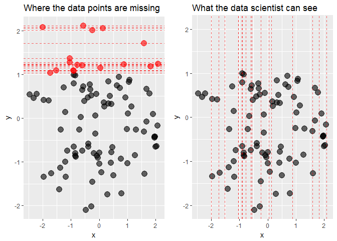
While from the first plot it is clear that the data are truly MNAR, what the data scientist can see are only the x-coordinates of the missing points. What conclusion can be drawn from the second plot? Are the data MCAR? Possibly yes, the locations of missing values seem to be spread out quite evenly over the x-axis. Or are they MAR? At a closer inspection, there seem to be more missing values in y for negative values of x than for the positive ones, so this can also be the case. Finally, MNAR can never be ruled out, because to know if the data are MNAR or not we would by definition need to observe the unobserved values.
Luckily, we do not need to be at a total loss here. Data visualization tools can provide us with some guidance as to what patterns are there in the missing data. We will now analyze a number of plots useful for detecting those patterns based on the biopics dataset from the fivethirtyeight package, containing some information about biographical films.
Data Cleaning
Before moving on to the plotting part, the data needs some pre-processing. The code chunk below will do the job. The select call at the beginning of the dplyr pipeline extracts variables of interest and the subsequent mutate groups related races together in order to have enough observations in each group. Then, the class of some variables is adjusted: we need factors for string variables and integers for the logical one. Finally, the variables are renamed to shorter names for the sake of plots' readability.
data(biopics, package = "fivethirtyeight")

biopics <- biopics %>%
  select(country, year_release, box_office, number_of_subjects,
         type_of_subject, subject_race, person_of_color, subject_sex) %>%
  mutate(subject_race = ifelse(grepl("^Hispanic", subject_race), "Hispanic",
                               subject_race),
         subject_race = ifelse(grepl("^African", subject_race), "African",
                               subject_race),
         subject_race = ifelse(grepl("^Middle", subject_race), "Mid Eastern",
                               subject_race),
         subject_race = ifelse(subject_race %in% c("White", "Asian", "African",
                                                   "Hispanic", "Mid Eastern",
                                                   "Multi racial", NA),
                               subject_race, "other")) %>%
  mutate(country = as.factor(country),
         type_of_subject = as.factor(type_of_subject),
         subject_race = as.factor(subject_race),
         subject_sex = as.factor(subject_sex),
         person_of_color = as.integer(person_of_color)) %>%
      as.data.frame()

colnames(biopics) <- c("country", "year", "earnings", "sub_num",
                       "sub_type", "sub_race", "non_white", "sub_sex")
We end up with a dataset consisting of eight variables:
country- film's country or countries of origin,year- year of release,earnings- gross earnings at U.S. box office,sub_num- the number of subjects featured in the film,sub_type- the occupation of the subject or reason for recognition,sub_race- a race of the subject,non_white- dummy variable that indicates a person of color,sub_sex- sex of subject.
Aggregation Plots
The first, fundamental question to ask would be: in which variables observations are missing, and how many? Aggregation plots are a useful tool for answering these questions. The one-liner below is all you need.
aggr(biopics, numbers = TRUE, prop = c(TRUE, FALSE))
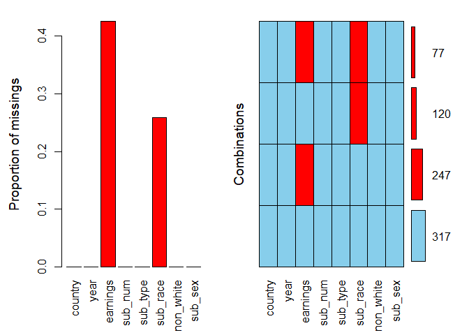
We specify the argument numbers = TRUE to display the numbers on top of the bars. The argument prop is a logical indicating whether the proportion of missing values and combinations should be used rather than the total amount. We set it to TRUE for the first plot and FALSE for the second.
It is clear that missing values appear only in two variables: they constitute over 40% of earnings and around 25% of sub_race. In the combinations plot on the right-hand side, the grid presents all combinations of missing (red) and observed (blue) values present in the data. There are 317 complete observations, and in 77 rows both variables are missing.
Looking at two plots at the same time might seem a little confusing, so let's coerce the same information into a single visualization with the following line of code.
aggr(biopics, combined = TRUE, numbers = TRUE)
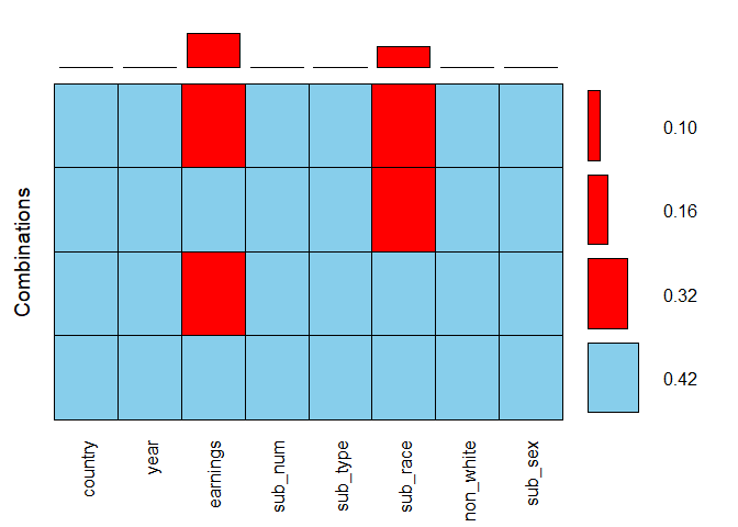
The combined argument allows for combining the two plots into one. Here, the horizontal bars to the right of the grid show the frequencies of the corresponding combinations, while the vertical bars on top of it present the proportions of missing values in each variable. By adding up the values of all possible combinations for earnings, so 0.32 and 0.10, we see that the overall proportion of missing values in this variable, which we estimated to be over 40% based on the previous bar plot, is in fact 42%.
Spinogram and Spineplot
So far we have gained some high-level overview of the missing data. It is time to look closer at the interactions between specific variables. Spinogram and spineplot allow to study the percentage of missing values in one variable for different values of the other. If the latter is a numeric variable, then we have to do with a spinogram; when it is categorical, this visualization is referred to as a spineplot.
Both can be generated with the function spineMiss(), taking a two-column dataframe as input. The first specified variable is the one according to which the data are split. It is mapped onto the horizontal axis of the plot. The second variable is the one who's missing data pattern we are interested in. To see it in practice, let us create a spineplot. We specify a categorical variable sub_race first, followed be earnings, which you can read as: what is the percentage of missing values in earnings for each category of sub_race?
spineMiss(biopics[, c("sub_race", "earnings")])
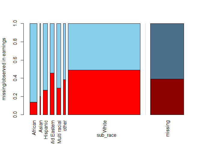
The relative width of the bars for specific categories in sub_race mirrors the frequency of this category in the dataset: for instance, in a vast majority of the films the main subject is white. Within each bar, the missing proportion of earnings is shown, while the shadowed bar on the right-hand side presents this proportion for the whole dataset. It seems that when the main subject is African, we are most likely to have complete earnings information.
By switching the order of the variables as in the code line below, we can produce a spinogram answering the following, turned-around question: what is the percentage of missing data in sub_race for different values of earnings?
spineMiss(biopics[, c("earnings", "sub_race")])
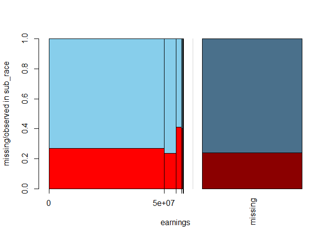
Because earnings is a numeric variable, its values are divided into bins, where the widths of the bins correspond to the distribution of the variable itself. The spinogram shows that earnings are highly negatively skewed: only a couple of films made the highest profit. Interestingly, for those blockbusters, we are most likely to miss subject's race, as reflected by the highest red bar for the most significant values of earnings.
Mosaic Plot
The spinogram and spineplot discussed above allow to study interactions between two variables. This idea is generalized to more variables in the form of a mosaic plot. This plot is a collection of tiles, wherein each tile corresponds to a specific combination of categories (for categorical variables) or bins (for numeric variables) of two or more variables. Within each tile, the percentage of missing data points in another variable is shown. In principle, mosaic plots can be created for any number of variables, but they can get cluttered if you go for too many. Also, they are more readable if the splitting variables are factors and the ones with not too many levels.
Let us take a look at the missing proportion in earnings split by sub_sex and US_movie. The latter, created in the code chunk below, is a logical stating whether the United States where involved in the film's production. We provide the three-variable data frame as the first argument to mosaicMiss(). Argument plotvars set to a vector with elements 1 and 2 means we want to split the data according to the first two columns of this data frame. Setting highlight to 3 means that we want the missing proportion of the variable in the third columns to be shown inside the tiles.
biopics <- biopics %>%
    mutate(US_movie = ifelse(grepl("US", country), TRUE, FALSE))
mosaicMiss(biopics[, c("sub_sex", "US_movie", "earnings")], highlight = 3,
           plotvars = 1:2, miss.labels = FALSE)
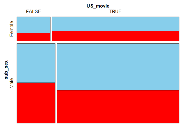
Again, the sizes of the tiles correspond to the occurance frequencies of given combinations in the dataset. For instance, the largest bottom-right tile means that most movies feature a male subject and were produced, at least partly, in the US.
When it comes to movies featuring a male as the main subject, the earnings information is more likely to be missing for non-American movies. On the other hand, if the main character is a female, the US films have slightly more missing values in earnings. These differences seem, however, too small to be deemed significant.
Parallel Boxplot
Another visualization type is a parallel boxplot. The idea behind it is to split the dataset into two subsets: one with only observed values of an incomplete variable and the other with only its missing values. For both subsets, a boxplot of a chosen numeric variable is produced. This allows you to check whether the distribution of the chosen variable is affected by missing values the splitting variable.
To produce a parallel boxplot, we can use the pbox() function. We pass only one argument: a two-column data frame. The boxplots will be drawn of the variable in the first column, while the one in the second column will be used for splitting. In the example below, we take the logarithm of earnings as they are highly skewed and without this transformation, the boxplot would resemble a single line.
biopics <- biopics %>%
  mutate(log_earnings = log(earnings))
pbox(biopics[, c("log_earnings", "sub_race")])
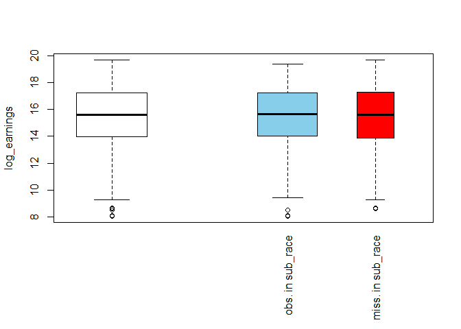
The white box on the left-hand side shows the overall distribution of log_earnings, while the blue and the red one show its distribution for the subsets of observed and missing values in sub_race, respectively. The relative width of the boxes reflects the sizes of the subsets on which they are based: the wider blue box means there are more observed than missing values in sub_race. Other than that, the two boxes look similar to each other and also the overall white box. This suggests that missing race information has no impact on the distribution of earnings.
Parallel Coordinate Plot
We have looked at single variables and their interactions. Let us now turn to analyzing all the variables in the dataset at once. The visualization allowing to do so is the parallel coordinate plot. In this plot, each variable is transformed to the same scale and represented by a parallel axis. In the case of categorical variables, the scale of the coordinate axis is broken down into a set of equidistant points, one for each of the categories. Missing values are placed above the vertical axes, outside of the plot area. Each line on the plot corresponds to one observation in the data, with the line's color denoting missing data in the selected variable.
We can produce the parallel coordinate plot with the parcoordMiss() function. By default, it uses all variables present in the data frame provided as its first argument. Setting highlight to earnings marks the lines representing observations with a missing value in earnings with a different color. Setting alpha-blending to 0.6 makes the lines slightly transparent, increasing plot's readability.
# Remove variables created for the previous plots
biopics <- biopics %>%
  select(- US_movie, - log_earnings)

parcoordMiss(biopics, highlight = 'earnings', alpha = 0.6)
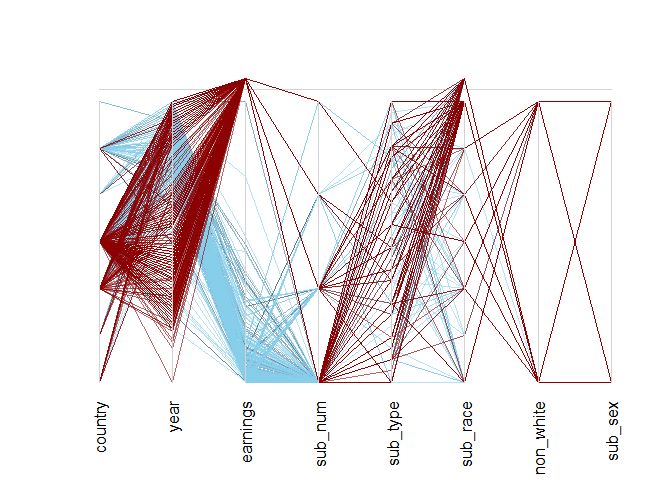
In the plot above, dark red lines denote observations with a missing value in earnings. These highlighted observations seem to behave differently than the rest of the data. In particular, only a few of them correspond to the second-highest level of the country, which otherwise encompasses many observations! It turns out to be US/UK movies (to see this, just run levels(biopics$country) and look for last-but-one value!).
Moreover, a quick inspection of the year axis reveals a spell somewhere two-thirds of its height with less dark red lines crossing. There seems to have been a time not so long ago when earnings data were more complete. This suggests that both country and year might help explain the distribution of missing values in earnings!
Matrix Plot
The last visualization tool we will inspect is a matrix plot. It visualizes all cells of the data matrix by rectangles. Observed data are shown in a continuous grey-black color scheme (the darker the color, the higher the value), while missing values are highlighted in red. It's a good practice to sort the data by one of the incomplete variables - it makes the plot easier to interpret. The code chunk below does the job, sorting by earnings.
matrixplot(biopics, sortby = c('earnings'))
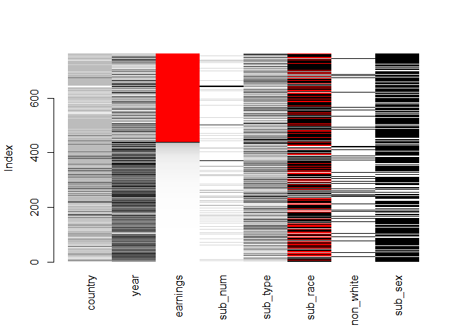
The plot validates some of the previous findings: the observations with missing values in earnings tend to come from long ago (low value of year) and also score low on country - this is denoted by the lighter color of these two variables in the rows in which earnings are red. Also, it looks like there are fewer movies with a non-white subject when earnings are missing.
Conclusions
Summarizing, it seems that the missing data in the biopics dataset are not MCAR. The locations of missing data points in earnings and sub_race help explain each other, as proved by the spineplot and the spinogram. Moreover, the matrix plot and parallel coordinate plot suggest that country, year and non_white might also help to explain the distribution of missing values in earnings. Therefore, it is not a good idea to drop the incomplete observations, as this would most probably introduce bias to our inference.
Final Thoughts
You've come a long way! Now you know what missing data mechanisms are and how do they differ, and more importantly, how to make inference about them with a variety of visualization tools. Good job! You are now fully equipped to analyze your own incomplete datasets!
If you are interested in learning more about R, take DataCamp's Data Visualization with ggplot2 (Part 1) course and check out our R Formula Tutorial.

