Corso
Introduzione a R
4 h
3M

scale() prima di eseguire la PCA per garantire pari contributo delle variabiliprincomp() o prcomp() in R con i pacchetti FactoMineR e factoextra per analisi e visualizzazionePer seguire questo tutorial, dovresti avere:
corrr, ggcorrplot, FactoMineR, factoextra (installazione trattata nel tutorial)Anche se il nostro focus è la PCA, teniamo a mente le seguenti cinque principali tecniche basate su componenti principali che mirano a sintetizzare e visualizzare dati multivariati. La PCA, a differenza delle altre tecniche, funziona solo con variabili quantitative.
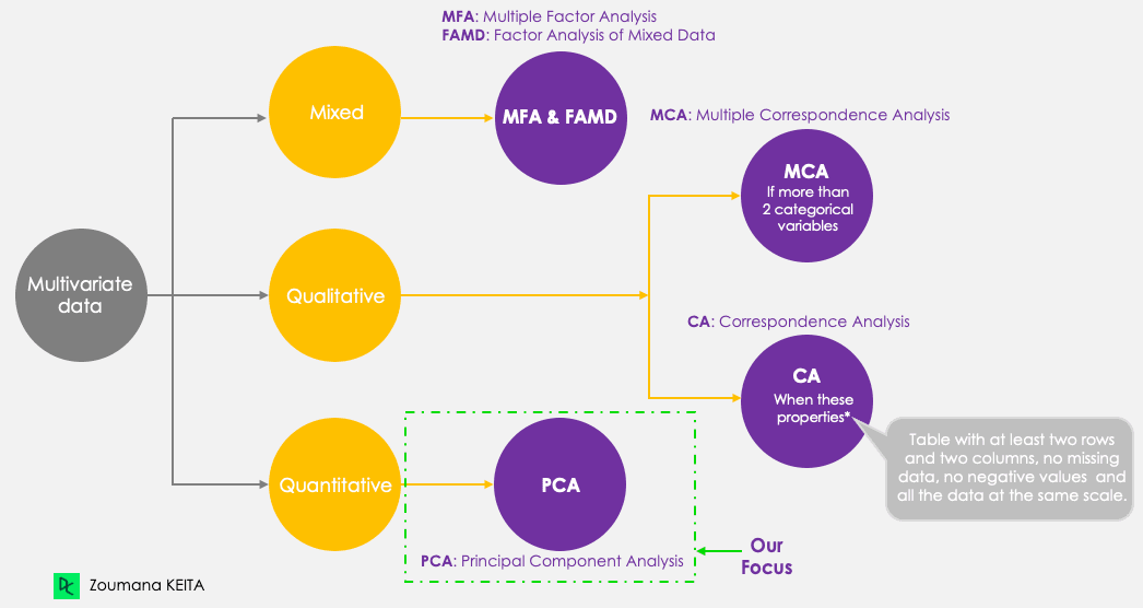
Metodi basati su componenti principali
Non entreremo nella spiegazione del concetto matematico, che può essere piuttosto complesso. Tuttavia, comprendere i cinque passaggi seguenti può aiutare ad avere un’idea migliore di come calcolare la PCA.
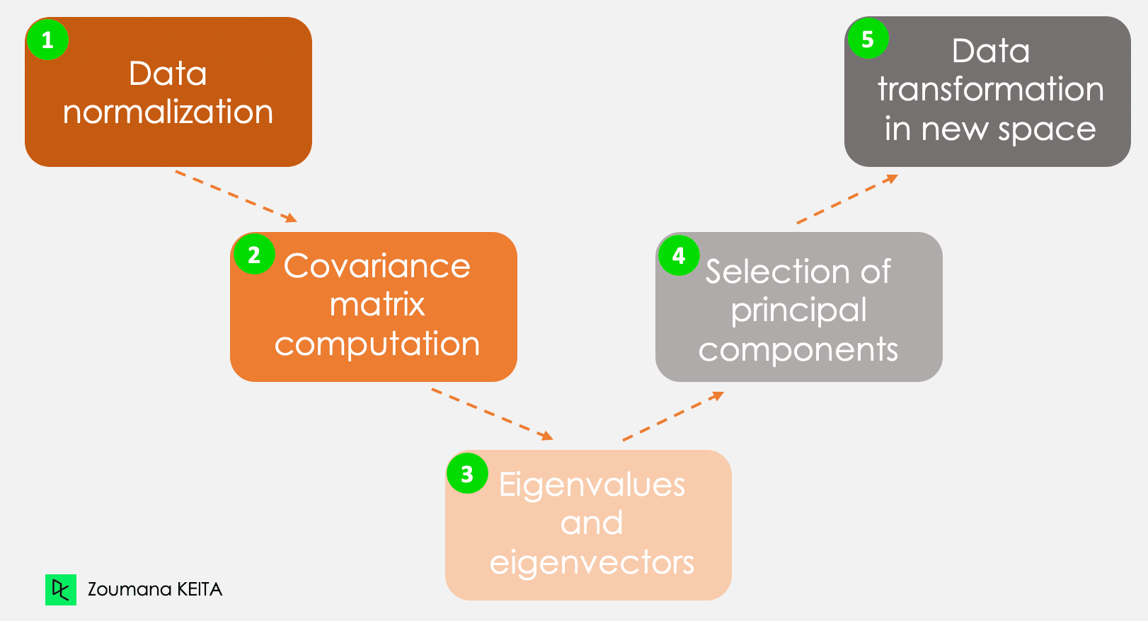
I cinque passaggi principali per calcolare le componenti principali
Riprendendo l’esempio dell’introduzione, consideriamo, ad esempio, le seguenti informazioni per un dato cliente.
Queste informazioni hanno scale diverse e svolgere la PCA su tali dati porterà a un risultato distorto. Qui entra in gioco la normalizzazione dei dati. Garantisce che ogni attributo abbia lo stesso livello di contributo, impedendo che una variabile domini sulle altre. Per ciascuna variabile, la normalizzazione si effettua sottraendo la sua media e dividendo per la sua deviazione standard.
Come suggerisce il nome, questo passaggio consiste nel calcolare la matrice di covarianza a partire dai dati normalizzati. È una matrice simmetrica e ciascun elemento (i, j) corrisponde alla covarianza tra le variabili i e j.
Geometricamente, un autovettore rappresenta una direzione come “verticale” o “90 gradi”. Un autovalore, invece, è un numero che rappresenta la quantità di varianza presente nei dati per una data direzione. Ogni autovettore ha il suo autovalore corrispondente.
Esistono tante coppie di autovettori e autovalori quante sono le variabili nei dati. Nei dati con sole spese mensili, età e valutazione, ci saranno tre coppie. Non tutte le coppie sono rilevanti. L’autovettore con l’autovalore più alto corrisponde alla prima componente principale. La seconda componente principale è l’autovettore con il secondo autovalore più alto, e così via.
Questo passaggio prevede di ri-orientare i dati originali in un nuovo sottospazio definito dalle componenti principali. Questa ri-orientazione si ottiene moltiplicando i dati originali per gli autovettori calcolati in precedenza.
È importante ricordare che questa trasformazione non modifica i dati originali, ma fornisce una nuova prospettiva per rappresentarli meglio.
La principal component analysis trova applicazioni in vari ambiti della vita quotidiana, tra cui (ma non solo) finanza, elaborazione di immagini, sanità e sicurezza.
Prevedere i prezzi azionari a partire dai prezzi passati è un’idea utilizzata in ricerca da anni. La PCA può essere usata per la riduzione della dimensionalità e l’analisi dei dati, aiutando gli esperti a trovare componenti rilevanti che spiegano gran parte della variabilità. Puoi approfondire la riduzione della dimensionalità in R nel nostro corso dedicato.
Un’immagine è composta da molteplici caratteristiche. La PCA è applicata principalmente nella compressione delle immagini per conservare i dettagli essenziali riducendo il numero di dimensioni. Inoltre, può essere utilizzata per compiti più complessi come il riconoscimento di immagini.
Con la stessa logica della compressione delle immagini, la PCA è usata nelle scansioni di risonanza magnetica (MRI) per ridurre la dimensionalità delle immagini a fini di migliore visualizzazione e analisi medica. Può anche essere integrata in tecnologie mediche utilizzate, ad esempio, per riconoscere una determinata malattia dalle immagini.
I sistemi biometrici usati per il riconoscimento delle impronte digitali possono integrare tecnologie basate sulla principal component analysis per estrarre le caratteristiche più rilevanti, come la texture dell’impronta e ulteriori informazioni.
Ora che conosci la teoria alla base della PCA, sei finalmente pronto per vederla in azione.
Questa sezione copre tutti i passaggi: dall’installazione dei pacchetti pertinenti, al caricamento e alla preparazione dei dati, all’applicazione della principal component analysis in R e all’interpretazione dei risultati.
Il codice sorgente è disponibile su DataLab.
Per portare a termine con successo questo tutorial, ti serviranno le seguenti librerie, e per ciascuna sono necessari due passaggi principali per usarla in modo efficiente:
È un pacchetto R per l’analisi delle correlazioni. Si concentra principalmente sulla creazione e gestione dei data frame in R. Di seguito i passaggi per installare e caricare la libreria.
install.packages("corrr")
library('corrr')Il pacchetto ggcorrplot fornisce diverse funzioni, tra cui la funzione ggplot2 che rende semplice visualizzare la matrice di correlazione. Analogamente alle istruzioni sopra, l’installazione è diretta.
install.packages("ggcorrplot")
library(ggcorrplot)Usato principalmente per l’analisi esplorativa dei dati multivariati; il pacchetto factoMineR offre il modulo PCA per eseguire la principal component analysis.
install.packages("FactoMineR")
library("FactoMineR")Quest’ultimo pacchetto fornisce tutte le funzioni necessarie per visualizzare gli output della principal component analysis. Tra queste funzioni rientrano, ma non solo, lo scree plot e il biplot: due delle tecniche di visualizzazione che tratteremo più avanti nell’articolo.
install.packages("factoextra")
library(factoextra)Prima di caricare i dati ed effettuare ulteriori esplorazioni, è utile comprendere e avere le informazioni di base relative ai dati con cui lavorerai.
Il dataset delle proteine è un dataset multivariato a valori reali che descrive il consumo medio di proteine da parte dei cittadini di 25 paesi europei.
Per ciascun paese ci sono dieci colonne. Le prime otto corrispondono ai diversi tipi di proteine. L’ultima corrisponde al valore totale delle medie di proteine.
Facciamo una rapida panoramica dei dati.
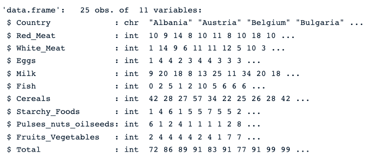
Per prima cosa, carichiamo i dati usando la funzione read.csv(), quindi str() che restituisce l’immagine qui sotto.
protein_data <- read.csv("protein.csv")
str(protein_data)
Possiamo vedere che il dataset contiene 25 osservazioni e 11 colonne. Ogni variabile è numerica tranne la colonna Country, che è una stringa di caratteri.
Descrizione del dataset delle proteine
La presenza di valori mancanti può distorcere il risultato della PCA. Pertanto, è fortemente consigliato adottare l’approccio appropriato per gestirli. Il nostro tutorial Top Techniques to Handle Missing Values Every Data Scientist Should Know può aiutarti a fare la scelta giusta.
colSums(is.na(protein_data))La funzione colSums() combinata con is.na() restituisce il numero di valori mancanti in ogni colonna. Come si vede sotto, nessuna colonna presenta valori mancanti.

Numero di valori mancanti in ciascuna colonna
Come detto all’inizio dell’articolo, la PCA funziona solo con valori numerici. Quindi dobbiamo rimuovere la colonna Country. Inoltre, la colonna Total non è rilevante per l’analisi poiché è la combinazione lineare delle restanti variabili numeriche.
Il codice seguente crea nuovi dati contenenti solo colonne numeriche.
numerical_data <- protein_data[,2:10]

head(numerical_data)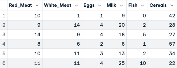
Prima della normalizzazione dei dati (sono mostrate solo le prime cinque colonne)
Ora, possiamo applicare la normalizzazione usando la funzione scale().
data_normalized <- scale(numerical_data)
head(data_normalized)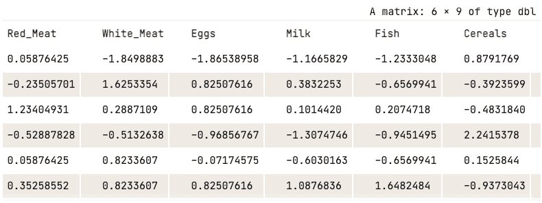
Dati normalizzati (mostrate solo le prime cinque colonne)
Prima di eseguire la PCA, visualizzare le correlazioni tra variabili conferma che la PCA sarà efficace. Alte intercorrelazioni indicano ridondanza che la PCA può comprimere. Userò i pacchetti corrr e ggcorrplot installati in precedenza.
corr_matrix <- cor(data_normalized)
ggcorrplot(corr_matrix,
           hc.order = TRUE,
           type = "lower",
           lab = TRUE)
La heatmap mostra forti correlazioni positive tra le fonti proteiche animali (carne rossa, carne bianca, uova e latte), il che spiega perché la prima componente principale catturi quasi il 77% della varianza totale. Questa struttura di correlazione è esattamente ciò che la PCA è progettata per sfruttare.
Nota sulle funzioni di PCA in R: Questo tutorial usa princomp(), che applica la decomposizione spettrale sulla matrice di covarianza. Per la maggior parte dei casi pratici, prcomp() è l’alternativa preferita — usa la decomposizione ai valori singolari (SVD), più stabile numericamente per dataset con molte variabili. La differenza principale nell’output: princomp() salva i loadings in $loadings, mentre prcomp() usa $rotation. Entrambe producono risultati equivalenti su dati ben condizionati come il dataset delle proteine usato qui.
Ora abbiamo tutte le risorse per condurre l’analisi PCA. Per prima cosa, princomp() calcola la PCA e la funzione summary() mostra il risultato.
data.pca <- princomp(data_normalized)
summary(data.pca)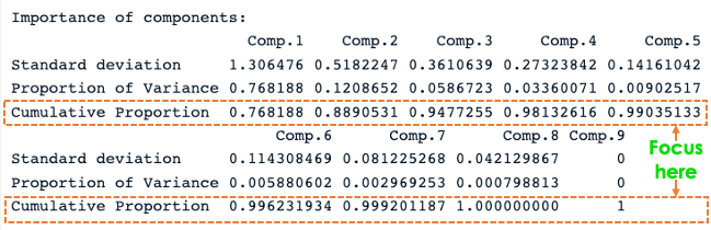
Riepilogo PCA in R
Dal precedente screenshot, notiamo che sono state generate nove componenti principali (Comp.1 a Comp.9), che corrispondono anche al numero di variabili nei dati.
Ogni componente spiega una percentuale della varianza totale del dataset. Nella sezione Cumulative Proportion, la prima componente principale spiega quasi il 77% della varianza totale. Ciò implica che quasi due terzi dei dati nell’insieme di 9 variabili possono essere rappresentati dalla sola prima componente principale. La seconda spiega il 12,08% della varianza totale.
La proporzione cumulata di Comp.1 e Comp.2 spiega quasi l’89% della varianza totale. Questo significa che le prime due componenti principali possono rappresentare accuratamente i dati.
Ottimo avere le prime due componenti, ma cosa significano davvero?
Possiamo rispondere esplorando come si relazionano a ciascuna colonna usando i loadings di ogni componente principale.
data.pca$loadings[, 1:2]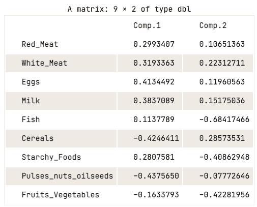
Matrice dei loadings delle prime due componenti principali
La matrice dei loadings mostra che la prima componente principale ha valori positivi elevati per carne rossa, carne bianca, uova e latte. Tuttavia, i valori per cereali, legumi, frutta a guscio e semi oleosi, e frutta e verdura sono relativamente negativi. Questo suggerisce che i paesi con un maggiore apporto di proteine animali sono in eccesso, mentre i paesi con un apporto minore sono in deficit.
Per quanto riguarda la seconda componente principale, presenta valori negativi elevati per pesce, cibi amidacei e frutta e verdura. Ciò implica che le diete dei paesi sottostanti sono fortemente influenzate dalla loro posizione, ad esempio regioni costiere per il pesce e regioni interne per una dieta ricca di verdure e patate.
L’analisi precedente della matrice dei loadings ha fornito una buona comprensione della relazione tra ciascuna delle prime due componenti principali e gli attributi nei dati. Tuttavia, potrebbe non essere visivamente accattivante.
Esistono un paio di strategie di visualizzazione standard che possono aiutare a trarre insight dai dati; questa sezione mira a coprirne alcune, a partire dallo scree plot.
Il primo approccio è lo scree plot. Serve a visualizzare l’importanza di ciascuna componente principale e può essere utilizzato per determinare il numero di componenti da mantenere. Lo scree plot può essere generato con la funzione fviz_eig().
fviz_eig(data.pca, addlabels = TRUE)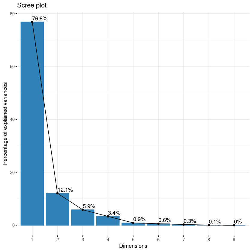
Scree plot delle componenti
Questo grafico mostra gli autovalori in una curva discendente, dal più alto al più basso. Le prime due componenti possono essere considerate le più significative poiché contengono quasi l’89% dell’informazione totale dei dati.
Con il biplot è possibile visualizzare somiglianze e differenze tra i campioni, e mostrare inoltre l’impatto di ciascun attributo su ciascuna componente principale.
# Grafico delle variabili
fviz_pca_var(data.pca, col.var = "black")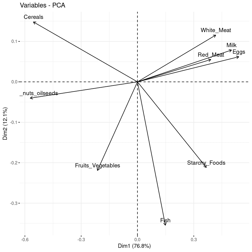
Biplot delle variabili rispetto alle componenti principali
Dal grafico precedente si possono osservare tre informazioni principali.
L’obiettivo della terza visualizzazione è determinare quanto ciascuna variabile sia rappresentata in una data componente. Tale qualità di rappresentazione è detta Cos2 e corrisponde al coseno quadrato; si calcola con la funzione fviz_cos2().
fviz_cos2(data.pca, choice = "var", axes = 1:2)Il codice sopra calcola il valore del coseno quadrato per ciascuna variabile rispetto alle prime due componenti principali.
Dall’illustrazione qui sotto, cereali, legumi/frutta a guscio/semi oleosi, uova e latte sono le quattro variabili con i cos2 più alti e quindi contribuiscono maggiormente a PC1 e PC2.
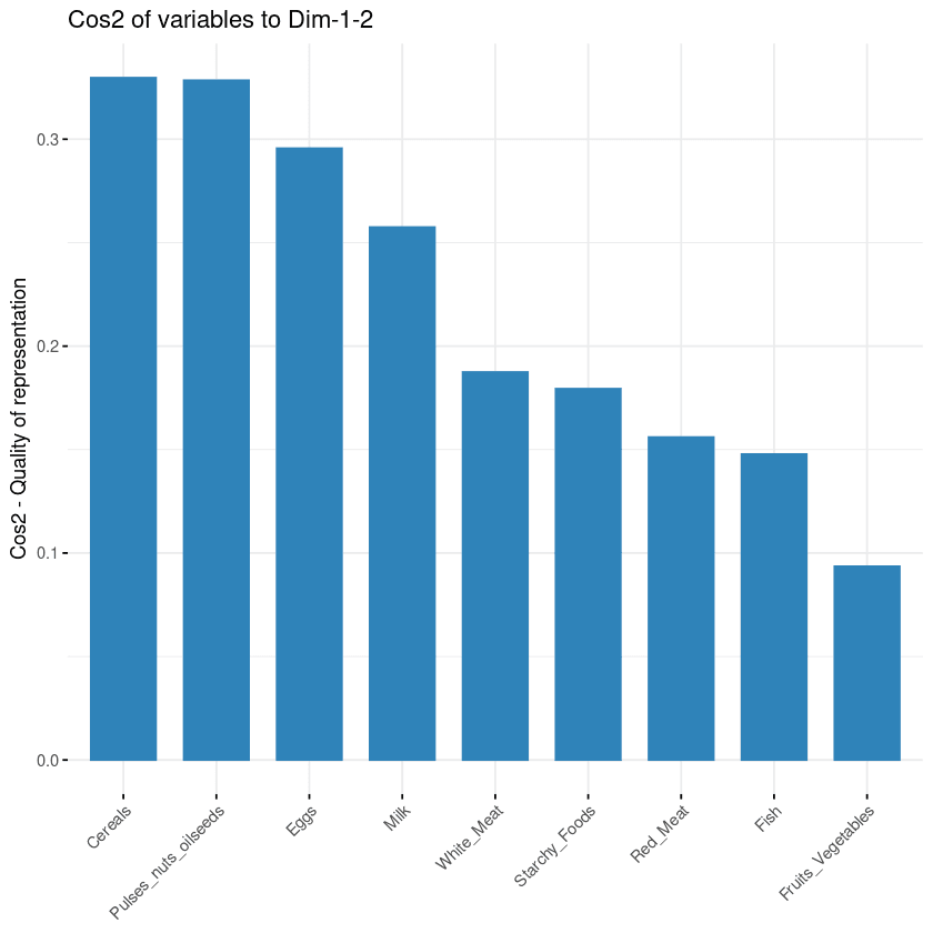
Contributo delle variabili alle componenti principali
Le ultime due tecniche di visualizzazione — biplot e importanza degli attributi — possono essere combinate per creare un unico biplot, in cui gli attributi con valori di cos2 simili avranno colori simili. Questo si ottiene perfezionando la funzione fviz_pca_var come segue:
fviz_pca_var(data.pca, col.var = "cos2",
            gradient.cols = c("black", "orange", "green"),
            repel = TRUE)
Dal biplot qui sotto:
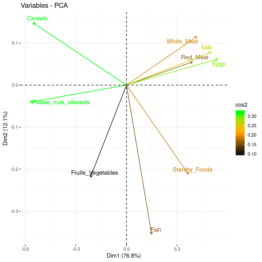
Combinazione di biplot e punteggio cos2
Due regole pratiche aiutano a decidere quante componenti principali mantenere:
In questo tutorial abbiamo visto cos’è la principal component analysis e la sua importanza nella data analytics. Dalle basi matematiche al codice pratico in R, abbiamo seguito un workflow completo di PCA sul dataset delle proteine — dalla normalizzazione e l’uso di princomp() fino all’interpretazione di scree plot, biplot e visualizzazioni cos2 per comprendere la relazione tra componenti principali e variabili originali.
Applica queste tecniche per ridurre la dimensionalità, far emergere strutture nascoste e costruire pipeline di machine learning più pulite sui tuoi dataset.
Per approfondire, esplora queste risorse correlate:
Corsi per R
Corso
Corso
Corso
blog
Abid Ali Awan
10 min
blog
Tim Lu
12 min
blog
Abid Ali Awan
15 min