Track
Machine Learning Scientist in Python
85 hr
We often encounter datasets with hundreds or even thousands of features in machine learning problems, and this scale often poses challenges of meaningful data visualization and analysis. Traditional plotting methods can only display two or three dimensions at once, making it nearly impossible to understand the structure of high-dimensional data. This is where dimensionality reduction techniques such as UMAP (Uniform Manifold Approximation and Projection) come to the rescue.
Over time, UMAP has become a go-to method for visualizing complex datasets across various fields. This tutorial will guide you through everything you need to know about UMAP, from its foundations to practical implementation and common challenges, helping you start using this technique in your projects from now on.
UMAP is a non-linear dimensionality reduction algorithm that projects high-dimensional data into a lower-dimensional space (typically 2D or 3D) while preserving the essential structure of the data. UMAP stands for Uniform Manifold Approximation and Projection, and is grounded in manifold learning and topological data analysis.
Other dimensionality reduction methods, such as t-SNE, are good at preserving local neighborhoods but end up distorting global relationships. The key benefit of UMAP is that it strikes a balance between both the local neighborhoods and the global relationships. It assumes that the data lies on a Riemannian manifold and that this manifold can be modeled locally with a fuzzy topological structure. This mathematical foundation allows UMAP to create more meaningful visualizations where similar data points cluster together while maintaining the overall topology of the dataset.
The algorithm works by constructing a high-dimensional graph representation of the data, then optimizing a low-dimensional graph to be as structurally similar as possible. In addition to visualization, UMAP is useful as a preprocessing step for clustering algorithms or even as a general non-linear dimensionality reduction technique for machine learning pipelines.
We’ll break down the process into several key steps to understand how UMAP works. The complete mathematical theory involves advanced concepts from topology and topological data analysis, so for this tutorial, we’ll take an intuitive approach to the core algorithm.
UMAP begins by building a weighted graph that represents relationships in the high-dimensional space. For each data point, it identifies its k nearest neighbors (where k is a parameter we can adjust). However, unlike simple k-NN graphs, UMAP uses a probabilistic approach. It calculates the probability that two points are connected based on their distance, using a smooth approximation that depends on the local density around each point.
The key insight here is that UMAP adapts to the local structure of our data. In dense regions, points need to be very close to be considered neighbors, while in sparse regions, the algorithm extends its search radius.
This adaptive behavior is controlled by the formula:
p(i,j) = exp(-(d(xi, xj) - ρi) / σi)Where d(xi, xj) is the distance between points, ρi is the distance to the nearest neighbor, and σi is a scaling factor computed for each point.
UMAP then converts these local probability distributions into a fuzzy topological structure from topological data analysis. It symmetrizes the graph by combining the probabilities from both directions:
p(i,j) = p(i|j) + p(j|i) - p(i|j) * p(j|i)This creates what’s called a fuzzy simplicial set, which captures the manifold structure of the high-dimensional data.
The final step involves finding a low-dimensional representation that preserves the fuzzy topological structure. UMAP initializes points in the low-dimensional space (using a spectral embedding) and then uses gradient descent to minimize the cross-entropy between the high-dimensional and low-dimensional fuzzy topological representations.
The optimization uses attractive forces to pull together points that should be close (based on the high-dimensional structure) and repulsive forces to push apart points that should be distant. This push-pull dynamic creates the characteristic visualizations where clusters are well-separated while maintaining their internal structure.
UMAP has applications across numerous fields where understanding high-dimensional data is useful.
Some of these real-world applications include:
Now that we’ve understood the concept, mathematical foundations, and practical applications of UMAP, let’s move on to the implementation.
Let’s implement UMAP on a real-world dataset to see how it works in practice. We’ll use the Olivetti Faces dataset, which contains grayscale images of faces from 40 different people. The Olivetti dataset can be downloaded from Kaggle or through the scikit-learn Python library.
The Olivetti Faces dataset contains:
This is perfect for UMAP because we expect images of the same person to cluster together, despite variations in expression and lighting.
First, let’s import the necessary libraries and load our dataset:
import numpy as np
import pandas as pd
import matplotlib.pyplot as plt
import matplotlib.cm as cm
from sklearn.datasets import fetch_olivetti_faces
from sklearn.preprocessing import StandardScaler
from sklearn.model_selection import train_test_split
import umap
import warnings
warnings.filterwarnings('ignore')
# Load the Olivetti faces dataset
faces = fetch_olivetti_faces(shuffle=True, random_state=42)
X = faces.data
y = faces.target
print(f"Dataset shape: {X.shape}")
print(f"Number of individuals: {len(np.unique(y))}")
print(f"Number of images per individual: {X.shape[0] // len(np.unique(y))}")
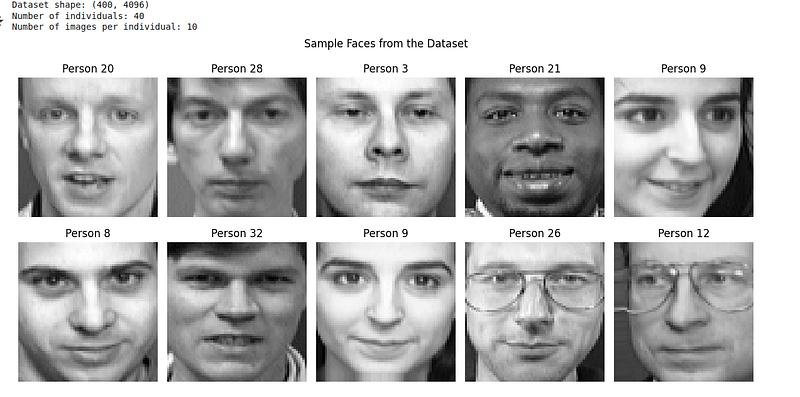
# Display sample faces
fig, axes = plt.subplots(2, 5, figsize=(12, 6))
for i, ax in enumerate(axes.flat):
ax.imshow(X[i].reshape(64, 64), cmap='gray')
ax.set_title(f'Person {y[i]}')
ax.axis('off')
plt.suptitle('Sample Faces from the Dataset')
plt.tight_layout()
plt.show()From the code above, we can visualize the dataset as follows:
The Olivetti faces dataset comes pre-normalized with pixel values between 0 and 1, so we can apply UMAP directly:
# Create UMAP instance with default parameters
reducer = umap.UMAP(random_state=42)

# Fit and transform the data
embedding = reducer.fit_transform(X)

# Create a custom colormap for 40 distinct classes
colors = cm.get_cmap('hsv', 40)

# Create visualization
plt.figure(figsize=(12, 10))
scatter = plt.scatter(embedding[:, 0], embedding[:, 1], c=y,
                    cmap=colors, s=50, alpha=0.8, edgecolors='black', linewidth=0.5)
plt.colorbar(scatter, label='Person ID', ticks=np.arange(0, 40, 5))
plt.title('UMAP Projection of Olivetti Faces (Default Parameters)')
plt.xlabel('UMAP 1')
plt.ylabel('UMAP 2')
plt.grid(True, alpha=0.3)
plt.show()
We are presented with a colored scatter plot as a UMAP visualization:
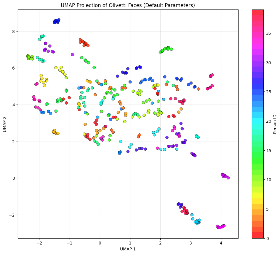
Here are some things to note to understand the diagram better:
Though it doesn’t happen in real-world scenarios, ideally, we would expect all 10 images of the same person (same color) to cluster together. In the image, we see some of the similar colors clustered together when we built the UMAP using the default parameters.
UMAP has several important parameters that control its behavior. Let’s explore how they affect the results:
# Create subplots for different parameter settings
fig, axes = plt.subplots(2, 3, figsize=(18, 12))
axes = axes.ravel()

# Different parameter configurations
param_configs = [
   {'n_neighbors': 5, 'min_dist': 0.1},
   {'n_neighbors': 15, 'min_dist': 0.1},
   {'n_neighbors': 50, 'min_dist': 0.1},
   {'n_neighbors': 15, 'min_dist': 0.0},
   {'n_neighbors': 15, 'min_dist': 0.5},
   {'n_neighbors': 15, 'min_dist': 0.99}
]

# Apply UMAP with different parameters
for idx, params in enumerate(param_configs):
   reducer = umap.UMAP(random_state=42, **params)
   embedding = reducer.fit_transform(X_scaled)

   ax = axes[idx]
   scatter = ax.scatter(embedding[:, 0], embedding[:, 1], c=y,
                       cmap='tab20', s=30, alpha=0.8)
   ax.set_title(f"n_neighbors={params['n_neighbors']}, "
                f"min_dist={params['min_dist']}")
   ax.set_xlabel('UMAP 1')
   ax.set_ylabel('UMAP 2')
   ax.grid(True, alpha=0.3)

plt.tight_layout()
plt.show()
The output visualization is as follows:
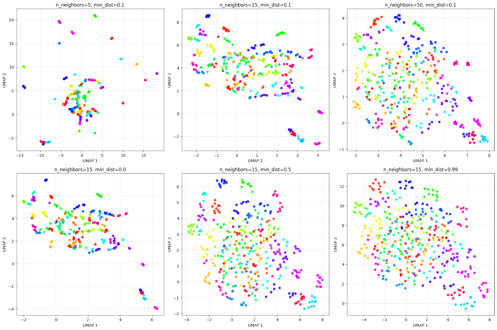
The grid above illustrates how parameters impact the visualization. Considering the top row of n_neighbors effect:
Considering the bottom row of min_dist effect:
It’s always advisable to experiment with these parameters to get the best clustering result for the problem at hand.
Let’s continue our example with the Olivetti dataset to compare UMAP with PCA and t-SNE and understand their differences:
from sklearn.decomposition import PCA
from sklearn.manifold import TSNE

# Create figure with subplots
fig, axes = plt.subplots(1, 3, figsize=(18, 6))

colors = cm.get_cmap('hsv', 40)

# PCA
pca = PCA(n_components=2, random_state=42)
pca_result = pca.fit_transform(X)
axes[0].scatter(pca_result[:, 0], pca_result[:, 1], c=y,
               cmap=colors, s=50, alpha=0.8)
axes[0].set_title('PCA Projection')
axes[0].set_xlabel('PC 1')
axes[0].set_ylabel('PC 2')
axes[0].grid(True, alpha=0.3)

# t-SNE
tsne = TSNE(n_components=2, random_state=42, perplexity=30)
tsne_result = tsne.fit_transform(X)
axes[1].scatter(tsne_result[:, 0], tsne_result[:, 1], c=y,
               cmap=colors, s=50, alpha=0.8)
axes[1].set_title('t-SNE Projection')
axes[1].set_xlabel('t-SNE 1')
axes[1].set_ylabel('t-SNE 2')
axes[1].grid(True, alpha=0.3)

# UMAP
umap_reducer = umap.UMAP(n_neighbors=15, min_dist=0.1, random_state=42)
umap_result = umap_reducer.fit_transform(X)
scatter = axes[2].scatter(umap_result[:, 0], umap_result[:, 1], c=y,
                        cmap=colors, s=50, alpha=0.8)
axes[2].set_title('UMAP Projection')
axes[2].set_xlabel('UMAP 1')
axes[2].set_ylabel('UMAP 2')
axes[2].grid(True, alpha=0.3)

plt.tight_layout()
plt.show()
We will see the comparison plot as below:
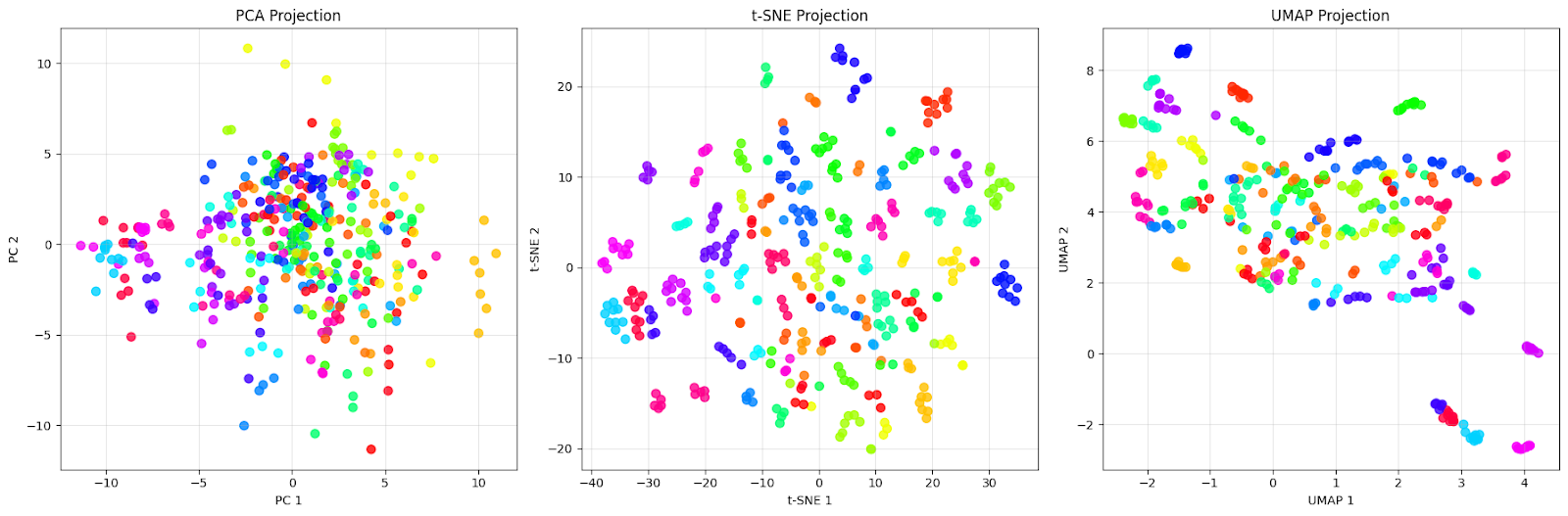
The PCA projection (left) shows a dense cloud of points centered around the origin with extensive overlap between different colored dots. This is exactly what we expect from PCA — it captures the directions of maximum variance in the data, but fails to separate the different people effectively. We can see that faces from different individuals (different colors) are completely mixed together, making it nearly impossible to identify distinct groups.
The t-SNE projection (middle) shows improvement with well-separated clusters. Each color (representing a different person) forms a distinct, compact group with clear boundaries between different individuals. Notice how t-SNE creates almost perfect local groupings where faces from the same person are pulled very close together while being pushed away from other groups. This is t-SNE’s strength: it excels at preserving local neighborhoods and creating visually distinct clusters.
The UMAP projection (right) takes a different approach. While the clusters are more spread out compared to t-SNE, this reflects UMAP’s attempt to preserve both local and global structure. We can see that each person still forms recognizable groups, but with more internal variation. Some clusters show slight overlap or are positioned closer together, which might indicate actual similarities between those individuals.
This comparison illustrates an important point: “better” depends on our goal. If we need the clearest possible visual separation for presentation or initial exploration, t-SNE’s tight clusters are excellent for this dataset. However, if we want to understand the overall structure of the data and how different groups relate to each other, UMAP’s preservation of global relationships makes it more suitable for this dataset.
As with all algorithms and techniques, we face several challenges when applying UMAP to real-world data.
Having worked extensively on this, here are some challenges I’ve noticed that keep coming up:
The most common challenge is selecting appropriate values for n_neighbors and min_dist. These parameters significantly affect the visualization, and there's no one-size-fits-all solution.
The n_neighbors parameter balances local versus global structure preservation. Smaller values (5-15) focus on preserving very local neighborhoods, capturing fine-grained structure but potentially fragmenting larger patterns. Larger values (30-100) emphasize broader connectivity patterns, revealing global structure but potentially obscuring local details.
The min_dist parameter controls how tightly points are packed in the low-dimensional layout, but it doesn't affect the high-dimensional graph construction. Values close to 0 allow points to be packed densely, creating visually tight clusters, while values approaching 1 spread points more evenly across the projection space.
The best approach is to start with the default values (n_neighbors=15, min_dist=0.1) and adjust based on your data characteristics:
UMAP can be slow on very large datasets (millions of points), making interactive exploration difficult. We can try some of these techniques below to improve performance:
Unlike PCA, distances in UMAP projections don’t have a direct interpretation. Points that appear close might not be similar in the original space. To address this limitation, it’s important to:
UMAP uses random initialization, which can lead to different results across runs, making it hard to reproduce exact visualizations. We can ensure reproducibility by following these practices:
random_state parameter: umap.UMAP(random_state=42)init parameter to specify initial positions if exact reproducibility is requiredUMAP’s default distance metric assumes continuous numerical data, which can be problematic for datasets with categorical or mixed features. When working with mixed data types, we can consider these approaches:
metric parameter with options like 'hamming' for binary dataExtreme outliers can compress the main data distribution, making it hard to see structure in the majority of points. Some techniques we can use to overcome this are:
local_connectivity parameter to be more robust to outliersThough this list is not exhaustive, it covers the most common issues faced when working with UMAP. Understanding these issues and their solutions will help us get the most out of UMAP.
Through this tutorial, we’ve explored how UMAP works at both conceptual and practical levels, implemented it on real data, compared it with alternative methods, and addressed common challenges. The key takeaway is that UMAP’s ability to balance local and global structure preservation makes it useful for exploratory data analysis when dealing with complex, high-dimensional datasets.
To deepen your expertise in dimensionality reduction techniques, consider exploring our Dimensionality Reduction in Python course, where you’ll gain hands-on experience with UMAP alongside other techniques like PCA and t-SNE. For a broader perspective on how dimensionality reduction fits into machine learning workflows, the Machine Learning Scientist with Python track teaches you both supervised and unsupervised learning techniques, helping you build end-to-end solutions for real-world data challenges.
Top DataCamp Courses
Track
Course
Course
blog
Abid Ali Awan
7 min
blog
Kurtis Pykes
9 min
blog
Josef Waples
12 min
Tutorial
Abid Ali Awan
Tutorial
Abid Ali Awan
Tutorial
Arunn Thevapalan