Course
Introduction to Tableau
6 hr
319.7K
If you would like to learn Tableau, take DataCamp's Introduction to Tableau course.
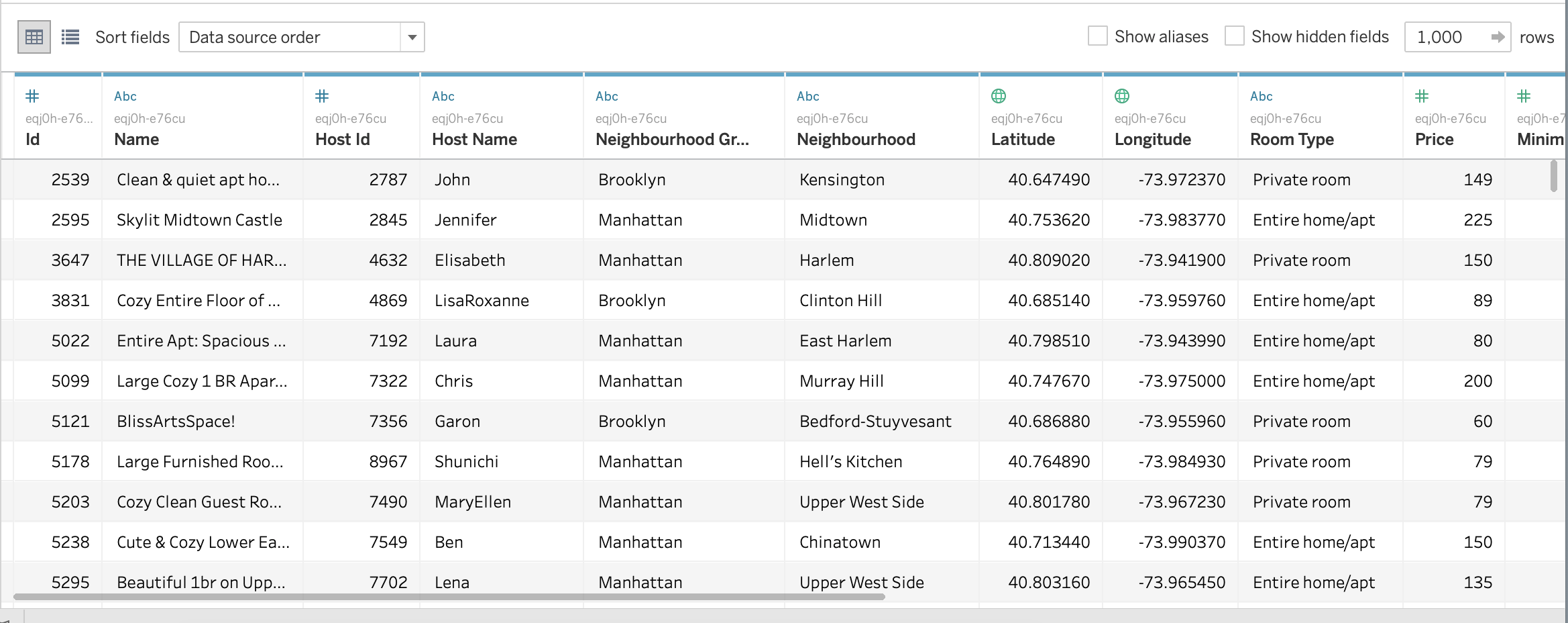
The dataset has been taken from the Airbnb website. We will use the listings.csv file of New York City, NY (2019), which describes the listing activity and its other metrics. All information about hosts, geographical availability, and price has been included to make exciting visualizations.
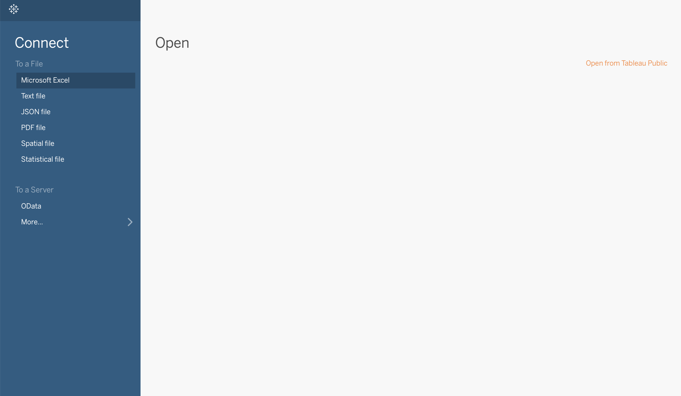
To connect to your file, go to Connect -> Text file -> Choose file path -> Open
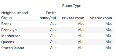
A quick glance over the data will look something like this:
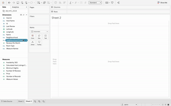
As soon as you load the Excel file and open a new worksheet in Tableau, it will automatically categorize all the column headings of your file into one of the below categories (as seen in the Data pane):
Notice that Tableau mistakenly classifies Reviews Per Month into Dimensions. Correct this by dragging the field into the Measures pane, as we want to use this field as a continuous numerical variable.
Apart from the column names, the Date pane will always contain a number of fields that do not come from your original data, two of which are Measure Values and Measure Names. Tableau automatically creates these fields so that you can build certain types of views that involve multiple measures. [1]
This article is going to focus on how we can use these multiple measures.
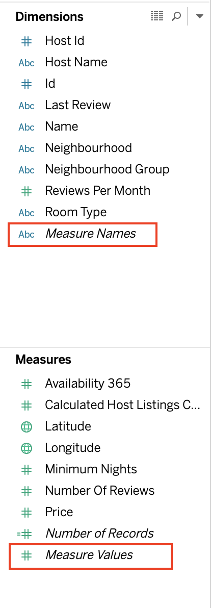
The Measure Values field always appears at the bottom of the Measures area in the Data pane and contains all the measures in your data, collected into a single field with continuous values. [2]
The Measure Names field always appears at the bottom of the Dimensions area in the Data pane and contains the names of all measures in your data, collected into a single field with discrete values. [3]
[1][2][3] Official Tableau documentation
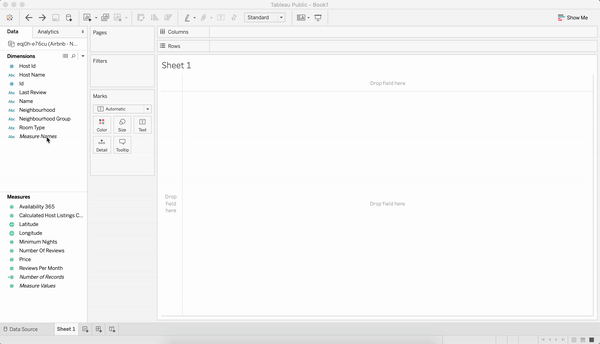
Let's start by first dragging the Measure Names field in the view. Next, drag the Measure Values field directly into the view or under the Text section in the Marks card. You will see a table with variable names against default aggregations applied to the corresponding numerical variables.
You may remove some measures values (which you do not want to be included) by dragging them out of the Measure Values card.
We know that Dimensions are types of categories, and Measures are the numerical values that we want to examine across such categories. So, let's see how we can tabulate multiple dimensions across multiple measures.
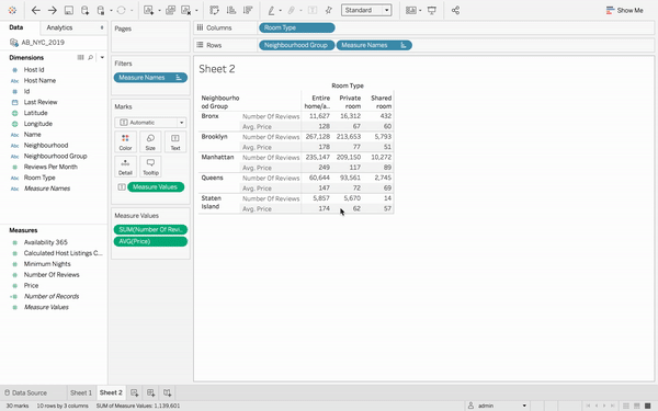
We would like to cross-tabulate multiple dimensions with multiple measures. Begin by simply dragging two-dimension fields, say Neighbourhood Group into the Rows tab and Room Type into the Columns tab. You will see a nice 5x3 table containing 5 neighbourhood groups and 3 room types.
Now suppose you want to show both the Price and the Number of Reviews for each Neighbourhood Group and Room Type. First drag Price into the view. Next, when you add Number of Reviews to the text table (by dragging it and dropping it in the view), the measures are combined, and the Measure Values field is added to Marks Text Card. Notice that the Measure Names field is automatically added to the Rows shelf.
It is vital to use Measure Names whenever dealing with more than one measure value.
Similar to the aggregate functions (SUM, AVG, MEAN, COUNT) that we have in MySQL, PostgreSQL, etc., Tableau also provides a number of aggregate functions for its Measures. An aggregate function performs a calculation on a set of values and returns a single value.
Here, since we would like to see the average price (and not the total price of all rooms) of each room type in different neighborhoods, we change the (default) aggregate function of Price from SUM() to AVG() using the Measure Values card.
Looks good! But there are too many numbers to comprehend. To get better insights, let's go ahead and make a graphical representation of the same data.
Select the Horizontal Bars graph using the Show Me button on the top right corner of Tableau. You will see a bar for the AVG(PRICE) and SUM(NUMBER OF REVIEWS) for each Neighborhood Group and Room Type.
Make it neater by color-coding the bars according to the Neighborhood Group. Tableau automatically creates and displays a legend for the same. Lastly, swap the rows and columns to make the graph more intuitive and understandable.
The graph now clearly shows the pricing and popularity (number of reviews) trends for every locality and room type.
It is always a good idea to use a geographical map when dealing with places, latitudes and longitudes. Below are the steps on how you can convert your same data into a beautiful geographical visualization.
We will again use the Color mark to classify and color each (latitude, longitude) pair into its associated neighborhood group. Similarly, we will use the Size mark to indicate the range of prices of the Airbnb properties. Larger circles denote higher prices, and smaller circles denote lower prices. Both the color and size legends can be found on the right.
In this article, we saw how Tableau automatically segregates your data fields into Dimensions and Measures. In case it misclassifies any column, we can easily drag-and-drop the field to its correct category.
We also cross-tabulated multiple dimensions with multiple measures using different visualizations - Text Table, Bar Graph, and Map.
We explored how we can use the Color and Size options in the Marks card. In addition, we experimented with some aggregate functions like SUM() and AVG() to draw meaningful inferences.
If you would like to learn more about Tableau, take DataCamp's Introduction to Tableau course and check out our Tableau Tutorial for Beginners.
Tableau Coursess
Course
Course
Course
Tutorial
Parul Pandey
Tutorial
Eugenia Anello
Tutorial
Abid Ali Awan
Tutorial
Parul Pandey
Tutorial
Chloe Lubin
Tutorial
Parul Pandey