HomeAbout Power BILearn Power BI

What can you do with Power BI?

Learning Power BI during free access week? Gain a better understanding of the art of the possible when mastering Power BI.
Jul 2022  · 4 min read

What can you do with Power BI

With an ever-growing amount of information circulating the global datasphere, understanding your data is more important than ever. Businesses worldwide depend on data contextualization to visualize their information, allowing them to make better business decisions. Better yet, we now have tools such as Power BI to process your data more efficiently.

Over 250,000 organizations, including many Fortune 500 companies, have adopted Power BI as their main business intelligence tool. It is robust and powerful (handling up to 100 million rows of data), making it an essential tool for businesses in different niches to convert raw data into a variety of actionable insights. 

If you’re curious about what you can do when you’ve mastered Power BI, we’ve taken a closer look at some potential projects. Plus, check out our comparison of Power BI vs Tableau in our full guide. 

What Can You Do When You Master Power BI For Data Analysis?

1. Visualize your data with beautiful no-code plots and charts

Visualize data with no-code plots and charts gif

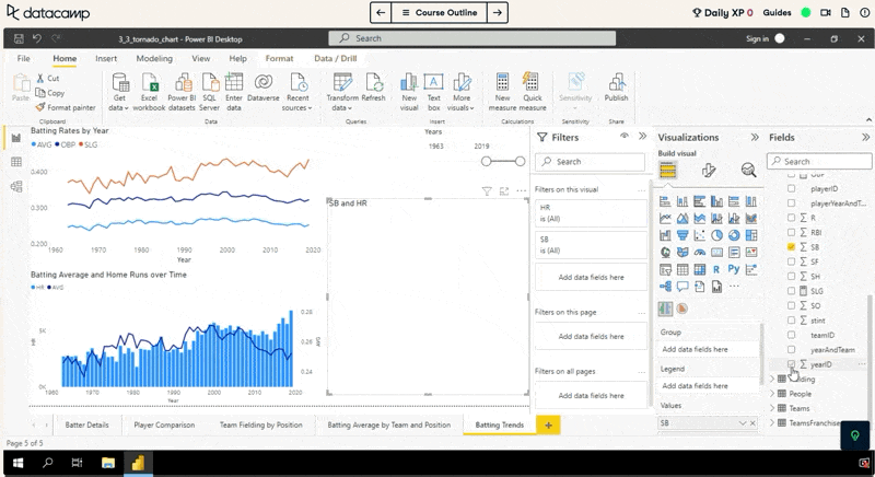
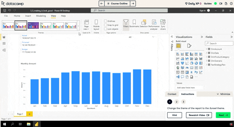
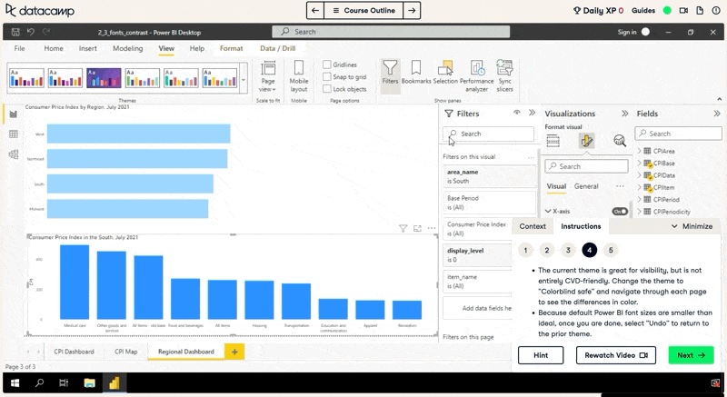
Power BI's plotting and charting tools are powerful and easy to use and require no coding at all. From traditional plots like bar plots and line plots to business focussed charts and gauges, Power BI has it all. By mastering data visualization in Power BI, you’ll be able to create beautiful, customizable charts, and create impact with your analysis. 

How to get started

2. Crunch those numbers with DAX

Crunch those numbers with DAX gif

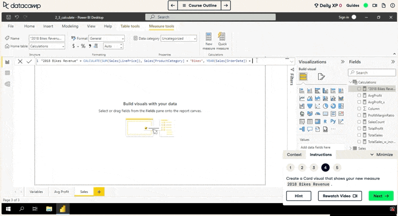
If you've ever thought "Excel formulas are useful, but I want something better", then DAX is for you! DAX is Power BI’s scripting language and closely resembles Excel formula syntax. It provides a simple-yet-powerful way to crunch numbers on your dataset.

How to get started

3. Manipulate and transform your data

Manipulate and transform data gif

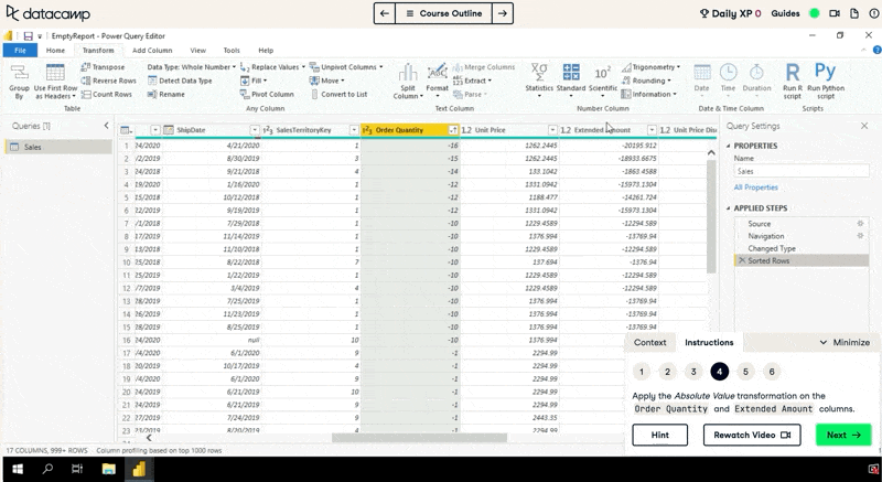
As every data analyst knows, data is never in the format you want when you get it. Fortunately, Power BI includes powerful tools to prepare and transform your data for analysis. With Power BI’s M language and advanced editor, you’ll create robust data transformations that take your data from raw, to ready for analysis. 

How to get started

4. Tell your data's story with interactive dashboards

Tell your data's story with interactive dashboards gif

At its heart, Power BI is all about creating interactive dashboards to help you understand your data. DataCamp’s Power BI curriculum teaches this from the start, so you can get from zero to insights as fast as possible. 

How to get started

5. Share your reports with colleagues and the world

Share your reports with colleagues and the world gif

The value of data analysis comes from the decisions people make from the results. To do that, you need to share your results with your colleagues or the wider world. Power BI provides a range of sharing tools to make your dashboards available to others. Before you get to that though, it's important to learn how to design dashboards and reports with users in mind.

How to get started

Topics

Power BI Courses

Course

Introduction to Power BI

3 hr
330.3K
Master the Power BI basics and learn to use the data visualization software to build impactful reports.
See DetailsRight Arrow
Start Course
See MoreRight Arrow
Related

[Radar Recap] Building a Learning Culture for Analytics Functions, with Russell Johnson, Denisse Groenendaal-Lopez and Mark Stern

In the session, Russell Johnson, Chief Data Scientist at Marks & Spencer, Denisse Groenendaal-Lopez, Learning & Development Business Partner at Booking Group, and Mark Stern, VP of Business Intelligence & Analytics at BetMGM will address the importance of fostering a learning environment for driving success with analytics.
Adel Nehme's photo

Adel Nehme

41 min

[Radar Recap] From Data Governance to Data Discoverability: Building Trust in Data Within Your Organization with Esther Munyi, Amy Grace, Stefaan Verhulst and Malarvizhi Veerappan

Esther Munyi, Amy Grace, Stefaan Verhulst and Malarvizhi Veerappan focus on strategies for improving data quality, fostering a culture of trust around data, and balancing robust governance with the need for accessible, high-quality data.
Richie Cotton's photo

Richie Cotton

39 min

[Radar Recap] Scaling Data ROI: Driving Analytics Adoption Within Your Organization with Laura Gent Felker, Omar Khawaja and Tiffany Perkins-Munn

Laura, Omar and Tiffany explore best practices when it comes to scaling analytics adoption within the wider organization
Richie Cotton's photo

Richie Cotton

40 min

A Step-By-Step Guide to Visualizing KPIs in Power BI

Learn how to effectively visualize KPIs in Power BI using visuals and DAX measures.
Joleen Bothma's photo

Joleen Bothma

8 min

Power BI Slicer Tutorial: A Comprehensive Guide to Enhancing Your Reports

Unlock the power of Power BI slicers with our step-by-step tutorial. Learn to create, customize, and optimize slicers for better reports.
Joleen Bothma's photo

Joleen Bothma

7 min

Complete Guide to Power BI Conditional Formatting

Learn how to use conditional formatting to boost your Power BI reports.
Joleen Bothma's photo

Joleen Bothma

7 min

See MoreSee More