
Course
Forecasting in R
5 hr
52.3K
The demand curve is one of the most interesting and useful tools for understanding consumer behavior and pricing strategies. It’s commonly used for analyzing the relationship between the price of a good or service and the quantity sold, although in other contexts it can be used to analyze market dynamics or forecast revenue outcomes.
In this article, we will learn all about the demand curve. We will explore both the defining characteristics and related terms. Later on, I will also find time to show how the demand curve can be extended to find the optimal price that maximizes profit - a useful bit of applied algebra to create an elementary optimization technique that I found useful in my own work.
By following these methods, I guarantee that you will be able to not only make decisions on pricing strategies but you will also be to able to clearly articulate the methods in a way that provides the framework for future projects. While I’ll be using R and SQL in this article, know that you can use these same methods with other major tools out there, like Excel, Python, Tableau, and Power BI. Finally, I want to say, to really become a pricing expert, I strongly recommend our course, Forecasting Product Demand in R.
A demand curve is a fundamental concept in pricing strategy and economics more generally. It is a compelling visual way to represent the relationship between the price of a good or service and the quantity demanded by consumers. The main components of a demand curve include the price on the one axis and the quantity demanded on the other. Here is one example:
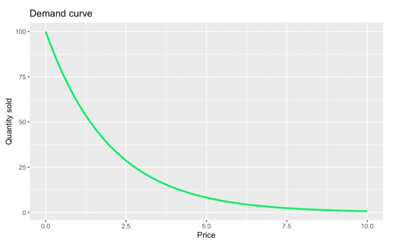
One basic demand curve shape. Image by Author.
In the above graph, you will notice something that is somewhat obvious at first glance: that price and quantity sold have an inverse relationship. More formally, we could say that the demand curve relates very much to what is known as the law of demand, which states that, all else being equal, as the price of a product decreases, the quantity demanded increases. Sometimes, this same idea is referred to as a price and quantity relationship, meaning that the price of a product directly influences how much consumers are willing to buy.
However, this particular graph also contains something a little less obvious, which is that the quantity sold falls more precipitously when the price is low and flattens out when the price is high. The curvature here relates to other concepts, like changing elasticity and diminishing marginal utility which I’ll cover in the next section.
One key concept that emerges from the inverse relationship between price and quantity demanded is the price elasticity of demand, which measures how sensitive the quantity demanded is to a change in price. Formally, elasticity is often calculated as:
![]()
A product is said to have elastic demand if a relatively small change in price leads to a large change in quantity demanded. High-end electronics or designer handbags might see a sharp drop in demand if their prices rise even a bit, because consumers can find substitutes.
A product has inelastic demand if large changes in price lead to relatively small changes in the quantity demanded. Necessities such as gasoline or medicine are classic examples. Even if the price goes up, consumers are still compelled to buy nearly the same amount because there are no alternatives.
Although I showed one example of a demand curve, do know that it can take on many different forms depending on the underlying characteristics of the market, the product, and consumer preferences. While it is always downward-sloping, this relationship does not have to follow any single mathematical shape.
Linear demand curves feature a constant rate of change between price and quantity. These would be common in simple market scenarios. They are represented by a straight line.
As we saw, demand curves aren’t always drawn as perfectly straight lines because the relationship between price and quantity is not always well represented by a simple one-to-one linear function. There are several reasons why, which I started to mention earlier:
In practice, non-linear demand curves may be more realistic because they are better at depicting a variable rate of change. After all, real-world data is messy, and consumer behavior is complex. That said, there are often ways to linearize a non-linear curve, as I will show later on.
We can also compare differences in demand at the consumer and market level. An individual demand curve represents the relationship between the price of a product and the quantity demanded by a single consumer. It reflects personal preferences and willingness to pay.
A market demand curve combines the demand from all consumers in a market. It aggregates individual demand curves, showing the total quantity demanded at each price point. Because of how they are constructed, market demand curves are used by businesses to gauge market potential.
If you are studying demand curves, you might have also heard of what is called a supply curve. Essentially, a supply curve and demand curve are two sides of the same coin. While the demand curve shows how much of a product consumers are willing to buy at different prices, the supply curve represents how much producers are willing to sell at those same prices.
Now, if you plot both a demand curve and a supply curve on the same chart, you will see a place where they cross. The intersection of these curves, known as the equilibrium point, is thought to determine the market price and quantity. So, when demand outpaces supply, prices tend to rise, which incentivizes producers to produce more. But when supply exceeds demand, prices drop, which encourages more buying.
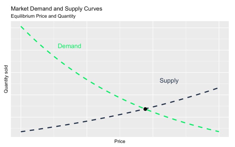
Demand curve vs. supply curve. Image by Author.
There are a lot of different ways to make use of demand curves to make business decisions. Here, I’m going to walk you through one specific way we can make demand curves useful: We will use our data to create both a demand curve and a demand model using a quadratic regression technique. I’ll show how you can use this technique in both R and SQL, where it can be used in interactive Power BI or Tableau dashboards.
Before I continue, I want to say that, if you are reading this and think you might want to upskill an entire team at once, such as a team of department of business analysts or data scientists, DataCamp for Business is here to help. We will help your team build skills and techniques that are helpful in your specific business context. A lot of heavy data analysis projects require multiple contributors - so reach out to our DataCamp team to learn more.
Unlock the full potential of data science with DataCamp for Business. Access comprehensive courses, projects, and centralized reporting for teams of 2 or more.

Let’s create and analyze a demand curve using R. To simulate a dataset, I’ve created an exponential decay-type curve with scattered noise around it. The idea here is that each data point represents a week of sales for a car dealership, where the dealership offers different specials and tries out different pricing levels for the same type of car as an attempt to increase sales.
# Load necessary library
library(tidyverse)
# Define parameters for the exponential decay
a <- 100 # Initial value
b <- 0.5 # Decay rate
# Define a realistic price range
price <- seq(10000, 40000, length.out = 200) # Price from $10,000 to $40,000
# Calculate the exponential decay
y <- a * exp(-b * (price / 10000)) # Adjust decay rate to match price scaling
# Add mixed noise (additive + slight proportional)
set.seed(42) # For reproducibility
additive_noise <- rnorm(length(y), mean = 0, sd = 1) # Constant additive noise
proportional_noise <- rnorm(length(y), mean = 0, sd = 0.05 * y) # Small proportional noise
y_noisy <- y + additive_noise + proportional_noise
# Ensure no negative values (optional, as sales can't be negative)
y_noisy[y_noisy < 0] <- 0.01
# Combine price and noisy y into a data frame
demand_curve_data <- data.frame(
price = price,
quantity_sold = y_noisy
)
# Clean and prepare the data
demand_curve_data <- demand_curve_data %>%
mutate(quantity_sold = round(quantity_sold, 0)) %>%
filter(quantity_sold != 0)
# Plot the noisy exponential decay
ggplot(demand_curve_data, aes(x = price, y = quantity_sold)) +
geom_point(color = '#203147', alpha = 0.6) +
geom_line(
aes(y = a * exp(-b * (price / 10000))),
color = '#01ef63',
size = 1.2,
linetype = "dashed"
) +
labs(
title = "Cars Sold",
subtitle = "Demand Curve (Cars Sold)",
x = "Price ($)",
y = "Quantity Sold"
) +
scale_x_continuous(labels = scales::dollar_format()) # Format x-axis as dollars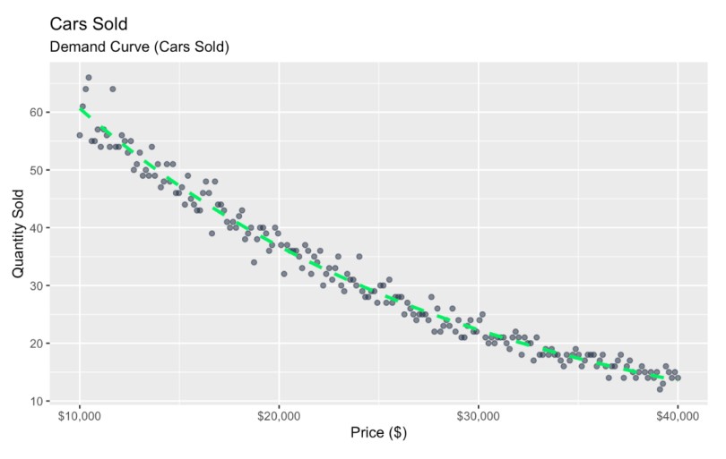 Demand curve with noise. Image by Author
Here, I’ve graphed a relationship between price and quantity sold, and I used scatterplot points to represent natural variation, which could be caused by many different reasons.
Reading this graph, we see that as price increases, sales decrease, and this relationship is more sensitive in some price ranges than others. But, depending on what your doing with the data, this general insight might not be enough to inform a practical business decision. In my experience, bosses often want to see a normative insight that provides a concrete answer to a more pressing business question. One such question is: What is the car price that actually maximizes overall revenue?
We could start by trying to make some guesses just by looking at the graph.
You might be starting to get the feeling now that the price that maximizes overall revenue is somewhere in the middle. Conceptually, this makes sense: We expect super low prices to yield a high volume of sales but relatively small revenue, while super high prices would yield much fewer sales and still also relatively small revenue. But somewhere in the middle there must be an optimal price that maximizes revenue.
Now, instead of eyeballing the graph, let’s learn a better, more efficient and solid way to maximize overall revenue. We can figure out the optimal price by solving a rudimentary optimization problem. We first create a linear model, then bend that model into a parabola, and find the highest point.
Our first step here is to linearize the relationship. Because I constructed all of this with an exponential decay function, I know it will be linearized well by taking the logarithm of quantity sold. For simplicity, let’s ignore any heteroscedasticity.
# Create a linearized version of the data
demand_curve_data$log_quantity_sold <- log(demand_curve_data$quantity_sold)

# Plot the linearized relationship
ggplot(demand_curve_data, aes(x = price, y = log_quantity_sold)) +
  geom_point(color = '#203147', alpha = 0.6) +
  geom_smooth(method = "lm", color = '#01ef63', se = FALSE) +
  labs(
    title = "Cars Sold",
    subtitle = "Demand Curve (Log Quantity Sold)",
    x = "Price ($)",
    y = "Log of Quantity Sold"
  ) +
  scale_x_continuous(labels = scales::dollar_format())  # Format x-axis as dollars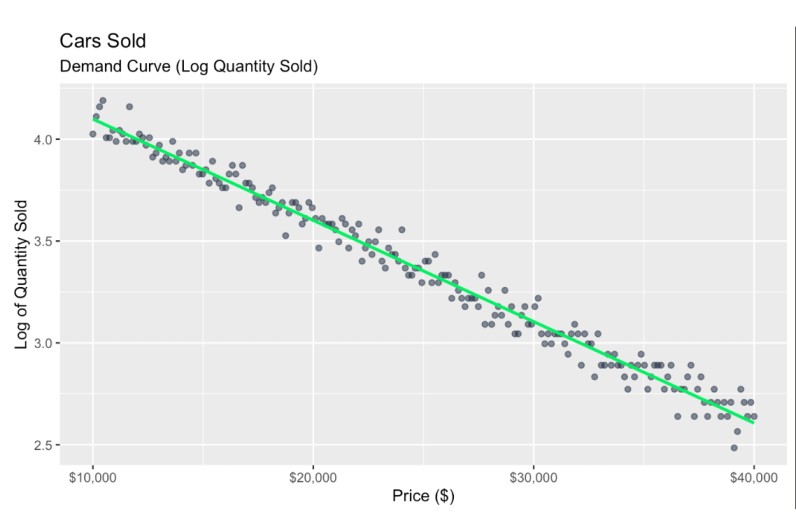
Transformed demand curve. Image by Author
Now, we can create a new variable called revenue which is defined as price times the log_quantity_sold. As a note, we create a linear model object using the lm() function because we want access to the numbers associated with the model coefficients.
For our next step, we insert our linear model equation into our formula. If we had had no log transform:
This would mean that our equation: revenue = price * quantity_sold can now be written as revenue = price * (b0 + b1 * price).
Then, we would distribute terms. Just like we would distribute terms in x(1-x) to make x-x2, we would rewrite our equation as, revenue = b0 * Price + b1 * price2.
Notice now that we would have revenue defined by an equation that has price as a squared term. This is really the key part because, by graphing price as a squared term, we have now created a maximizing function.
However, since we do have a log transform, we have to do an exponential back-transform of the log-linear model.
This means that our equation: revenue = price * log_quantity_sold is now going to be written as revenue = price * eb0 + b1 * price.
We can now factor this equation into a new form, if we prefer: revenue=price * eb0 * eb1⋅price. But this particular equation doesn't distribute in the same way as a linear or polynomial equation because the exponential function does not allow terms to be separated or distributed like the more standard algebraic terms, above.
At any rate, let's continue:
# Fit a linear model to the log-transformed quantity sold
model <- lm(log_quantity_sold ~ price, data = demand_curve_data)

# Create a revenue model based on the linear model coefficients
revenue_model_data <- demand_curve_data %>%
  mutate(
    revenue_model = price * exp(coef(model)[1] + coef(model)[2] * price)  # Modeled revenue
  )

# Plot the revenue model
ggplot(revenue_model_data, aes(x = price, y = revenue_model)) +
  geom_point(color = '#203147', alpha = 0.6) +  # Actual revenue points
  geom_line(color = '#01ef63', size = 1.2) +    # Revenue model line
  labs(
    title = "Car Sales",
    subtitle = "Revenue Model",
    x = "Price ($)",
    y = "Revenue ($)"
  ) +
  scale_y_continuous(labels = scales::dollar_format()) +  # Format y-axis as dollars
  theme_minimal() +  # Apply a minimal theme for aesthetics
  theme(
    text = element_text(family = "Arial", size = 12),
    plot.title = element_text(face = "bold", size = 16),
    plot.subtitle = element_text(size = 14)
  )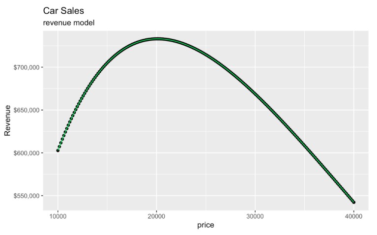
Revenue model created from a demand curve. Image by Author.
Interestingly, even though the original model used log_quantity_sold, the graph we have created is entirely on the original scales of price and revenue. The log transform only affects the underlying model, and our back-transform involving e put our graph on the original scale so it's still easy to interpret.
Now, our final key point is this: The place at the top of the parabola, where the derivative equals zero, is going to be the theoretical price that maximizes revenue.
We might remember that we find the derivative of an equation like 3x² + 2x by multiplying with the exponents to get 6x + 2. This same reasoning applies, but again, remember, in this example, we first have to back-transform our logged values before forming the revenue function. By translating back to the original scale before finding the revenue maximum, we know we are finding the price that maximizes actual revenue, not some transformed metric. So this is the correct revenue function to differentiate: revenue = price * e(b0 + b1 * price).
Let’s work it out. Here, I take the linear model coefficients. I then define a revenue function. Finally, I calculate the optimal price and learn about the associated expected total revenue.
# Model coefficients
b0 <- 4.596 # Intercept
b1 <- -4.974e-05 # Slope for price

# Define the revenue function
revenue <- function(P, b0, b1) {
  P * exp(b0 + b1 * P)
}

# Calculate the optimal price (analytical solution from dR/dP = 0) - shortcut code here
(optimal_price <- -1 / b1)

# Calculate maximum revenue
(max_revenue <- revenue(optimal_price, b0, b1))
[1] 20104.54
[1] 732853.5You might have noticed that I had one line of code for the optimal price that wasn't well explained in the context. I'm referring to this part of the code: (optimal_price <- -1 / b1). Let me take a minute to show you how I found this out, that the optimal price is -1 minus the slope.
First, we have to remember what is called the product rule in calculus, which states that, if the function of x "f of x" is equal to u(x) times v(x), then the the derivative, which we can write as f'(x), is equal to the derivative of the first thing multiplied by the section thing, then added to the first thing times these derivative of the second thing.
# the product rule in calculus
f(x) = u(x) * v(x)
f'(x) = u'(x) * v(x) + u(x) * v'(x)
Here is our equation again, along with the derivative:
# our equation:
revenue = price * e^(b0 + b1 * price)

# the derivative of our equation
derivative = 1 * e^(b0 + b1 * price) + price * b1 * e^(b0 + b1 * price)
I know that the derivative of price here is 1 because that is the thing we are finding the derivative of. "How much does price change as price changes?" Well, it's a one-to-one relationship.
On the other side, the derivative of e(b0 + b1 * price) is not neat like a simple function is neat, like 2x2, for example, which has as its derivative 4x.
In the expression that we are working with here, the exponent is a polynomial. The trick here is to look closely at all the terms: To start,
b0 is just a single value, so the derivative there is zero
price is 1, as we already handled.
b1 is the scaling factor, so we put that number in front, then, as per rule, we leave the polynomial exponent the same.
So the derivative of e(b0 + b1 * price) is b1 * e(b0 + b1 * price). This is known as the chain rule, as I'll show here:
# the chain rule in calculus
f(x) = x^g(x)
f'(x) = g'(x) * x^g(x)
The last thing is to do some factoring.
Algebra tells us that these are the same:
A + B * A = A(1+B)And when I look closely at the derivative I'm working with, I realize there's an A and a B part:
The "A" is e(b0 + b1 * price) and the "B" is price * b1. So I can factor this
e^(b0 + b1 * price) + price * b1 * e^(b0 + b1 * price)to this:
e^(b0 + b1 * price)(1 + price * b1)Finally, I have to set this derivative to zero to find the place where the slope stops going up and starts going down, which is the top of the parabola.
e^(b0 + b1 * price)(1 + price * b1) = 0As a final trick, I know that, when A * B equals zero, either A or B (or both) have to equal zero. But conveniently, I know that e(b0 + b1 * price) can never equal zero because it's an exponent. If it were positive, the number would be large; if the exponent evaluated to 0, the result would be 1; if the exponent were negative, the result would be a small fraction. So I can discard half when solving for zero.
The only thing I have to do now is move things around and solve for price.
(1 + b1 * price) = 0
b1 * price = -1
price = - 1 / b1
This is how I found -1 / b1 to put into our R code custom-built function.
Now, to pick up where we left off, we can graph the optimal price and see its associated revenue.
The optimal price is $20,104.54, which yields an expected $732,853.50 in total revenue, more or less. I'm saying 'more or less' because, if you check the math, we are assuming 36.45 cars sold, but we can't sell half a car.
ggplot(revenue_model_data, aes(x = price, y = revenue_model)) +
geom_point() + geom_line(color = '#01ef63') +
ggtitle("Car Sales") + labs(subtitle = "revenue model") +
ylab("Revenue") +
scale_y_continuous(labels = scales::dollar_format()) +
geom_vline(xintercept = optimal_price, linetype = "dashed", color = '#203147') +
geom_point(aes(x = optimal_price, y = max_revenue), color = '#203147', size = 3) 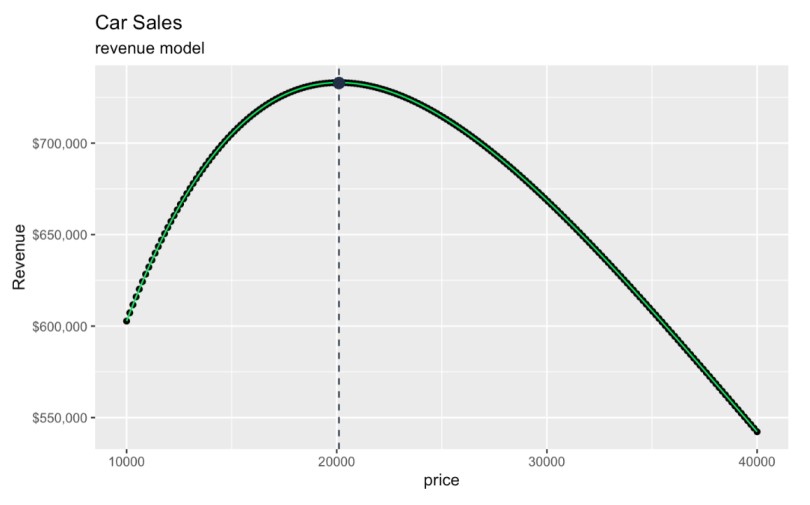 Finding the price that maximizes revenue. Image by Author.
In another workflow, we could even extend these ideas to consider profit instead of revenue. I won’t work it all out here, but to do this, know that we might consider profit = revenue - cost, where cost is considered as quantity * unit cost. If unit cost is constant and quantity can be replaced by an expression like 1 - price, then we get an upside down parabola again.
If you are interested in learning more about how calculus and derivatives feature in machine learning, try our Introduction to Deep Learning with PyTorch course which explores gradient descent in detail in the context of hyperparameter tuning. The context is different, but you can apply some similar thinking. Optimization, in its different forms, as you are seeing, is a key skill in data science, and practice helps.
If you’ve studied economics, you might recognize this parabola as something similar to the Laffer curve, which is a somewhat controversial concept that illustrates how tax rates influence government tax revenue.
While I would consider both the Laffer curve and this transformation on the demand curve to be “maximize vs. rate” type problems, the Laffer curve is specific to taxation: the x-axis would represent the tax rate (0% to 100%), and the y-axis would be the total tax revenue collected. Conceptually, the Laffer curve is also an inverse-U shape because, at the high end, we would consider that, if the tax rate were too high, it would yield no revenue because there would be no incentive for individuals or businesses to engage in taxable activities. Economists might disagree on that 'incentive' part.

The Laffer curve in Ferris Bueller's Day Off. Source: YouTube
Now that we’ve gone through the idea, I want to also share a SQL script that will do the same work. This function will perform a regression on quantity_sold versus price. It will then allow you to find the optimal price to maximize revenue based on the regression coefficients, and determine the corresponding maximum revenue.
I think the following script will be particularly useful when creating dynamic dashboards in Power BI or Tableau because you will have real-time data updates without the need to take anything offline.
You will see also that I used a manual approach to find the regression coefficients using SQL aggregate functions, since most SQL dialects do not have specialized regression functions that you can use. You might be surprised to know that simple linear regression works well in SQL because the model coefficients for simple linear regression can be expressed in terms of the correlation, standard deviation, and mean values between x and y.
-- SQL script to perform linear regression on log(quantity_sold) vs price,
-- calculate the optimal price to maximize revenue, and determine the maximum revenue.
WITH regression_data AS (
  SELECT
    COUNT(*) AS N,
    SUM(price) AS sum_x,
    SUM(LOG(quantity_sold)) AS sum_y,
    SUM(price * LOG(quantity_sold)) AS sum_xy,
    SUM(price * price) AS sum_x2,
    SUM(LOG(quantity_sold) * LOG(quantity_sold)) AS sum_y2
  FROM sales_data
),
regression_coefficients AS (
  SELECT
    N,
    sum_x,
    sum_y,
    sum_xy,
    sum_x2,
    sum_y2,
    (N * sum_xy - sum_x * sum_y) / (N * sum_x2 - sum_x * sum_x) AS slope,
    (sum_y - ((N * sum_xy - sum_x * sum_y) / (N * sum_x2 - sum_x * sum_x)) * sum_x) / N AS intercept
  FROM regression_data
),
optimal_price AS (
  SELECT
    slope,
    intercept,
    (-1 / slope) AS optimal_P
  FROM regression_coefficients
),
max_revenue AS (
  SELECT
    optimal_P,
    slope,
    intercept,
    optimal_P * EXP(intercept + slope * optimal_P) AS max_R
  FROM optimal_price
)
SELECT
  optimal_P AS Optimal_Price,
  max_R AS Maximum_Revenue
FROM max_revenue;
Optimal_Price | Maximum_Revenue
------------- | ----------------
20104.32 | 402082.58Please know that the SQL script provided might need adjustments depending on the SQL dialect used, as the syntax can vary. Also, for troubleshooting purposes, I would make sure that your sales data table contains valid and positive values for both price and quantity_sold, since negative or zero values can lead to errors.
Also, if you wanted to incorporate a log transform, as we did in the R section, you could do that, but, depending on your dialect, the natural logarithm function might be named differently, either LN or LOG. In DuckDB, LN and LOG are actually different: LN is the natural logarithm e, while LOG is base 10. If you are interesting in creating a demand curve to analyze the relationship between price and sales in SQL, tune in to my Analyzing Product Demand in SQL code-along. Finally, I would say that, to enhance your SQL proficiency as an analyst, you should explore the Associate Data Analyst in SQL career track, so you develop a full set of tools.
Learn Data Analysis and Data Science with DataCamp
Course
Course
Course
blog
Elena Kosourova
9 min
Tutorial
Josef Waples
Tutorial
Kurtis Pykes
code-along
Josef Waples
code-along
Tim Sangster
code-along
Agata Bak-Geerinck