
Track
Excel Fundamentals
16 hr
Inequality is a topic that affects almost every aspect of life: income, wealth, health, education, and even how resources are distributed in ecosystems. But how do we actually measure it? One of the more powerful tools I’ve found for visualizing inequality is the Lorenz curve.
Although it’s commonly used to measure income inequality, the Lorenz curve isn’t just for economists. Over time, it has become a versatile tool used to examine healthcare disparities, to study biodiversity, and even in machine learning to assess fairness in predictive models. For data scientists, it’s a great way to tell a story about inequality in a dataset.
In this tutorial, I’ll show you how the Lorenz curve works. We’ll discuss how to create it with your dataset, using Python, and you’ll learn how to use it in your own projects. If you’re interested in quantifying income inequality, analyzing customer segmentation, or investigating resource allocation, the Lorenz curve can help you communicate these complex ideas with a simple visual.
The Lorenz curve was introduced in 1905 by economist Max O. Lorenz. The way it works is by comparing the actual distribution of a resource with a hypothetical perfect equality line (a line where everyone has an equal amount). The further the curve is from this perfect equality line, the greater the inequality in the distribution of that particular resource.
The Lorenz curve has a simple structure. On its x-axis, we plot the cumulative share of the population, starting with the poorest individual and moving to the richest. The y-axis shows the cumulative share of the resource being measured.
Next, we need to add the line of perfect equality, which is a diagonal line running from the bottom-left corner to the top-right corner. This line represents a scenario where everyone has an equal share of the resource we’re interested in.
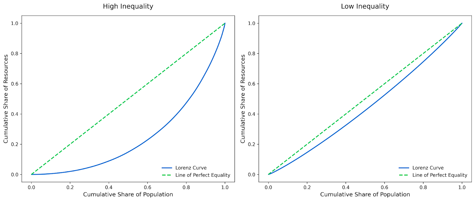
The Lorenz curve itself shows the actual distribution of the resource. The further the curve bows away from the line of perfect equality, the greater the inequality it represents.
If the Lorenz curve is close to the diagonal line of perfect equality, it means the resource is distributed fairly evenly. For example, in a society where the bottom 50% of the population has roughly 50% of the income, the Lorenz curve be closer to the diagonal. This shallow curve indicates low inequality.
On the other hand, if the curve bows far away from the diagonal, it indicates high inequality. This may happen if, for instance, the bottom 50% of the population has only 10% of the income while the top 10% has all the rest.
Let’s walk through constructing a Lorenz curve together using a simple example. Imagine we’re analyzing the income distribution of a small population.
The first step is to organize the data in ascending order. For this example, let’s say we have the following income values for five individuals in a population: $20, $30, $50, $80, $100.
We’ll sort these values from smallest to largest. This ensures that the cumulative percentages we calculate later make sense. Here’s the sorted table:
| Individual | Income ($) |
|---|---|
| 1 | 120 |
| 2 | 230 |
| 3 | 350 |
| 4 | 480 |
| 5 | 5100 |
Next, we calculate the cumulative percentages for both the population (x-axis) and the income (y-axis).
Here’s the updated table with cumulative percentages:
| Individual | Income ($) | Cumulative Population (%) | Cumulative Income (%) |
|---|---|---|---|
| 120 | 20 | 20% | 7.14% |
| 230 | 30 | 40% | 17.86% |
| 350 | 50 | 60% | 35.71% |
| 480 | 80 | 80% | 64.29% |
| 5100 | 100 | 100% | 100% |
Now that we have the cumulative percentages, we can plot them on a graph.
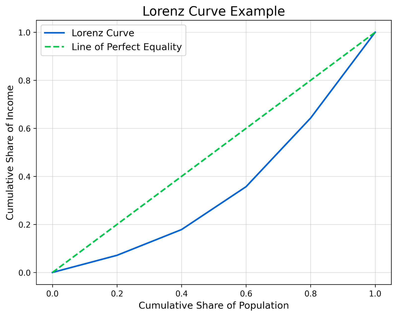
The x-axis represents the cumulative share of the population, and the y-axis represents the cumulative share of income. Each row in the table corresponds to a point on the graph. Once the points are plotted, connect them to form the Lorenz curve. Then, add the line of perfect equality.
The resulting Lorenz curve shows the actual distribution of income in this population. The further the curve bows away from the diagonal line, the greater the inequality. As you can see in this example, the curve bows noticeably because the bottom 20% of the population holds only 7.14% of the income.
To construct an accurate Lorenz curve, you’ll need high-quality data that meets a few key criteria. The quality and structure of your data will directly impact the accuracy and reliability of your results.
Firstly, sample size is a critical factor. Small datasets can lead to misleading results, as they may not capture the full range of inequality in a population. Our example here used a much too small dataset of only 5 individuals. This curve is designed for whole populations. Larger datasets provide a more reliable and representative picture of inequality, making your Lorenz curve more accurate.
Granularity is also important because the more detailed your data, the more precise your Lorenz curve will be. For example, the income for individuals or households will give you a better idea of inequality in a population than the income for whole counties. The latter dataset can hide a lot of inequity.
As with most analyses, incomplete data is a common issue that can significantly distort the Lorenz curve. Missing values create gaps in the cumulative percentages, which can lead to inaccurate results. Before constructing your curve, make sure your dataset is as complete as possible, and consider carefully how you handle any missing data. If you’re unsure how to handle missing data, check out our very helpful Dealing with Missing Data in Python course.
Now that we’ve got the basics down, let’s explore how the Lorenz curve can be used as a storytelling tool beyond just income data.
For this example, we’ll analyze crime data to understand inequality in the distribution of reported crimes across neighborhoods in a city. This will demonstrate how the Lorenz curve can be applied to fields like public policy.
We’ll use a real-world dataset from the Chicago Police Department’s crime database, which is freely available online. You can download the dataset from the Chicago Data Portal. This dataset contains detailed information about reported crimes in Chicago, including the type of crime, location, and date.
Below, we’ll walk through the steps to clean the data, calculate the Lorenz curve, and visualize it using Python. If you’re new to Python, I recommend our Introduction to Python course as a quick way to learn the language.
First, let’s install all the libraries we’ll need for this example:
import pandas as pd
import numpy as np
import matplotlib.pyplot as pltThe code below should download the dataset from the Chicago Data Portal as a CSV file and load it into Python using pandas.
# Load the dataset
url = "<https://data.cityofchicago.org/resource/ijzp-q8t2.csv?$limit=100000>"  # Limit to 100,000 rows for simplicity
data = pd.read_csv(url)This dataset contains a column for community areas, or neighborhoods. We’ll group the data by this column to calculate the total number of crimes reported in each neighborhood.
# Group by community area and count the number of crimes
crime_counts = data.groupby("community_area").size().reset_index(name="crime_count")

# Drop rows with missing community area values
crime_counts = crime_counts.dropna()

# Sort by crime count
crime_counts = crime_counts.sort_values(by="crime_count").reset_index(drop=True)

# Display the aggregated data
print(crime_counts.head())
Output:
community_area crime_count
0 47.0 102
1 9.0 102
2 12.0 195
3 74.0 212
4 37.0 246To construct the Lorenz curve, we need to calculate the cumulative percentage of neighborhoods and the cumulative percentage of crimes.
# Calculate cumulative percentages
crime_counts["cumulative_crime"] = crime_counts["crime_count"].cumsum()
crime_counts["cumulative_crime_percentage"] = crime_counts["cumulative_crime"] / crime_counts["crime_count"].sum()
crime_counts["cumulative_population_percentage"] = (np.arange(1, len(crime_counts) + 1)) / len(crime_counts)

# Display the updated data
print(crime_counts.head())
Output:
community_area crime_count cumulative_crime cumulative_crime_percentage \\
0 47.0 102 102 0.00102
1 9.0 102 204 0.00204
2 12.0 195 399 0.00399
3 74.0 212 611 0.00611
4 37.0 246 857 0.00857
cumulative_population_percentage
0 0.012987
1 0.025974
2 0.038961
3 0.051948
4 0.064935 Now that we have the cumulative percentages, we can plot the Lorenz curve. The x-axis represents the cumulative share of neighborhoods, and the y-axis represents the cumulative share of crimes. To add a regional flair, we’ll use the colors of the Chicago Bears as inspiration for our plot.
# Example data for cumulative percentages
# x represents the cumulative share of neighborhoods
# y represents the cumulative share of crimes
x = np.linspace(0, 1, 100)  # Replace with actual data
y = x**2  # Replace with actual data

# Chicago Bears-inspired colors
blue = "#0065D1"  # Lighter blue for the Lorenz curve
orange = "#FF5A1F"  # Bright orange for the line of perfect equality

# Create the plot
plt.figure(figsize=(8, 6))

# Plot the Lorenz curve
# This curve shows the inequality in crime distribution across neighborhoods
plt.plot(x, y, label="Lorenz Curve", color=blue, linewidth=2)

# Plot the line of perfect equality
# This line represents a hypothetical scenario where crimes are evenly distributed
plt.plot([0, 1], [0, 1], label="Line of Perfect Equality", color=orange, linestyle="--", linewidth=2)

# Add a title to explain what the graph represents
plt.title("Lorenz Curve of Crime Distribution Across Chicago Neighborhoods", fontsize=16, color="black", pad=15)

# Label the x-axis to show what the horizontal axis represents
plt.xlabel("Cumulative Share of Neighborhoods", fontsize=12, color="black", labelpad=10)

# Label the y-axis to show what the vertical axis represents
plt.ylabel("Cumulative Share of Crimes", fontsize=12, color="black", labelpad=10)

# Add a legend to explain the two lines
plt.legend(fontsize=12, loc="lower right", frameon=False)

# Remove the grid for a cleaner look
plt.grid(False)

# Set the background color to white for a professional appearance
plt.gca().set_facecolor("white")

# Remove the top and right borders of the graph for a minimalist design
plt.gca().spines["top"].set_visible(False)
plt.gca().spines["right"].set_visible(False)

# Save the plot as a PNG file
# This saves the graph as an image file for sharing or embedding in reports
plt.savefig("lorenz_curve_crime.png", dpi=300, bbox_inches="tight")

# Display the plot
plt.show()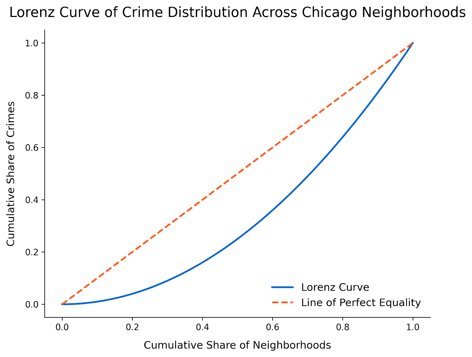
Finally, we need to interpret the plot. This Lorenz curve reveals a striking inequality in the distribution of crimes across Chicago neighborhoods. The curve bows significantly away from the line of perfect equality, showing that a small fraction of neighborhoods account for the majority of reported crimes.
It looks like the first 50% of neighborhoods contribute to less than 20% of total crimes, while the remaining neighborhoods bear the bulk of the crime burden. This visualization highlights patterns of inequality that might not be as apparent in other types of graphs. The next step may be to identify neighborhoods with higher crime to initiate mitigation measures or to identify neighborhoods with less crime to see what deterrants are working.
This example demonstrates how the Lorenz curve can be applied beyond income data to tell compelling stories about inequality in other fields. By analyzing crime data, we can uncover patterns of inequality that inform public policy and urban planning decisions. Try applying this method to other datasets, such as healthcare access, education outcomes, or environmental data to explore inequality in new and meaningful ways.
The Gini coefficient is derived directly from the Lorenz curve. It measures the area between the Lorenz curve and the line of perfect equality. A larger area indicates greater inequality, while a smaller area suggests more equality. The Gini coefficient ranges from 0 to 1, where 0 represents perfect equality (everyone has equal resources), and 1 represents extreme inequality (one individual holds all the resources).
Which measure you use depends on your goals. The Lorenz curve shows the shape of the inequality, while the Gini coefficient provides a numerical summary of it. If you are looking at the amount of inequality within one population, the Lorenz curve will offer more detail. However, if you are comparing lots of populations with each other, comparing Lorenz curves from each one may be cumbersome, so the Gini coefficient may be more appropriate. For a deeper dive into the Gini coefficient, check out my Understanding the Gini Coefficient tutorial.
Also, we should say that the Lorenz curve is perhaps more flexible, as it can be applied to various types of data, including income, crime, healthcare access, or biodiversity, and used to compare distributions over time or across groups. The Gini coefficient can also be used for these types of comparisons, but it has a reputation for primarily being used to measure income inequality. This may create a bias for some consumers. In my experience, people tend to have fewer biases when interpreting graphs than they do when being given a number.
| Feature | Lorenz curve | Gini coefficient |
|---|---|---|
| Purpose | Shows the distribution of resources across a population | Summarizes inequality into a single value |
| Type | Visual representation | Numerical representation |
| Interpretation | Shape of the curve indicates the degree of inequality | Value ranges from 0 (perfect equality) to 1 (extreme inequality) |
| Use cases | Comparing distributions, identifying patterns, and communicating findings | Comparing inequality levels across datasets or populations |
| Flexibility | Can be applied to various datasets (e.g., income, crime, biodiversity) | Primarily used for income or wealth inequality |
| Actionability | Helps identify specific areas of inequality for targeted interventions | Provides a high-level summary for broad comparisons |
The above comparison highlights how the Lorenz curve and the Gini coefficient complement each other. The Lorenz curve offers a more detailed and visual perspective for one population, while the Gini coefficient provides a concise summary that can be used to compare across populations.
The Lorenz curve is a versatile tool that has been applied across a wide range of fields. Let’s explore a few of its most impactful applications.
Like any method, the Lorenz curve has its strengths and weaknesses.
The Lorenz curve often requires pretty granular data to produce any meaningful results. Aggregated or incomplete datasets can sometimes lead to inaccurate conclusions. For example, income data that excludes informal earnings, like tips, may underestimate inequality.
It’s also important to have a large enough sample size to ensure a curve instead of a jagged line, which you can see in the first figure. As always, it’s important to ensure your data is as complete as possible. And, of course, you should carefully validate your data and document any assumptions made to ensure transparency and reliability.
The Lorenz curve also doesn’t capture multidimensional inequality. It focuses on a single variable, such as income or wealth, and does not account for any combined effects. However, if you do want to measure multidimensional inequality, there are other tools you can use, such as the Multidimensional Poverty Index.
The biggest advantage of the Lorenz curve, in my opinion, is that it provides an intuitive visual representation of inequality, making it easy to understand at a glance. By comparing the curve to the line of perfect equality, disparities within a population become immediately apparent. It’s a visual storytelling tool that makes inequality data accessible to both technical and non-technical audiences.
Its versatility is its other major advantage. The Lorenz curve can be applied across various fields, from economics and public health to ecology and machine learning. This flexibility makes it broadly useful.
The Lorenz curve is a versatile storytelling tool that’s useful for displaying and understanding inequality. If this type of visualization interests you, you may enjoy reading Geometric Mean: A Measure for Growth and Compounding. Or, if you want to learn more about finance, I encourage you to check out our Introduction to Python for Finance course and our Applied Finance in Python skill track.
Learn Excel with DataCamp
Track
Course
Course
blog
Amberle McKee
14 min
Tutorial
Aditya Sharma
Tutorial
Sejal Jaiswal
Tutorial
Elena Kosourova
Tutorial
Bekhruz Tuychiev
Tutorial
Kurtis Pykes