
Track
Applied Finance in Python
16 hr
Income inequality has long been a talking point in economic and social discussions. Disparities in income distribution affect everything from policy decisions to individual well-being. But have you ever wondered how we actually measure inequality empirically? One way is to use the Gini coefficient.
The Gini coefficient is a powerful metric for quantifying inequality. It is widely used across disciplines, including economics, sociology, and health. It is primarily used to measure inequality in income, but it has been modified to measure things like wealth distribution and even access to healthcare. The strength of the Gini coefficient is that it summarizes complex datasets into a single number. This single value provides a clear lens through which to compare inequality. If you’d like to brush up on your statistics, as we get started, check out Statistical Inference in R.
The Gini coefficient is a statistical measure used to assess inequality within a dataset. It ranges from 0, representing perfect equality, to 1, indicating perfect inequality. A Gini value of 0 means everyone has an equal share, while 1 means one person owns everything.
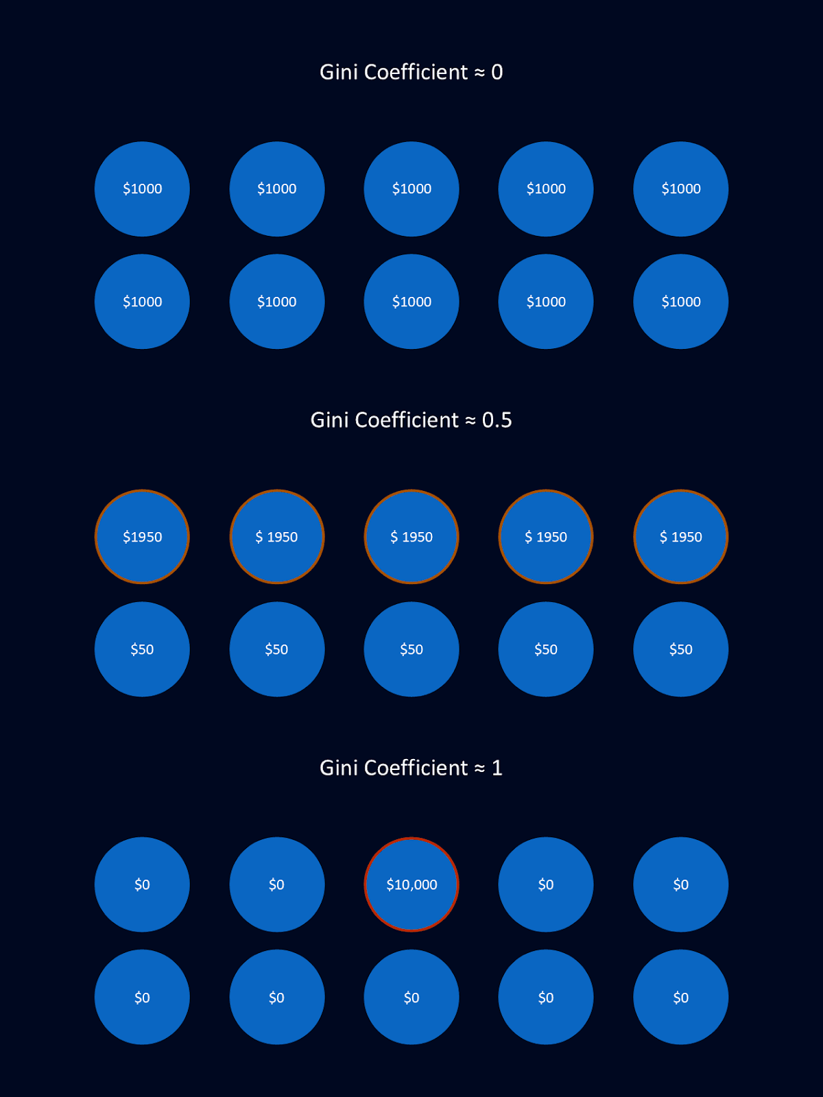
Above is a simplified example of different Gini coefficients. In each of the three scenarios, there are 10 people and $10,000. In the first example, the money is perfectly equally distributed, resulting in a Gini coefficient close to 0. In the second, there are essentially two classes, with the upper class retaining the vast majority of the money. This results in a Gini coefficient close to 0.5. In the third example, one individual owns all of the money while the rest of the population owns none of it. This extreme example of inequality results in a Gini coefficient close to 1.
The versatility of the Gini coefficient makes it applicable to a variety of contexts. Often, when the Gini coefficient is reported, it refers to income inequality. However, it has been adapted to measure wealth distribution, inequality in consumption, and even disparities in housing size.
The Gini coefficient was introduced in 1912 by Italian statistician Corrado Gini in his seminal work on measuring variability. You can read more about him in Corrado Gini (1884–1965): Versatile Originator of Measures of Variability.
Over the years, the Gini coefficient has evolved, extending its applications to fields such as ecology, health sciences, and education. For example, it's used to measure inequality in biodiversity, healthcare access, and educational attainment. Nonetheless, its predominant use remains within economic contexts, particularly with respect to income inequality. It serves as a vital tool for researchers, policymakers, and analysts worldwide.
By providing a quantifiable measure of inequality, the Gini coefficient helps governments and organizations make informed decisions about resource allocation, tax policies, and social welfare programs. Its simplicity and clarity allow for easy comparisons across regions and time periods.
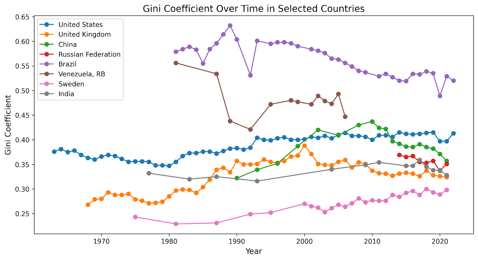
The graph above shows known Gini coefficients over time for several large countries. Data for this graph comes from the World Bank. Gaps in the graph reflect gaps in the data, years when sufficient economic data was not available to the World Bank.
The Gini coefficient can be calculated many different ways, but there are maybe two main methods, both which involve comparing the actual distribution of a resource, such as income, to a perfectly equal distribution.
The continuous equation for the Gini coefficient can be written as:

Where:
The Lorenz curve shows the cumulative proportion of the variable against the cumulative proportion of the population. The Gini coefficient measures how far the Lorenz curve is from the line of perfect equality (which is a 45-degree diagonal line).
Using this formula to calculate the Gini coefficient is a straightforward process. Let’s go through it step-by-step with an example.
Suppose we have a population of five individuals with incomes of $10, $20, $30, $40, and $50.
Start by arranging the incomes in ascending order. Then, calculate the cumulative percentages for both the population and their respective values.
Next, we need to compute the cumulative shares of income for the population. These values will help us plot the Lorenz curve in the next step.
Here’s how the sorted data look for our population at this point.
| Individual Income | Cumulative Income (%) | Cumulative Population (%) |
|---|---|---|
| 10 | 6.7% | 20% |
| 20 | 40% | 30% |
| 40 | 60% | 40% |
| 66.7% | 80% | |
| 100% | 100% |
Next, we need to graph the cumulative income share against the cumulative population share. This is called the Lorenz curve. We’ll add a 45-degree line to represent perfect equality.
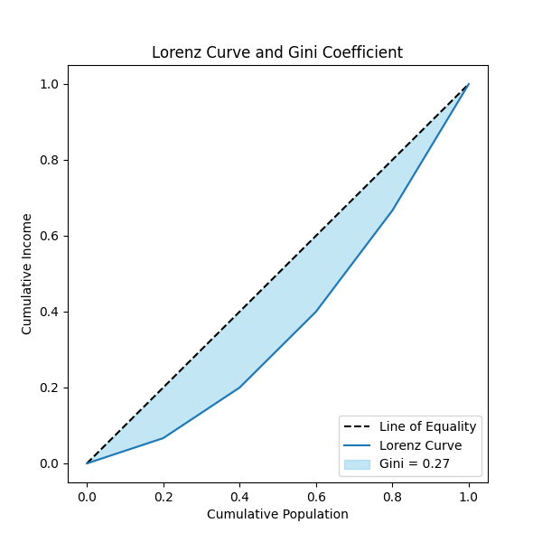
The plot above illustrates the Lorenz curve for a sample dataset. The dotted line represents the line of equality, and the shaded area between the Lorenz curve and the line of equality corresponds to the Gini coefficient. Note the sharp edges on the Lorenz curve. This is due to our small population size in our example. Larger population sizes will result in a smoother Lorenz curve.
Lastly, we use this graph to calculate the Gini coefficient. The Gini coefficient is proportional to the area between the Lorenz curve and the Line of Equality. Typically, this is calculated in few steps.
First, we calculate the area under the Lorenz curve using numerical integration methods, like the trapezoidal rule. Once we have that value, we subtract it from the area under the Line of Equality, which is always 0.5 for normalized data. Finally, we multiply the result by 2 to capture the full measure of inequality.

For our example, the Gini coefficient is 0.27.
When working with small populations or discrete datasets, the pairwise income gap method provides a better way to calculate the Gini coefficient. This approach avoids the interpolation inherent in the method involving the Lorentz curve and directly measures inequality by comparing all pairwise differences in the data.
This is the formula, sometimes called the pairwise income gap method:

Where:
This formula calculates the relative mean difference by comparing all pairs of values in the dataset.
This version directly calculates the Gini coefficient from data without graphing. It looks at all possible pairwise differences between values and compares them to the average value.
Let’s step through this with our example population again: five individuals with incomes of $10, $20, $30, $40, and $50.
Start with the sorted dataset of incomes.
For each pair of values xi and xj, compute the absolute value of the difference between the two xi-xj.
Add up all the absolute differences between all pairs of values. For our example data, the sum of the differences adds up to 400
Lastly, we need to divide the sum of all pairwise differences by 2n2x, where n is the number of data points and x is the mean of the dataset. This step will give us our final Gini coefficient.
Number of data points (n) = 5
Mean of the dataset (x)= 10 + 20 + 30 + 40 + 505=30
Normalize the sum of pairwise differences:

The Gini coefficient for the given example dataset is approximately 0.27.
Try your hand at measuring inequality in carbon emissions or in basketball analytics with these projects.
The Gini coefficient almost always refers to income inequality, unless it’s stated otherwise. Its value ranges from 0 to 1, where 0 represents perfect equality (everyone has exactly the same income) and 1 represents perfect inequality, with one individual holding all the income while others have none. Values between these extremes provide insights into the degree of income disparity within a population.
Note: Some sources multiply this value by 100 to give a range of Gini coefficients between 0-100.
A low Gini coefficient indicates relatively equal income distribution, often associated with countries that implement strong redistributive policies. In contrast, a high Gini coefficient reflects significant income disparities, which can contribute to challenges like social unrest or reduced economic mobility.
However, the way we interpret these values depends on context. In developed nations, a high Gini value may reflect rising inequality due to weakened labor protections, favorable tax policies for the wealthy, or wage gaps in fast-growing industries. A low Gini value, however, may signal strong welfare programs like universal healthcare, affordable education, or progressive taxation that reduce disparities.
In developing nations, a high Gini value may highlight disparities from concentrated land ownership, limited education access, or informal, unregulated labor markets. Conversely, a low Gini value can indicate progress through equitable policies, such as improved education access, poverty alleviation efforts, or agricultural reforms.
The Gini coefficient is used by economists, governments, and sociologists, among others. Its applications include:
Scandinavian Countries have famously low Gini values (<0.30) due to strong social programs and redistributive policies. The United States, China, and Russia all have moderate Gini values (between 0.35 and 0.41) with notable disparities between income and wealth. South Africa is notable for having a high Gini value (~0.63), highlighting significant income inequality driven by historical and structural factors.
You can experiment with economic data in DataCamp’s DataLab. Simply upload the data you’re interested in and start exploring!
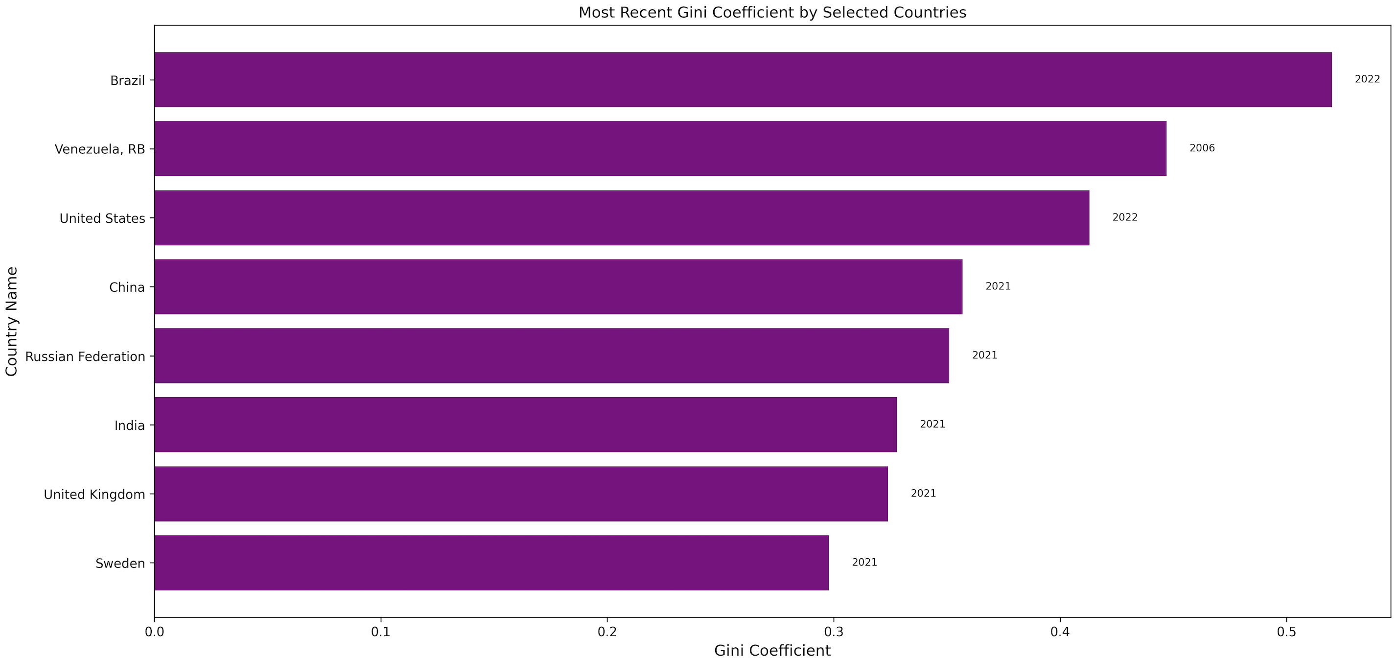
Above is a graph of the most recent estimates for Gini Coefficient according to the World Bank for a few interesting countries. You can experiment with the data yourself at World Bank.
Globalization and technological advancements have shaped Gini trends across the globe. Emerging economies often experience rising inequality as rapid industrialization concentrates wealth in certain sectors. In contrast, developed nations tend to show lower post-tax Gini values, reflecting the impact of redistributive tax policies and robust social welfare systems.
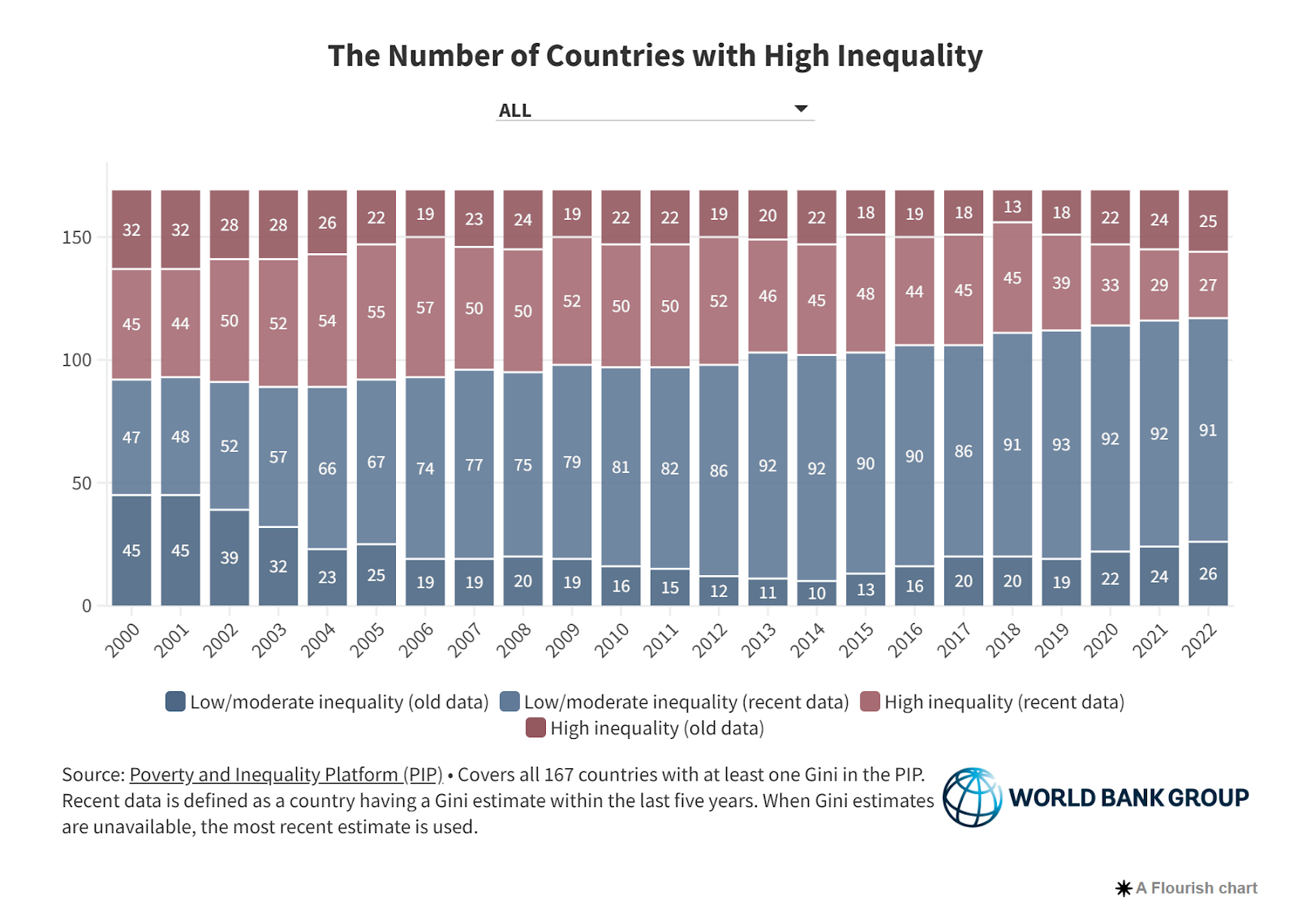
The World Bank tracks the Gini coefficient for countries worldwide. Their graph above shows how the proportion of countries with low and high Gini coefficients have changed over the last two decades. They define high inequality as a having a Gini coefficient higher than 40. Figure source: Inside the World Bank’s new inequality indicator: The number of countries with high inequality.
Policies are a significant determinant of the Gini coefficient of a nation. Countries with robust welfare systems, such as universal healthcare, free or subsidized education, and unemployment benefits, often report lower Gini values. These programs help redistribute resources, reducing the gap between high- and low-income groups. Check out this research article entitled: Welfare type and income inequality: an income source decomposition including in-kind benefits and cash-transfers entitlement.
Taxation policies also play a role. Progressive tax systems, where higher earners pay a larger percentage of their income in taxes, are particularly effective at reducing inequality. Conversely, regressive tax structures or insufficient tax enforcement can exacerbate disparities. You can read about how progressive tax policies reduced inequality in the US in this document from the US Treasury Department: Reducing Income Inequality through Progressive Tax Policy: The Effects of Recent Tax Changes on Inequality.
Policies that promote equitable access to opportunities, such as labor protections, minimum wage laws, and affordable housing initiatives, can lower Gini values over time. Without these interventions, structural inequalities often persist, particularly in regions with weak governance or underdeveloped social programs. Check out this discussion on whether unions help reduce disparities.
The Gini coefficient, while widely used, has several limitations that must be considered when interpreting its results.
One key limitation is its sensitivity to data quality. Inconsistent or incomplete datasets can lead to inaccurate conclusions, especially in regions with informal economies or unrecorded income. This can skew the Gini value and affect policy decisions based on that data. To account for some of these discrepancies, organizations like the World Bank use consumption as a proxy for income when income data is not sufficient. However, even such adjustments have their limitations.
Additionally, the Gini coefficient as it’s often presented focuses solely on income inequality. This means it doesn’t capture other important dimensions of inequality such as access to education, healthcare, or social mobility. This narrow focus may oversimplify the broader picture of societal inequality. You can use the Gini coefficient to measure other forms of inequality, but most of the time that’s not how it’s used.
Dangerously, Gini coefficient can produce identical values from different income distributions, masking important variations in inequality. Two societies with the same Gini value may have vastly different income structures.
import numpy as npdef gini_coefficient(income_distribution): sorted_income = np.sort(income_distribution) n = len(income_distribution) cumulative_income = np.cumsum(sorted_income) relative_cumulative_income = cumulative_income / cumulative_income[-1] lorenz_curve_area = (np.sum(relative_cumulative_income) - 0.5) / n gini_coefficient = 1 - 2 * lorenz_curve_area return round(gini_coefficient, 2)# Population with a middle classincome_distribution1 = np.array([1, 1, 1, 50, 50, 50, 9000, 9000, 90000])# Population without a middle classincome_distribution2 = np.array([1, 1, 1, 1, 1, 1, 1, 1, 140])gini1 = gini_coefficient(income_distribution1)gini2 = gini_coefficient(income_distribution2)print("Gini coefficient for distribution 1:", gini1)print("Gini coefficient for distribution 2:", gini2)Gini coefficient for distribution 1: 0.83Gini coefficient for distribution 2: 0.83In the above example, two populations, one with a middle class and one without, have the same Gini coefficient. This demonstrates one reason why Gini coefficients need to be interpreted in context: they do not show the underlying distribution.
Remember, the Gini coefficient is only one number that distills down a lot of underlying information. So be careful making assumptions based solely on the Gini coefficient.
The Gini coefficient is not the only available measure of inequality. You can check out a list of inequality measures used by the US government at the US census website.
Let’s explore a few other metrics that provide additional insights.
The Theil Index is a powerful tool for breaking inequality into within-group and between-group disparities. This allows for a more detailed analysis of inequality, particularly when comparing different regions, sectors, or demographic groups. It can highlight disparities within a population and show how inequality changes when different groups are considered. This makes it valuable for policy analyses and identifying areas where targeted interventions might be needed.
The Atkinson Index is distinctive for its focus on the lower end of the income distribution. Unlike the Gini coefficient, the Atkinson Index gives more weight to changes in the income of the poorest segments of society. This makes it particularly useful in determining where in the distribution the inequality lies. The Atkinson Index is used in assessing the impact of policies aimed at reducing poverty or improving the well-being of the most disadvantaged groups.
The Lorenz Curve is used as part of the calculation for the Gini coefficient. But it’s also a useful metric on its own.
Developed by Max Lorenz in 1905, the Lorenz Curve provides a visual representation of income distribution. It demonstrates the cumulative share of income held by different percentiles of the population. While the Gini coefficient distills inequality into a single number, the Lorenz Curve offers a more granular view of how income is distributed across a population. I found this discussion about the Lorenz Curve and the Gini coefficient very interesting: Lorenz Curve: Definition and Uses.
Tools like the Gini coefficient are impactful because they offer a simple distillation of a complex distribution. This clarity helps guide policymakers and economists in their efforts to create more equitable societies.
If you’re interested in discovering more statistical tools, check out our wide offering of statistics courses. If learning more about how money makes the world go round is more your style, check out DataCamp’s Python for Finance series or check out their Applied Finance track to explore concepts around credit risk, portfolios, and more. We also offer upskilling for entire teams at once, if you connect with our DataCamp for Business team.
Train your finance team with DataCamp for Business. Comprehensive data and AI training resources and detailed performance insights to support your goals.

Learn with DataCamp
Track
Track
Course
Tutorial
Arunn Thevapalan
Tutorial
Vahab Khademi
Tutorial
Vinod Chugani
Tutorial
Bex Tuychiev
Tutorial
Vinod Chugani
Tutorial
Vinod Chugani