
Course
Generalized Linear Models in R
4 hr
21.7K
When analyzing data that involves counting events - like the number of customer complaints per day, hospital admissions per month, or website clicks per hour - ordinary linear regression often produces misleading results. Count data has unique characteristics that require specialized modeling approaches.
Poisson regression provides a statistical method specifically designed for count data. Unlike linear regression, which can predict negative values, Poisson regression ensures predictions remain non-negative integers. This makes it particularly valuable any field where counting events is central to decision-making.
If you're new to regression analysis, our Introduction to Regression in R course provides essential foundational concepts you'll need for this tutorial. For those ready to explore the broader family of regression techniques, Generalized Linear Models in R offers comprehensive coverage of the statistical framework that includes Poisson regression.
Count data represents the number of times something happens within a fixed period or space. Examples include the number of insurance claims filed per policy per year or the number of traffic accidents at an intersection per month.
Count data has several distinctive properties that make ordinary linear regression inappropriate:
Consider predicting the number of customer complaints based on factors like product complexity and customer satisfaction scores. Linear regression treats this like any continuous outcome, potentially predicting impossible values like -1.5 complaints or 14.7 complaints.
More problematically, linear regression assumes constant variance across all prediction levels. In reality, weeks with higher predicted complaint counts will likely show more variability than weeks with low predicted counts. This pattern, called heteroscedasticity, leads to unreliable confidence intervals and hypothesis tests.
Poisson regression builds on the Poisson probability distribution, which naturally describes count data. The Poisson distribution has a single parameter (lambda) that represents both the mean and variance of the counts. This equal mean-variance property, called equidispersion, is a key assumption we'll need to verify in practice.
The distribution excels at modeling "rare" events - not necessarily infrequent, but events where each individual occurrence is independent and the rate remains relatively constant under similar conditions.
First, let’s talk about the ideal conditions under which Poisson regression performs well. Then, we can talk about the real applications.
Poisson regression works best when your data meets several conditions:
In healthcare and epidemiology, researchers track disease cases across regions or time periods, adjusting for population. For instance, they may study how vaccination rates influence infections per 100,000 people.
In business and marketing, teams examine customer behavior like purchase frequency, support tickets, or engagement. E-commerce companies often model daily orders based on marketing spend, seasonality, and promotions.
Or here is a common example often mentioned with Poisson regression: Manufacturing teams monitor defect rates by batch size or inspection period to catch quality issues early and improve processes.
Poisson regression doesn't model counts directly. Instead, it models the logarithm of the expected count as a linear combination of predictors.

This logarithmic transformation, ensures predictions remain positive. Specifically, the log-link function transforms the expected count to the log scale, ensuring that model predictions for the mean count remain strictly positive. When we reverse the transformation (by exponentiating), we get:

This structure means that changes in predictors have multiplicative effects on the expected count.
In linear regression, increasing a predictor by one unit adds a constant amount to the outcome. In Poisson regression, increasing a predictor by one unit multiplies the expected count by a constant factor.
For example, if the coefficient for "marketing spend" is 0.1, then each additional dollar of marketing spend multiplies the expected number of customers by e^0.1 ≈ 1.105, representing about a 10.5% increase.
Even though it seems more complicated, this characteristic can be intuitive for business applications, where we often think in terms of percentage changes and relative effects.
As with any model, there are some assumptions we need to pay attention to:
Many count datasets involve different exposure levels - varying time periods, population sizes, or observation intensities. For example, comparing accident counts between cities requires accounting for population differences, or comparing monthly sales figures requires noting that some months have different numbers of days.
Exposure variables represent the "denominator" that makes counts comparable. Without proper adjustment, larger cities will trivially have more accidents, and longer months will have higher sales, potentially masking the true relationships you want to study.
Offsets provide a way to incorporate exposure variables with a coefficient fixed at 1. Instead of modeling raw counts, offsets allow you to model rates while maintaining the count structure of your data.
The mathematical form becomes:

Rearranging this equation:

This shows that you're effectively modeling the log-rate, where rate = count/exposure.
The offset ensures that doubling the exposure doubles the expected count (all else equal), which is the natural relationship for rate-based phenomena.
Raw Poisson regression coefficients represent changes in the log-count, which can be difficult to interpret directly. Exponentiating coefficients transforms them into incidence rate ratios (IRRs), which have intuitive interpretations.
An IRR represents the multiplicative change in the expected count for a one-unit increase in the predictor:
IRR confidence intervals provide uncertainty estimates around your rate ratios. An IRR of 1.25 with a 95% confidence interval of [1.10, 1.42] suggests you can be reasonably confident the true effect represents between a 10% and 42% increase in the rate.
If a confidence interval includes 1.0, the effect might not be statistically significant. For example, an IRR of 1.15 with CI [0.95, 1.39] suggests the predictor might have no effect.
When presenting results to non-technical audiences, focus on percentage changes rather than ratios. Instead of saying "the IRR is 1.3," say "this factor is associated with a 30% increase in the event rate."
Provide concrete examples: "Based on our model, increasing marketing spend by $1000 is associated with approximately 15% more customer acquisitions, from an average of 20 to about 23 customers per month."
Now that we have gone through the detail of interpretation, let’s implement in R.
Before fitting any model, examine your count data carefully. Start by loading necessary libraries and exploring the distribution:
library(ggplot2)
library(dplyr)

# Example: Website daily visitor counts
data <- data.frame(
  visitors = c(42, 48, 39, 52, 44, 58, 51, 47, 41, 49, 40, 46, 43, 54, 50),
  day_of_week = factor(c("Mon", "Tue", "Wed", "Thu", "Fri", "Sat", "Sun",
                        "Mon", "Tue", "Wed", "Thu", "Fri", "Sat", "Sun", "Mon")),
  marketing_spend = c(200, 150, 180, 250, 220, 400, 350, 300, 160, 190,
                     140, 210, 380, 420, 170),
  temperature = c(22, 25, 19, 24, 26, 28, 30, 27, 21, 23, 18, 25, 29, 31, 20)
)

# Check mean vs variance (should be similar for Poisson)
mean(data$visitors)
var(data$visitors)
var(data$visitors) / mean(data$visitors) # Should be close to 1

# Visualize the distribution
ggplot(data, aes(x = visitors)) +
  geom_histogram(bins = 8, fill = "lightblue", color = "black") +
  labs(title = "Distribution of Daily Visitors",
       x = "Number of Visitors", y = "Frequency")
> mean(data$visitors)
[1] 46.93333
> var(data$visitors)
[1] 30.35238
> var(data$visitors) / mean(data$visitors)
[1] 0.6467127The variance-to-mean ratio of 0.65 is reasonably close to 1, indicating our data is well-suited for Poisson regression. While not exactly equal, ratios between 0.5 and 1.5 are generally acceptable and suggest the Poisson distribution provides a good foundation for modeling this count data.
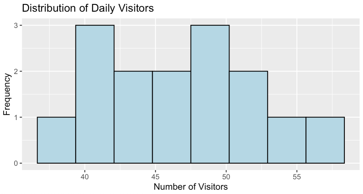
Distribution of daily website visitors. Image by Author.
The histogram shows a roughly symmetric distribution of visitor counts centered around 47 visitors per day, with values ranging from about 39 to 58. This distribution pattern is consistent with count data that can be effectively modeled using Poisson regression.
The glm() function with family = poisson fits Poisson regression models:
# Basic Poisson regression
model <- glm(visitors ~ day_of_week + marketing_spend + temperature,
             family = poisson, data = data)

# View key model results
summary(model)

# Calculate Incidence Rate Ratios (IRRs)
exp(coefficients(model))
Here is the coefficients table:
Coefficients:
                 Estimate Std. Error z value Pr(>|z|)
(Intercept)     3.2978122  0.5556601   5.935 2.94e-09 ***
day_of_weekMon  0.0724036  0.1635467   0.443    0.658
day_of_weekSat  0.0316265  0.2872878   0.110    0.912
day_of_weekSun  0.0339621  0.2502578   0.136    0.892
day_of_weekThu  0.1068756  0.1870821   0.571    0.568
day_of_weekTue  0.0442967  0.1633032   0.271    0.786
day_of_weekWed  0.0653789  0.1813230   0.361    0.718
marketing_spend 0.0001593  0.0018211   0.087    0.930
temperature     0.0186099  0.0317682   0.586    0.558
Here are the incidence rate ratios (IRRs):
(Intercept)  day_of_weekMon  day_of_weekSat  day_of_weekSun  day_of_weekThu  day_of_weekTue  day_of_weekWed marketing_spend
27.053386        1.075089        1.032132        1.034545        1.112796        1.045292        1.067563        1.000159
temperature
1.018784
The coefficients show the log-scale effects, but the IRRs provide more intuitive interpretations. For example, Thursday (day_of_weekThu) has an IRR of 1.11, suggesting about 11% more visitors compared to Friday (the reference category). Marketing spend has an IRR of 1.0002, indicating each additional dollar increases expected visitors by about 0.02%.
Notice that if we calculated confidence intervals for these IRRs, many would include 1.0, suggesting the effects aren't statistically significant with this small sample. This is common with small datasets and demonstrates why sample size matters.
If your data has varying exposure periods, include them as offsets:
# Example with exposure data
data$exposure_days <- c(rep(7, 10), rep(6, 5))  # Some weeks had 6 observation days

# Model with offset
model_offset <- glm(visitors ~ day_of_week + marketing_spend + temperature +
                   offset(log(exposure_days)),
                   family = poisson, data = data)

summary(model_offset)
Call:
glm(formula = visitors ~ day_of_week + marketing_spend + temperature +
offset(log(exposure_days)), family = poisson, data = data)
Coefficients:
Estimate Std. Error z value Pr(>|z|)
(Intercept) 1.734e+00 5.579e-01 3.109 0.00188 **
day_of_weekMon 2.371e-02 1.637e-01 0.145 0.88485
day_of_weekSat 9.873e-02 2.898e-01 0.341 0.73338
day_of_weekSun 1.208e-01 2.472e-01 0.489 0.62513
day_of_weekThu 5.642e-02 1.871e-01 0.302 0.76297
day_of_weekTue -6.713e-02 1.634e-01 -0.411 0.68128
day_of_weekWed -6.073e-02 1.825e-01 -0.333 0.73934
marketing_spend -4.231e-05 1.823e-03 -0.023 0.98149
temperature 8.210e-03 3.179e-02 0.258 0.79623Notice how the coefficients change dramatically when we include the offset. The intercept drops from 3.30 to 1.73, and all other effects become smaller. This transformation occurs because we're now modeling the rate per day rather than total counts over varying periods.
The offset ensures fair comparisons by adjusting for different exposure lengths. Without this adjustment, periods with more observation days would artificially appear to have higher visitor counts, potentially masking the true relationships we want to study. The model now answers "What's the daily visitor rate?" rather than "How many total visitors occurred?"
Generate predictions for new scenarios:
# Create new data for prediction
new_data <- data.frame(
  day_of_week = factor("Fri", levels = levels(data$day_of_week)),
  marketing_spend = 300,
  temperature = 25
)

# Predict expected counts
predicted_counts <- predict(model, newdata = new_data, type = "response")
print(paste("Expected visitors:", round(predicted_counts, 1)))
[1] "Expected visitors: 45.2"The model predicts 45.2 visitors for a Friday with $300 marketing spend and 25°C temperature. This prediction falls within the reasonable range of our observed data (39-58 visitors) and is close to our overall mean of 46.9 visitors.
Poisson regression naturally ensures predictions remain positive integers when rounded, unlike linear regression which could produce impossible negative values. The type = "response" parameter returns predictions on the original count scale rather than the log scale used internally by the model.
Overdispersion occurs when the variance exceeds the mean, violating a key Poisson assumption:
# Calculate dispersion statistic
residual_deviance <- model$deviance
df_residual <- model$df.residual
dispersion <- residual_deviance / df_residual

print(paste("Dispersion statistic:", round(dispersion, 3)))

if (dispersion > 1.5) {
  print("Possible overdispersion detected")
  print("Consider quasi-Poisson or negative binomial models")
}
[1] "Dispersion statistic: 0.849"The dispersion statistic of 0.849 is close to 1, indicating our model fits the data well without significant overdispersion. Values close to 1 suggest the Poisson assumption of equal mean and variance is reasonable for this dataset.
Since the statistic is below 1.5, no warning message appears, confirming that standard Poisson regression is appropriate. If this value were much larger than 1 (typically above 1.5), we would need to consider quasi-Poisson or negative binomial models to account for the extra variability.
Examine residuals to detect patterns or model violations:
# Calculate Pearson residuals
fitted_values <- fitted(model)
pearson_residuals <- residuals(model, type = "pearson")

# Plot residuals vs fitted values
plot(fitted_values, pearson_residuals,
     xlab = "Fitted Values", ylab = "Pearson Residuals",
     main = "Residuals vs Fitted")
abline(h = 0, col = "red", lty = 2)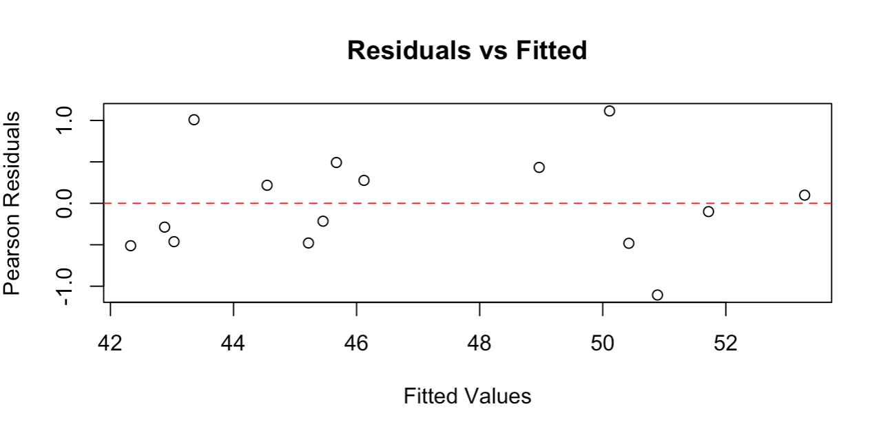
Residual plot showing random scatter around zero. Image by Author.
The residual plot shows points randomly scattered around the zero line with no clear patterns, indicating our model fits the data well. The residuals range roughly from -1 to +1, which is reasonable for this sample size.
Good residual plots should show: random scatter around zero (no curved patterns), roughly constant spread across fitted values (no funnel shapes), and no extreme outliers. This plot meets all these criteria, confirming that Poisson regression assumptions are satisfied and our model provides reliable results.
If overdispersion is detected, consider quasi-Poisson models that adjust standard errors:
# Fit quasi-Poisson model
quasi_model <- glm(visitors ~ day_of_week + marketing_spend + temperature,
                   family = quasipoisson, data = data)
Since our model shows good dispersion (0.849), quasi-Poisson adjustments aren't needed here. However, this approach provides more conservative confidence intervals and p-values when variance exceeds the mean, making it a valuable tool for real-world count data that often exhibits overdispersion.
Transform model output into business-relevant insights by focusing on the practical meaning of your IRRs. When your model shows that weekend days have an IRR of 1.4 compared to weekdays, communicate this as "weekends see about 40% more visitors than weekdays." When marketing spend has an IRR of 1.002, explain that "each additional dollar in marketing is associated with about a 0.2% increase in visitors."
For continuous variables, consider presenting effects at meaningful intervals. Instead of discussing the effect of a single degree temperature change, show the impact of a 10-degree difference, which might be more relevant for business planning.
Poisson regression identifies associations, not causal relationships. A strong association between marketing spend and visitor counts doesn't prove that marketing causes the increase. Other factors might influence both variables. Acknowledge this limitation when presenting results.
The model assumes the rate remains constant for given predictor values. If your business has seasonal trends not captured by your variables, or if the relationship between predictors and outcomes changes over time, your model might not generalize well to future periods.
Count data often contains zeros, which are perfectly valid in Poisson regression. However, if your data has many more zeros than a Poisson distribution would predict, this might indicate a different data-generating process. Some observations might represent periods or conditions where the event simply cannot occur, rather than periods where it could occur but didn't.
For example, website visitor counts might include zeros for days when the site was down for maintenance. These "structural zeros" are different from "random zeros" that occur naturally in Poisson processes.
Start with your most important predictors based on domain knowledge. Add variables one at a time and assess whether they improve your understanding of the data. More complex models aren't always better.
Pay attention to the practical significance of effects, not just statistical significance. A statistically significant 1% change in event rates might not justify business action, while a 20% change that's marginally non-significant might still warrant investigation with more data.
When equidispersion fails (variance much larger than mean), quasi-Poisson regression provides a simple solution. It keeps the same model structure but adjusts standard errors to account for the extra variability. This produces more conservative confidence intervals and p-values.
For severe overdispersion, negative binomial regression explicitly models the extra variation. This approach estimates both the mean relationship and the additional variability.
Don't ignore overdispersion - it's one of the most common violations of Poisson assumptions and can severely affect your conclusions. Always check the variance-to-mean ratio and consider alternatives when necessary.
Be cautious about extrapolating beyond your data range. If your marketing spend data ranges from $100 to $1000, don't confidently predict effects for $5000 spend levels. The relationship might not remain log-linear at extreme values.
Avoid treating all categorical predictors as having equal spacing between levels. Education categories (high school, some college, college graduate) might not have equal effects on your outcome variable.
Document your modeling decisions, especially assumption violations and how you addressed them. If you discovered overdispersion but chose quasi-Poisson adjustments, note this decision and its implications for interpretation.
Poisson regression provides an effective framework for analyzing count data across many domains. As you apply these techniques to your own data, start with simple models and build complexity gradually based on both statistical evidence and domain expertise. When assumptions are violated, extensions like quasi-Poisson or negative binomial models offer good alternatives. The goal is not just statistical significance, but practical insights that inform better decisions.
If you are looking to deepen your regression expertise, our Intermediate Regression in R course covers advanced diagnostic techniques and modeling strategies that complement the Poisson regression skills you've learned here. Generalized Linear Models in R is another great option.
Learn with DataCamp
Course
Course
Course
Tutorial
Vinod Chugani
Tutorial
Eladio Montero Porras
Tutorial
Daniel Schütte
Tutorial
Vidhi Chugh
Tutorial
Josef Waples
Tutorial
Josef Waples