Course
October is historically the most volatile month for stocks, but is this a persistent signal or just noise in the data?
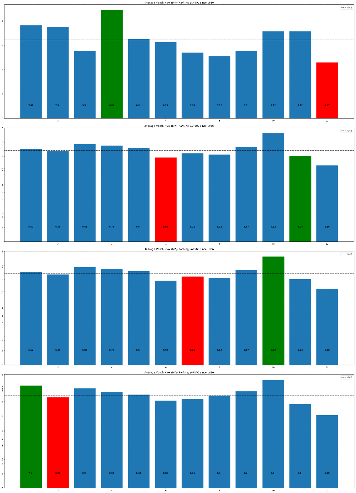
"Over the past 32 years, October has been the most volatile month on average for the S&P500 and December the least volatile".
In this tutorial, we will use Python to walk through a full analysis and testing of this phenomena to ascertain if it's statistically significant or not.
We will use pandas time series functionality, such as Resample, to wrangle raw stock price data into a format that brings the data to life.
We will then discover how to conduct hypothesis testing using simulation in Python instead of cumbersome formulas.
Finally, we will discuss a major problem in statistical analysis, Multiple Comparison Bias, learn how to deal with it and show visually through matplotlib, the effect of 'p-Hacking'.
Our goal:
- Demonstrate how to use Pandas to analyze Time Series
- Understand how to construct a hypothesis test
- Use simulation with Python to perform hypothesis testing
- Show the importance of accounting for multiple comparison bias
Our data:
We will be using Daily S&P500 data for this analysis, in particular, we will use the raw daily closing prices from 1986 to 2018 (which is surprisingly hard to find, so I’ve made it publicly available).
The inspiration for this post came from Winton, which we will be reproducing here, albeit with 32 years of data vs. their 87 years.
Wrangle with Pandas
To answer the question of whether the extreme volatility seen in certain months really is significant and therefore likely to continue, we need to transform our 32yrs of price data into a format that shows the phenomena we are investigating.
Our format of choice will be the average monthly volatility rankings (AMVR).
The following code shows how we get our raw price data into this format. Let's get started!
First the standard imports. (matplotlib.patches give us control over styling individual bars within a histogram)
#standard imports
import numpy as np
import pandas as pd
import matplotlib.pyplot as plt
import matplotlib.patches as mpatches
%matplotlib inline
A nice trick to make charts display full width in Jupyter notebooks:
#resize charts to fit screen if using Jupyter Notebook
plt.rcParams['figure.figsize']=[15,5]
This one is optional - give it a try and see what happens!
#plt.xkcd()
Import our data using the read_csv method which takes a path, in our case a url to the data. We also tell it to use 'date' as the index and to automatically parse the dates from the given text, as best it can.
#Daily S&P500 data from 1986==>
url = "https://raw.githubusercontent.com/Patrick-David/Stocks_Significance_PHacking/master/spx.csv"
df = pd.read_csv(url,index_col='date', parse_dates=True)

#view raw S&P500 data
df.head()
| close | |
|---|---|
| date | |
| 1986-01-02 | 209.59 |
| 1986-01-03 | 210.88 |
| 1986-01-06 | 210.65 |
| 1986-01-07 | 213.80 |
| 1986-01-08 | 207.97 |
This gives us the raw unadjusted closing prices of the S&P500 (SPX). Now we need to convert our raw prices into daily % returns. To do this, we have two options:
- We could take the natural log of the prices. This will give an approximation to the true daily returns.
- We can use the pandas method 'pct_change()' to calculate the daily percentage change directly.
For our purpose, we will use method 2, as pandas can handle the computation instantly on a dataset of this size (over 8000 values). We will also clean up the data by dropping the first value which becomes a 'NaN' as there is no price change from the day before. pct_change() takes an optional parameter 'periods' that changes the period shift. We'll leave it at the default one.
#To model returns we will use daily % change
daily_ret = df['close'].pct_change()
#drop the 1st value - nan
daily_ret.dropna(inplace=True)
#daily %change
daily_ret.head()
date
1986-01-03    0.006155
1986-01-06   -0.001091
1986-01-07    0.014954
1986-01-08   -0.027268
1986-01-09   -0.008944
Name: close, dtype: float64
The next step is to take these daily % change values and transform them into 'monthly annualized volatility'. The 1st line of code below shows that we can perform this transformation in just one line of code. This is the power of Pandas! But let's unpack each step sequentially.
1. To get mnthly_annu, we first use the 'resample' method on our daily returns. Resample allows us to change the frequency of the data periods. It takes a 'frequency offset string' or in simple terms, a letter that corresponds to the desired new frequency. They include:
- B business day frequency
- C custom business day frequency
- D calendar day frequency
- W weekly frequency
- M month end frequency
As we want to resample from daily returns to monthly, we pass 'M' as our parameter.
2. The second thing we need to do is decide how we want to arrive at this new monthly figure, for example, we could sum the daily values together, multiply them, etc. For our analysis, we want some measure of volatility and standard deviation works well, so we will append std() to our resampled data to get monthly volatility.
3. The final step is to annualize this figure. We do this simply by multiplying by the square root of 12, with 12 being the number of periods (months) in a year. This gives us our annualized monthly volatility values that we require.
Best practice in data analysis is to visualize the data as we proceed through the analysis. So let's take a look at our annualized volatility data.
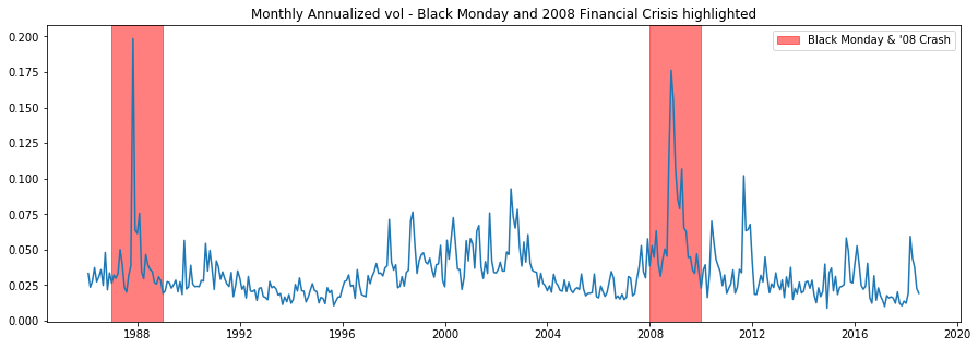
The plot below shows major market events clearly, such as Black Monday and the 2008 Financial Crisis. The matplotlib method 'axvspan' allows us to add vertical lines (axhspan is the corresponding method for horizontal lines), it takes 'xmin' and 'xmax' as parameters, which specify the width of the rectangle created, as our x-axis is the datetime index, we can simply pass in the years we want to highlight. The alpha parameter adjusts the transparency of the block color so we can still see the graph beneath.
The mpatches attribute allows us to create a custom legend box. We do this by first defining the 'labs' variable with color, alpha, and the desired text, we then pass this to the 'handles' parameter within plt.legend to render the legend.
#use pandas to resample returns per month and take Standard Dev as measure of Volatility
#then annualize by multiplying by sqrt of number of periods (12)
mnthly_annu = daily_ret.resample('M').std()* np.sqrt(12)

print(mnthly_annu.head())
#we can see major market events show up in the volatility
plt.plot(mnthly_annu)
plt.axvspan('1987','1989',color='r',alpha=.5)
plt.axvspan('2008','2010',color='r',alpha=.5)
plt.title('Monthly Annualized vol - Black Monday and 2008 Financial Crisis highlighted')
labs = mpatches.Patch(color='red',alpha=.5, label="Black Monday & '08 Crash")
plt.legend(handles=[labs])
date
1986-01-31    0.033317
1986-02-28    0.023585
1986-03-31    0.027961
1986-04-30    0.037426
1986-05-31    0.027412
Freq: M, Name: close, dtype: float64

<matplotlib.legend.Legend at 0x280b1ee6908>
So we've seen one of the powerful methods in pandas, resample. Now, let's use another, 'groupby'. We need to get from our monthly annualized volatility values to our desired AMVR metric. Again, we can achieve this in just a few lines of code.
1. First, we apply the 'groupby' method to our mnthly_annu values. Groupby requires a parameter that specifies how to group the data. This could be a function or as in our case, a Series. We pass in 'mnthly_annu.index.year', this is simply the year attribute on the datatime index of the mnthly_annu data. This will group our monthly volatility values for each of the 32 years in our data set.
2. Next, we apply the 'rank' method, which orders the data in ascending order.
3. Finally, we do the same thing again and average over all years for each month. This gives us our final AMVR values!
#for each year rank each month based on volatility lowest=1 Highest=12
ranked = mnthly_annu.groupby(mnthly_annu.index.year).rank()

#average the ranks over all years for each month
final = ranked.groupby(ranked.index.month).mean()

final.describe()
count    12.000000
mean      6.450521
std       0.627458
min       5.218750
25%       6.031013
50%       6.491004
75%       6.704545
max       7.531250
Name: close, dtype: float64
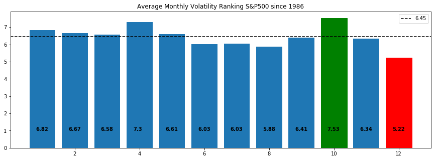
This gives our final Average Monthly Volatility Rankings. Numerically we can see that month 10 (October) is the highest and 12 (December) is the lowest.
#the final average results over 32 years
final
date
1     6.818182
2     6.666667
3     6.575758
4     7.303030
5     6.606061
6     6.030303
7     6.031250
8     5.875000
9     6.406250
10    7.531250
11    6.343750
12    5.218750
Name: close, dtype: float64
Choosing the right visualization for our data is important because we want to tell the story of the data through the most impactful charts and plots. For our analysis, we want to clearly show the highest volatility and the lowest. For this, we will use matplotlib's bar chart and annotate and color accordingly to give the most impact.
1. By indexing b_plot (b_plot[9]) with the desired bar, we can set the color to highlight the highest and lowest values.
2. To add the AMVR values to their respective bar, we enumerate through each AMVR value ('final' variable) and round the result to 2 decimal places. 'i' and 'v' represent the 'index' and 'value' for the 'final' variable, so 'i' will range from 1-12, and 'value' gives the AMVR value rounded to 2 decimal places. We use these variables within plt.text(). The 1st parameter of plt.txt() is the x-axis location for the label, so we pass 'i' for each bar and offset by 0.8 to center it. The 2nd parameter is the string version of the 'final' value.
3. To show the mean value, we use axhline and use the 'label' value to add a legend in the top right corner. Simply pass in the y-axis value, which is the mean, then add styling.
This gives the best visual yet of the phenomena we are investigating. We can clearly see that October has been the most volatile month and December the least. Importantly, we can also see that December is the more 'extreme' value, in absolute terms. This will be important for our analysis in the next section.
#plot results for ranked s&p 500 volatility
#clearly October has the highest AMVR
#and December has the lowest
#mean of 6.45 is plotted

b_plot = plt.bar(x=final.index,height=final)
b_plot[9].set_color('g')
b_plot[11].set_color('r')
for i,v in enumerate(round(final,2)):
    plt.text(i+.8,1,str(v), color='black', fontweight='bold')
plt.axhline(final.mean(),ls='--',color='k',label=round(final.mean(),2))
plt.title('Average Monthly Volatility Ranking S&P500 since 1986')

plt.legend()
plt.show()
So that’s our data, now onto Hypothesis testing…
Hypothesis Testing: What’s the Question?
Hypothesis testing is one of the most fundamental techniques of data science, yet it is one of the most intimidating and misunderstood. The basis for this fear is the way it is taught in Stats 101, where we are told to:
"perform a t-test, is it a one-sided or two-sided test? Choose a suitable test-statistic such as Welch’s t-test, calculate degrees of freedom, calculate the t score, look up the critical value in a table, compare the critical value to t statistic ……"
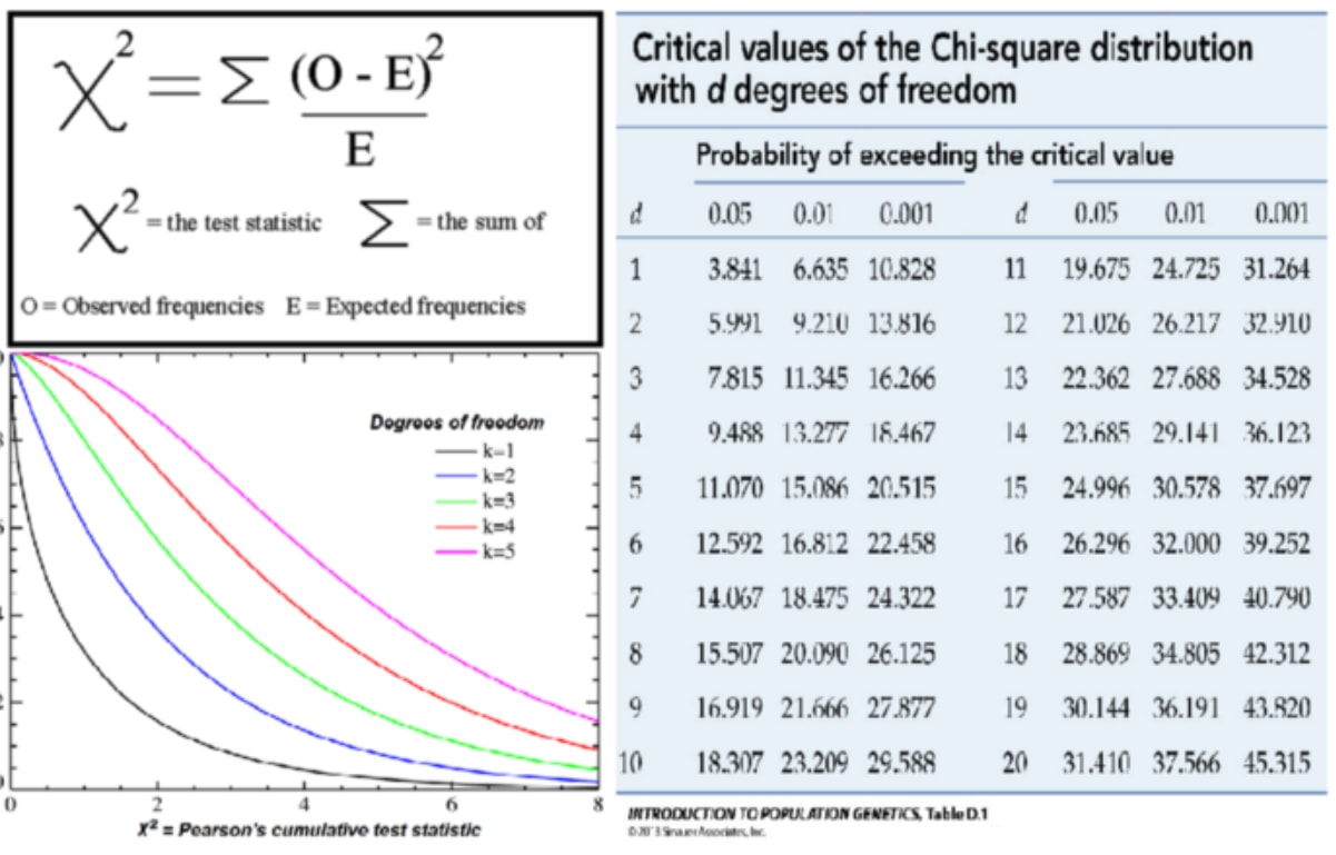
Understandably, this leads to confusion over what test to conduct and how to conduct it. However, all of these classical statistical techniques for performing a hypothesis test were developed at a time when we had very little computing power and were simply closed-form analytical solutions for calculating a p-value, that's it! But with the added complication of needing to pick the right formula for the given situation, due to their restrictive and sometimes opaque assumptions.
But rejoice!
There is a better way. Simulation.
To understand how simulation can help us, let's remind ourselves what a hypothesis test is:
We wish to test “whether the observed effect in our data is real or whether it could happen simply by chance” and to perform this test we do the following:
- Choose an appropriate ‘test statistic’: this is simply a number that measures the observed effect. In our case, we will choose the absolute deviation in AMVR from the mean.
- Construct a Null Hypothesis: this is merely a version of the data where the observed effect is not present. In our case, we will shuffle the labels of the data repeatedly (permutation). The justification for this is detailed below.
- Compute a p-value: this is the probability of seeing the observed effect amongst the null data, in other words, by chance. We do this through repeated simulation of the null data. In our case, we shuffle the ‘date’ labels of the data many times and simply count the occurrence of our test statistic as it appears through multiple simulations.
That’s hypothesis testing in 3 steps! No matter what phenomena we are testing, the question is always the same: “is the observed effect real, or is it due to chance”
There is only one test! This great blog by Allen Downey has more details on hypothesis testing
The real power of simulation is that we have to make explicit what our model assumptions are through code. Whereas classical techniques can be a ‘black-box’ when it comes to there assumptions.
Example below: The left plot shows the true data and the observed effect with a certain probability (green). The right plot is our simulated null data with a recording of when the observed effect was seen by chance (red). This is the basis of hypothesis testing, what is the probability of seeing the observed effect on our null data.

The most critical part of hypothesis testing is being clear what question we are trying to answer. In our case we are asking:
“Could the most extreme value happen by chance?”
The most extreme value we define as the greatest absolute AMVR deviation from the mean. This question forms our null hypothesis.
In our data, the most extreme value is the December value (1.23) not the October value (1.08), because we are looking at the most significant absolute deviation from the mean, not simply the highest volatility.
1. To get the absolute deviation, we merely take each value from the mean and apply the abs() function.
2. By using the sort_values() method, we can order the results smallest to largest. Then select out the 2 biggest values, Oct & Dec.
#take abs value move from the mean
#we see Dec and Oct are the biggest abs moves

fin = abs(final - final.mean())
print(fin.sort_values())
Oct_value = fin[10]
Dec_value = fin[12]
print('Extreme Dec value:', Dec_value)
print('Extreme Oct value:', Oct_value)
date
9     0.044271
11    0.106771
3     0.125237
5     0.155540
2     0.216146
1     0.367661
7     0.419271
6     0.420218
8     0.575521
4     0.852509
10    1.080729
12    1.231771
Name: close, dtype: float64
Extreme Dec value: 1.231770833333333
Extreme Oct value: 1.080729166666667
Simulation
Now we know what question we are asking, we need to construct our ‘Null Model’.
There are a number of options here:
- Parametric models. If we had a good idea of the data distribution or simply made assumption on it, we could use ‘classical’ hypothesis testing techniques, t-test, X², one-way ANOVA, etc. These models can be restrictive and something of a blackbox if the researcher doesn't fully understand their assumptions.
- Direct Simulation. We could make assumptions about the data generating process and simulate directly. For example, we could specify an ARMA time series model for the financial data we are modeling and deliberately engineer it to have no seasonality. This could be a reasonable choice for our problem. However, if we knew the data generating process for the S&P500, we would be rich already!
- Simulation through Resampling. This is the approach we will take. By repeatedly sampling at random from the existing dataset and shuffling the labels, we can make the observed effect equally likely amongst all labels in our data (in our case the labels are the dates), thus giving the desired null dataset.
Sampling is a big topic, but we will focus on one particular technique, permutation or shuffling.
To get the desired null model, we need to construct a dataset that has no seasonality present. If the null is true, that there is no seasonality in the data and the observed effect was simply by chance, then the labels for each month (Jan, Feb, etc) are meaningless and therefore we can shuffle the data repeatedly to build up what classical statistics would call the ‘sampling distribution of the test statistic under the null hypothesis’. This has the desired effect of making the observed phenomena (the extreme December value) equally likely for all months, which is exactly what our null model requires.
To prove how powerful simulation techniques are with modern computing power, the code in this example will actually permute the daily price data, which requires lots more processing power, yet still completes in seconds on a modern CPU.
Note: shuffling either the daily or the monthly labels will give us the desired null dataset in our case.
Shuffle 'date' label to create null dataset

A great resource for learning about sampling is by Julian Simon.
Note: The way our test is constructed is the equivalent of a two-sided test using ‘classical’ methods, such as Welch’s t-test or ANOVA, etc, because we are interested in the most extreme value, either above or below the mean.
These decisions are design choices, and we have this freedom because the Null Model is just that, it’s a Model! This means we can specify its parameters as we choose, the key is to really be clear what question we are trying to answer.
So we want to use Python to simulate lots of data to create a null dataset. To achieve this, we will simulate 1000 sets of 12 AMVR, permuting the 'date' labels each time to build up the sampling distribution. The output from this code is included below in the p-hacking section.
1. 1st we define a few containers to store our results: we will use a pd.Dataframe() and a simple array [ ].
2. Next, we define a counter and set it to zero, then begin a for-loop of 1000 iterations to create the simulated data.
3. The 1st line within the for-loop takes the original daily returns (from the beginning of the tutorial) and uses the pandas sample() method. This randomly samples from the daily returns data a given number of times. In our case, we have 8191 data points (252 trading days over 32 years). We also drop the index using reset_index(), so we can add a new index. We need to do this as the original date index gets shuffled along with the data, whereas we want to 'shuffle' just the data.
4. The next line adds the new date index by reassigning the daily_ret_shuffle index with a pd.bdate_range of equal length to the original data. We use bdate_range instead of date_range, as we want business days (5, Mon - Fri) rather than 7 days per week.
5. Now that we have generated our 'shuffled' data, we perform the same data wrangling that we did at the beginning to construct our AMVR values. That's what the next 3 lines of code do.
6. Now we have our simulated AMVR values we need to append them to our dataframe that will store all 1000 runs of the simulation. pd.concat takes our current dataframe and appends each subsequent dataframe to the end. We choose axis 1, so we get columns of data.
7. Maximonth is a variable that stores just the highest value from each simulation (we will use this later in our analysis).
8. As our analysis requires absolute AMVR values, the next 3 lines of code take all the 1000 AMVR runs and flattens into one big array. We then take the mean and subtract the individual values from this mean and finally take the absolute value.
9. We also do the same for the 'highest only' data. Note: here we used a list rather than a dataframe which means we can use a list comprehension to calculate the abs(AMVR) for each of our highest values.
We now have all the data we need to complete our analysis, both original observations and our new simulated data set.
#as our Null is that no seasonality exists or alternatively that the month does not matter in terms of AMVR,
#we can shuffle 'date' labels
#for simplicity, we will shuffle the 'daily' return data, which has the same effect as shuffling 'month' labels

#generate null data

new_df_sim = pd.DataFrame()
highest_only = []

count=0
n=1000
for i in range(n):
    #sample same size as dataset, drop timestamp
    daily_ret_shuffle = daily_ret.sample(8191).reset_index(drop=True)
    #add new timestamp to shuffled data
    daily_ret_shuffle.index = (pd.bdate_range(start='1986-1-3',periods=8191))

    #then follow same data wrangling as before...
    mnthly_annu = daily_ret_shuffle.resample('M').std()* np.sqrt(12)

    ranked = mnthly_annu.groupby(mnthly_annu.index.year).rank()
    sim_final = ranked.groupby(ranked.index.month).mean()
    #add each of 1000 sims into df
    new_df_sim = pd.concat([new_df_sim,sim_final],axis=1)

    #also record just highest AMVR for each year (we will use this later for p-hacking explanation)
    maxi_month = max(sim_final)
    highest_only.append(maxi_month)

#calculate absolute deviation in AMVR from the mean
all_months = new_df_sim.values.flatten()
mu_all_months = all_months.mean()
abs_all_months = abs(all_months-mu_all_months)

#calculate absolute deviation in highest only AMVR from the mean
mu_highest = np.mean(highest_only)
abs_highest = [abs(x - mu_all_months) for x in highest_only]
p-Hacking
Here’s the interesting bit. We’ve constructed a hypothesis to test, we’ve generated simulated data by shuffling the ‘date’ labels of the data, now we need to perform our hypothesis test to find the probability of observing a result as significant as the December result given that the null hypothesis (no seasonality) is true.
Before we perform the test lets set our expectations.
What's the probability of seeing at least one significant result given a 5% significance level?
= 1-p(not significant)
= 1-(1–0.05)¹²
= 0.46
so there’s a 46% chance of seeing at least one month with a significant result, given our null is true.
Now let's ask, for each individual test (comparing each of the 12 months absolute AMVR to the mean) how many significant values should we expect to see amongst our random, non-seasonal data?
12 x 0.05 = 0.6
So with a 0.05 significance level, we should expect a false positive rate of 0.6. In other words, for each test (with the null data) comparing all 12 months AMVR to the mean, 0.6 months will have show a significant result. (obviously, we can't have less than 1 month showing a result, but under repeat testing the math should tend towards this number).
All the way through this work, we have stressed the importance of being really clear with the question we are trying to answer. The problem with the expectations we’ve just calculated is we have assumed we are testing for a significant result against all 12 months! That’s why the probability of seeing at least one false positive is so high at 46%.
This is an example of multiple comparison bias where we have expanded our search space and increased the likelihood of finding a significant result. This is a problem because we could abuse this phenomenon to cherry pick the parameters of our model which give us the ‘desired’ p-value.
This is the essence of p-Hacking
To illustrate the effect of p-hacking and how to reduce multiplicity, we need to understand the subtle but significant difference between the following 2 questions:
- “What's the probability that December would appear this extreme by chance?”
- “What's the probability any month would appear this extreme by chance?"
The beauty of simulation lies in its simplicity. The following code is all we need to compute the p-value to answer the 1st question. We simply count how many values in our dataset using all 12000 AMVR deviations (12 months x 1000 trials) are greater than the observed December value. We get a p-value of 4.4%, close to our somewhat arbitrary 5% cut off, but significant none the less.
#count number of months in sim data where ave-vol-rank is >= Dec
#Note: we are using Dec not Oct, as Dec has highest absolute deviation from the mean
count=0
for i in abs_all_months:
    if i> Dec_value:
        count+=1
ans = count/len(abs_all_months)
print('p-value:', ans )
p-value: 0.04425
To answer the 2nd question and to avoid multiplicity, instead of comparing our result to the distribution made with all 12000 AMVR deviations, we only consider the highest value from each of the absolute AMVR 1000 trials. This gives a p-value of 23%, very much not significant!
#same again but just considering highest AMVR for each of 100 trials
count=0
for i in abs_highest:
    if i> Dec_value:
        count+=1
ans = count/len(abs_highest)
print('p-value:', ans )
p-value: 0.236
Now that we have our final results, let's plot these distributions to show the effect of p-Hacking and the results of our analysis visually:
1. 1st we use np.quantile() to find our 5% significance level, we'll plot this using axvline on the lower plots.
2. Next we define our 4 box subplots. Here plt.subplots returns 'fig' = our figure and 'ax1,ax2,ax3,ax4' = variables representing each of the 4 subplots.
3. #plot 1 shows the 1st column. Here we simply define a histogram of our data 'abs_all_months' and choose type='bar'. For the lower plots we set cumulative='True', this gives us a cdf rather than a pdf. Bins defines how many bars we have for each of the values to fill, 30 is a reasonable number for our data. We then format the plots using techniques we have already learnt, such as axvline to plot the significance and observation values.
abs_all_months_95 = np.quantile(abs_all_months,.95)
abs_highest_95 = np.quantile(abs_highest,.95)

fig, ((ax1,ax2),(ax3,ax4)) = plt.subplots(2,2,sharex='col',figsize=(20,20))

#plot 1
ax1.hist(abs_all_months,histtype='bar',color='#42a5f5')
ax1.set_title('AMVR all months',fontsize=30)
ax1.set_ylabel('Frequency',fontsize=20)
ax3.hist(abs_all_months,density=1,histtype='bar',cumulative=True,bins=30,color='#42a5f5')
ax3.set_ylabel('Cumulative probability',fontsize=20)
ax1.axvline(Dec_value,color='b',label='Dec Result',lw=10)
ax3.axvline(Dec_value,color='b',lw=10)
ax3.axvline(abs_all_months_95,color='r',ls='--',label='5% Sig level',lw=10)

#plot2
ax2.hist(abs_highest,histtype='bar',color='g')
ax2.set_title('AMVR highest only',fontsize=30)
ax2.axvline(Dec_value,color='b',lw=10)
ax4.hist(abs_highest,density=1,histtype='bar',cumulative=True,bins=30,color='g')
ax4.axvline(Dec_value,color='b',lw=10)
ax4.axvline(abs_highest_95,color='r',ls='--',lw=10)

ax1.legend(fontsize=15)
ax3.legend(fontsize=15)
<matplotlib.legend.Legend at 0x280b4eb0b00>
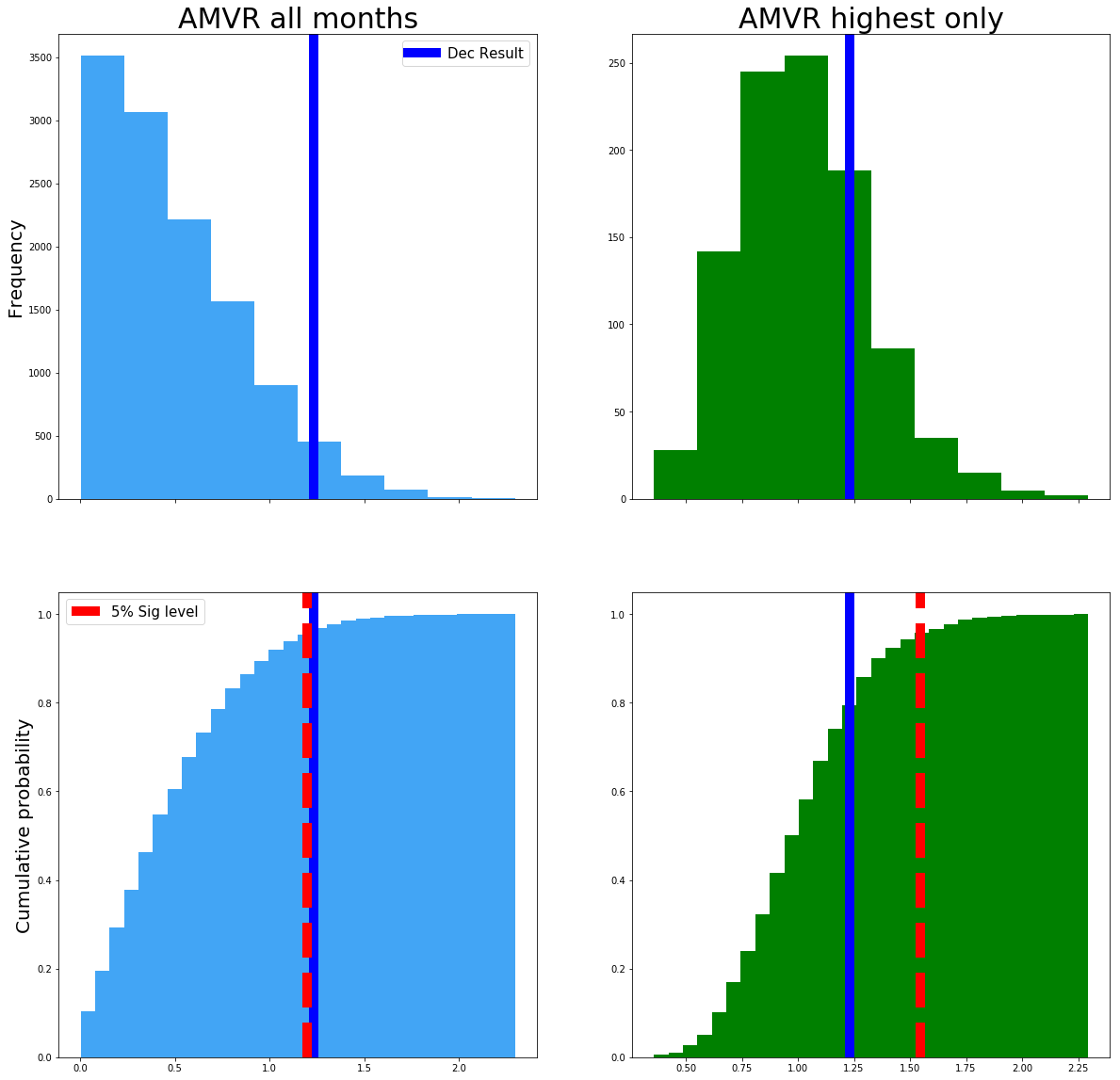
The left column is the data that answers question 1 and the right column, question 2. The top row is the probability distributions, and the bottom row is the CDF. The red dashed line is the 5% significance level that we arbitrarily decided upon. The blue line is the original extreme December AMVR value of 1.23.
The left side plot shows that the original December value is significant at a 5% level, but only just! However, when we account for multiple comparison bias, in the right-hand plot the threshold for significance moves up from around 1.2 (abs AMVR) up to around 1.6 (see the redline).
By accounting for multiple comparison bias, our December value of 1.23 is no longer significant!
By taking into consideration the specific question we are trying to answer and avoiding multiple comparison bias, we have avoided p-hacking our model and avoided showing a significant result when there isn’t one.
To further explore p-hacking and how it can be abused to tell a particular story about our data, see this great interactive app from FiveThirtyEight
Conclusions
- We have learned that hypothesis testing is not the big scary beast we thought it was. Simply follow the 3 steps above to construct your model for any kind of data or test statistic.
- We’ve shown that asking the right question is vital for scientific analysis. A slight change in the wording can lead to a very different model with very different results.
- Hopefully, the power of the more intermediate Python functionality and it's ability to empower you to conduct statistical testing is now apparent! With just a few lines of code, we have constructed and tested a real-world phenomena and been able to draw actionable conclusions.
- We discussed the importance of recognizing and correcting for multiple comparison bias and avoiding the pitfalls of p-hacking and showed how a seemingly significant result could become non-significant.
- With more and more ‘big data’ along with academic pressure to produce a research paper with ‘novel’ findings or political pressure to show a result as being ‘significant’, the temptation for p-hacking is ever increasing. By learning to recognize when we are guilty of it and correcting for it accordingly, we can become better researchers and ultimately produce more accurate and therefore actionable scientific results!
Authors Notes: Our results differ slightly from the original Winton research, this due in part to having a somewhat different data set (32yrs vs. 87yrs) and they have October being the month of interest whereas we have December. Also, they used an undisclosed method for their ‘simulated data’ whereas we have made explicit, through code our methodology for creating that data. We have made certain modeling assumptions throughout this work, again, these have been made explicit and can be seen in the code. These design and modeling choices are part of the scientific process, so long as they are made explicit, the analysis has merit.
If you would like to learn more about finance in Python, take DataCamp's Intro to Python for Finance course and check out the Python For Finance Tutorial: Algorithmic Trading.
Follow me on twitter.com/pdquant for more!
