
Course
Machine Learning with Tree-Based Models in Python
5 hr
116.4K
In this brief section, I’ll show you how to install system-wide dependencies and Python libraries needed to visualize machine learning models.
The only system-wide dependency you’ll need to follow along is Graphviz. You’ll use it later to visualize a decision tree, and the code won’t work without Graphviz installed.
It’s an open-source software used to make diagrams, abstract graphs, and networks. You won’t use it directly; only through scikit-Learn.
This Python library is widely used for machine learning tasks in Python.
In this article, you’ll use it to train machine learning models, split datasets, scale numerical features, and visualize model performance. It’s a must-have, so install it with the following command (depending on your Python environment):
pip install scikit-learn
conda install scikit-learn
If you’re completely new to scikit-learn, we recommend watching our popular course on supervised machine learning.
The SHAP library in Python is a popular tool for explaining the predictions of machine learning models. It leverages game theory concepts (e.g., Shapely values) to measure the contribution of each attribute to the model’s prediction.
Even better, it’s packed with useful visualizations that help you understand the inner workings of your models.
Install it with the following command:
pip install shap
conda install -c conda-forge shapThis Python library is used by many when explaining a single model prediction is crucial. It works differently from SHAP. It approximates the original model locally with an interpretable, simpler model. Then, it shows the contribution of each dataset feature to the prediction.
You’ll see how LIME works in a minute, but first, install it:
pip install lime
conda install conda-forge::limeIf you’re building neural network models with TensorFlow, then TensorBoard is a no-brainer.
It’s a visualization tool that helps you track machine learning experiments and monitor training metrics (e.g., loss and accuracy). It visualizes and updates model graphs for you in real time and shows how model parameters change during training.
TensorBoard can be used with other deep learning frameworks like PyTorch, but I’ll focus on TensorFlow for this article.
Install it by running the following command:
pip install tensorboard
conda install -c conda-forge tensorboardThe final step in this preparation phase is to take care of the data.
I’ll use two datasets today: MBA admissions for classification and Insurance for regression. Both are free to use and available for download on Kaggle.
To start, import these Python libraries:
import numpy as np
import pandas as pd
import matplotlib.pyplot as plt
from sklearn.preprocessing import StandardScaler
from sklearn.model_selection import train_test_splitAs for the classification dataset, the data preprocessing I’ve done is minimal. It boils down to:
It’s by no means a comprehensive data preprocessing pipeline. If you have the time, feel free to improve on it.
Nevertheless, copy this function to get the classification dataset in order:
def load_classification_dataset() -> pd.DataFrame:
# https://www.kaggle.com/datasets/taweilo/mba-admission-dataset?resource=download
df = pd.read_csv("MBA.csv")
# Just an arbitrary ID
df = df.drop(["application_id"], axis=1)
# Fill unknown
df["race"] = df["race"].fillna("Unknown")
# Assume these are denied
df["admission"] = df["admission"].fillna("Deny")
# Convert boolean cols to 0/1
df["gender"] = df["gender"].replace({"Male": 0, "Female": 1})
df["international"] = df["international"].replace({False: 0, True: 1})
# Create dummy columns for categorical features
cols_for_dummy = ["major", "race", "work_industry"]
for col in cols_for_dummy:
dummies = pd.get_dummies(df[col], prefix=col)
df = pd.concat([df, dummies], axis=1)
# To drop
cols_to_drop = ["major", "race", "work_industry", "major_Humanities", "race_Unknown", "work_industry_Other"]
df = df.drop(cols_to_drop, axis=1)
return df
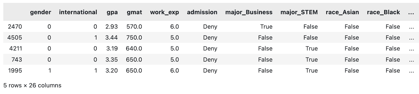
load_classification_dataset().sample(5)
A sample of the modified MBA dataset. Image by Author.
I’ll now do the same for the regression dataset.
The regression dataset of choice contains an insurance amount ($) as a continuous feature that the machine learning model will try to predict based on other attributes.
The data preprocessing I’ve done is, once again, fairly minimal. It boils down to:
If you have the time, feel free to add more steps to the pipeline.
Copy the following function to load and preprocess the insurance dataset:
def load_regression_dataset() -> pd.DataFrame:
# https://www.kaggle.com/datasets/mirichoi0218/insurance
df = pd.read_csv("MedicalCostPersonal.csv")
# Scale numerical features
cols_to_scale = ["age", "bmi", "children"]
scaler = StandardScaler()
df[cols_to_scale] = scaler.fit_transform(df[cols_to_scale])
# Binary features
df["sex"] = df["sex"].replace({"male": 0, "female": 1})
df["smoker"] = df["smoker"].replace({"no": 0, "yes": 1})
# Dummies
dummies_region = pd.get_dummies(df["region"], prefix="region", drop_first=True)
df = pd.concat([df, dummies_region], axis=1)
df = df.drop("region", axis=1)
return df
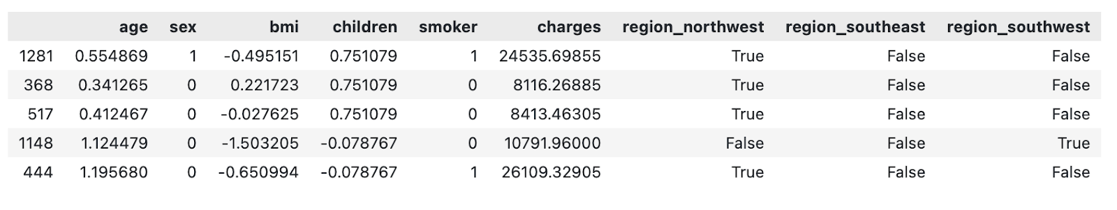
load_regression_dataset().sample(5)
A sample of the modified insurance dataset. Image by Author.
And that’s it!
In the following section, I’ll show you how to start visualizing machine learning models.
Tree-based models are often used for classification, but most of them can also handle regression tasks.
In this section, I’ll show you how to visualize a decision tree, feature importance from a random forest model, and prediction explanations with SHAP and LIME.
Keep in mind that decision tree and random forest models can be difficult to grasp. We have a complete course that covers the fundamentals of tree-based machine learning models in Python.
To get started, load the classification dataset and split it into training and testing subsets:
df = load_classification_dataset()
X = df.drop("admission", axis=1)
y = df["admission"]
X_train, X_test, y_train, y_test = train_test_split(X, y, test_size=0.25, random_state=42)
Up next, let’s visualize a decision tree!
Think of a decision tree as a set of nested if statements in which conditions are determined by a machine learning model.
There’s more to the story, but with this analogy, you can see that visualizing decisions should be a straightforward process. And it is: the plot_tree() function from sklearn handles most of the heavy lifting.
Start by training a decision tree model. The max_depth parameter is optional and is here only for visualization purposes. Without it, the tree will get too deep, and you’ll get lost in the sheer volume of decisions the model makes, especially for bigger datasets.
The following snippet trains the decision tree classification model on the training subset:
from sklearn import tree

decision_tree = tree.DecisionTreeClassifier(random_state=42, max_depth=4)
decision_tree.fit(X_train, y_train)
And for visualization, just copy the following snippet. The optional filled and feature_names parameters make the tree easier to interpret:
plt.figure(figsize=(12,8))
tree.plot_tree(decision_tree, filled=True, feature_names=X.columns, class_names=y.unique())
plt.title("Decision Tree Visualization", size=20, loc="left", y=1.04, weight="bold")
plt.show()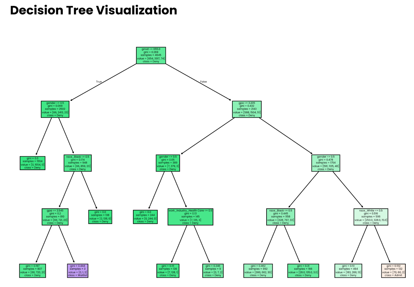
Four-level deep decision tree. Image by Author.
Note that the decisions made by the model don’t mean anything if the model isn’t accurate. Later in the article, I’ll show you how to estimate accuracy.
Remember the cake analogy from earlier? It’s time to put it into practice.
Every time you train a tree model with sklearn, you get access to the feature_importances_ property. Pair that with the feature names, and you have all the data needed to see which attributes contribute the most to the prediction.
Let’s see it in action! First, train a random forest classifier on the training subset:
from sklearn.ensemble import RandomForestClassifier

random_forest = RandomForestClassifier(n_estimators=25, random_state=42)
random_forest.fit(X_train, y_train)
The visualization now boils down to extracting and sorting feature importances and replacing indices with feature names:
importances = random_forest.feature_importances_
indices = np.argsort(importances)[::-1]
plt.figure(figsize=(10,6))
bars = plt.bar(range(X.shape[1]), importances[indices], edgecolor="#008031", linewidth=1)

for bar in bars:
    height = bar.get_height()
    plt.text(bar.get_x() + bar.get_width() / 2, height, f"{height:.2f}", ha="center", va="bottom", size=8)

plt.title("Feature Importances", size=20, loc="left", y=1.04, weight="bold")
plt.ylabel("Importance")
plt.xticks(range(X.shape[1]), np.array(X.columns)[indices], rotation=90, size=12)
plt.show()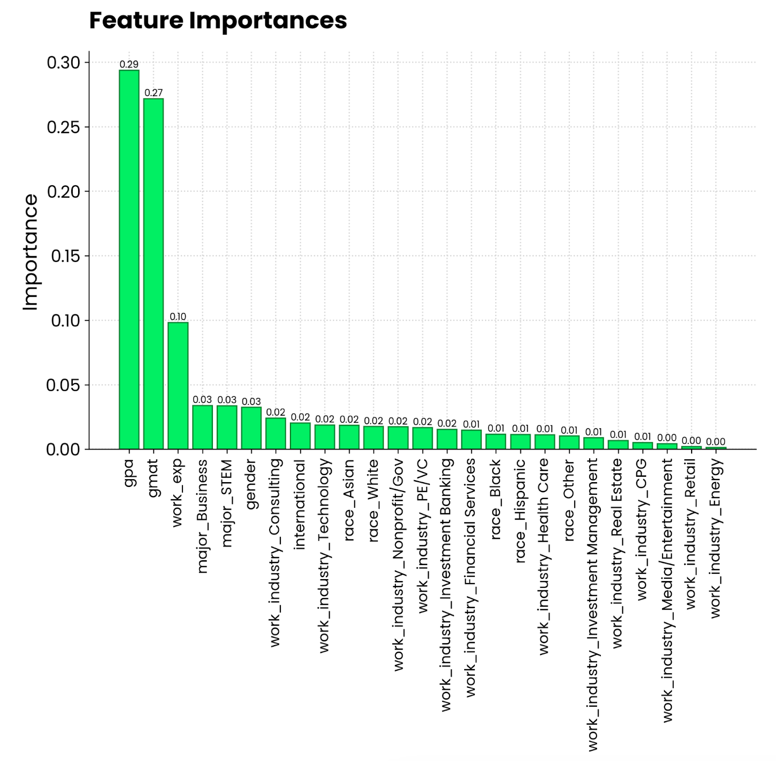
Random forest feature importance plot. Image by Author.
It looks like a grade point average on a 4.0 scale and a GMAT score contribute the most to being admitted to an MBA program. Following these is work experience, which is a requirement for MBA studies. What the person has majored in, and the industry they’re working in is far less relevant.
Feature importance paints the overall picture, but what if you want to visualize machine learning models on a level of individual prediction?
That’s where SHAP and LIME come in. I’ll discuss SHAP first. You already know what it is, so I’ll skip the theory.
I’ll fit a gradient-boosting model onto our regression dataset to see the impact individual features have on insurance charges. The following snippet shows you how to fit the model and calculate SHAP values from a shap.Explainer() model:
import shap
from xgboost import XGBRegressor

df = load_regression_dataset()

# No need for train-test splits
X = df.drop("charges", axis=1)
y = df["charges"]
model = XGBRegressor().fit(X, y)

# Shap explainer
explainer = shap.Explainer(model)
shap_values = explainer(X)
With SHAP, there’s a suite of plots you can make.
I’ll start with waterfall() and examine SHAP values for the first prediction:
shap.plots.waterfall(shap_values[0])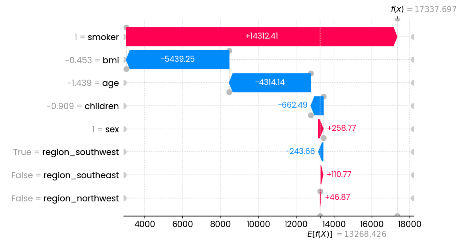
First prediction explanations. Image by Author.
In this specific instance, being a smoker drastically increases insurance charges. The features that have the most impact in reducing the charges are BMI (connected to weight) and age. Other features have minimal or no impact whatsoever.
You can represent the above chart in a more compact format:
shap.plots.force(shap_values[0])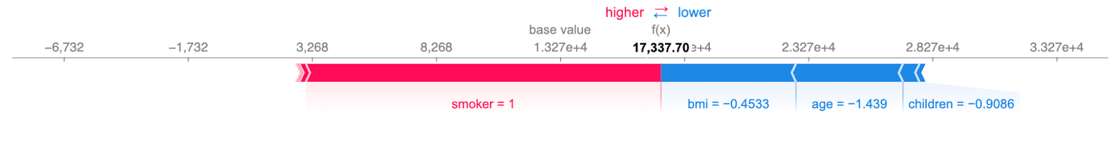
Concise first prediction explanations. Image by Author.
The information is still the same: red features increase the charges, and blue features reduce them. The point at which they meet shows the insurance charges for a single instance.
The beeswarm plot shows you which features are most important by plotting SHAP values of every feature for every sample. The features are sorted by the sum of SHAP value magnitudes over all samples. The color represents the feature value (red meaning high and blue meaning low):
shap.plots.beeswarm(shap_values)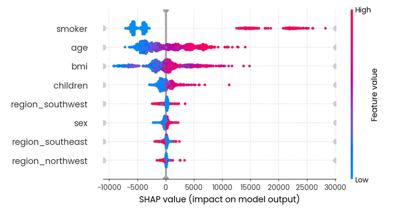
Summary effect of all features. Image by Author.
To interpret, being a young non-smoker with a reasonable BMI lowers the insurance charges.
The final SHAP visualization I want to show is the mean absolute value bar chart. It calculates the mean absolute value of all SHAP values for each feature:
shap.plots.bar(shap_values)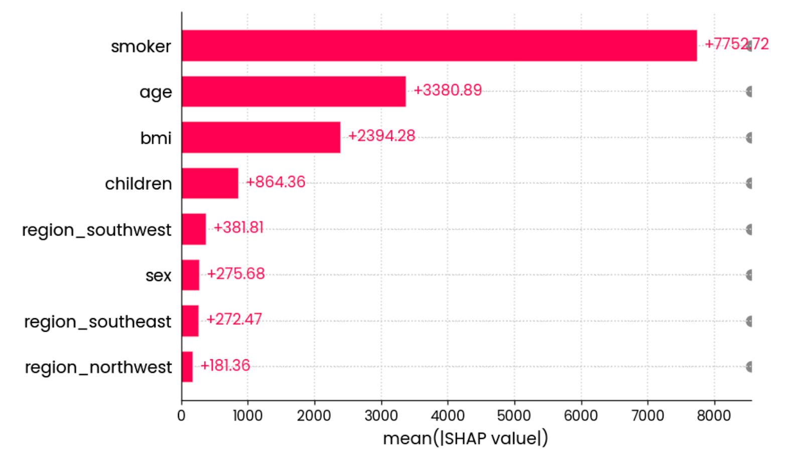
The mean absolute value of all SHAP values for all features. Image by Author.
In other words, it’s a fancy way to calculate global feature importance - the graph isn’t tied to an individual prediction.
And that does it for SHAP. I’ll shift the focus to LIME next.
Just like SHAP, LIME is all about interpretable machine learning.
It doesn’t have as many visualization types under its toolbelt, but it does one thing well—at least with tabular datasets.
For demonstration purposes, I’ll load the classification dataset and further convert it into a binary classification task by replacing waitlisted entries with denied ones. This will give you an easier time understanding LIME’s output:
from lime import lime_tabular

df = load_classification_dataset()

# Convert to binary
df["admission"] = df["admission"].replace({"Waitlist": "Deny"})
X = df.drop("admission", axis=1)
y = df["admission"]
X_train, X_test, y_train, y_test = train_test_split(X, y, test_size=0.25, random_state=42)
X_train.shape, y_test.shape
random_forest = RandomForestClassifier(n_estimators=25, random_state=42)
random_forest.fit(X_train, y_train)
The LimeTabularExplainer() class now receives training data, column names, names of the categories in the target variable, and the machine learning mode (classification or regression):
explainer = lime_tabular.LimeTabularExplainer(
    training_data=np.array(X_train),
    feature_names=X_train.columns,
    class_names=["Admit", "Deny"],
    mode="classification"
)
Once done, you can call the explain_instance() method to interpret a single prediction based on class prediction probabilities:
exp = explainer.explain_instance(
    data_row=X_test.iloc[0],
    predict_fn=random_forest.predict_proba
)
exp.show_in_notebook(show_table=True)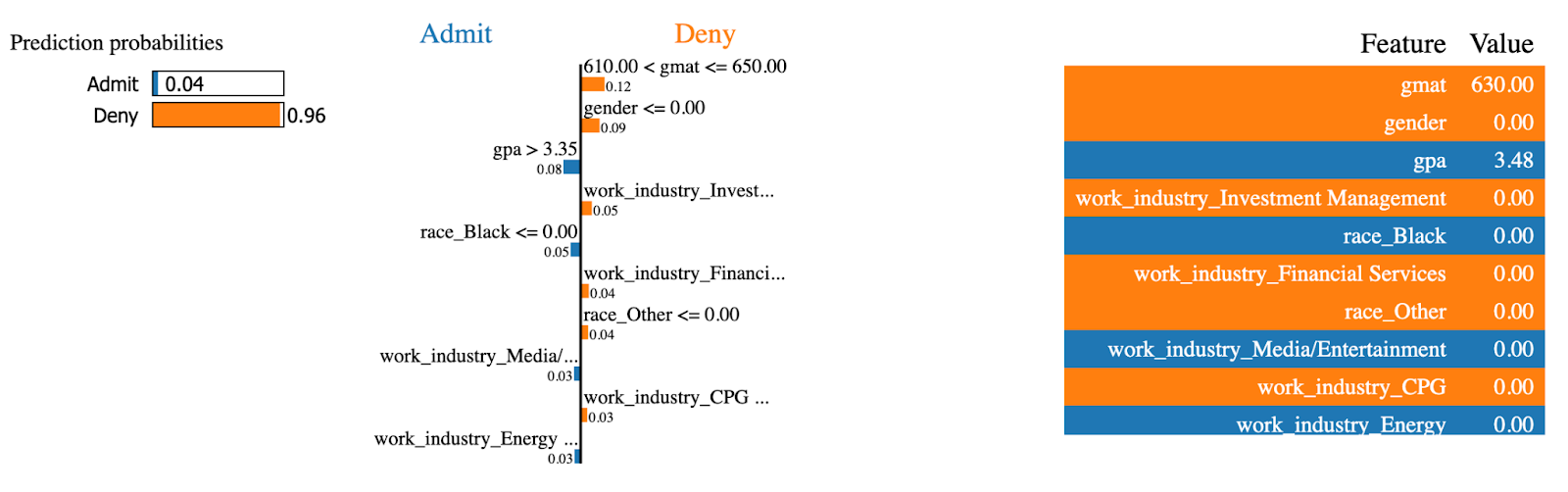
LIME explanations (1). Image by Author.
LIME model is 96% certain this MBA admission will be denied. Features such as gmat and gender had the most impact on the decision.
Let’s now do the same for an instance that was admitted to the MBA program:
exp = explainer.explain_instance(
    data_row=X_test.iloc[234],
    predict_fn=random_forest.predict_proba
)
exp.show_in_notebook(show_table=True)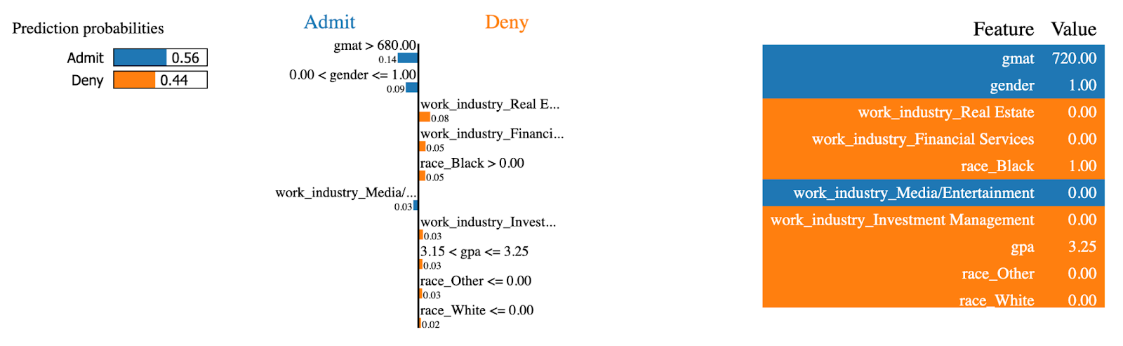
LIME explanations (2). Image by Author.
The same features now had the opposite effect! This person had a high gmat score, which is the largest contributor to being admitted to the MBA program.
And that does it for tree models! Up next, you’ll learn how to visualize linear models for regression tasks.
If you’re just starting out in predictive modeling, it doesn’t get more basic than linear regression. It’s a simple model that’s easy to understand and works well, provided the relationships in your dataset are linear.
Now, there are other linear models out there, but in this section, I’ll work with linear regression only.
Start by loading the regression dataset, splitting it into training and testing subsets, and fitting a linear regression model to the training portion:
from sklearn.linear_model import LinearRegression

df = load_regression_dataset()
X = df.drop("charges", axis=1)
y = df["charges"]
X_train, X_test, y_train, y_test = train_test_split(X, y, test_size=0.25, random_state=42)
model = LinearRegression().fit(X_train, y_train)
The first visualization type I’ll explore is model coefficients.
In plain English, a linear regression model boils down to a single equation. You might remember y = mx+b from high school - the same idea holds.
The regression equation expands to y = w0 + w1_x1 + w2_x2 + … + wn_xn to accommodate multiple parameters. The goal of the model is to find the best estimation of weights (w) given the set of input features (x).
So, why is this important?
Because you can access the coefficients (weights) after the model is trained and analyze their contribution, features with a larger coefficient associated with them will have a higher contribution to predicting the target variable.
You can get the coefficients by accessing the coef_ parameter on a trained model.
The following snippet gets the coefficients and plots them as a horizontal bar chart:
features = X_train.columns
coefficients = model.coef_
plt.figure(figsize=(10, 4))
bars = plt.barh(y=features, width=coefficients, edgecolor="#008031", linewidth=1)

for bar in bars:
    width = bar.get_width()
    plt.text(width + 1, bar.get_y() + bar.get_height()/2, f"{width:.2f}",
             va="center", ha="left")

plt.xlabel("Coefficient value")
plt.title("Linear Regression Model Coefficients", y=1.05)
plt.show()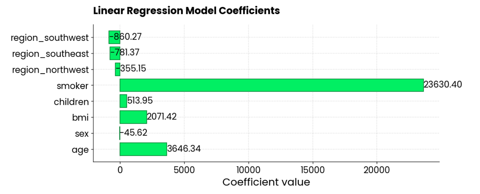
Linear regression model coefficients. Image by Author.
The features smoker, BMI, and age are the largest positive contributors to the insurance charges—when they go up, so does the amount. There are a couple of negative coefficients, too, meaning they reduce the overall amount.
The other common type of regression visualization is the residual plot. In plain English, you’re making a scatter plot of predicted values on the X-axis and residuals (true values - predicted values) on the Y-axis.
Ideally, there should be no patterns visible in the residuals, and they should be centered around 0. In other words, they should be normally distributed.
Use this code snippet to visualize the residuals of a linear regression model on the insurance dataset:
y_pred = model.predict(X_test)
residuals = y_test - y_pred
plt.figure(figsize=(10, 6))
plt.scatter(y_pred, residuals, color="#03EF62", alpha=0.6, edgecolors="#008031")
plt.axhline(0, color="red", linestyle="--")
plt.xlabel("Predicted Values")
plt.ylabel("Residuals")
plt.title("Residuals vs Predicted Values", y=1.05)
plt.grid(True)
plt.show()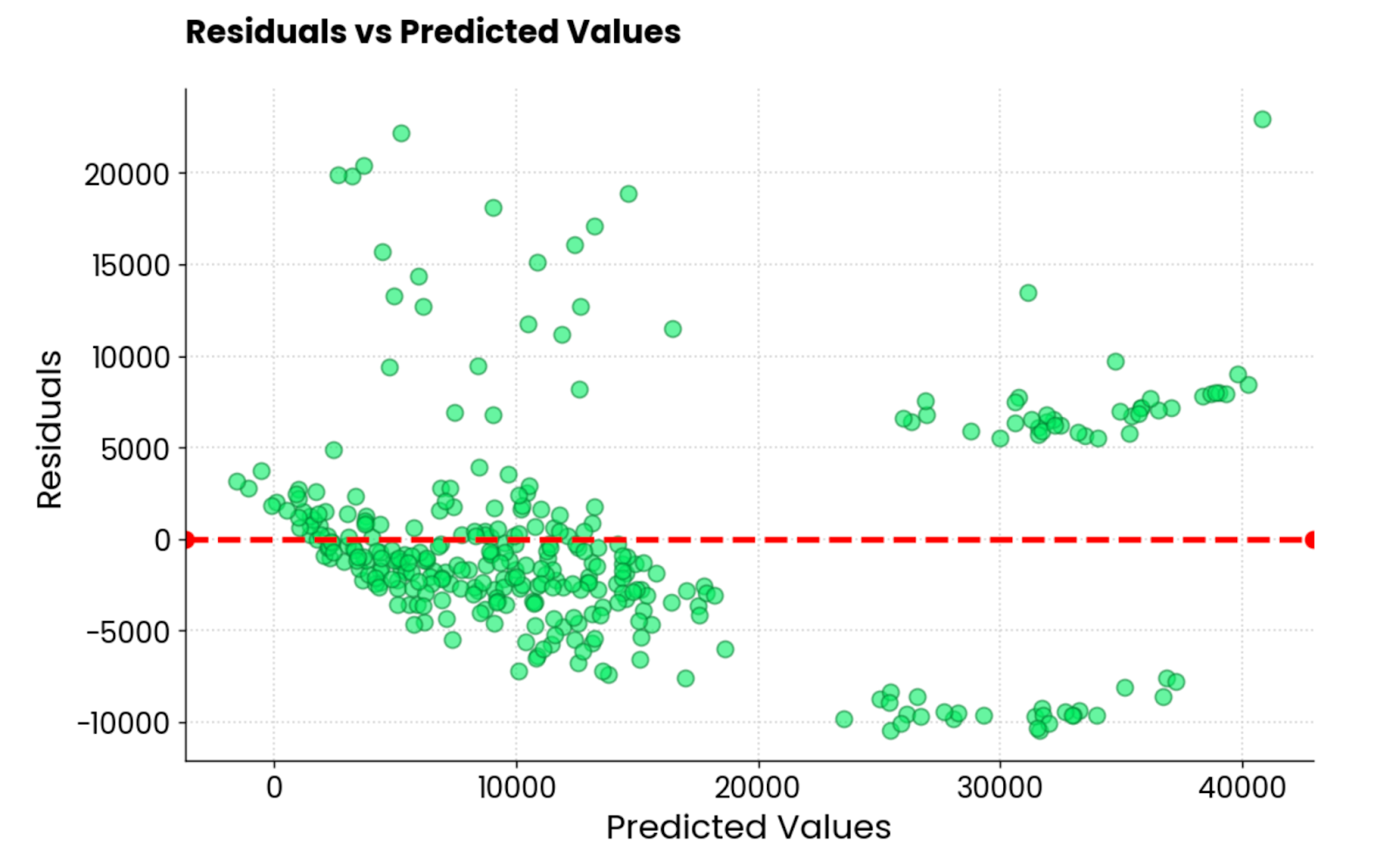
Linear regression model residuals. Image by Author.
It’s not the best residual plot I’ve seen. It looks good aesthetically, but the values are all over the place. If you’re a machine learning practitioner and get a similar residual plot, you have a lot of work in front of you.
Up next, I’ll show you 3 ways to visualize neural network models.
If there’s one area of machine learning where visualization and interpretation matter the most, it’s got to be neural networks.
These are complex to wrap your head around, even at the most fundamental level. You have different layer types, activation functions, and backpropagation - just to name a few. For this reason, neural networks are often synonyms for black box models.
It doesn’t have to be this way.
In this section, I’ll show you three ways to visualize neural networks: architecture plots, real-time training metrics, and Grad-CAM.
My library of choice is TensorFlow. If you’ve never heard of it, we have a TensorFlow for beginners course that will get you started quickly!
When you visualize the architecture of your neural network model, you’ll get one thing demystified - shapes.
In other words, you’ll see how the underlying matrix transforms in size by moving through the layers. It can be a hard subject for newcomers, so any visualization is more than welcome.
To demonstrate, I’ll use TensorFlow to create a basic neural network model for handwritten digit classification. Then, I’ll use the plot_model() function to save the model architecture image to a local file.
Take a look for yourself:
from tensorflow.keras import layers, models
from tensorflow.keras.utils import plot_model

model = models.Sequential()
model.add(layers.Input(shape=(28, 28, 1)))
model.add(layers.Conv2D(32, (3, 3), activation="relu"))
model.add(layers.MaxPooling2D((2, 2)))
model.add(layers.Conv2D(64, (3, 3), activation="relu"))
model.add(layers.MaxPooling2D((2, 2)))
model.add(layers.Flatten())
model.add(layers.Dense(64, activation="relu"))
model.add(layers.Dense(10, activation="softmax"))
plot_model(model, to_file="model_architecture.png", show_shapes=True, show_layer_names=True)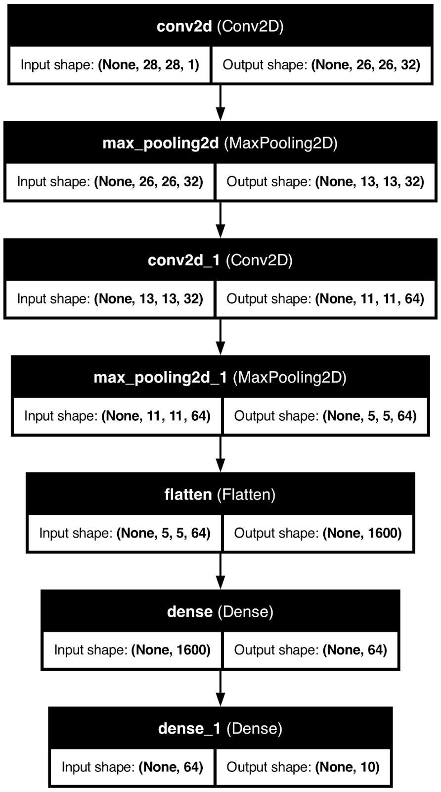
Neural network model architecture. Image by Author.
While helpful, this type of visualization can only get you so far.
You know how the data transforms along the way, but you don’t have an idea of how a neural network model arrives at its conclusions. That’s what I’ll cover next.
Grad-CAM, or Gradient Class Activation Mapping is a popular technique used for visualizing convolutional neural network models.
To be more precise, it helps you understand which parts of an input image contribute most to the model’s predictions. Think of it as a feature importance plot of a decision tree, but cranked to 11.
It’s an advanced interpretability technique that works for all convolutional models regardless of the architecture and helps you understand why a neural network model makes a certain prediction.
But here’s the problem - it’s not a trivial thing to implement in Python. Here’s a high-level overview of the algorithm:
It’s quite an involved process, and to make matters easier, I’ll use a pre-trained ResNet50 model that can already classify 1000 different image types.
But first, load in the necessary libraries and the image you want to view a Grad-CAM for. I’m using a stock dog image:
import cv2
import tensorflow as tf
from tensorflow.keras.applications.resnet50 import ResNet50
from tensorflow.keras.preprocessing.image import load_img

image = np.array(load_img("dog.jpg", target_size=(224, 224, 3)))
plt.grid(False)
plt.imshow(image)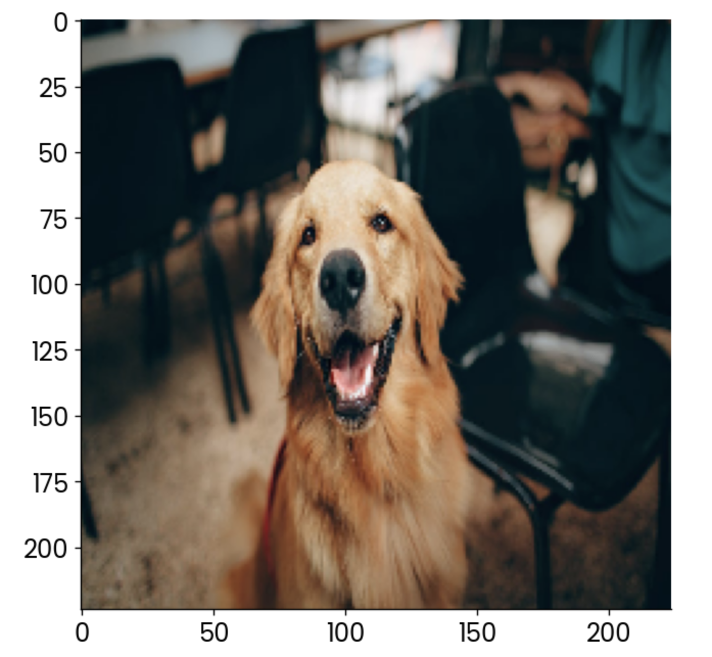
Sample dog image. Image by Author.
Now, the fun part begins. In the following code snippet, I implement the four-step process described earlier. You’ll find comments above each code line for easier understanding:
# Load the pre-trained ResNet50 model
model = ResNet50()

# Extract the output of the last convolutional layer
last_conv_layer = model.get_layer("conv5_block3_out")

# Create a model that outputs the last convolutional layer’s activations
last_conv_layer_model = tf.keras.Model(model.inputs, last_conv_layer.output)

# Prepare the classifier model using the layers after the last convolutional layer
classifier_input = tf.keras.Input(shape=last_conv_layer.output.shape[1:])
x = classifier_input
for layer_name in ["avg_pool", "predictions"]:
    # Reuse the pooling and prediction layers from the ResNet50 model
    x = model.get_layer(layer_name)(x)

# Create a new model that takes in the last conv layer output and returns predictions
classifier_model = tf.keras.Model(classifier_input, x)

# Use a GradientTape to record operations for automatic differentiation
with tf.GradientTape() as tape:
    # Prepare the input image and get the activations from the last conv layer
    inputs = image[np.newaxis, ...]
    last_conv_layer_output = last_conv_layer_model(inputs)
    tape.watch(last_conv_layer_output)  # Watch the conv layer output
    # Get predictions from the classifier model
    preds = classifier_model(last_conv_layer_output)
    # Get the index of the highest predicted class
    top_pred_index = tf.argmax(preds[0])
    # Focus on the prediction of the top class
    top_class_channel = preds[:, top_pred_index]

# Compute the gradient of the top predicted class with respect to the conv layer output
grads = tape.gradient(top_class_channel, last_conv_layer_output)

# Average the gradients over the width and height dimensions
pooled_grads = tf.reduce_mean(grads, axis=(0, 1, 2))

# Multiply each channel in the conv layer output by its corresponding gradient
last_conv_layer_output = last_conv_layer_output.numpy()[0]
pooled_grads = pooled_grads.numpy()
for i in range(pooled_grads.shape[-1]):
    last_conv_layer_output[:, :, i] *= pooled_grads[I]

# Compute the Grad-CAM by averaging the channels and apply a ReLU activation
gradcam = np.mean(last_conv_layer_output, axis=-1)

# Normalize the Grad-CAM to be between 0 and 1
gradcam = np.clip(gradcam, 0, np.max(gradcam)) / np.max(gradcam)

# Resize the Grad-CAM heatmap to the size of the original image (224x224)
gradcam = cv2.resize(gradcam, (224, 224))
It was a lot, sure, but you can now finally plot the heatmap produced by the Grad-CAM algorithm:
plt.grid(False)
plt.imshow(gradcam)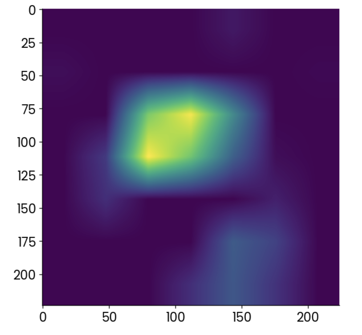
Grad-CAM heatmap. Image by Author.
Lighter points indicate areas in which the activation was the highest, but the heatmap alone doesn’t tell you much.
You’re far better off overlaying it over the original image and reducing the opacity slightly:
plt.grid(False)
plt.imshow(image)
plt.imshow(gradcam, alpha=0.5)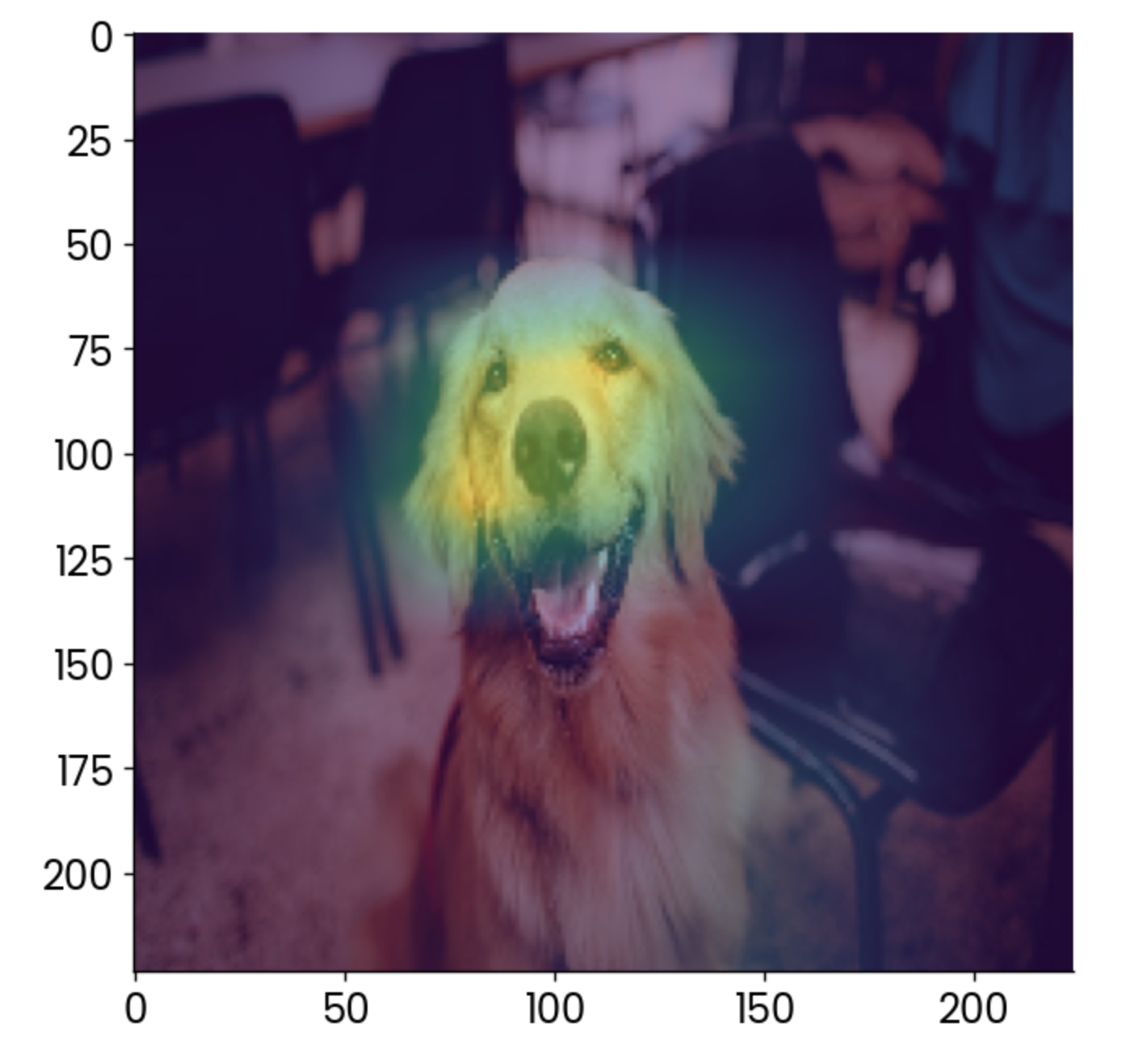
Dog image with a grad-CAM overlay. Image by Author.
To interpret, the most contributing factor to this image being classified as a “golden retriever” is the face, which makes sense.
You can use Grad-CAM to make sure your model is making predictions the right way. In this case, imagine the heatmap showing something else, like the chair in the background, as the most contributing factor. You wouldn’t trust that model, would you?
Training a neural network model can take a long time. The good thing is you don’t have to wait for training to complete to get a glimpse into the model’s performance. Libraries like TensorBoard can show you that in real time.
TensorBoard ships with TensorFlow, so you don’t have to install anything to follow along.
For demonstration purposes, I’ll train a basic digit classifier model for 25 epochs. The important part is the callback—in there, you specify the path and format for training logs, which TensorBoard will use in a minute.
This is the code you’ll need to train the model and store training logs:
import tensorflow as tf
from tensorflow.keras import layers, models
from datetime import datetime

# Load MNIST dataset
mnist = tf.keras.datasets.mnist
(x_train, y_train), (x_test, y_test) = mnist.load_data()

# Normalize pixel values between 0 and 1
x_train, x_test = x_train / 255.0, x_test / 255.0

# Add a channels dimension (for the Convolutional layer)
x_train = np.expand_dims(x_train, -1)
x_test = np.expand_dims(x_test, -1)

# Build a simple CNN model
model = models.Sequential([
    layers.Conv2D(32, kernel_size=(3, 3), activation="relu", input_shape=(28, 28, 1)),
    layers.MaxPooling2D(pool_size=(2, 2)),
    layers.Flatten(),
    layers.Dense(128, activation="relu"),
    layers.Dense(10, activation="softmax")
])

# Compile the model
model.compile(
    optimizer="adam",
    loss="sparse_categorical_crossentropy",
    metrics=["accuracy"]
)

# Set up TensorBoard callback
log_dir = "logs/fit/" + datetime.now().strftime("%Y%m%d-%H%M%S")
tensorboard_callback = tf.keras.callbacks.TensorBoard(log_dir=log_dir, histogram_freq=1)

# Train the model with TensorBoard monitoring
model.fit(
    x_train,
    y_train,
    epochs=25,
    validation_data=(x_test, y_test),
    callbacks=[tensorboard_callback]
)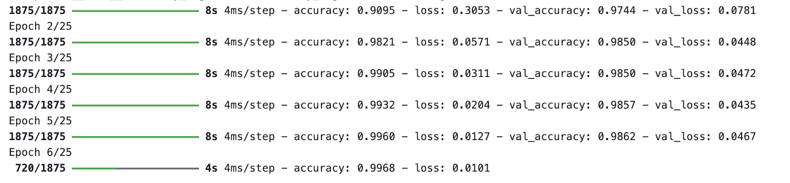
Model training process. Image by Author.
While the model is training, run TensorBoard from the terminal and specify a path to the training logs folder:
tensorboard --logdir=logs/fitTensorBoard will run on port 6006 by default:
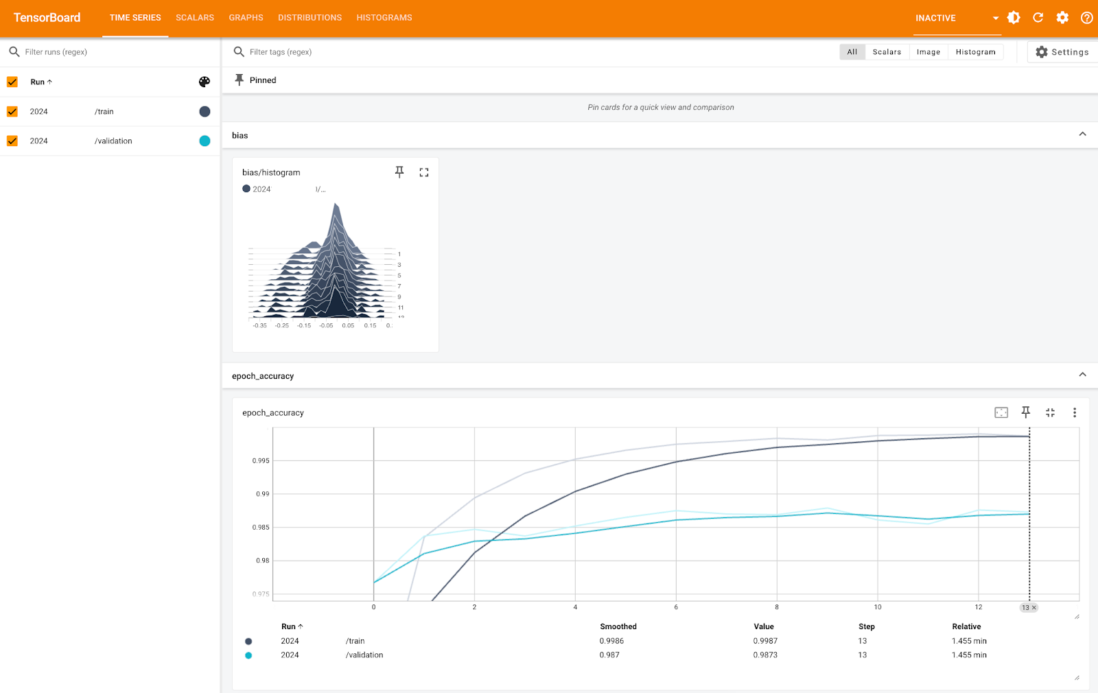
TensorBoard metrics (1). Image by Author.
The image above shows you the bias histogram and accuracy per epoch, both for training and validation sets. You can see the accuracy is very high for both, close to 100% - it’s just the Y-axis scale that’s too small.
Other tabs will dive into more specific metrics and allow you to tweak certain things, as you can see below:
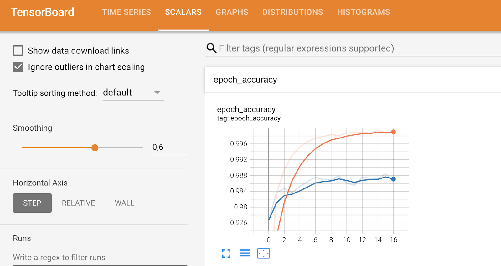
TensorBoard metrics (2). Image by Author.
To conclude, TensorBoard is a neat model performance visualization tool and it can help you analyze the performance while the model is training.
In this last part, I want to take a step back and dive into more general-purpose metrics for visualizing the model’s performance.
You’ll see three of them: confusion matrix, ROC curve plot, and Precision-Recall curve plot.
Since they’re tied to classification problems, you’ll have to load the classification MBA dataset. To make things easier, I’ve also converted it to a binary classification problem by setting waitlisted entries to denied. The rest of the code snippet splits the data into training and testing subsets and first a random forest classification model:
from sklearn.ensemble import RandomForestClassifier

df = load_classification_dataset()
df["admission"] = df["admission"].replace({"Waitlist": "Deny"})
df["admission"] = df["admission"].replace({"Deny": 0, "Admit": 1})
df.rename(columns={"admission": "is_admitted"}, inplace=True)
X = df.drop("is_admitted", axis=1)
y = df["is_admitted"]
X_train, X_test, y_train, y_test = train_test_split(X, y, test_size=0.25, random_state=42)
random_forest = RandomForestClassifier(n_estimators=25, random_state=42)
random_forest.fit(X_train, y_train)
Let’s dive into the first metric - the confusion matrix.
A confusion matrix tells you how well your model performs. In an ideal scenario, values on a top-left to bottom-right diagonal would be the only non-zero elements, indicating the model didn’t make any false predictions.
But that doesn’t happen often in the real world.
Use the following guidelines to interpret a confusion matrix (for binary classification):
There’s no general rule on whether you should care more about false positives or false negatives. The prior is more painful in the case of MBA admissions since the model classified the student being admitted, but that wasn’t the case in reality. In other cases, such as cancer prediction, it’s vital to minimize the number of false negatives, as you don’t want to declare someone as healthy when they have cancer.
That’s where domain knowledge comes in.
Anyway, back to the code. The following snippet calculates the confusion matrix from our random forest model on the test set and uses the ConfusionMatrixDisplay class to create a visualization:
from sklearn.metrics import confusion_matrix
from sklearn.metrics import confusion_matrix, ConfusionMatrixDisplay

preds = random_forest.predict(X_test)
cm = confusion_matrix(y_true=y_test, y_pred=preds, labels=random_forest.classes_)
disp = ConfusionMatrixDisplay(confusion_matrix=cm, display_labels=random_forest.classes_)
disp.plot()
plt.grid(False)
plt.title("Confusion Matrix", y=1.04)
plt.show()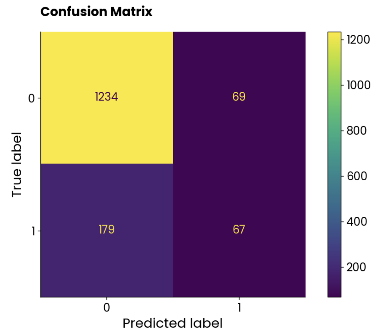
Confusion matrix plot. Image by Author.
The classes aren’t balanced, but the number of incorrect predictions is astonishingly high.
Let’s see what the ROC curve has to say.
ROC stands for Receiver Operating Characteristics, and it’s a curve that displays the performance evaluation of a binary classification model. In the case of multi-class classification, you’ll have to compare two classes at a time.
The ROC curve shows a tradeoff between a true positive rate (TPR, sensitivity, recall) and a false positive rate (FPR) across different classification thresholds. TPR is plotted on the Y-axis against FPR on the X-axis. Each point represents a different threshold for the classification decision (probability score used to classify an instance as positive or negative).
The curve is typically plotted against a diagonal from (0, 0) to (1, 1), which represents a random classifier.
If the curve is above the diagonal, it means your model performs better than a random classifier. A single scalar value summarizes that. It’s called AUC (Area Under the Curve) and ranges from 0 to 1, with higher being better and 0.5 being random.
In short, you want to curve as close as possible to the top left corner.
Use the following snippet to calculate ROC and AUC and plot the curve:
from sklearn.metrics import roc_curve, auc

# Get predicted probabilities for the positive class
y_probs = random_forest.predict_proba(X_test)[:, 1]
fpr, tpr, roc_thresholds = roc_curve(y_test, y_probs)
roc_auc = auc(fpr, tpr)
plt.plot(fpr, tpr, label=f"AUC = {roc_auc:.2f}")
plt.plot([0, 1], [0, 1], color="navy", linestyle="--")
plt.xlim([0.0, 1.0])
plt.ylim([0.0, 1.05])
plt.xlabel("False Positive Rate")
plt.ylabel("True Positive Rate")
plt.title("ROC Curve", y=1.04)
plt.legend(loc="lower right")
plt.show()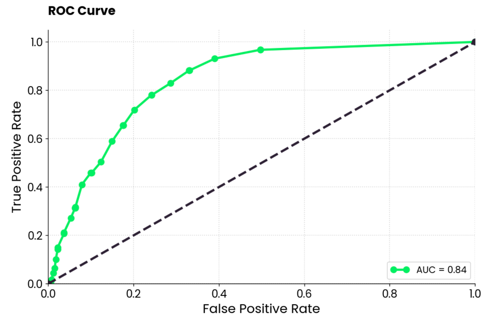
ROC curve plot. Image by Author.
To interpret, the random forest model is much better than a random classifier and has a reasonable balance between true positives and false positives. There’s still some degree of misclassification present, and you should aim to lift the curve up and to the left by optimizing the data or choosing a different machine learning model.
This curve is similar to the ROC curve but shows the trade-off between precision and recall for different classification thresholds. It shows precision on the Y-axis and recall on the X-axis and is typically preferred over ROC when classes are imbalanced.
That happens to be the case in the MBA admissions dataset, so a PR curve sounds like a great fit!
It’s important to note that precision-recall curves focus only on the minority class and provide a better picture of how well the model identifies instances that matter the most (students admitted, cancers detected, and so on).
Use the following snippet to calculate precision and recall values and plot them on a graph:
from sklearn.metrics import precision_recall_curve

# Get predicted probabilities for the positive class
y_probs = random_forest.predict_proba(X_test)[:, 1]

# Precision-Recall curve
precision, recall, pr_thresholds = precision_recall_curve(y_test, y_probs)
pr_auc = auc(recall, precision)
plt.plot(recall, precision, label=f"(AUC = {pr_auc:.2f})")
plt.xlabel("Recall")
plt.ylabel("Precision")
plt.title("Precision-Recall Curve", y=1.04)
plt.legend(loc="lower left")
plt.show()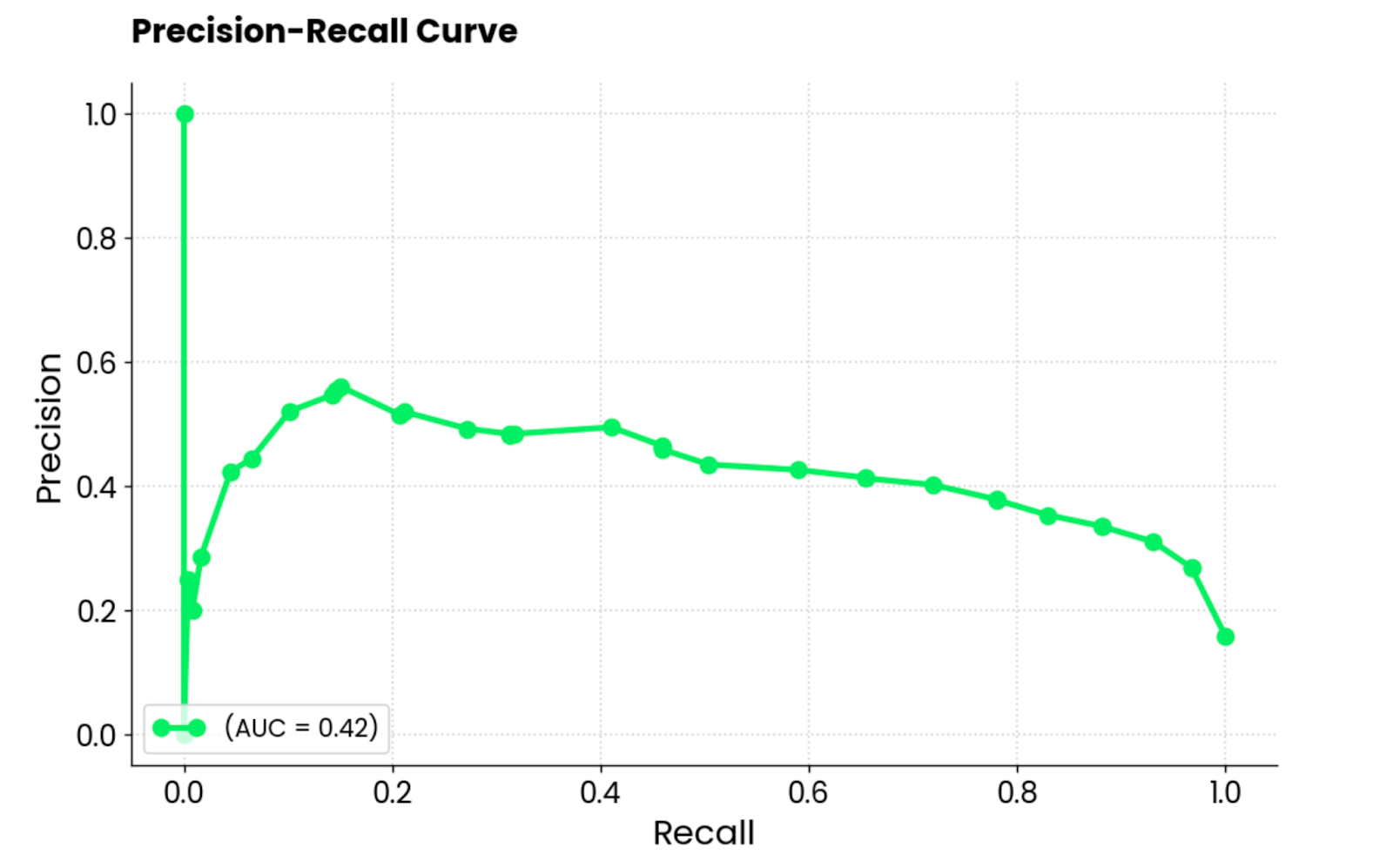
Precision-recall curve plot. Image by Author.
To interpret, the model performs poorly, indicated by the AUC score of 0.42. When the model tries to increase recall, it sacrifices too much precision, leading to many false positives. In short, this model isn’t well suited for this dataset, or the dataset itself isn’t preprocessed adequately.
To conclude, the field of machine learning is complex and often unintuitive. If you’re a beginner, you’ll have a hard time wrapping your head around the big ideas. If you’re working with a business client, they likely won’t understand the tech jargon.
Data visualization helps to bridge the gap in both scenarios.
Today, you’ve seen all the different chart types you can use to visualize regression and classification models, as well as the decision process of neural networks and single prediction interpretation through SHAP and LIME. It’s a lot to process, so feel free to revisit this article multiple times!
If you’re completely new to the subject, we recommend watching our fundamentals machine learning course to get started. After that, a more applied course with Python is a great fit.
If you have some experience but don’t understand how it all works on a larger scale, we encourage you to give our machine learning for production course a try.
Learn more about machine learning with these courses!
Course
Course
Course
blog
Natassha Selvaraj
15 min
Tutorial
Hadrien Jean
Tutorial
Aditya Sharma
Tutorial
Kurtis Pykes
code-along
Serg Masis
code-along
Weston Bassler