Track
AI Fundamentals
10 hr
Disclaimer: The following analysis is intended for educational purposes only and should not be considered financial advice.
With its price surging to an all-time high, even surpassing the magical $100,000 barrier in the current bull market, Bitcoin has once again become a hot topic of discussion.
In this blog, I will use Python to highlight key insights derived from Bitcoin's historical price data. From identifying seasonal patterns related to halving events to exploring micro-patterns in intra-day and calendar effects, I’ll uncover trends that provide context for Bitcoin’s price movements.
I’ll explain my methodology step-by-step, and together we will:
To make this blog easier to read, I moved all the code into this DataLab notebook. While I encourage you to explore the code, the article is designed to stand on its own, so you can follow along with or without the code.
Historical Bitcoin price data can be collected in various ways. One straightforward option we use for the daily price data is downloading a CSV file from a reliable website, such as CoinCodex, which provides daily Bitcoin price data without requiring an account. The CSV can then be imported into Python using pandas.read_csv().
Alternatively, APIs of platforms like CoinGecko or Binance offer access to historical data, though free retrieval is often subject to limitations. A technical workaround for these restrictions is to use stacked requests to gather large datasets incrementally. For the hourly data in this article, we use the Bitcoin Historical Dataset by Mark Zielinski, which even includes minute-by-minute prices.
The raw data requires basic preprocessing to be prepared for analysis. This includes setting a datetime index, converting numeric columns into float format, and addressing any missing values.
One critical aspect to consider is that trading volume is represented in BTC for hourly data and in USD for daily data, which we have to keep in mind for our analysis later.
Initial exploration involves visualizing the price alongside the 7-day moving average of daily volatility.
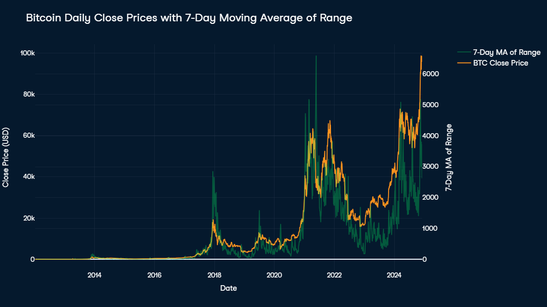
Bitcoin’s price exhibits a massive upward trend, making pre-2017 data appear negligible by comparison. Notably, the end of 2020 saw an extremely steep price increase, followed by high volatility and a strong downward trend lasting until late 2022.
Volatility remains a defining feature, with daily changes often around 10% of the price and peaks of up to 30% during events like in January 2018 and May 2021.
Recently, Bitcoin has rallied dramatically, climbing from $16,000 to $100,000 within two years. To better understand Bitcoin's price development, it makes sense to examine the built-in features influencing its supply. Besides its limitation to a maximum of 21 million Bitcoins, one of the most important features is the concept of halving.
Halving is a programmed event in Bitcoin’s code that reduces the reward miners receive for adding a new block to the blockchain by 50%. Occurring approximately every four years, it effectively slows the rate at which new Bitcoin enters circulation, maintaining its scarcity over time. This mechanism is central to Bitcoin’s deflationary model, often influencing market dynamics by creating supply shocks that can drive price increases in the months following a halving event.
To better visualize Bitcoin’s long-term trends, a logarithmic price chart is useful. This approach compresses exponential growth, making it easier to observe patterns over time.
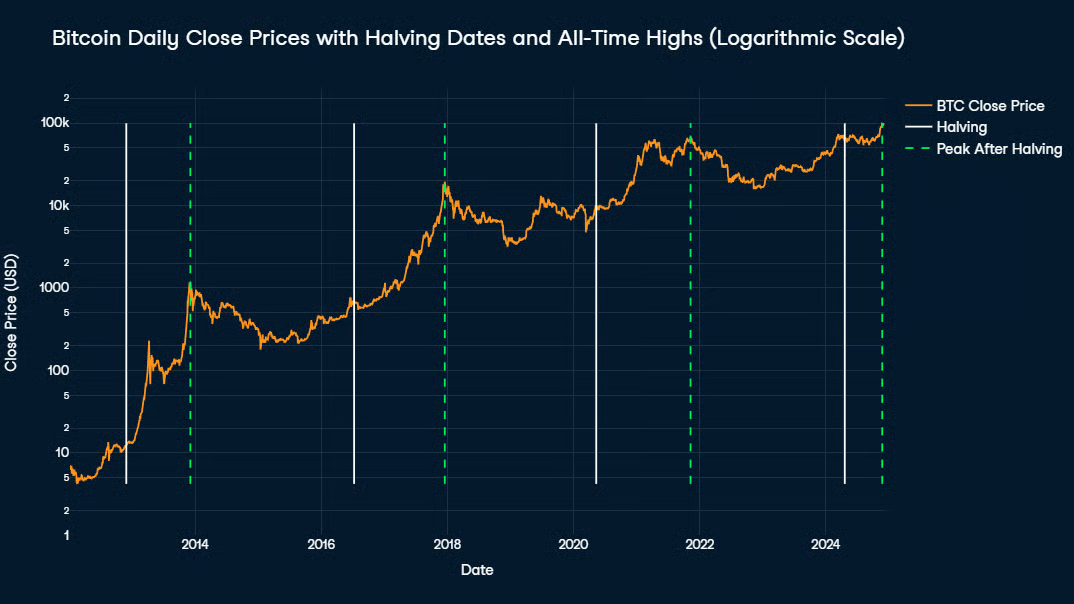
Key events, such as Bitcoin halving dates, are highlighted with white vertical lines. Historical data reveals that all-time highs typically occur between halvings, often 1 to 1.5 years after a halving event, with peaks marked by green vertical lines on the chart. This pattern suggests a cyclical nature to Bitcoin’s price movements, driven by its supply mechanics.
Time series decomposition is a method used to break down a time series into three main components:
We will cover two types of decomposition—additive and multiplicative:
One critical concept in time series analysis is stationarity. A stationary series has constant statistical properties (mean, variance, and autocorrelation) over time, making it easier to model and predict. Many forecasting methods and additive decomposition assume the series is stationary. For non-stationary data, transformations are often necessary to stabilize variance and remove trends, ensuring the decomposition results are accurate and interpretable.
Since the prices of financial assets are usually the result of many different overlapping patterns, they are almost never stationary. This is especially true for Bitcoin, whose price history is marked by high volatility, a strong upward trend, and irregular seasonal patterns. The results of an augmented Dickey-Fuller test on the original time series confirm our initial assumption and show the Bitcoin price to be far from stationary.
When dealing with a non-stationary time series, a decomposition is still possible. We can either perform a multiplicative decomposition on the original time series or make it suitable for an additive decomposition, either by subtracting each value from its predecessor (differencing), transforming values into their logarithm (logging), or a combination of both.
Accordingly, we create three new columns based on each day’s Close price and name them Close_Diff, Close_Log, and Close_Log_Diff. It is important to note that the order of transformations matters in the latter case: if the differencing was done first, there would be many negative values for which the logarithm is not defined. That is why logging always needs to be done before differencing.
The results of further augmented Dickey-Fuller tests applied on those new columns indicate that Close_Diff and Close_Log_Diff are stationary, while Close_Log is not. This is not necessarily a problem in itself but increases the likelihood of an incomplete separation of components, indicated by residual values being autocorrelated and not representing a normal distribution.
To sum up, we will perform the following decompositions:
We can perform decomposition with the statsmodels package. We need to pass the time series, the mode of decomposition in the model parameter, and the period of seasonality.
The only kind of seasonality to be expected in Bitcoin prices is related to halving events. Since the timespan between each halving is roughly the same, we can choose the mean of days between the halving dates so far, which results in a seasonality period of 1,379 days.
The trend and seasonal components must provide meaningful insights, so it makes sense to first look at the interpretability of each approach. The multiplicative decomposition of the original time series and the additive decomposition of the logged-time series provide both a smooth trendline with a clear direction and a consistent seasonal component throughout all the cycles. Both differenced time series, however, fail to provide an easy-to-interpret trendline and, therefore, fail their main purpose.
A further statistical evaluation of the residuals reveals distinct strengths and weaknesses in the two remaining decomposition approaches. One weakness that both decompositions share is a high autocorrelation of residuals, as displayed by the very high values in the Ljung-Box test statistic (30618.1, respectively 29331.3, each p = 0). This indicates an incomplete separation of components, as there seem to be some patterns left in the residuals.
The strength of the multiplicative decomposition of the original time series lies in having near-normal residuals, as indicated by a Shapiro-Wilk statistic of 0.992, i.e. a distribution that is 99.2% normal. This suggests the residuals resemble white noise in their distribution, as normally distributed residuals are often a sign that any unexplained variation is purely random and unbiased. The residuals of the additive decomposition of the logged time series approach normality as well, but to a slightly lesser degree (SW = 0.971).
Finally, the additive decomposition of the logged time series has a near-zero correlation (-0.059) between residuals and the logged series. This suggests a very small amount of data unexplained by the decomposition and one clearly smaller compared to the multiplicative decomposition of the original time series (0.249).
Overall, the logged additive decomposition offers more statistically robust residuals, although the slight trade-off in normality should be weighed against its improved randomness and lower correlation.
Unsurprisingly, both decompositions tell a story of a strong upward trend. The trendline of the raw close prices (white) demonstrates exponential growth, with increasing steepness over time as Bitcoin prices rise. While this trend captures the overall upward movement in prices, it disproportionately emphasizes larger changes in later periods due to the scale of exponential growth.
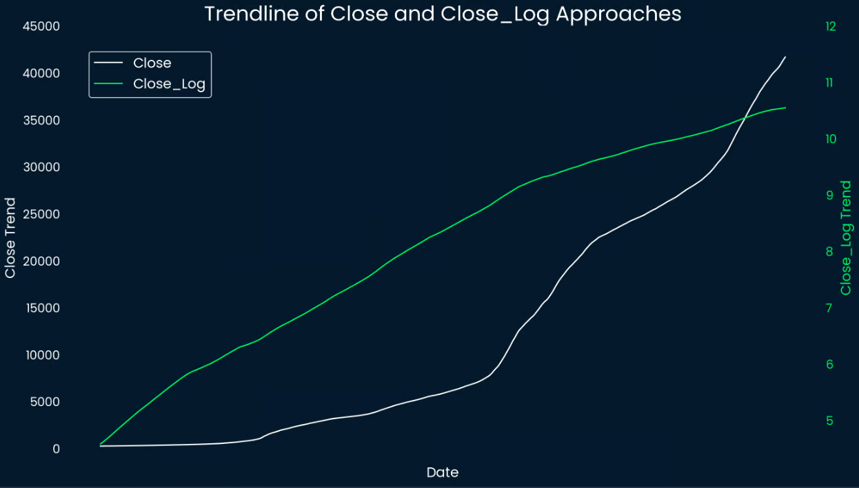
In contrast, the log-transformed trendline (green) smooths out the growth, resulting in a more linear-like pattern that is easier to interpret. Only in the last third of the overall timeline does it show a slight decrease in steepness, suggesting a slowing of Bitcoin’s exponential growth. By stabilizing variance, the log transformation ensures that larger changes in later periods do not overshadow smaller price movements in earlier periods.
When analyzing seasonality, we have to remember the statistical limitations we pointed out earlier. Nevertheless, both line charts show seasonal components with a consistent and repeating cycle, indicating that Bitcoin prices exhibit periodic behavior over time. Peaks and troughs align, suggesting regular phases of increased and decreased activity or market interest.
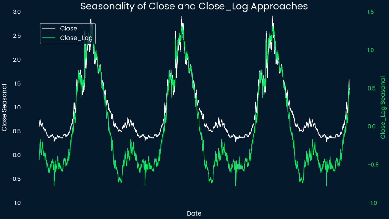
The symmetry of the peaks and troughs suggests a relatively stable rhythm despite Bitcoin's inherent volatility. This could imply that consistent market trends or participant behaviors influence Bitcoin's periodic behavior. Since one period in the seasonality displayed equals the timespan between two halving events, we can check when the price in each cycle peaks or bottoms.
According to the extracted seasonality component, the Bitcoin price reaches its seasonal components’ peak about 466 days after a halving event and the respective bottom about 97 days before the next halving event. If we mark them as green and red vertical lines on the logarithmic Bitcoin price chart from earlier, it looks like this:
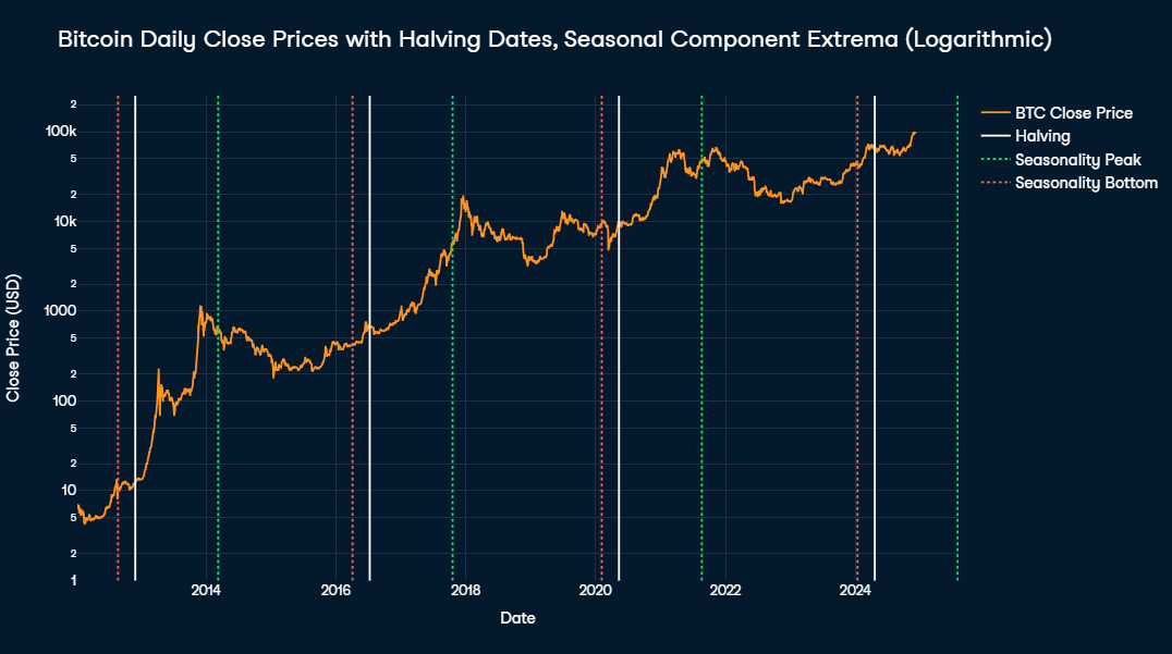
The seasonal peaks consistently align closely with the post-halving peaks, always occurring within a three-month window of the actual peak date. In contrast, the seasonal bottoms appear much later than the actual cyclical lows, creating an apparent discrepancy.
This discrepancy arises from two factors. First, after each cyclical peak, there is a prolonged period during which the cyclical component remains near its minimum, and the actual low occurs during this phase.
Second, the strong upward trend in Bitcoin's price must be considered. As the seasonal component remains unchanged until shortly before the next halving event, the upward trend causes the price just before a halving to exceed the actual cyclical low, resulting in a larger discrepancy from the expected seasonal value.
Predicting market movements is inherently challenging, especially with highly volatile assets like Bitcoin. Prices can be influenced by a complex interplay of factors, including macroeconomic trends, market sentiment, and unforeseen events. Nevertheless, we will try to find patterns in the chaos.
This includes intra-day patterns and calendar effects in Bitcoin price movements, the latter being distinct from the "seasonality" observed in decomposed time series. While decomposed seasonal components span approximately four years, calendar effects are tied to shorter, recurring patterns within specific timeframes. These include variations by day of the week, day of the month, and month of the year.
One interesting feature of cryptocurrencies compared to traditional financial assets is their 24/7 tradability. Let’s see if we can find some pattern on how prices change and volume fluctuate throughout an average day. All times are expressed in GMT.
To calculate the average price change and volatility for each hour, we first extract the hour component using the .dt.hour attribute of the Timestamp column. The price change is then computed using the .diff() function, which calculates the difference in the Close price compared to the previous hour. Finally, the data is grouped by hour using .agg() to calculate each hour's mean price change and volume.
The results are visualized in a Plotly line chart. The orange line represents the average price change during each hour, while the green line shows the average trading volume. Shaded grey areas indicate the opening hours of major global stock exchanges—Shanghai, London, and New York (NYSE and NASDAQ)—in chronological order.
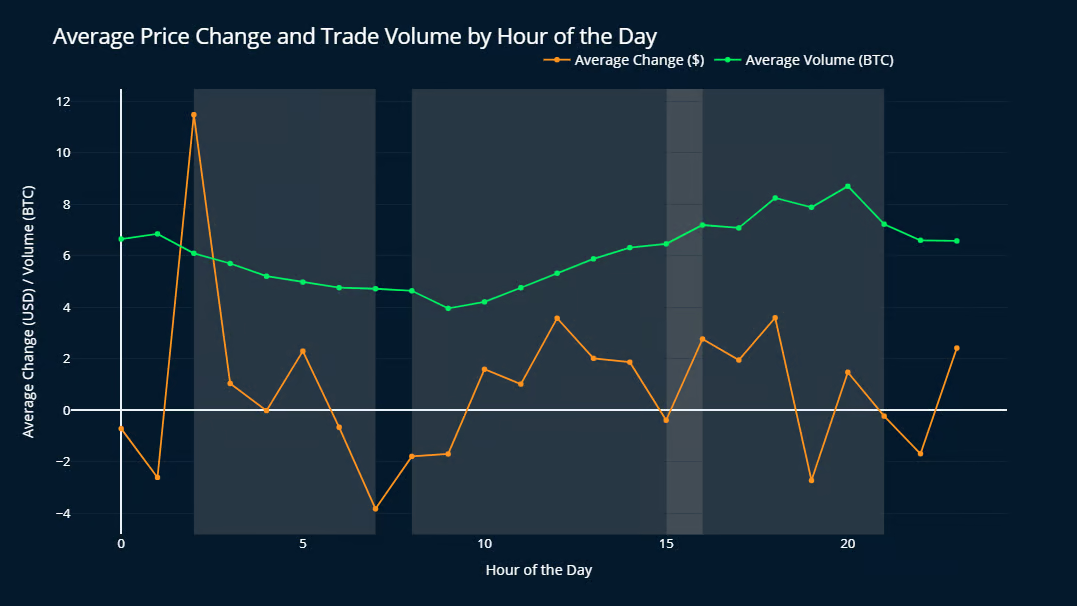
Bitcoin's price experiences the largest average increase at 2 am GMT, with a substantial rise of $11.48 on average, compared to $3.59 at 6 pm GMT, which takes second place. This peak coincides with the opening of the Shanghai Stock Exchange and follows the only period of the day without any of the three major global exchanges operating (9 PM to 2 AM GMT).
It is important to note that the standard deviations of price changes are roughly between $150 and $250 for all hours of the day, so several orders of magnitude larger than the respective mean values. This indicates that the daily patterns are quite small and irrelevant compared to bigger trends. Nevertheless, the difference between the price change at 2 AM and the second placed one at 6 PM is still statistically significant on a 99% significance level.
Trading volume seems to rise from the opening of the London Stock Exchange until it reaches its peak of 8.70 BTC per hour shortly before the NYSE and NASDAQ close for the day. After that, the volume continually drops to its lowest average value at 9 AM. (3.96 BTC per hour). These observations indicate that Bitcoin's price and volume are shaped by the activity of major stock exchanges and the waking hours of different regions across the globe.
To analyze Bitcoin price movements by weekdays, we first extract the .dt.weekday component from the Date column and calculate the daily price change using .diff(), similar to the hourly analysis. This method provides insights into recurring patterns tied to specific days of the week.
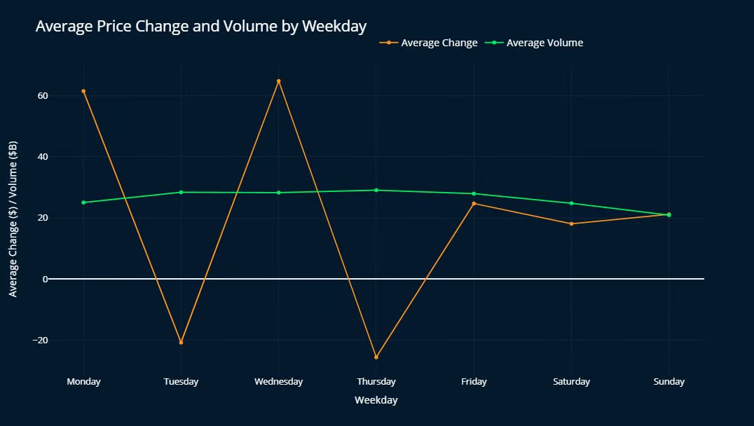
In terms of price changes, Mondays and Wednesdays show the strongest growth, while Tuesdays and Thursdays tend to exhibit small declines. Fridays and weekend days are more neutral, typically showing modest growth. Although the standard deviations are again significantly larger than the average values, this pattern holds across all market cycles, with only minor variations.
The average trading volume remains relatively steady at around $28B, except for a weekend dip that reaches its lowest point on Sundays (approximately $20B), with slightly lower values also observed on Saturdays and Mondays. This emphasizes the influence of global stock exchange times on Bitcoin trading.
When analyzing Bitcoin price changes by the day of the month, no consistent pattern emerges across all cycles. Each cycle displays unique behaviors, making it difficult to identify a general trend or recurring effect tied to specific days.
To ensure accurate monthly price changes, we first isolate the closing prices from the last day of each month. This subset is then used to calculate the price change compared to the previous month's close. Afterward, the calculated price changes are combined with aggregated monthly trading volume data for analysis.
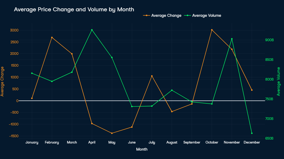
October and February stand out as the best months on average, with price increases of around $3,000. This is particularly notable given that nearly half of the dataset covers Bitcoin's early years, when the asset's value had not yet reached $3,000 (first achieved in October 2017). The only significant average price drops occur from April to June, with May experiencing the steepest decline (-$1,380).
April and November recorded the highest average trading volumes, each exceeding $900B USD. Interestingly, while April's high volume coincides with a price drop, November's elevated trading activity aligns with a significant price increase of $2,500. Lower trading volumes, such as in August, September, and December, are typically associated with more stable price movements, reflecting reduced market activity and volatility.
Finally, we will take a look at how moving averages can be used to apply a data-driven buying and selling strategy.
Note: This chapter is purely for educational purposes and should not be taken as financial advice.
Simple Moving Averages (SMAs) and Exponential Moving Averages (EMAs) are tools used to smooth out price fluctuations over a specified time period, helping traders identify more stable trends in volatile markets. SMAs calculate the average price over a fixed number of periods, giving equal weight to each period, while EMAs assign greater weight to more recent prices, making them more responsive to recent market changes.
Crossover strategies involve observing the interaction between two moving averages—typically one with a shorter time period and one with a longer time period. The golden cross occurs when a short-term MA crosses above a long-term MA, signaling a potential bullish trend, and it’s traditionally seen as a buy signal. Conversely, the death cross happens when a short-term MA crosses below a long-term MA, indicating a possible bearish trend, and it’s viewed as a sell signal.
These crossovers are widely regarded as reliable indicators in trading due to their ability to reflect shifts in market momentum. For an asset as volatile as Bitcoin, selecting appropriate moving averages for cross strategies involves balancing sensitivity (to capture trends early) with stability (to filter out noise). This is why a hybrid approach with differently defined buying and selling signals can be useful.
Bitcoin has historically exhibited long-term positive growth, which is why it makes sense to focus on longer time periods as buying signals. As a consequence, medium-to-long-term moving averages, such as the 50-day and 200-day SMAs, are a good fit for the golden cross. They help capture sustained upward trends while filtering out short-term noise, ensuring traders enter positions during more reliable bullish phases.
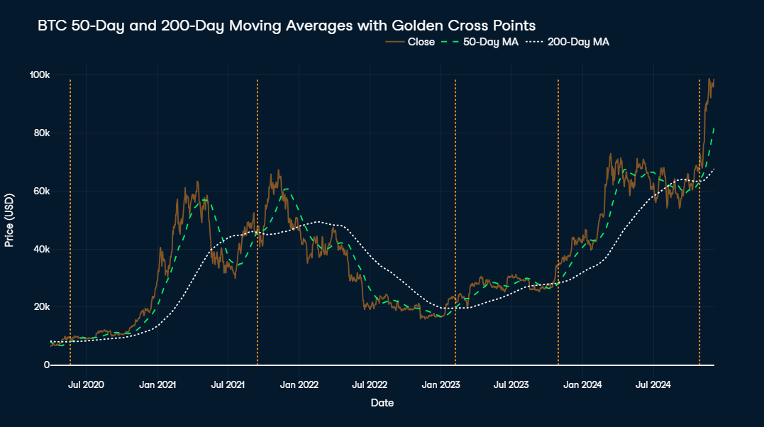
The visualization displays the 50-day and 200-day moving averages of Bitcoin alongside its actual price from mid-2020 to the present. The white dotted line represents the 200-day MA, the green dashed line shows the 50-day MA, and the orange line depicts Bitcoin's actual price. Golden crosses, where the 50-day MA overtakes the 200-day MA, are marked by orange vertical lines on the chart.
At first glance, the golden cross strategy appears effective, as all five occurrences were followed by significant price increases. For instance, the latest golden cross on October 28, 2024, at a price of $69,892, preceded a 40% increase within just one and a half months.
However, the timing of the subsequent peak, which would have been an optimal point to sell, varies widely, ranging from 1.5 months to 1.5 years. The buying signal in September 2021, for example, was followed by a value increase of 40% as well after only 1.5 months, but after the subsequent bearish phase the price took over two years to come back to the buying price in September 2021.
While this approach could be refined further, it seems to be good enough for now. In the following, we will take a look at the other side of the coin—which is selling signals to look out for.
While finding a good time to buy seems to be quite straightforward, figuring out when to sell before the price drops seems to be a big challenge. During bearish periods, Bitcoin's volatility can lead to quick and steep losses if signals are delayed. Accordingly, one would assume that it is crucial to identify potential downtrends early to mitigate losses during periods of high volatility.
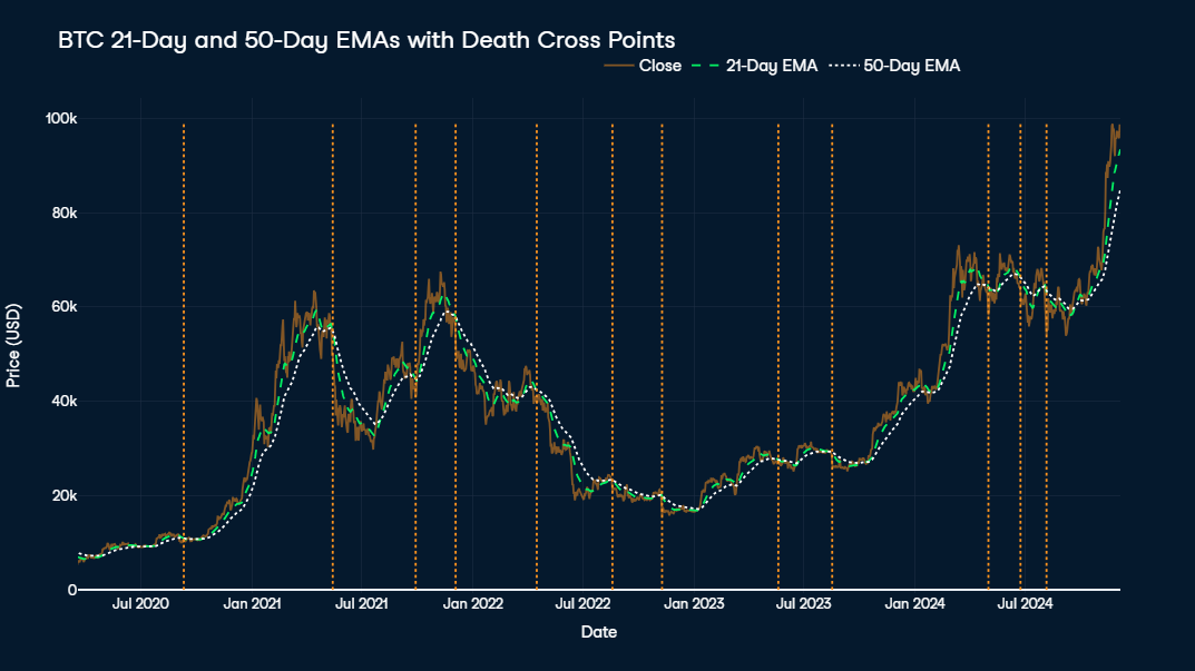
Therefore, in theory the death cross ideally should employ short-to-medium-term moving averages, such as the 21-day and 50-day EMAs. Nevertheless, if we take a look at the visualization between mid-2020 and now, we see too many selling signals, some of which are at very unfortunate points of time, for example in September 2020 or August 2023, just at the start of bigger price rallies.
The traditional concept of the death cross, aimed at avoiding short-term losses, may not deliver optimal results for a highly volatile asset like Bitcoin, which has shown a strong long-term upward trend. Assuming this trend continues, the strategy could be refined by introducing additional conditions, such as selling only when the price has risen x times above the average buying price. Alternatively, other measures, including supply-based indicators or momentum analysis, might provide more accurate sell signals tailored to Bitcoin's unique market behavior.
One of these momentum-oriented measures is the Relative Strength Index (RSI), which measures the speed and magnitude of price changes to identify overbought or oversold conditions. A high RSI, typically above 70, suggests that the asset is overbought and might be due for a correction, making it a valuable tool for identifying potential sell signals during price surges.
For taking into account the Bitcoin supply mechanism, taking a look at the ThermoCap Multiple can be useful. This metric evaluates the ratio of Bitcoin’s market cap to the ThermoCap, which tracks miner revenue over time. High ThermoCap Multiples often signal speculative bubbles, suggesting that the market may be overheated and a price correction is likely, making it a strong indicator for long-term sell signals.
Finally, Reserve Risk quantifies the confidence of long-term holders relative to the current price. High Reserve Risk indicates excessive market optimism and a potential overvaluation, signaling that it may be an opportune moment to sell before a significant correction occurs.
This analysis highlights key insights derived from Bitcoin's historical price data. From identifying seasonal patterns related to halving events to exploring micro-patterns in intra-day and calendar effects, we uncovered trends that provide context for Bitcoin’s price movements. For those interested in diving deeper or expanding the analysis, the full code is available in the accompanying DataLab notebook.
If you want to learn more about time series analysis, I recommend you check out the following resources:
Learn data science with these courses!
Track
Course
Course
Tutorial
Moez Ali
Tutorial
Karlijn Willems
Tutorial
Hugo Bowne-Anderson
Tutorial
Aditya Sharma
code-along
Maham Khan