
Track
Design in Power BI
4 hr
Dashboards sit between a question and a decision. When they work, teams answer “What changed?” in seconds and move. When they don’t, people hunt through tabs and make guesses about their data.
In this tutorial, I will cover the basics of dashboard design: what a dashboard is (and isn’t), how to arrange information so someone can scan it at a glance, which charts and labels carry the load, and where context belongs. We’ll also look at patterns by domain and a build process you can reuse.
If you're looking for some hands-on, practical learning, I recommend checking out the Dashboard Design Concepts course. You might also want to master either the Power BI Fundamentals or Tableau Fundamentals.
A dashboard is a single screen that brings together a small set of metrics, along with enough context to support a decision. It turns raw tables into ranked lists, small trends, and clear status, so people know where to look first and what to do next.
It gives a shared view of performance, so teams talk about the same facts. To put it simply, it shortens the time from “What’s going on?” to the next action, such as raising a ticket, calling a customer, rerouting inventory, or adjusting spend.
Most dashboards start from a recurring question (for example, “Are sign-ups on pace?”). They answer it once, keep the data fresh, and reuse it regularly.
The path from data to action is simple:
collect → clean → model → transform → encode.
The last step maps numbers to the right charts and labels so the intent is obvious, such as units, targets, comparisons, or time windows.
Dashboards are more effective when they read like a short story. Give users a setup, a change, and a next step.
Easy, right?
Stories work because people tend to remember sequences better. If the screen tells them what changed and why, they stop hunting through charts and start acting.
Let’s exemplify this approach with the following dashboards:
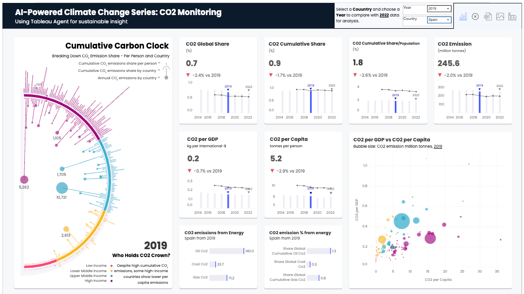
Screenshot of Tableau Public. Dashboard by Harim Jung
This dashboard guides decisions by:
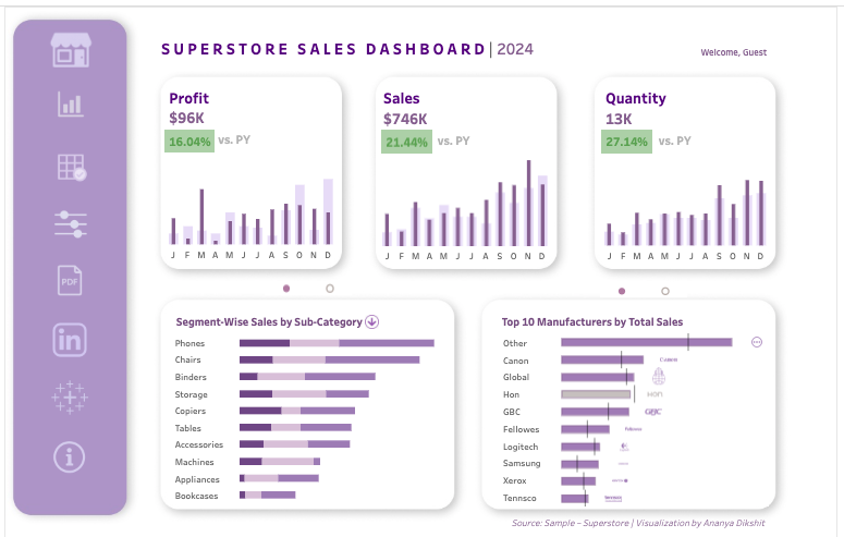
Screenshot of Tableau Public. Dashboard by Ananya D.
This dashboard helps users by:
Remember to keep the arc tight: What changed? → Why? → What do we do now?
For more inspiration, make sure to take a look at these Power BI dashboard examples.
Dashboards appear in any place where routine choices depend on fresh data. For example:
Each dashboard should give clear outcomes: reassigning the night shift, calling aged invoices, reordering stock for the morning flight, or shipping a small fix. Good design makes the next action obvious.
Strong dashboards don’t start with charts but with structure. A few decisions about layout, color, and type determine whether people can scan the page and take action. For a one-page checklist that aligns with these principles, refer to the Dashboard Design Checklist.
People tend to read what’s heavy, close, and high-contrast first. In left-to-right languages, they usually scan in a Z: top-left → top-right → bottom-left → bottom-right. Put the critical numbers on that path, especially at the start.
Image by Author
Another important concept to keep in mind is the inverted pyramid model, which structures your dashboard into three distinct layers, based on urgency:
The layout refers to how you arrange your charts and data on the screen to make sure the most essential information is easy to find and understand. Use size and whitespace to signal priority, not as decoration.
One basic yet important rule is to keep a simple grid with even gutters. Aligned cards read as orderly and trustworthy. If you break the grid, however, the page will feel noisy, which slows scanning the content and hides what matters.
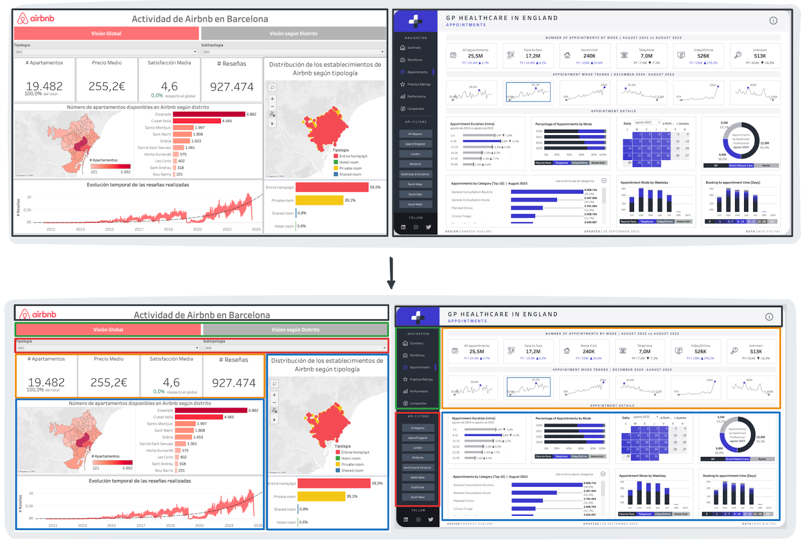
Image by Author
To reduce the mental effort required to interpret the data, grouping and UI hygiene are relevant. It is best practice to:
Next, we will go through two common page patterns: top-rail and left-rail layouts.
The top-rail layout consolidates navigation, filters, and key performance indicators into a horizontal header, dedicating the expansive space below to your main charts and detailed visualizations. It is the best choice when the first question is “Are we on track?”
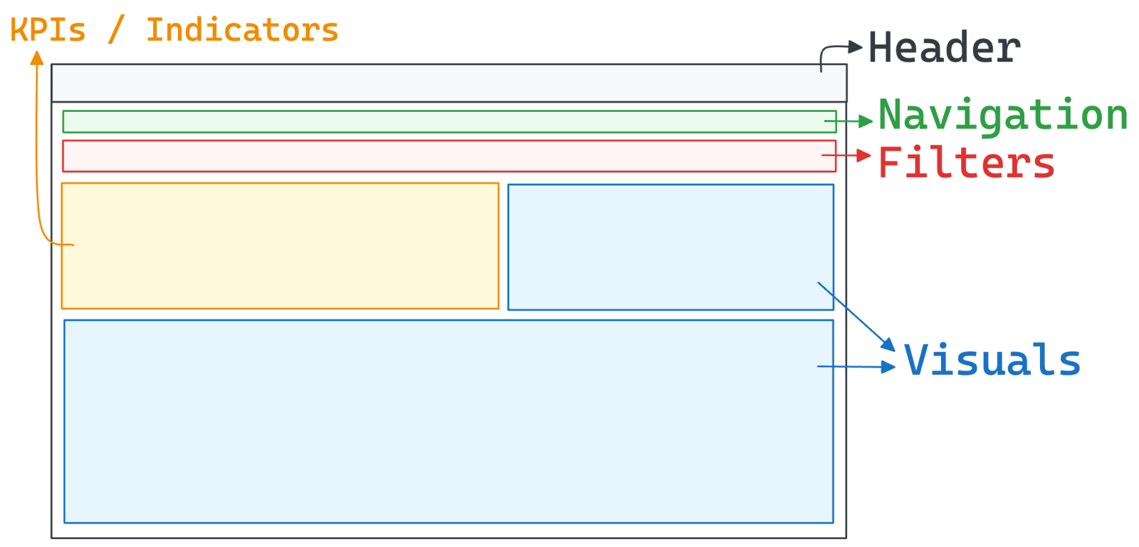
Image by Author
The sidebar layout organizes navigation and filters into a vertical column on the left, preserving the full width of the remaining screen for deep data analysis and complex visualizations. It is especially useful when people frequently switch views or need many filters.
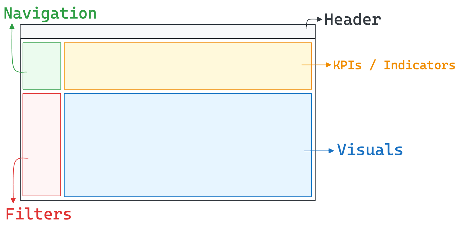
Image by Author
Use color as a signal, not as decoration.
Aim for accessible contrast and test dark/light themes early. If a chip, tag, or button fails contrast, users might miss it under time pressure.
Consistency lets people reuse what they learned on page one. Fix a grid, a spacing scale, and a component set. In an optimal dashboard, titles look the same everywhere, filters are located in the same spot, and legends behave the same way. Don’t surprise the user between tabs.
Make the rules explicit
Trim mental effort
Limit choices
Simplicity isn’t décor; it’s fewer decisions for the reader.
Different audiences have different questions and needs, which is why you should always ask yourself: Who opens the page, when, and why?
Tie these goals to dashboard design. The user’s specific cadence dictates your technical constraints, such as refresh frequency, tolerance for data lag, and level of detail. Similarly, the decision type determines the context you must provide, whether that means comparing against a target, historical data, or a specific cohort.
To validate your output, apply this simple test: if the dashboard can’t answer the team’s top two questions in ten seconds, it is too complex and should be rearranged.
Different problems call for different pages. You should match the type to the decision horizon and the user’s workflow. Here's a handy comparison table for your reference:
|
Dashboard Type |
Purpose |
User |
Cadence |
Design Priorities |
Example |
|
Analytical |
Root cause analysis |
Analysts |
Ad-hoc / Deep dive |
High interaction, filters, drill-downs |
Sales deep-dive |
|
Operational |
Live monitoring |
Shift Leads |
Real-time |
Low latency, big status, alerts |
Support wallboard |
|
Strategic |
Long-term steering |
Executives |
Quarterly / Monthly |
Comparisons, baselines, annotations |
KPI summary |
|
Tactical |
Daily execution |
Managers |
Daily / Weekly |
Actionability, progress vs. targets |
Campaign tracker |
|
Explanatory |
Storytelling |
General Audience |
As-needed |
Narrative, minimal controls |
Broad overview |
Let's look at an example of these principles with some examples.
Analytical dashboards are built for detailed exploration. This is why they extensively utilize interactive elements, such as filters, drill-downs, and range pickers. Due to their information density, using reset elements and keeping metric definitions one click away is advisable.
A classic example is a sales analysis board, where an analyst can slice revenue data by region or channel to uncover the root cause of a quarterly dip.
Screenshot of Tableau Public. Dashboard by ScatterPie Analytics
Operational dashboards are designed for monitoring live systems, requiring low latency and immediate clarity. The layout should prioritize big status indicators and clear ownership, often utilizing tiles or tables extended by sparklines to show rapid movement. To ensure instant action is triggered, alert rules must be explicit.
A typical use case is a customer support wallboard that displays open tickets, active agents, and breaches in red. This allows leads to spot issues and reassign work directly from the screen the moment a threshold is crossed.
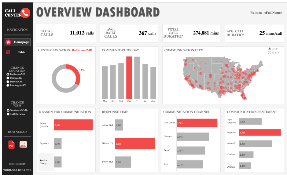
Screenshot of Tableau Public. Dashboard by Tobiloba Barbajide
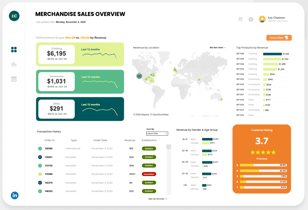
Strategic dashboards focus on tracking long-term outcomes to guide high-level decision-making, requiring a cleaner design with fewer, larger charts. Metrics should always be compared against baselines, such as the original plan, last year's performance, or current targets. It is also essential to annotate specific events, like product launches or outages, to help the viewer interpret sudden shifts in the data.
An example is a monthly executive summary showing KPI bands, such as sales profit and efficiency. By using top-level filters, executives can quickly flag misses against the plan and assign owners to address performance gaps.
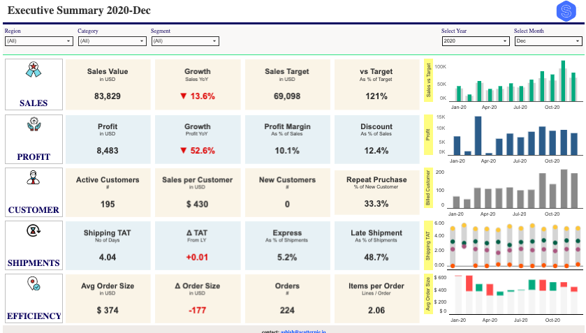
Screenshot of Tableau Public. Dashboard by ScatterPie Analytics
Tactical dashboards bridge the gap between high-level strategy and day-to-day execution, and are often utilized in daily or weekly workflows. Outcome metrics are displayed alongside work-in-progress, clearly showing targets, current progress, blockers, and owners. Because they are used frequently, the data needs to be refreshed often, and controls should be placed close to the data points.
A common example is a campaign tracker that monitors spend against caps alongside a table of creative performance. By visualizing a backlog of experiments with owners and due dates, the team can adjust bids or shift focus immediately during their daily stand-up.
Screenshot of Tableau Public. Dashboard by Hazem Elseify
Explanatory dashboards are distinct in that they communicate a clear, pre-defined story to a broad audience, rather than inviting open exploration. Since they follow the principle of "one question and one answer" per screen, interactive controls should be kept to a minimum.
Use annotations, step-through sections, and educational comparisons (like "before/after") to guide the viewer through the narrative.
For instance, a country overview might use an annotated map as the hero image, supported by small panels for key breakdowns, such as age or region. This layout enables non-specialists to scan the information and understand the core story in under a minute.
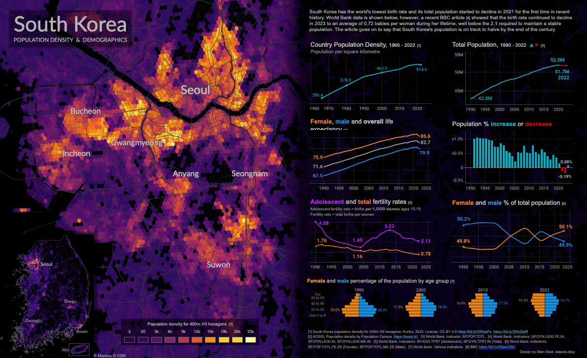
Screenshot of Tableau Public. Dashboard by Marc Reid
Below, I've outlined some tips to help you ship a page that answers real questions and isn't just a gallery of charts. The advice focuses on a small scope, quick loops, and clear owners.
Every successful dashboard starts with a clear understanding of its purpose and the needs of its users. This is why you should always start with people. It means taking notes of the potential users of the dashboard and understanding their needs and requirements.
To make it easy, follow these steps:
Pick a small set of KPIs that predict future performance, supported by a few “helper” metrics. Avoid cluttering the dashboard with too many lagging indicators. For each metric you select, create a standardized definition entry to ensure trust and accuracy. This documentation should include:
Next, structure the KPIs so they’re easy to read:
Additionally, remember the data hygiene. To keep trust in the data high, follow these best practices:
Planning the dashboard layout is all about making it scannable.
The top-left card answers “good or not?” Everything else explains “why”.
The goal of visual elements is to present information efficiently. Pick charts based on the data, not for variety.
To match your data to the right visual, you can refer to this table:
|
If you want to show... |
Use this visual |
Design Note |
|
Change over Time |
Line chart or Sparkline |
Add a shaded "target band" to show expected range. |
|
Ranking |
Horizontal Bar chart |
Sort by value (descending) to make the winner obvious. Easier to read labels than vertical columns. |
|
Operational Detail |
Table |
Freeze key columns for scrolling. Add sparklines within rows to show trends. |
|
Part-to-Whole |
Stacked Bar chart |
Caution: Use Donuts only if you have 2–3 slices max. |
|
Spread / Distribution |
Histogram or Box Plot |
Great for spotting outliers. |
|
Relationship |
Scatter Plot |
Add a trend line (fit) to make the correlation obvious. |
|
Progress vs. Goal |
Bullet Chart |
Compactly displays actual value, target line, and qualitative bands (poor/good/great). |
|
Geography |
Choropleth or Dot Map |
Use choropleths (shaded regions) for rates/ratios and dot maps for specific counts. |
Keep legends immediately next to their corresponding charts to minimize eye movement, and rely on compact KPI cards to display your top-headline numbers. To ensure critical updates stand out, use visual badges or colored pills for status alerts rather than burying them in rows of text.
To see this flow being applied to one of the leading visualization tools, feel free to check out this blog on how to create a dashboard in Tableau and our code-along with dashboard design in Power BI.
People tend to act faster when the headline numbers are obvious and self-explanatory. Give the few KPIs that matter the most in real estate, then make every label and comparison do a bit of work.
Another pro tip to keep the interface clean is to tuck definitions and formulas behind a consistent info icon.
Ship the dashboard, watch real people use it, and tighten the parts that slow answers. Keep the loop short and visible. This iteration cycle is a good practice:
Most broken dashboards fail for the same reasons: too much on the page, the wrong chart for the job, and numbers without context. Fix those first, so your dashboard is a tool rather than a distraction.
A crowded page slows reading and invites guesswork. Here’s an example of an overcrowded dashboard:
When users are bombarded with too many widgets, they struggle to distinguish signal from noise. To fix this, apply the concept of “data-ink ratio”: remove anything that isn’t essential to the message. Here’s how to reduce the noise:
Bad matches create bad reads. Avoid these common mistakes that distort data:
A single number answers nothing on its own. To make a metric actionable, frame it with the following four layers of context:
Inconsistency forces users to re-learn every card. Once a rule is established, you should make sure it is followed everywhere.
Dashboards are tools. If they don’t fit the job, they gather dust.
Cut clutter, match the chart to the question, add context, stay consistent, and watch people use the page. That’s the work.
Build dashboards that work whether used with a mouse, keyboard, and screen reader, and in different environments ranging from bright offices to dim laptops.
Always keep in mind to design for differences in vision, motor control, and memory: use plain language, predictable layouts, and big touch targets.
One thing that needs to be ensured is that the data is visually clear. The dashboard needs to be readable for users with color blindness or low vision.
The dashboard has to be keyboard-operable as well. To achieve it, pay attention to the following:
Finally, ensure screen reader support using these best practices:
Good dashboard design shortens the gap between a question and the next action. In this article, I've introduced the basics (what a dashboard is), the craft (hierarchy, color, type, consistency), common traps, and patterns for different dashboard types.
The key takeaways are that it is essential to keep the user’s goal visible at all times, write for different abilities, and design for speed.
Tools will change, AI will continue to propose views, but the job stays the same: turn messy data into a clear decision on one screen.
To keep learning and put this into practice, I recommend these resources:
Dashboard Design Courses
Track
Course
Course
blog
Anuj Syal
13 min
blog
Flavio Matos
14 min
blog
Eugenia Anello
8 min
blog
DataCamp Team
code-along
Iason Prassides
code-along
Carl Rosseel