Course
Tableau has earned its place as one of the top tools in business intelligence and data visualization, helping companies turn messy data into meaningful insights.
Gartner® published the 2024 Magic Quadrant™ for Analytics and Business Intelligence Platforms, and Tableau has been recognized as a Leader in this category for 12 consecutive years.
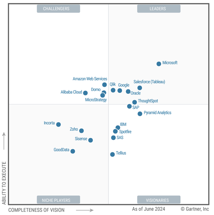
Tableau is placed as a leader in the Gartner® 2024 Magic Quadrant™. Source: GCP
Whether you’re a junior analyst just getting your feet wet or a senior looking to level up, there’s always something new to explore with Tableau.
In this article, I’ll walk you through real-world examples, key design principles, and some advanced features that can help you get the most out of your dashboards.
If you're just beginning to learn about Tableau, I suggest checking out the Introduction to Tableau course and Tableau Tutorial for Beginners.
Real-World Examples of Tableau Dashboards
Let’s kick things off with some real-life use cases that show just how versatile Tableau can be.
Healthcare data analytics
In healthcare, data is everywhere—patient records, lab results, billing, compliance reports—you name it. Tableau helps healthcare organizations make sense of all this information. For example, hospitals use dashboards to monitor patient demographics, track average length of stay, flag high-risk patients, and ensure they’re hitting critical compliance metrics.
A great example is NYU Langone Health, which uses Tableau dashboards to monitor and improve care quality across departments.
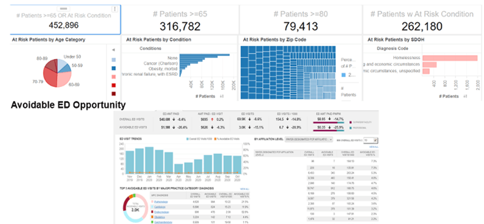
The NYU Langone High Risk Care Coordination dashboard reports on cases for patients with at-risk conditions. Source: Tableau
The medical center NYU Langone Health has utilized data analysis and descriptive analytics to improve the quality of patient care and experience. When planning out their vision for the future, they wanted to make data accessible and applicable to physicians and clinical leadership. They believe this would maximize productivity and collaboration in order to achieve better outcomes for patients.
NYU Langone did this by creating dashboards in Tableau. These dashboards allow users to easily sort and filter information. More than 100 dashboards use over 800 key performance indicators to track and analyze factors, including:
- Operational analytics like hospital resource capacity
- Patient census and lengths of stay
- Financial performance
- Industry trends
These dashboards offered NYU Langone a large number of data points. By using descriptive analytics, they were able to utilize all of that data to understand what had happened internally, among patients and employees, and externally, in the healthcare industry and with their competitors. Finding trends and insights from that data helped them make better decisions moving forward.
If you want to learn more about dashboards, I suggest enrolling in the Creating Dashboards in Tableau course and checking out the How to Create a Dashboard in Tableau tutorial.
Sales performance monitoring
Sales dashboards are some of the most common—and powerful—use cases in Tableau. They help teams track performance in real-time and make smarter decisions based on actual data, not gut instinct.
A well-built sales dashboard brings all your key metrics together in one place: revenue trends, profit margins, sales pipeline, conversion rates, and customer segmentation, to name a few. This makes it easy to monitor overall performance and drill into specifics when needed, like identifying which products are underperforming or which regions are exceeding targets.
One great use case is PPC (Pay-Per-Click) campaign dashboards. If you’re running ads across Google, Meta, LinkedIn, or other platforms, it can be tricky to make sense of it all. A Tableau dashboard can pull in that data and visualize key metrics like cost per click (CPC), click-through rate (CTR), conversion rate, and return on ad spend (ROAS). This helps marketing and sales teams see what’s working, what’s burning budget, and where to focus ad spend.
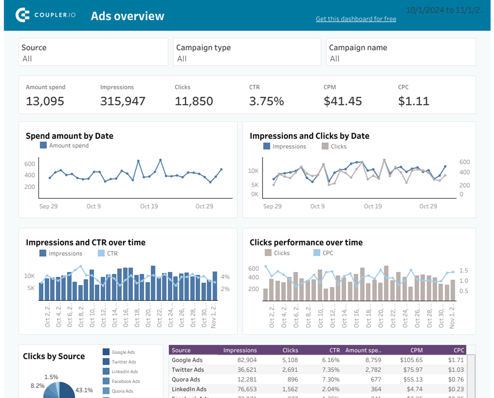
Example of a PPC multi-channel dashboard. Source: Coupler.io
Another popular example is the Superstore Sales Dashboard—a classic in the Tableau world. It shows how sales and profit break down by region, category, and sub-category, with filters for time, product, and customer segment. It’s simple, but incredibly effective at helping sales managers keep a pulse on business performance and spot trends early.
In short, Tableau lets you move past static reports and into dynamic, data-driven selling. Whether you're looking at daily numbers or high-level KPIs, dashboards give your team what they need to take action—fast.
If you want to get hands-on, check out the Data Visualization in Tableau course.
Crime mapping and public safety
Tableau’s mapping capabilities make it a powerful tool for visualizing crime data and improving public safety. Law enforcement agencies use dashboards to identify crime hotspots, monitor trends over time, and allocate resources more effectively.
One example is the Crimes in India dashboard, which brings together geographic crime data to help policymakers and citizens better understand where and when different types of crimes are happening. These visual insights can lead to smarter prevention strategies and more efficient patrols.
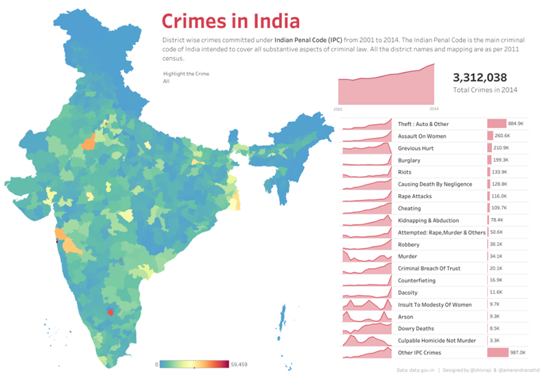
“Crimes in India” dashboard helps spot crime hotspots and track trends over time. Source: Tableau Public
Industry-Specific Applications and Case Studies
Now let’s zoom in on how specific industries are using Tableau to drive real impact.
Sports analytics: Trajektory’s sponsorship valuation
In the sports world, data is king—not just for athletes, but also for the business side of things. Trajektory helps sports teams and sponsors measure the true value of sponsorship assets. Using Tableau dashboards, they analyze ticket sales, TV viewership, social media engagement, and more to estimate the ROI of sponsorship deals.
With these insights, teams can make data-backed decisions about pricing, negotiating, and activating partnerships.
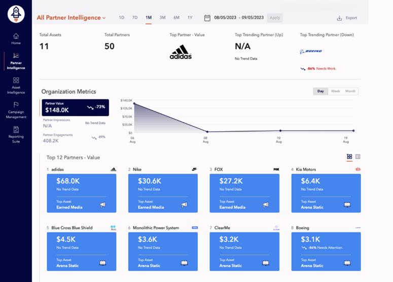
Example of a Tableau dashboard template by Trajektory. Source: Trajektory
Telecommunications: Verizon’s customer experience optimization
Verizon, one of the biggest names in telecom, uses Tableau to enhance the customer experience. By analyzing call center data, technician dispatch records, and customer feedback, Verizon built dashboards that help reduce customer service call volume and improve technical dispatch efficiency.
The result? Happier customers, faster resolutions, and smoother operations.
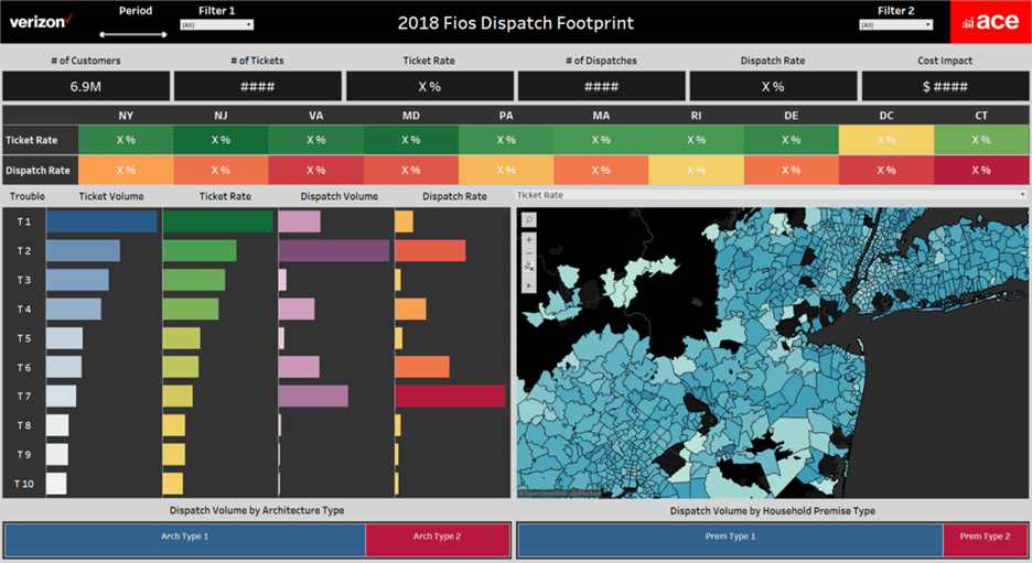
Verizon’s ticket management dashboard. Source: Tableau
Retail: Carter’s Inc. and supply chain resilience
Carter’s Inc. leaned on Tableau to navigate supply chain hiccups, using dashboards to enable faster decisions and build resilience across their operations.
Carter’s Inc., a leading children’s apparel company based in Atlanta, Georgia, embarked on a significant journey toward digital transformation and data literacy. Facing the immense challenge of managing 50 terabytes of enterprise data and shipping approximately 700 million units annually, Carter’s initiated a strategic shift to modernize its data infrastructure and analytics processes.
To cultivate data literacy across the organization, Carter’s established a Tableau CoE. This initiative focused on improving departmental data literacy, fostering comfort and enthusiasm in using data analytics technology. The CoE provided training and engagement programs, department-focused projects, and one-on-one sessions with data experts. This approach was particularly effective during the COVID-19 pandemic, enabling rapid adaptation to new supply chain and inventory management challenges.
When the pandemic hit, supply chains everywhere were thrown into chaos. Carter’s Inc., leaned on Tableau to weather the storm. By using dashboards to monitor inventory levels, supplier performance, and shipping timelines, Carter’s was able to stay agile, quickly identify disruptions, and keep products flowing to customers.
Design Principles for Effective Dashboards
Building a dashboard isn’t just about throwing charts on a page. It’s about creating an experience that helps users understand the story the data is telling.
If you want to get more familiar with Tableau, I recommend enrolling in the Tableau Fundamentals course.
Audience-centric layouts
Start with your audience. Who’s using the dashboard? What do they care about most? What questions are they trying to answer?
You should prioritize key information. For example, if your dashboard is for the HR team, put the most relevant KPIs—like headcount trends, turnover rate, or diversity metrics—in the center of the dashboard.
If it’s for Sales, you might lead with revenue performance, sales pipeline stages, or top-performing reps. Different roles need different stories.
Your dashboard should tell a story, and that means thinking about how people visually process information. A common rule of thumb is the Z-pattern for layout.
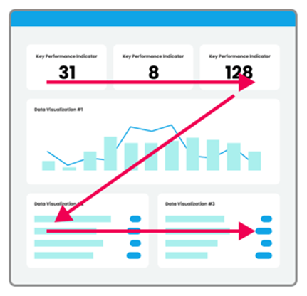
Illustration of a “Z-pattern” layout. Image by Seerinteractive
- Users scan from the top-left to the top-right, forming the top bar of the Z.
- Then, their eyes move diagonally to the bottom left. Here’s where you can place the most important chart.
- Finally, they scan left to right again along the bottom.
This pattern is useful for dashboards that aren’t too text-heavy and helps guide the eye naturally through the most important insights.
You can also support the data story by starting with high-level, aggregate numbers at the top—think BANs (Big Ass Numbers) like total revenue, highest-selling region, or average customer satisfaction score. Then, as the user scrolls or moves down the page, you can increase granularity: break it down by department, product, geography, or even individual customers or transactions.
Once you’ve nailed the narrative, it’s time to lay things out. Use clear, scannable cards for the most critical KPIs at the top. Group related visuals together so your audience can easily compare or dig deeper into related insights.
I’d strongly suggest not cram everything into one screen. It’s tempting to show off all the cool data, but too much info at once is overwhelming. Instead, focus on guiding users through a few strong, well-organized insights.
I think it’s worth mentioning that reducing cognitive load is key to a great user experience.
Here are a few ways to do that:
- Be consistent: Stick to the same font sizes, colors, alignment, padding, and number formats throughout your dashboard.
- Use color with intention: Color is powerful for highlighting key points or showing differences, but overusing it can be distracting. Avoid rainbow palettes or throwing in colors just because you can.
- Limit unnecessary decoration: Skip 3D charts, gradients, and clutter. Clean and simple wins.
At the end of the day, your goal is to build something intuitive. The less users have to think about how to use your dashboard, the more they can focus on what the data is telling them.
Interactive filtering and highlighting
One of Tableau’s biggest strengths is its interactivity. With filters, highlight actions, and dashboard actions, users can explore data in ways that matter to them, like toggling between years, drilling into product categories, or zooming in on a region.
Take the 2024 SDG Gender Index dashboard by Equal Measures 2030. Users can:
- Filter by SDG Goal to focus on a specific area.
- Click an indicator to get detailed info in the bottom pane.
- Select a country on the map to see data for that location.
This kind of interactivity makes dashboards feel alive. It also empowers your users—they’re not just passive viewers; they become active participants in the data story. The more they can engage, the more valuable your dashboard becomes.
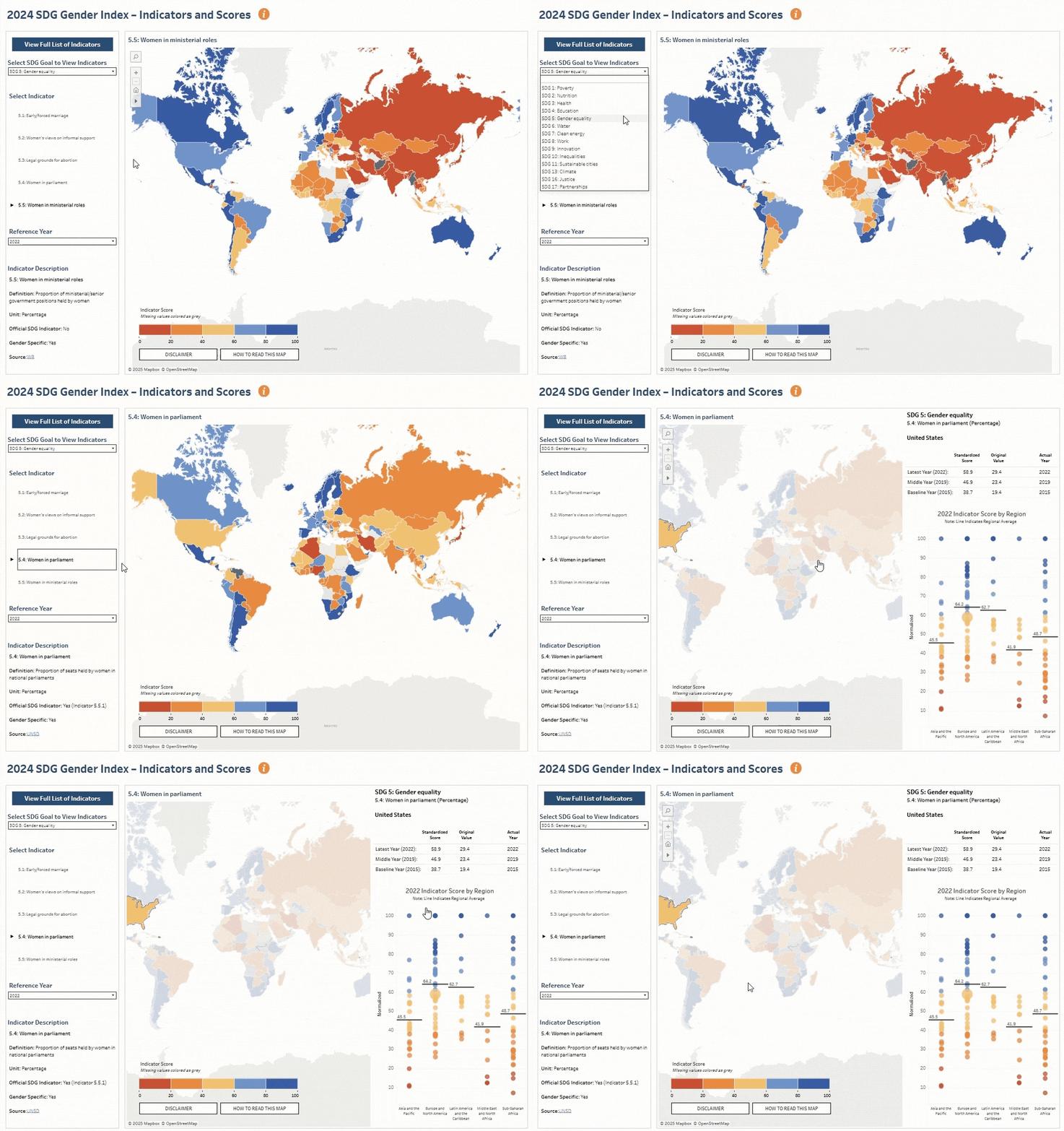
Dashboard interaction using filters and parameters. Source: Equal Measures 2030
Responsive design for multi-device access
Let’s be real, your dashboard won’t always be viewed on a big monitor. Users might open it on a laptop, a tablet, or even a phone. That’s why designing with responsiveness in mind is so important.
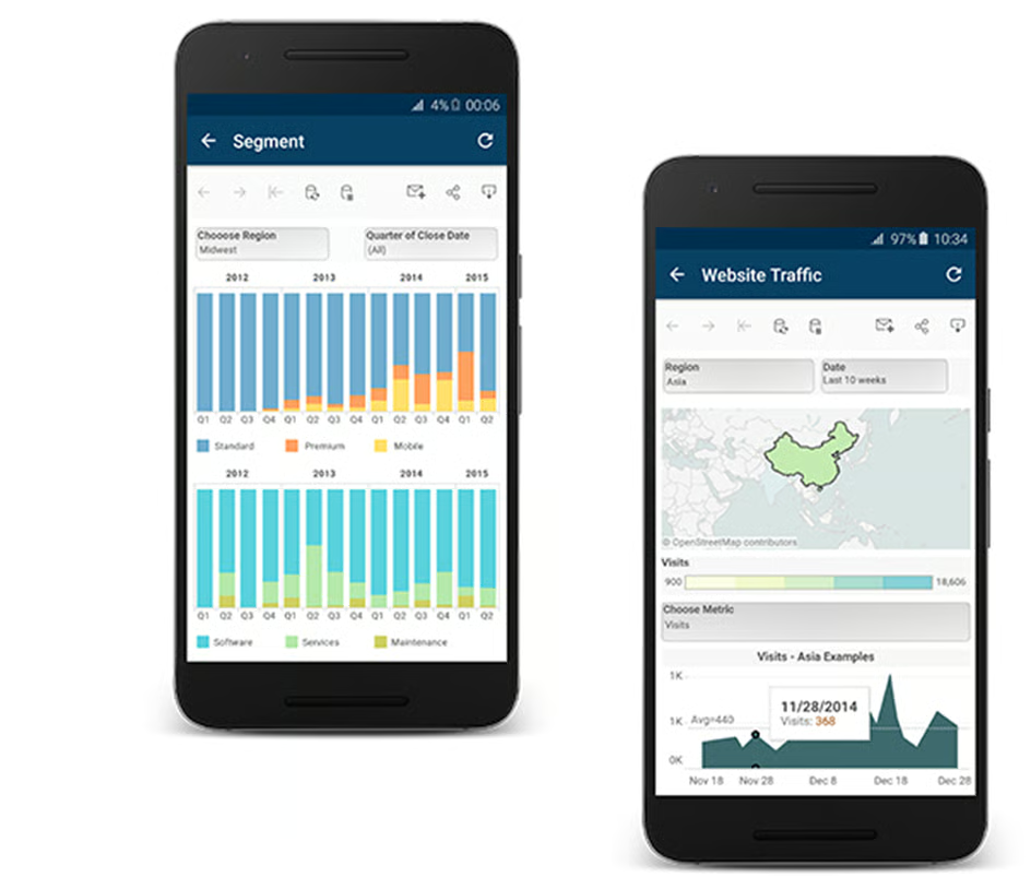
Your audience might consume your dashboard on a mobile phone. Source: Tableau
Tableau makes this easier with the Device Layout feature, which lets you create custom views for desktop, tablet, and phone. You don’t have to rebuild everything from scratch—just tweak how things display on smaller screens so they’re still readable and usable.
Each layout starts with the Default version, so make sure all filters, legends, and actions exist there first. Then you can adjust layouts as needed for smaller screens.
Need a quick setup? Use Auto-Generate Layout or click the unlock icon on the Phone layout to let Tableau auto-adjust based on the Default view.
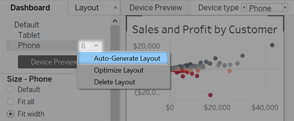
Save time with the Auto-Generate Layout option. Source: Tableau
It’s a good idea to test your dashboards across different screen sizes. What looks great on a wide screen might feel cramped or unreadable on a mobile device.
Keep layouts clean, avoid tiny fonts, and make sure interactive elements (like filters or dropdowns) are easy to tap.
At the end of the day, good design isn’t just about looks, it’s about making sure your dashboard works wherever your users are.
Technical Implementation and Advanced Features
Alright, now that we’ve talked about design, let’s get our hands dirty. This section is all about how dashboards actually work in Tableau, from connecting to data to adding advanced interactivity and predictive tools.
Building a dashboard: step-by-step workflow
Creating a dashboard in Tableau might feel overwhelming at first, but once you understand the basic flow, it becomes second nature. Here’s a simple breakdown:
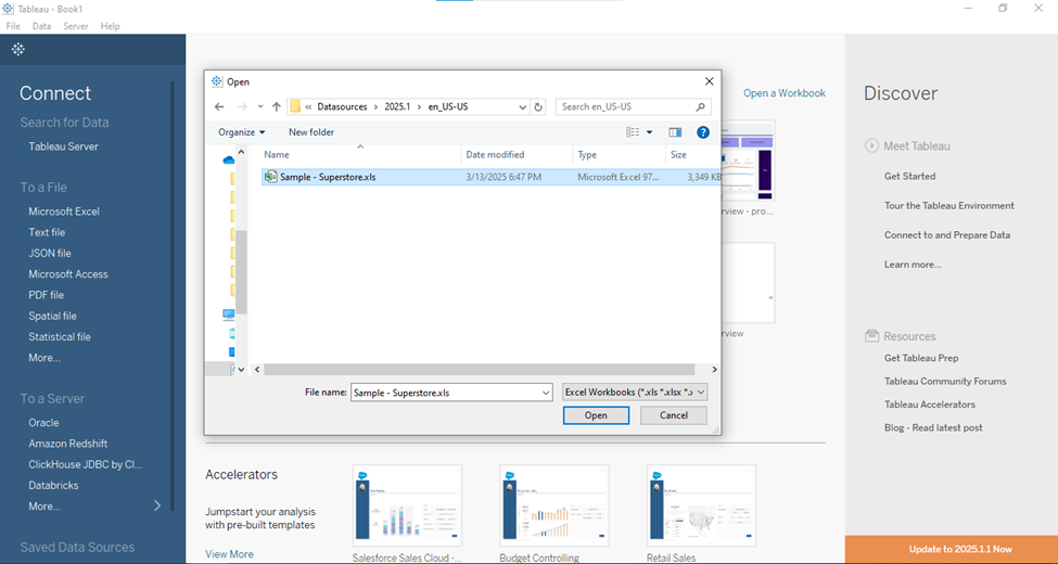
1. Connect to your data
Tableau works with just about everything—Excel files, databases, cloud services, and more. Just open Tableau Desktop, hit Connect, and choose your data source:
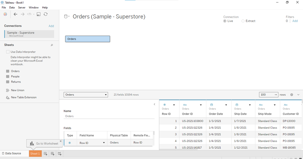
2. Prep your data (if needed)
Use Tableau’s built-in Data Source tab to clean things up. Rename fields, change data types, filter out information you don’t need—whatever it takes to get the data ready:
3. Build your worksheets
This is where the fun begins. Create different views like bar charts, maps, or line graphs—each one in its own worksheet. Try to keep each worksheet focused on a single idea or question:
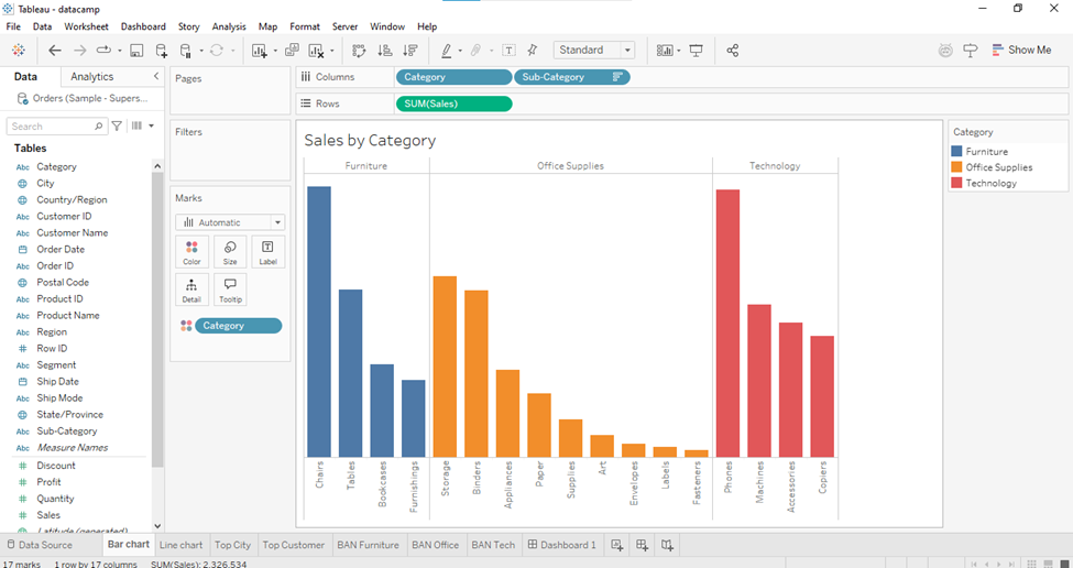
4. Assemble your dashboard
Head over to the Dashboard tab, drag in your worksheets, and arrange them like puzzle pieces. Add filters, legends, text boxes, and images as needed:
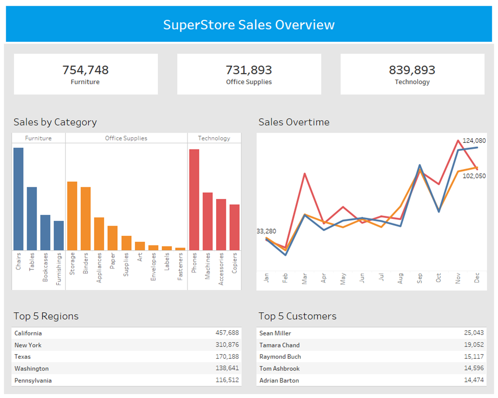
5. Add interactivity
Use actions to make the dashboard come alive. You can add filter actions (click a bar to filter another chart), highlight actions (hover to spotlight related data), or navigation buttons to guide users through the story.
6. Optimize performance
Keep things snappy by minimizing the number of filters, avoiding overly complex calculations, and hiding unused fields in the data pane. You can also check Performance Recording in Tableau to see what’s slowing things down. Go to Help > Settings and Performance > Start Performance Recording:
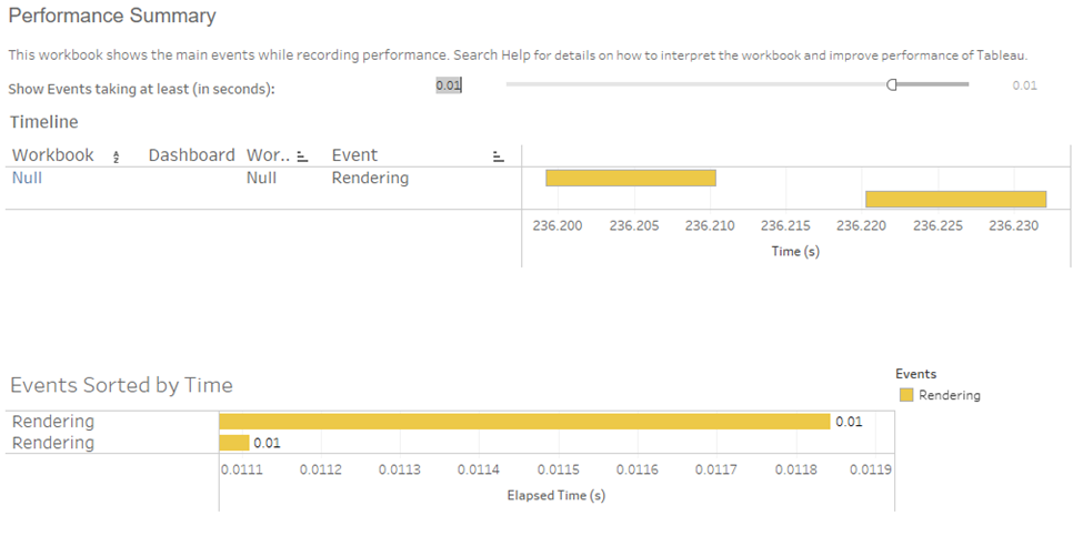
In short, it’s all about building solid worksheets, combining them into a clean layout, and adding just enough interactivity to keep things intuitive and engaging.
Dynamic zone visibility and navigation menus
Want to make your dashboards more dynamic? Use parameters and Boolean logic to show or hide sections of your dashboard based on user input. For example, you might create a toggle switch that reveals a detailed breakdown only when needed, or even hide advanced filters unless the user asks for them —no need to create multiple dashboards.
A brilliant example of this in action is the Periodic Table of Wine dashboard. It has a single parameter to let users translate the entire dashboard into different languages. Every title, label, and even tooltip updates instantly based on that one selection. It’s clean, efficient, and a great use of dynamic design.
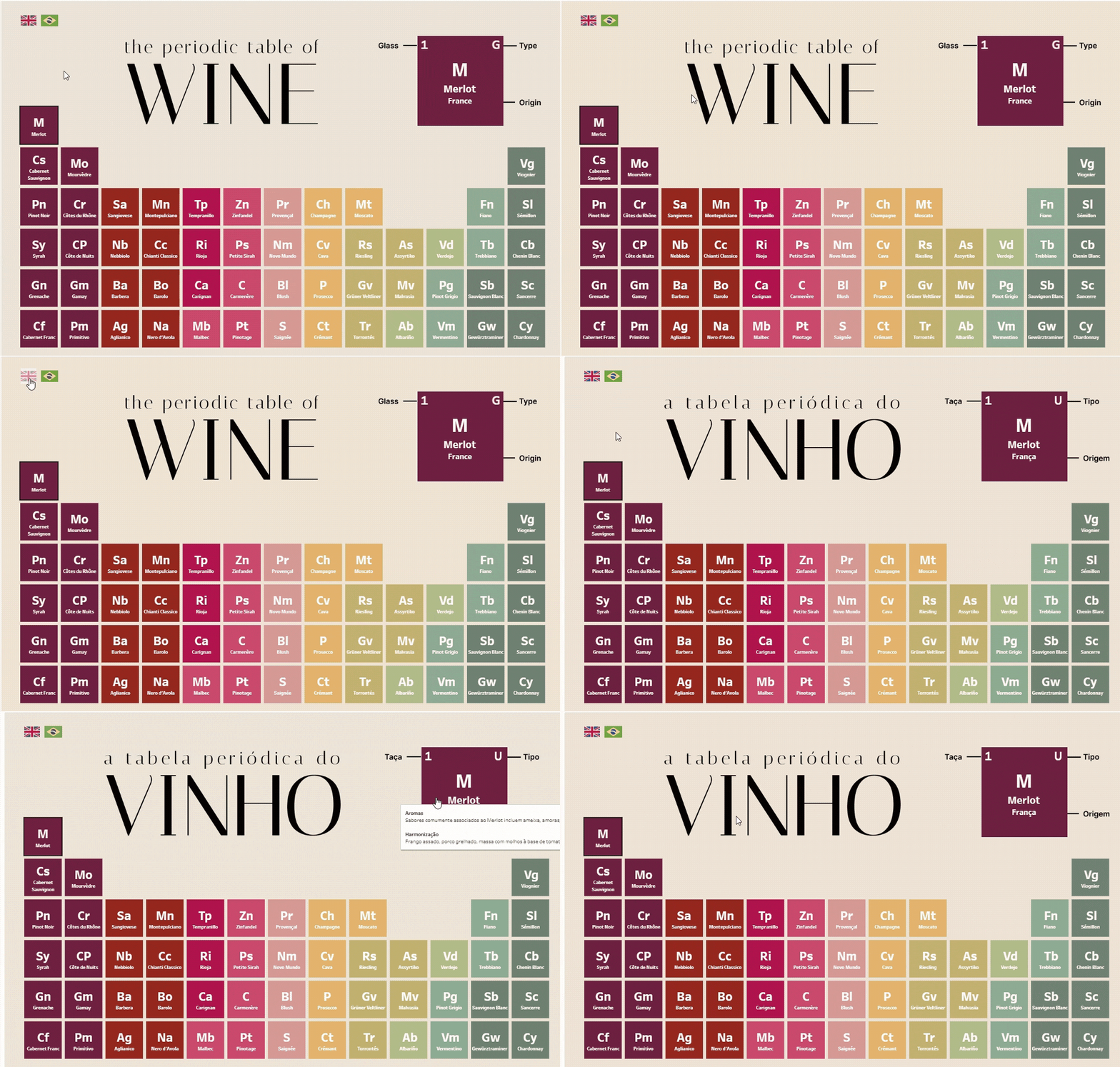
Periodic Table of Wine. Source: Flavio Matos
Navigation menus can also improve the user journey, allowing people to jump between different dashboard sections without getting lost. It’s a great way to guide your audience through a structured journey while keeping the interface tight and uncluttered.
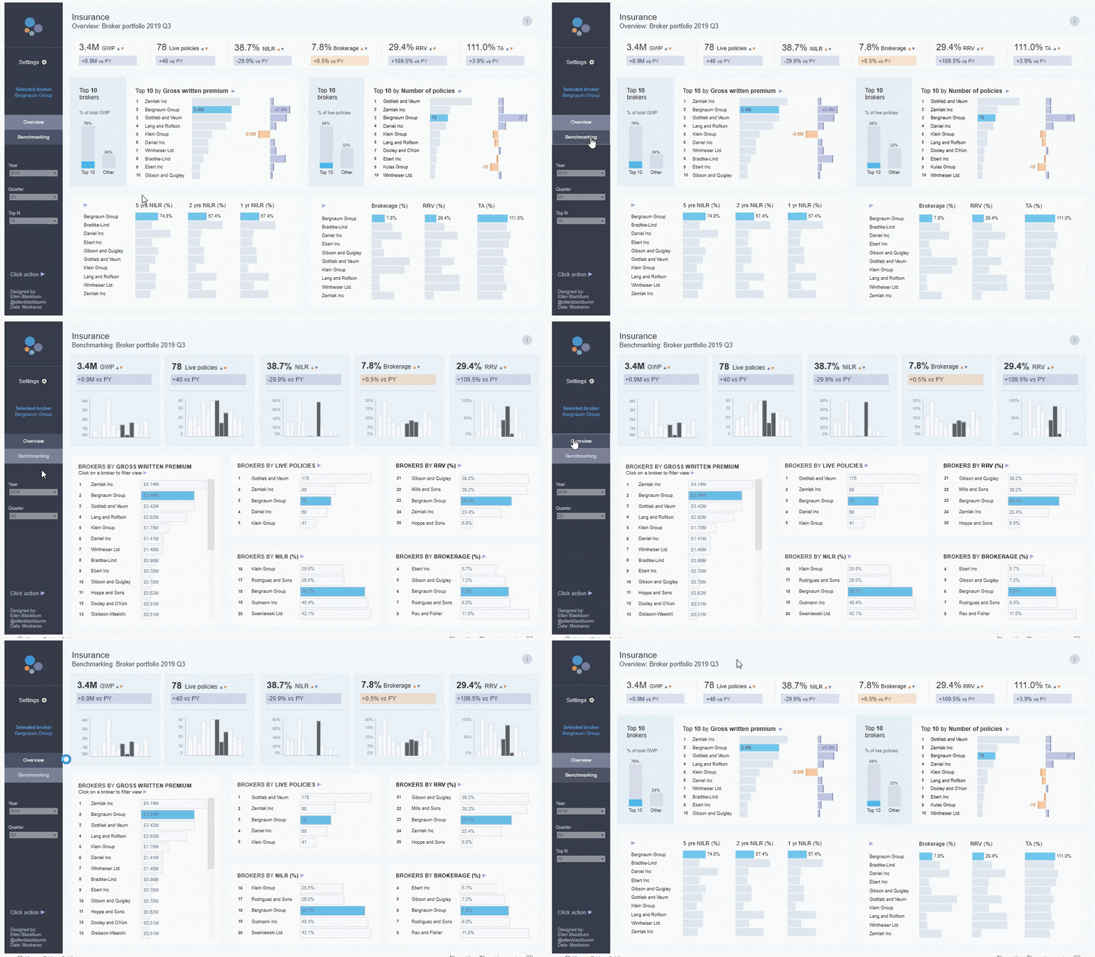
Example of Navigation buttons. Source: Tableau Public
Predictive analytics and explain data
Sometimes, your users don’t just want to know what happened; they want to know why, or what’s likely to happen next. That’s where Tableau’s built-in predictive features shine.
If you’re working with time series or trend data, Tableau lets you add forecast lines to your visualizations using built-in models like exponential smoothing. It’s quick to set up and super handy for things like projecting future sales, website traffic, or stock levels. You can add forecasts and trend lines straight from the Analytics pane. Just drag and drop options like Trend Line, Forecast, or Average Line right onto your viz. It’s a quick way to summarize your data or run simple predictive models.
Now, let’s talk about Explain Data—a lesser-known gem that feels like having a mini data analyst on call. When you click a data point and hit “Explain Data,” Tableau automatically runs an analysis to help uncover why that point might be an outlier. It’ll suggest potential drivers or correlations and even generate charts to back up the findings.
This feature is great when you're exploring data and something weird jumps out at you, but you're not sure what’s behind it. Instead of manually slicing and dicing the data, Explain Data does the digging for you. This can save hours of manual analysis and surface insights you might have missed.
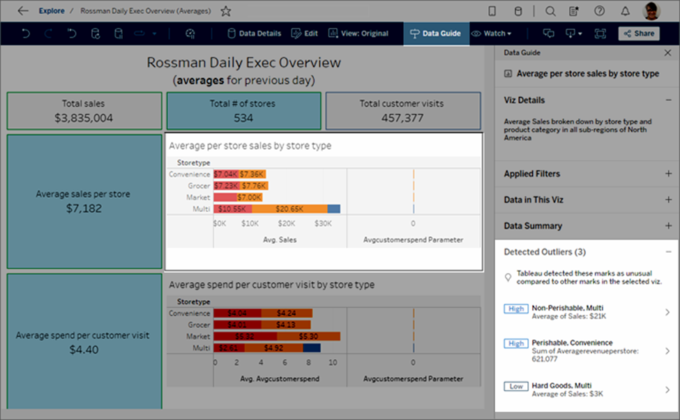
Example of Explain Data. Source: Tableau
To learn how to get the most out of your data and uncover valuable insights, check out the Analyzing Data in Tableau course.
Conclusion
We covered a lot, from real-world Tableau dashboard examples to smart design principles and advanced features like dynamic zone visibility and predictive analytics.
Whether you’re building dashboards for healthcare, retail, or anything in between, the key is to make your data work for your users. Keep it clean, keep it interactive, and always think about how someone will actually use it in the real world.
If you're ready to level up your Tableau skills even more, check out these Tableau courses and articles:
Become a Tableau Data Analyst
FAQs
What’s the difference between worksheets and dashboards in Tableau?
Worksheets are individual charts or visualizations. Dashboards combine multiple worksheets (and filters, legends, etc.) into one interactive view.
How do I optimize dashboard performance in Tableau?
Keep extracts lean, reduce the number of filters, avoid high-cardinality joins, and limit custom calculations. Also test performance in the Performance Recording tool.
Do I need to know coding to build advanced dashboards in Tableau?
Nope! Most features are drag-and-drop. But if you want to go deeper, using calculated fields, parameters, and Tableau’s built-in functions can give you a lot more power—without needing to code.
What industries use Tableau dashboards the most?
Pretty much all of them. From healthcare and retail to public safety and sports, Tableau dashboards help teams track performance, spot trends, and make data-driven decisions.
Where can I find good examples or templates of Tableau dashboards?
Tableau Public is a goldmine! You can explore dashboards by category, industry, or topic—and even download the workbook to reverse-engineer how it was built.
Hey there! I'm a data analytics consultant, writer, and data visualization expert with 5+ years of experience. I’ve worked across various industries, delivering impactful insights and building effective data solutions. Passionate about learning and sharing knowledge, I aim to drive positive change through data analytics and visualization.


