Course
Introduction to R
4 hr
3M
Take a Sentimental Journey through the life and times of Prince, The Artist, in part Two-A of a three part tutorial series using sentiment analysis with R to shed insight on The Artist's career and societal influence. The three tutorials cover the following:
If you would like to learn more about sentiment analysis, be sure to take a look at our Sentiment Analysis in R: The Tidy Way course.
Did you know that Prince predicted 9/11, on stage, three years before it happened? He may have also predicted his own death. Could this be true? Wouldn't it be interesting to examine his lyrics and make an educated judgment call on your own? On April 21, 1985, he recorded "Sometimes It Snows In April". He died exactly 31 years later on April 21, 2016. Take a look at his choice of words in the sentiment analysis of this song:
This gives new meaning to Predictive Analytics!
Each piece of code is followed by an insight that is typically subjective in nature. Feel free to move from section to section making your own assumptions if you prefer! I recommend reading the following introduction, but if you would like to jump straight to the code, click here. If you already understand the concept behind lexicons, you can take the fast track by going directly to the detailed analysis section.
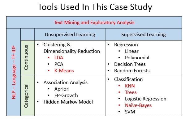
I just rescued two kittens and a puppy, so I think in threes now. Plus, the rule of three is a writing principle that suggests that things that come in threes are inherently funnier, more satisfying, or more effective than other numbers or things - which is why I broke this up into three parts... So, in Part One, you were introduced to text mining and exploratory analysis using a dataset of hundreds of song lyrics by the legendary artist, Prince. In Part Two, you will focus on sentiment analysis (Two-A) and topic modeling (Two-B) with NLP. Part Three will conclude with additional predictive analytic tasks using machine learning techniques addressing questions such as whether or not it is possible to determine what decade a song was released, or more interestingly, predict whether a song will hit the Billboard charts based on its lyrics. Throughout these tutorials, you will utilize different machine learning algorithms - each highlighted in red in the graphic below.
Yes, I committed to just three parts, but I decided to break up Part Two into Two-A (Sentiment Analysis) and Two-B (Topic Modeling - soon to follow), resulting in four distinct tutorials. There are many great articles and courses on the process behind sentiment analysis, so the goal in Part Two-A is to focus on deriving insights from the analysis - not just writing the code. You'll use Prince's lyrics as an example, but you can apply the steps to your own favorite artist. Your journey through the complete tutorial series will hopefully fuel a sense of wonder about the opportunities offered by lyrical analysis while being introduced to Natural Language Processing (NLP) and machine learning techniques.
Part Two-A of this tutorial series requires a basic understanding of tidy data - specifically packages such as dplyr for data transformation, ggplot2 for visualizations, and the %>% pipe operator (originally from the magrittr package). You will notice that several steps are typically combined using the %>% operator to keep the code compact and reusable.
As this tutorial is also a case study, it is densely packed with visualizations beyond the commonly used graphs and charts. As a result, another prerequisite is to be able to install new packages in your own environment. In order to focus on capturing insights, I have included code that is designed to be reused on your own dataset, but detailed explanation will require further investigation on your part. Supporting links will be provided for each package. This will expose you to new tools while focusing on their application.
Tip: read Part One first in order to have a foundation for the tutorial series and insight into the dense and diverse vocabulary of Prince's lyrics.
Methods: Sentiment analysis is a type of text mining which aims to determine the opinion and subjectivity of its content. When applied to lyrics, the results can be representative of not only the artist's attitudes, but can also reveal pervasive, cultural influences. There are different methods used for sentiment analysis, including training a known dataset, creating your own classifiers with rules, and using predefined lexical dictionaries (lexicons). In this tutorial, you will use the lexicon-based approach, but I would encourage you to investigate the other methods as well as their associated trade-offs.
Levels: Just as there are different methods used for sentiment analysis, there are also different levels of analysis based on the text. These levels are typically identified as document, sentence, and word. In lyrics, the document could be defined as sentiment per decade, year, chart-level, or song. The sentence level is not usually an option with lyrics as punctuation can detract from rhymes and patterns. Word level analysis exposes detailed information and can be used as foundational knowledge for more advanced practices in topic modeling.
Every data science project needs to have a set of questions to explore. Here are a few to keep in mind as you work through this tutorial: is it possible to write a program to determine the mood expressed in lyrics? Are predefined lexicons sufficient? How much data preparation is necessary? Can you link your results to real-life events? Does sentiment change over time? Are hit songs more positive or negative than uncharted songs? What words stand out in the lyrics during the year Prince was said to predict 9/11? Did he predict his own death?
Tip: lyrical analysis is very different and typically more complex than speeches or books, making it difficult to capture insights, so remember to be cautious of all assumptions! I will propose more questions than answers in this tutorial, so be prepared to think outside of the quadrilateral parallelogram!
To get started analyzing Prince's lyrics, load the libraries below. These may seem daunting at first, but most of them are simply for graphs and charts. Given the frequent use of visuals, it's preferable to define a standard color scheme for consistency. I've created a list using specific ANSI color codes. The theme() function from ggplot2 allows customization of individual graphs, so you will also create your own function, theme_lyrics(), that will modify the default settings. The knitr package is an engine for dynamic report generation with R. Use it along with kableExtra and formattable to create attractive text tables with color. Again create your own function, my_kable_styling() to standardize the resulting output of these libraries. I will mention the other packages as they are utilized.
library(dplyr) #Data manipulation (also included in the tidyverse package)
library(tidytext) #Text mining
library(tidyr) #Spread, separate, unite, text mining (also included in the tidyverse package)
library(widyr) #Use for pairwise correlation

#Visualizations!
library(ggplot2) #Visualizations (also included in the tidyverse package)
library(ggrepel) #`geom_label_repel`
library(gridExtra) #`grid.arrange()` for multi-graphs
library(knitr) #Create nicely formatted output tables
library(kableExtra) #Create nicely formatted output tables
library(formattable) #For the color_tile function
library(circlize) #Visualizations - chord diagram
library(memery) #Memes - images with plots
library(magick) #Memes - images with plots (image_read)
library(yarrr)  #Pirate plot
library(radarchart) #Visualizations
library(igraph) #ngram network diagrams
library(ggraph) #ngram network diagrams

#Define some colors to use throughout
my_colors <- c("#E69F00", "#56B4E9", "#009E73", "#CC79A7", "#D55E00", "#D65E00")

#Customize ggplot2's default theme settings
#This tutorial doesn't actually pass any parameters, but you may use it again in future tutorials so it's nice to have the options
theme_lyrics <- function(aticks = element_blank(),
                         pgminor = element_blank(),
                         lt = element_blank(),
                         lp = "none")
{
  theme(plot.title = element_text(hjust = 0.5), #Center the title
        axis.ticks = aticks, #Set axis ticks to on or off
        panel.grid.minor = pgminor, #Turn the minor grid lines on or off
        legend.title = lt, #Turn the legend title on or off
        legend.position = lp) #Turn the legend on or off
}

#Customize the text tables for consistency using HTML formatting
my_kable_styling <- function(dat, caption) {
  kable(dat, "html", escape = FALSE, caption = caption) %>%
  kable_styling(bootstrap_options = c("striped", "condensed", "bordered"),
                full_width = FALSE)
}
As always, you'll start by reading the raw data into a data frame. In Part One, you performed some data conditioning on the original dataset, such as expanding contractions, removing escape sequences, and converting text to lower case. You saved that clean dataset to a CSV file for use in this tutorial. Use read.csv() to create prince_data and keep in mind that you want your lyrics to be character strings, so make sure to set stringsAsFactors = FALSE. Since you don't need the rows numbered, set row.names = 1.
Note that you could avoid these parameters by reading this into a modern data frame called a tibble, using read_csv(), but for consistency with Part One, read.csv() is used instead.
prince_data <- read.csv('prince_new.csv', stringsAsFactors = FALSE, row.names = 1)
Take a quick peek at the data:
glimpse(prince_data) #Transposed version of `print()`## Observations: 824
## Variables: 10
## $ lyrics <chr> "all 7 and we will watch them fall they stand in t...
## $ song <chr> "7", "319", "1999", "2020", "3121", "7779311", "u"...
## $ year <int> 1992, NA, 1982, NA, 2006, NA, NA, NA, NA, NA, NA, ...
## $ album <chr> "Symbol", NA, "1999", "Other Songs", "3121", NA, N...
## $ peak <int> 3, NA, 2, NA, 1, NA, NA, NA, NA, NA, NA, NA, NA, N...
## $ us_pop <chr> "7", NA, "12", NA, "1", NA, NA, NA, NA, NA, NA, NA...
## $ us_rnb <chr> "61", NA, "4", NA, "1", NA, NA, NA, NA, NA, NA, NA...
## $ decade <chr> "1990s", NA, "1980s", NA, "2000s", NA, NA, NA, NA,...
## $ chart_level <chr> "Top 10", "Uncharted", "Top 10", "Uncharted", "Top...
## $ charted <chr> "Charted", "Uncharted", "Charted", "Uncharted", "C...You can see that prince_data is a data frame of 824 songs and 10 columns. This means that a record is a song, literally!
prince_tidyHere are a few remaining data wrangling steps:
In order to turn your raw data into a tidy format, use unnest_tokens() from tidytext to create prince_tidy which breaks out the lyrics into individual words with one word per row. Then, you can use anti_join() and filter() from dplyr for the remaining cleaning steps. (See Part One for a detailed explanation.)
#Created in the first tutorial
undesirable_words <- c("prince", "chorus", "repeat", "lyrics",
                       "theres", "bridge", "fe0f", "yeah", "baby",
                       "alright", "wanna", "gonna", "chorus", "verse",
                       "whoa", "gotta", "make", "miscellaneous", "2",
                       "4", "ooh", "uurh", "pheromone", "poompoom", "3121",
                       "matic", " ai ", " ca ", " la ", "hey", " na ",
                       " da ", " uh ", " tin ", "  ll", "transcription",
                       "repeats", "la", "da", "uh", "ah")

#Create tidy text format: Unnested, Unsummarized, -Undesirables, Stop and Short words
prince_tidy <- prince_data %>%
  unnest_tokens(word, lyrics) %>% #Break the lyrics into individual words
  filter(!word %in% undesirable_words) %>% #Remove undesirables
  filter(!nchar(word) < 3) %>% #Words like "ah" or "oo" used in music
  anti_join(stop_words) #Data provided by the tidytext package
glimpse(prince_tidy) #From `dplyr`, better than `str()`.
 ## Observations: 76,116
## Variables: 10
## $ song        <chr> "7", "7", "7", "7", "7", "7", "7", "7", "7", "7", ...
## $ year        <int> 1992, 1992, 1992, 1992, 1992, 1992, 1992, 1992, 19...
## $ album       <chr> "Symbol", "Symbol", "Symbol", "Symbol", "Symbol", ...
## $ peak        <int> 3, 3, 3, 3, 3, 3, 3, 3, 3, 3, 3, 3, 3, 3, 3, 3, 3,...
## $ us_pop      <chr> "7", "7", "7", "7", "7", "7", "7", "7", "7", "7", ...
## $ us_rnb      <chr> "61", "61", "61", "61", "61", "61", "61", "61", "6...
## $ decade      <chr> "1990s", "1990s", "1990s", "1990s", "1990s", "1990...
## $ chart_level <chr> "Top 10", "Top 10", "Top 10", "Top 10", "Top 10", ...
## $ charted     <chr> "Charted", "Charted", "Charted", "Charted", "Chart...
## $ word        <chr> "watch", "fall", "stand", "love", "smoke", "intell...
Your new dataset, prince_tidy, is now in a tokenized format with one word per row along with the song from which it came. You now have a data frame of 76116 words and 10 columns.
If you haven't read Part One, you may need to take a quick look at a few summary graphs of the full dataset. You'll do this using creative graphs from the ggplot2, circlize, and yarrr packages.
A pirate would say shipshape when everything is in good order, tidy and clean. So here is an interesting view of the clean and tidy data showing the lexical diversity, or, in other words, vocabulary, of the lyrics over time. A pirate plot is an advanced method of plotting a continuous dependent variable, such as the word count, as a function of a categorical independent variable, like decade. This combines raw data points, descriptive and inferential statistics into a single effective plot. Check out this great blog for more details about pirateplot() from the yarrr package.
Create the word_summary data frame that calculates the distinct word count per song. The more diverse the lyrics, the larger the vocabulary. Thinking about the data in this way gets you ready for word level analysis. Reset the decade field to contain the value "NONE" for songs without a release date and relabel those fields with cleaner labels using select().
word_summary <- prince_tidy %>%
  mutate(decade = ifelse(is.na(decade),"NONE", decade)) %>%
  group_by(decade, song) %>%
  mutate(word_count = n_distinct(word)) %>%
  select(song, Released = decade, Charted = charted, word_count) %>%
  distinct() %>% #To obtain one record per song
  ungroup()

pirateplot(formula =  word_count ~ Released + Charted, #Formula
   data = word_summary, #Data frame
   xlab = NULL, ylab = "Song Distinct Word Count", #Axis labels
   main = "Lexical Diversity Per Decade", #Plot title
   pal = "google", #Color scheme
   point.o = .2, #Points
   avg.line.o = 1, #Turn on the Average/Mean line
   theme = 0, #Theme
   point.pch = 16, #Point `pch` type
   point.cex = 1.5, #Point size
   jitter.val = .1, #Turn on jitter to see the songs better
   cex.lab = .9, cex.names = .7) #Axis label size
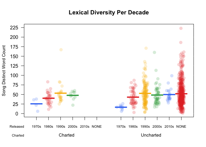
Every colored circle in this pirate plot represents a song. The dense red area with the "NONE" value shows that a large number of songs in the dataset do not have a release date. There is a slight upward trend in the unique number of words per song in the early decades: the solid horizontal line shows the mean word count for that decade. This is important to know when you begin to analyze the sentiment over time. The words become more illuminating throughout Prince's career.
I would challenge you to explore pirate plots in more detail as you've only touched the surface with this one!
Circular graphs are a unique way to visualize complicated (or simple!) relationships among several categories. (Plus, albums used to be round!). The graph below is simply a circular bar chart using coord_polar() from ggplot2 that shows the relative number of songs per year. It's a ton of code to produce such a simple graph, but it's totally worth it. A similar example can be found in more detail in the R Graph Gallery here. As with pirate plots, this is only an introduction to what you can do with circular plots.
songs_year <- prince_data %>%
  select(song, year) %>%
  group_by(year) %>%
  summarise(song_count = n())

id <- seq_len(nrow(songs_year))
songs_year <- cbind(songs_year, id)
label_data = songs_year
number_of_bar = nrow(label_data) #Calculate the ANGLE of the labels
angle = 90 - 360 * (label_data$id - 0.5) / number_of_bar #Center things
label_data$hjust <- ifelse(angle < -90, 1, 0) #Align label
label_data$angle <- ifelse(angle < -90, angle + 180, angle) #Flip angle
ggplot(songs_year, aes(x = as.factor(id), y = song_count)) +
  geom_bar(stat = "identity", fill = alpha("purple", 0.7)) +
  geom_text(data = label_data, aes(x = id, y = song_count + 10, label = year, hjust = hjust), color = "black", alpha = 0.6, size = 3, angle =  label_data$angle, inherit.aes = FALSE ) +
  coord_polar(start = 0) +
  ylim(-20, 150) + #Size of the circle
  theme_minimal() +
  theme(axis.text = element_blank(),
        axis.title = element_blank(),
        panel.grid = element_blank(),
        plot.margin = unit(rep(-4,4), "in"),
        plot.title = element_text(margin = margin(t = 10, b = -10)))
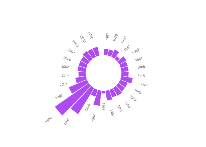
See the gap at the very top? This is an indicator of the hundreds of songs without release dates you identified in the pirate plot. With such a large number of unreleased songs, the chart would not be useful if they were included. The missing years indicate those where no songs were released. The most prolific years were 1996 and 1998.
Do you want to know why? Keep reading!
The following graph shows the relationship between the decade a song was released and whether or not it hit the Billboard charts. Using a chordDiagram() for musical analysis just seemed appropriate! This graphical tool is from the beautiful circlize package by Zuguang Gu. The graph is split into two categories: charted (top), and decade (bottom). The two categories are separated by wide gaps, with smaller gaps between the values. The high-level comments in the code below can be supplemented with more detail here.
decade_chart <-  prince_data %>%
  filter(decade != "NA") %>% #Remove songs without release dates
  count(decade, charted)  #Get SONG count per chart level per decade. Order determines top or bottom.

circos.clear() #Very important - Reset the circular layout parameters!
grid.col = c("1970s" = my_colors[1], "1980s" = my_colors[2], "1990s" = my_colors[3], "2000s" = my_colors[4], "2010s" = my_colors[5], "Charted" = "grey", "Uncharted" = "grey") #assign chord colors
# Set the global parameters for the circular layout. Specifically the gap size
circos.par(gap.after = c(rep(5, length(unique(decade_chart[[1]])) - 1), 15,
                         rep(5, length(unique(decade_chart[[2]])) - 1), 15))

chordDiagram(decade_chart, grid.col = grid.col, transparency = .2)
title("Relationship Between Chart and Decade")
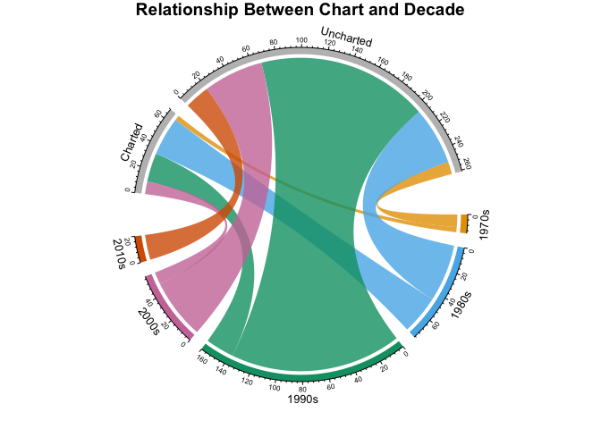
The above circle graph may seem complex at first glance, but it nicely illustrates the counts of songs per decade, per chart level. You can see that Prince began his career in the 1970s with only a few releases, some of which charted. If you compare the 1980s to the 1990s, you'll find that more songs were released in the 1990s, but more songs charted in the 1980s. There were only a few commercially successful songs in the 2000s and in the 2010s there were no hit songs.
In this section you will:
The tidytext package includes a dataset called sentiments which provides several distinct lexicons. These lexicons are dictionaries of words with an assigned sentiment category or value. tidytext provides three general purpose lexicons:
In order to examine the lexicons, create a data frame called new_sentiments. Filter out a financial lexicon, create a binary (also described as polar) sentiment field for the AFINN lexicon by converting the numerical score to positive or negative, and add a field that holds the distinct word count for each lexicon.
new_sentiments has one column with the different sentiment categories, so for a better view of the word counts per lexicon, per category, use spread() from tidyr to pivot those categories into separate fields. Take advantage of the knitr and kableExtra packages in the my_kable_styling() function you created earlier. Add color to your chart using color_tile() and color_bar() from formattable to create a nicely formatted table. Print your table and examine the differences between each lexicon.
new_sentiments <- sentiments %>% #From the tidytext package
  filter(lexicon != "loughran") %>% #Remove the finance lexicon
  mutate( sentiment = ifelse(lexicon == "AFINN" & score >= 0, "positive",
                              ifelse(lexicon == "AFINN" & score < 0,
                                     "negative", sentiment))) %>%
  group_by(lexicon) %>%
  mutate(words_in_lexicon = n_distinct(word)) %>%
  ungroup()

new_sentiments %>%
  group_by(lexicon, sentiment, words_in_lexicon) %>%
  summarise(distinct_words = n_distinct(word)) %>%
  ungroup() %>%
  spread(sentiment, distinct_words) %>%
  mutate(lexicon = color_tile("lightblue", "lightblue")(lexicon),
         words_in_lexicon = color_bar("lightpink")(words_in_lexicon)) %>%
  my_kable_styling(caption = "Word Counts Per Lexicon")
| lexicon | words_in_lexicon | anger | anticipation | disgust | fear | joy | negative | positive | sadness | surprise | trust |
|---|---|---|---|---|---|---|---|---|---|---|---|
| AFINN | 2476 | NA | NA | NA | NA | NA | 1597 | 879 | NA | NA | NA |
| bing | 6785 | NA | NA | NA | NA | NA | 4782 | 2006 | NA | NA | NA |
| nrc | 6468 | 1247 | 839 | 1058 | 1476 | 689 | 3324 | 2312 | 1191 | 534 | 1231 |
The table above gives you an idea of the size and structure of each lexicon.
In order to determine which lexicon is more applicable to the lyrics, you'll want to look at the match ratio of words that are common to both the lexicon and the lyrics. As a reminder, there are 76116 total words and 7851 distinct words in prince_tidy.
So how many of those words are actually in the lexicons?
Use an inner_join() between prince_tidy and new_sentiments and then group by lexicon. The NRC lexicon has 10 different categories, and a word may appear in more than one category: that is, words can be negative and sad. That means that you'll want to use n_distinct() in summarise() to get the distinct word count per lexicon.
prince_tidy %>%
  mutate(words_in_lyrics = n_distinct(word)) %>%
  inner_join(new_sentiments) %>%
  group_by(lexicon, words_in_lyrics, words_in_lexicon) %>%
  summarise(lex_match_words = n_distinct(word)) %>%
  ungroup() %>%
  mutate(total_match_words = sum(lex_match_words), #Not used but good to have
         match_ratio = lex_match_words / words_in_lyrics) %>%
  select(lexicon, lex_match_words,  words_in_lyrics, match_ratio) %>%
  mutate(lex_match_words = color_bar("lightpink")(lex_match_words),
         lexicon = color_tile("lightgreen", "lightgreen")(lexicon)) %>%
  my_kable_styling(caption = "Lyrics Found In Lexicons")
| lexicon | lex_match_words | words_in_lyrics | match_ratio |
|---|---|---|---|
| AFINN | 770 | 7851 | 0.0980767 |
| bing | 1185 | 7851 | 0.1509362 |
| nrc | 1678 | 7851 | 0.2137307 |
The NRC lexicon has more of the distinct words from the lyrics than AFINN or Bing. Notice the sum of the match ratios is low. No lexicon could have all words, nor should they. Many words are considered neutral and would not have an associated sentiment. For example, 2000 is typically a neutral word, and therefore does not exist in the lexicons. However, if you remember, people predicted planes would fall out of the sky and computers would just stop working during that year. So there is an associated fear that exists in the song but is not captured in sentiment analysis using typical lexicons.
Here are a few reasons that a word may not appear in a lexicon:
Take a look at some specific words from Prince's lyrics which seem like they would have an impact on sentiment. Are they in all lexicons?
new_sentiments %>%
  filter(word %in% c("dark", "controversy", "gangster",
                     "discouraged", "race")) %>%
  arrange(word) %>% #sort
  select(-score) %>% #remove this field
  mutate(word = color_tile("lightblue", "lightblue")(word),
         words_in_lexicon = color_bar("lightpink")(words_in_lexicon),
         lexicon = color_tile("lightgreen", "lightgreen")(lexicon)) %>%
  my_kable_styling(caption = "Specific Words")
| word | sentiment | lexicon | words_in_lexicon |
|---|---|---|---|
| controversy | negative | nrc | 6468 |
| controversy | negative | bing | 6785 |
| dark | sadness | nrc | 6468 |
| dark | negative | bing | 6785 |
| discouraged | negative | AFINN | 2476 |
| gangster | negative | bing | 6785 |
Controversy and dark appear in NRC and Bing, but gangster only appears in Bing. Race doesn't appear at all and is a critical topic in Prince's lyrics. But is it easily associated with a sentiment? Note that AFINN is much smaller and only has one of these words.
Now look at a more complicated example. Sexuality is a common theme in Prince's music. How will sentiment analysis based on predefined lexicons be affected by different forms of a word? For example, here are all the references to the root word sex in the lyrics. Compare these to Bing and NRC and see where there are matches.
my_word_list <- prince_data %>%
  unnest_tokens(word, lyrics) %>%
  filter(grepl("sex", word)) %>% #Use `grepl()` to find the substring `"sex"`
  count(word) %>%
  select(myword = word, n) %>% #Rename word
  arrange(desc(n))

new_sentiments %>%
  #Right join gets all words in `my_word_list` to show nulls
  right_join(my_word_list, by = c("word" = "myword")) %>%
  filter(word %in% my_word_list$myword) %>%
  mutate(word = color_tile("lightblue", "lightblue")(word),
          instances = color_tile("lightpink", "lightpink")(n),
          lexicon = color_tile("lightgreen", "lightgreen")(lexicon)) %>%
  select(-score, -n) %>% #Remove these fields
  my_kable_styling(caption = "Dependency on Word Form")
| word | sentiment | lexicon | words_in_lexicon | instances |
|---|---|---|---|---|
| sexy | positive | bing | 6785 | 220 |
| sexy | positive | AFINN | 2476 | 220 |
| sex | anticipation | nrc | 6468 | 185 |
| sex | joy | nrc | 6468 | 185 |
| sex | positive | nrc | 6468 | 185 |
| sex | trust | nrc | 6468 | 185 |
| superfunkycalifragisexy | NA | NA | NA | 19 |
| lovesexy | NA | NA | NA | 16 |
| sexual | NA | NA | NA | 11 |
| sexuality | NA | NA | NA | 11 |
| sexiness | NA | NA | NA | 2 |
| sexually | NA | NA | NA | 2 |
| sexe | NA | NA | NA | 1 |
| sexed | NA | NA | NA | 1 |
| sexier | NA | NA | NA | 1 |
| superfunkycalifraagisexy | NA | NA | NA | 1 |
| superfunkycalifragisexi | NA | NA | NA | 1 |
Notice that Prince uses sexy frequently, but it doesn't exist in this form in NRC. The word sex is found in NRC but not in Bing. What if you looked at the stems or roots of words, would that help? What a conundrum! Your text could contain a past tense, a plural, or an adverb of a root word, but it may not exist in any lexicon. How do you deal with this?
It may be the case that you need a few more data preparation steps. Here are three techniques to consider before performing sentiment analysis:
An advanced concept in sentiment analysis is that of synonym (semantically similar peer) and hypernym (a common parent) replacement. These are words that are more frequently used than the related word in the lyric, and actually do appear in a lexicon, thus giving a higher match percentage. There is not enough space in this tutorial to address additional data preparation, but it's definitely something to consider!
Challenge: do a little research on lexicons and how they are created. Is there already one that exists that is better suited to musical lyrics? If you're really interested, maybe consider what it would take to build your own lexicon. What is the difference between classifier-based sentiment analysis and lexicon-based sentiment analysis?
Now that you have a foundational understanding of the dataset and the lexicons, you can apply that knowledge by joining them together for analysis. Here are the high-level steps you'll take:
Start off by creating Prince sentiment datasets for each of the lexicons by performing an inner_join() on the get_sentiments() function. Pass the name of the lexicon for each call. For this exercise, use Bing for binary and NRC for categorical sentiments. Since words can appear in multiple categories in NRC, such as Negative/Fear or Positive/Joy, you'll also create a subset without the positive and negative categories to use later on.
prince_bing <- prince_tidy %>%
  inner_join(get_sentiments("bing"))
prince_nrc <- prince_tidy %>%
  inner_join(get_sentiments("nrc"))
prince_nrc_sub <- prince_tidy %>%
  inner_join(get_sentiments("nrc")) %>%
  filter(!sentiment %in% c("positive", "negative"))
In the detailed analysis of the lyrics, you'll want to examine the different levels of text, such as all songs, chart level, decade level and word level. Start by graphing the NRC sentiment analysis of the entire dataset.
(Just for fun, I used the memery and magick packages to add images (memes) to the graphs.)
nrc_plot <- prince_nrc %>%
  group_by(sentiment) %>%
  summarise(word_count = n()) %>%
  ungroup() %>%
  mutate(sentiment = reorder(sentiment, word_count)) %>%
  #Use `fill = -word_count` to make the larger bars darker
  ggplot(aes(sentiment, word_count, fill = -word_count)) +
  geom_col() +
  guides(fill = FALSE) + #Turn off the legend
  theme_lyrics() +
  labs(x = NULL, y = "Word Count") +
  scale_y_continuous(limits = c(0, 15000)) + #Hard code the axis limit
  ggtitle("Prince NRC Sentiment") +
  coord_flip()

img <- "prince_background2.jpg" #Load the background image
lab <- ""  #Turn off the label
#Overlay the plot on the image and create the meme file
meme(img, lab, "meme_nrc.jpg", inset = nrc_plot)
#Read the file back in and display it!
nrc_meme <- image_read("meme_nrc.jpg")
plot(nrc_meme)
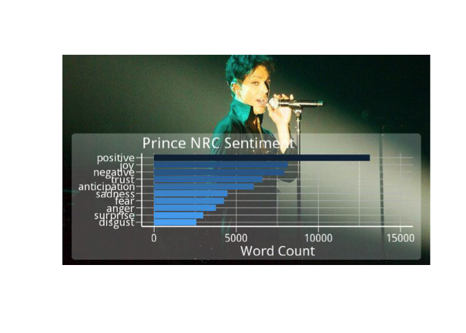
It appears that for Prince's lyrics, NRC strongly favors the positive. But are all words with a sentiment of disgust or anger also in the negative category as well? It may be worth checking out.
Now take a look at Bing overall sentiment. Of the 1185 distinct words from Prince's lyrics that appear in the Bing lexicon, how many are positive and how many are negative?
bing_plot <- prince_bing %>%
  group_by(sentiment) %>%
  summarise(word_count = n()) %>%
  ungroup() %>%
  mutate(sentiment = reorder(sentiment, word_count)) %>%
  ggplot(aes(sentiment, word_count, fill = sentiment)) +
  geom_col() +
  guides(fill = FALSE) +
  theme_lyrics() +
  labs(x = NULL, y = "Word Count") +
  scale_y_continuous(limits = c(0, 8000)) +
  ggtitle("Prince Bing Sentiment") +
  coord_flip()

img1 <- "prince_background1.jpg"
lab1 <- ""
meme(img1, lab1, "meme_bing.jpg", inset = bing_plot)
x <- image_read("meme_bing.jpg")
plot(x)
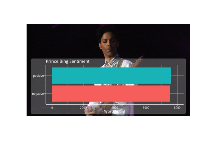
Could it be the case that for Bing, there appears to be equal positive and negative sentiment in Prince's music? Does overall sentiment cancel itself out when looking at a dataset that is too large? It's hard to know, but try looking at it in chunks and see what happens.
In acoustics, there is something called phase cancellation where the frequency of two instances of the same wave are exactly out of phase and cancel each other out, for example, when you're recording a drum with two mics and it takes the sound longer to get to one mic than the other. This results in total silence at that frequency! How may this apply to sentiment analysis of large datasets? Give it some thought.
Linguistic Professor: "In English, a double negative forms a positive. In Russian, a double negative is still a negative. However, there is no language wherein a double positive can form a negative." Disagreeing student: "Yeah, right."
Turn up the volume on your analysis by breaking it down to the chart level using the Bing lexicon. Create a graph of the polar sentiment per chart level. Use spread() to separate the sentiments into columns and mutate() to create a polarity (positive - negative) field and a percent_positive field ($positive / total sentiment * 100$), for a different perspective. For the polarity graph, add a yintercept with geom_hline(). Plot the graphs side by side with grid.arrange().
prince_polarity_chart <- prince_bing %>%
  count(sentiment, chart_level) %>%
  spread(sentiment, n, fill = 0) %>%
  mutate(polarity = positive - negative,
    percent_positive = positive / (positive + negative) * 100)

#Polarity by chart
plot1 <- prince_polarity_chart %>%
  ggplot( aes(chart_level, polarity, fill = chart_level)) +
  geom_col() +
  scale_fill_manual(values = my_colors[3:5]) +
  geom_hline(yintercept = 0, color = "red") +
  theme_lyrics() + theme(plot.title = element_text(size = 11)) +
  xlab(NULL) + ylab(NULL) +
  ggtitle("Polarity By Chart Level")

#Percent positive by chart
plot2 <- prince_polarity_chart %>%
  ggplot( aes(chart_level, percent_positive, fill = chart_level)) +
  geom_col() +
  scale_fill_manual(values = c(my_colors[3:5])) +
  geom_hline(yintercept = 0, color = "red") +
  theme_lyrics() + theme(plot.title = element_text(size = 11)) +
  xlab(NULL) + ylab(NULL) +
  ggtitle("Percent Positive By Chart Level")

grid.arrange(plot1, plot2, ncol = 2)
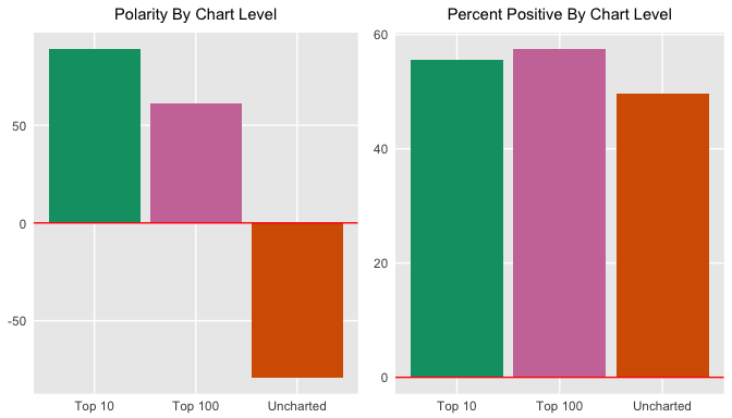
Does this say that charted songs are typically more positive than negative? If so, what does this tell you about what society wants to hear? Can you even make these assumptions? Looking at the positive sentiment relative to total sentiment, it seems like the charted songs are just slightly more positive than the negative. This is interesting given that the Bing lexicon itself has more negative than positive words.
Since you're looking at sentiment from a polar perspective, you might want to see weather or not it changes over time (geek humor). This time use geom_smooth() with the loess method for a smoother curve and another geom_smooth() with method = lm for a linear smooth curve.
prince_polarity_year <- prince_bing %>%
  count(sentiment, year) %>%
  spread(sentiment, n, fill = 0) %>%
  mutate(polarity = positive - negative,
    percent_positive = positive / (positive + negative) * 100)

polarity_over_time <- prince_polarity_year %>%
  ggplot(aes(year, polarity, color = ifelse(polarity >= 0,my_colors[5],my_colors[4]))) +
  geom_col() +
  geom_smooth(method = "loess", se = FALSE) +
  geom_smooth(method = "lm", se = FALSE, aes(color = my_colors[1])) +
  theme_lyrics() + theme(plot.title = element_text(size = 11)) +
  xlab(NULL) + ylab(NULL) +
  ggtitle("Polarity Over Time")

relative_polarity_over_time <- prince_polarity_year %>%
  ggplot(aes(year, percent_positive , color = ifelse(polarity >= 0,my_colors[5],my_colors[4]))) +
  geom_col() +
  geom_smooth(method = "loess", se = FALSE) +
  geom_smooth(method = "lm", se = FALSE, aes(color = my_colors[1])) +
  theme_lyrics() + theme(plot.title = element_text(size = 11)) +
  xlab(NULL) + ylab(NULL) +
  ggtitle("Percent Positive Over Time")

grid.arrange(polarity_over_time, relative_polarity_over_time, ncol = 2)
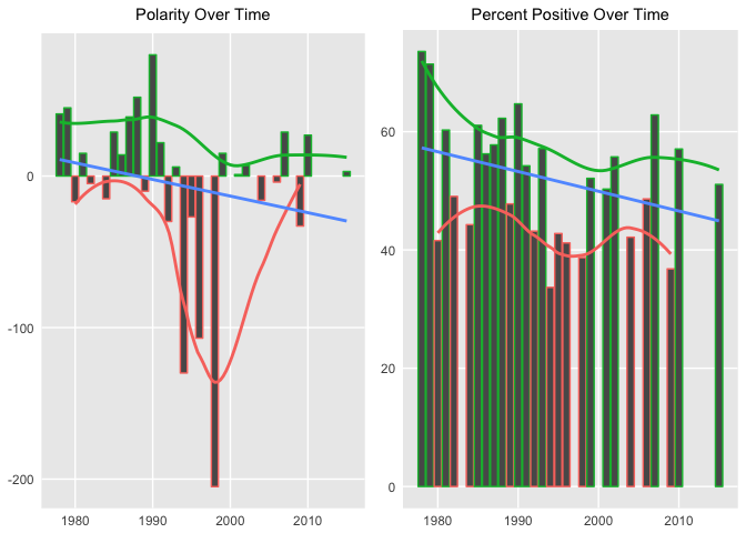
A few extremes were adjusted in the second graph above, but the overall polarity trend over time is negative in both cases.
You'll again use the power of the chordDiagram() to examine the relationships between NRC sentiments and decades. Note that sentiment categories appear on the top part of the ring and decades on the bottom.
grid.col = c("1970s" = my_colors[1], "1980s" = my_colors[2], "1990s" = my_colors[3], "2000s" = my_colors[4], "2010s" = my_colors[5], "anger" = "grey", "anticipation" = "grey", "disgust" = "grey", "fear" = "grey", "joy" = "grey", "sadness" = "grey", "surprise" = "grey", "trust" = "grey")

decade_mood <-  prince_nrc %>%
  filter(decade != "NA" & !sentiment %in% c("positive", "negative")) %>%
  count(sentiment, decade) %>%
  group_by(decade, sentiment) %>%
  summarise(sentiment_sum = sum(n)) %>%
  ungroup()

circos.clear()
#Set the gap size
circos.par(gap.after = c(rep(5, length(unique(decade_mood[[1]])) - 1), 15,
                         rep(5, length(unique(decade_mood[[2]])) - 1), 15))
chordDiagram(decade_mood, grid.col = grid.col, transparency = .2)
title("Relationship Between Mood and Decade")
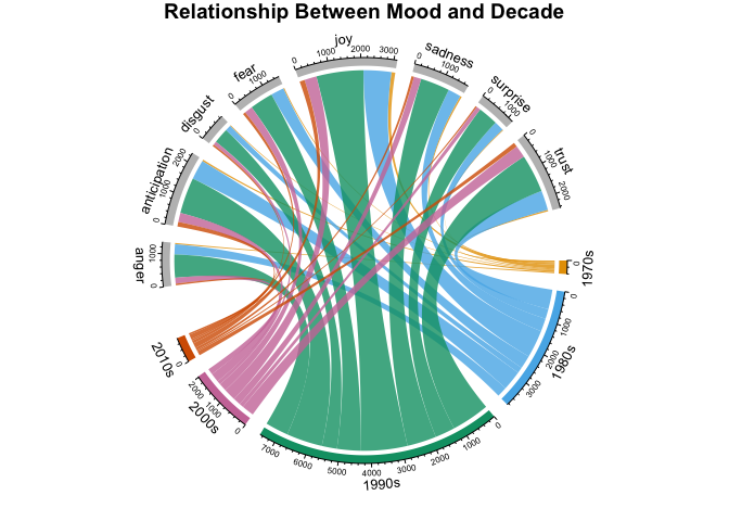
This shows the counts of words per NRC category per decade. It's a lot to take in on a small graph, but it provides tons of information on relationships between categories and time. These diagrams are incredibly customizable and can be as simple or informative as desired.
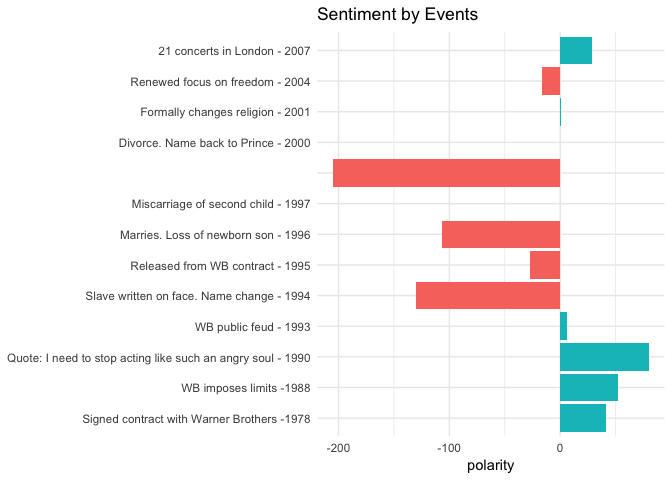
Given all the wonderful courses you've taken on DataCamp, you're probably itching to apply those skills to real world situations. So do that now by mapping your analysis of Prince's lyrics to something real over a period of time. However, please be skeptical and cautious when performing a simplified analysis on such a complex subject.
I have created a list of Prince's life events, collected from popular sources such as Rolling Stone Magazine, Biography.com, etc. I selected highly public years that match songs that have release dates in our dataset. Read in those events from princeEvents.csv now. Then use prince_bing and spread() to create a polarity score per year. Join on the events data frame and create a sentiment field so you can fill in colors on your bar chart. As always, use coord_flip() when you're showing large text labels.
events <- read.csv('princeEvents.csv', stringsAsFactors = FALSE)

year_polarity_bing <- prince_bing %>%
  group_by(year, sentiment) %>%
  count(year, sentiment) %>%
  spread(sentiment, n) %>%
  mutate(polarity = positive - negative,
         ratio = polarity / (positive + negative)) #use polarity ratio in next graph

 events %>%
   #Left join gets event years with no releases
   left_join(year_polarity_bing) %>%
   filter(event != " ") %>% #Account for bad data
   mutate(event = reorder(event, year), #Sort chart by desc year
           sentiment = ifelse(positive > negative,
                              "positive", "negative")) %>%
   ggplot(aes(event, polarity, fill = sentiment)) +
   geom_bar(stat = "identity") +
   theme_minimal() + theme(legend.position = "none") +
   xlab(NULL) +
   ggtitle("Sentiment by Events") +
   coord_flip()
Tip: you can find princeEvents.csv here.
I think it's fascinating to compare the events with the sentiment. Although subjective, I found them to be very correlated. Now granted, I created the event dataset myself. I could have easily biased it to match the lyrics. However, I did use multiple sources for each year to determine the most commonly reported fact. These results should motivate you to look even more deeply into a word level analysis to see what Prince was singing about.
In 1994, Prince released The Black Album as an attempt to regain his African-American audience. Given the fact that 1994 and the following two years stand out in the analysis, you can look at the top words that match the NRC lexicon for this period using geom_label_repel() from the ggrepel package along with geom_point(). This is a tricky graph, so I suggest you play around with the configuration of the code below.
plot_words_94_96 <- prince_nrc %>%
  filter(year %in% c("1994", "1995", "1996")) %>%
  group_by(sentiment) %>%
  count(word, sort = TRUE) %>%
  arrange(desc(n)) %>%
  slice(seq_len(8)) %>% #consider top_n() from dplyr also
  ungroup()

plot_words_94_96 %>%
  #Set `y = 1` to just plot one variable and use word as the label
  ggplot(aes(word, 1, label = word, fill = sentiment )) +
  #You want the words, not the points
  geom_point(color = "transparent") +
  #Make sure the labels don't overlap
  geom_label_repel(force = 1,nudge_y = .5,
                   direction = "y",
                   box.padding = 0.04,
                   segment.color = "transparent",
                   size = 3) +
  facet_grid(~sentiment) +
  theme_lyrics() +
  theme(axis.text.y = element_blank(), axis.text.x = element_blank(),
        axis.title.x = element_text(size = 6),
        panel.grid = element_blank(), panel.background = element_blank(),
        panel.border = element_rect("lightgray", fill = NA),
        strip.text.x = element_text(size = 9)) +
  xlab(NULL) + ylab(NULL) +
  ggtitle("1994 - 1996 NRC Sentiment") +
  coord_flip()
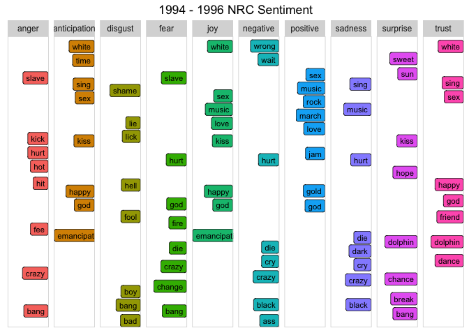
In 1994, Prince quoted to Rolling Stone magazine,
"When you stop a man from dreaming, he becomes a slave. That's where I was."
So he appeared in public with the word "slave" prominently penned on his face outwardly declaring his anti-corporate sentiment with his current music label. He also changed his name to a symbol. How well do the words above match these events? Notice the words "slave", "emancipation", "black" and "change" in the graph?
(Remember, this is not just about Prince. You can apply it to any text! For example, what were the most trust sentiment words spoken by President Trump in his first year in office?)
The Sentiment By Events chart above indicated that between 1996 and 1998, Prince married, lost two children, and was said to predict 9/11 on stage. (Do a YouTube search on his 1998 concert in The Netherlands to listen for yourself!) Using the same steps as with the previous graph, look at the top 10 words in each NRC category during 1998.
plot_words_1998 <- prince_nrc %>%
  filter(year == "1998") %>%
  group_by(sentiment) %>%
  count(word, sort = TRUE) %>%
  arrange(desc(n)) %>%
  slice(seq_len(10)) %>%
  ungroup()

#Same comments as previous graph
plot_words_1998 %>%
  ggplot(aes(word, 1, label = word, fill = sentiment )) +
  geom_point(color = "transparent") +
  geom_label_repel(force = 1,nudge_y = .5,
                   direction = "y",
                   box.padding = 0.05,
                   segment.color = "transparent",
                   size = 3) +
  facet_grid(~sentiment) +
  theme_lyrics() +
  theme(axis.text.y = element_blank(), axis.text.x = element_blank(),
        axis.title.x = element_text(size = 6),
        panel.grid = element_blank(), panel.background = element_blank(),
        panel.border = element_rect("lightgray", fill = NA),
        strip.text.x = element_text(size = 9)) +
  xlab(NULL) + ylab(NULL) +
  ggtitle("1998 NRC Sentiment") +
  coord_flip()
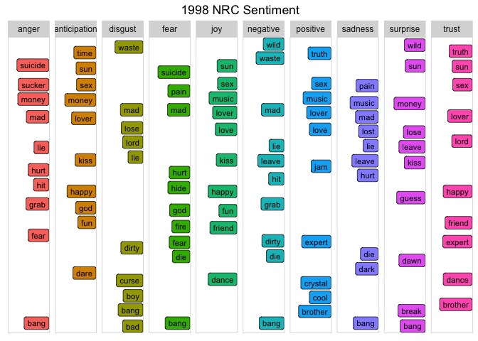
Given the personal loss and the looming threat of terrorism, words like "suicide", "waste", "mad", "hurt", and many more not captured in this graph are very indicative of the actual events. These words are powerful and provide real insight into the sentiment of that time period.
Another great way to compare sentiment across categories is to use a radar chart, which is also known as a spider chart. You can make this type of charts with the radarchart package. These are useful for seeing which variables have similar values or if there are any outliers for each variable.
You will break this analysis into three different levels: year, chart, and decade. (To save space, I'll only include code for the specific years.)
prince_nrc_sub dataset which does not contain the positive and negative sentiments so that the other ones are more visible. This time you will first calculate the total count of words by sentiment per year, as well as the total sentiment for the entire year and obtain a percentage ($count of sentiment words per year / total per year * 100$).select().spread() the year and percent values (key/value pairs) into multiple columns so that you have one row for each sentiment and a column for each year. Then use chartJSRadar() to generate an interactive HTML widget. You can pass an argument to display dataset labels in the mouse over. (FYI, sometimes the J and Y are cropped from the word "joy" by radarchart and it looks like "iov".)#Get the count of words per sentiment per year
year_sentiment_nrc <- prince_nrc_sub %>%
group_by(year, sentiment) %>%
count(year, sentiment) %>%
select(year, sentiment, sentiment_year_count = n)
#Get the total count of sentiment words per year (not distinct)
total_sentiment_year <- prince_nrc_sub %>%
count(year) %>%
select(year, year_total = n)
#Join the two and create a percent field
year_radar_chart <- year_sentiment_nrc %>%
inner_join(total_sentiment_year, by = "year") %>%
mutate(percent = sentiment_year_count / year_total * 100 ) %>%
filter(year %in% c("1978","1994","1995")) %>%
select(-sentiment_year_count, -year_total) %>%
spread(year, percent) %>%
chartJSRadar(showToolTipLabel = TRUE,
main = "NRC Years Radar")
You'll have to scroll up and down to compare these graphs because I wanted to leave them full size. It's interesting to note that with a smaller dataset like year, you are able to see the variance in each sentiment more distinctly using this type of visualization. You may also notice that in contrast to previous exercises, using a percentage, "joy" has the highest score on all charts (especially at the beginning of Prince's career in 1978).
Spotify uses machine learning to create song recommendations for its 140 million active users. It doesn't use lyrical content yet. Imagine if it could... So now, take an even deeper look into the mood of specific songs.
In 1987, Prince wrote a song called "Sign O' the Times". A Billboard article by Kenneth Partridge stated:
"As he tackles the topics of AIDS, gangs, drugs, natural disasters, and even the Challenger explosion, Prince plays it cool and detached. 'Sign O' the Times' is a status update, not a call to action. His solution isn't marching in the streets or phoning your congressman."
So how would a machine interpret the mood of this song? Is it highly emotional or simply informative? Does it represent Prince as a person or society in general? Graph the NRC categories with ggplot2.
prince_nrc %>%
  filter(song %in% "sign o the times") %>%
  group_by(sentiment) %>%
  summarise(word_count = n()) %>%
  ungroup() %>%
  mutate(sentiment = reorder(sentiment, word_count)) %>%
  ggplot(aes(sentiment, word_count, fill = -word_count)) +
  geom_col() +
  guides(fill = FALSE) +
  theme_minimal() + theme_lyrics() +
  labs(x = NULL, y = "Word Count") +
  ggtitle("Sign O' The Times NRC Sentiment") +
  coord_flip()
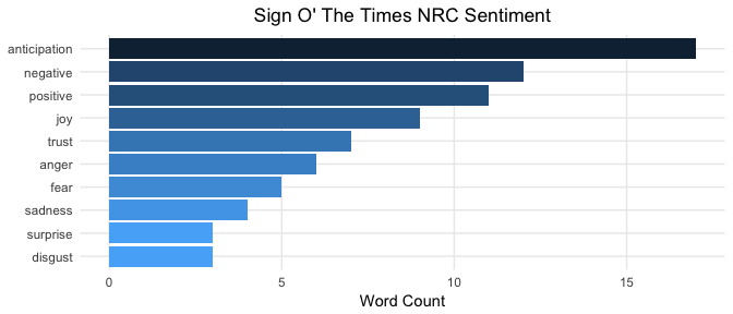
Although once again highly subjective, your results appear to confirm that Prince "plays it cool and detached", as stated by Partridge. This may be interpreted by the observation that anticipation words are more prevalent than emotional categories such as sadness, fear, and anger. Here is an article that states these three categories are emotions whereas anticipation is a sentiment. The Billboard author also stated the song is simply a "status update, almost devoid of emotion". It seems as that the machine agrees. Do you interpret it this way as well? I know that this is an R tutorial, but sentiment analysis is not purely technical. It is said to be the place where AI meets psychology.
Using ggplot2 to create a slightly different chart, look at the words for each category.
prince_tidy %>%
  filter(song %in% 'sign o the times') %>%
  distinct(word) %>%
  inner_join(get_sentiments("nrc")) %>%
  ggplot(aes(x = word, fill = sentiment)) +
  facet_grid(~sentiment) +
  geom_bar() + #Create a bar for each word per sentiment
  theme_lyrics() +
  theme(panel.grid.major.x = element_blank(),
        axis.text.x = element_blank()) + #Place the words on the y-axis
  xlab(NULL) + ylab(NULL) +
  ggtitle("Sign O' The Times Sentiment Words") +
  coord_flip()
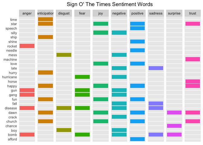
Can you match these words with the topics mentioned in the Billboard article? It's pretty easy to see the connection: Challenger disaster -> "rocket", AIDS -> "disease", Drugs -> "crack", Natural Disasters -> "hurricane", Gangs -> "gang", etc.
It's almost like Partridge wrote some R code and created this chart before writing the article!
Look at the sentiment categories for a few more songs with distinctive titles and see if they appear to be correlated.
prince_nrc_sub %>%
  filter(song %in% c("so blue", "controversy", "raspberry beret",
                     "when doves cry", "the future", "1999")) %>%
  count(song, sentiment, year) %>%
  mutate(sentiment = reorder(sentiment, n), song = reorder(song, n)) %>%
  ggplot(aes(sentiment, n, fill = sentiment)) +
  geom_col() +
  facet_wrap(year ~ song, scales = "free_x", labeller = label_both) +
  theme_lyrics() +
  theme(panel.grid.major.x = element_blank(),
        axis.text.x = element_blank()) +
  labs(x = NULL, y = NULL) +
  ggtitle("NRC Sentiment Song Analysis") +
  coord_flip()
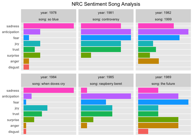
NRC sentiments show high anticipation and fear for a song about the future, and the same thing plus high trust for a song about controversy. The songs that are prevalently sad seem to match their titles as well.
So far you have only been looking at unigrams or single words. But if "love" is a common word, what precedes it? Or follows it? Looking at single words out of context could be misleading. So, now it's time to look at some bigrams or word pairs.
Conveniently, the tidytext package provides the ability to unnest pairs of words as well as single words. In this case, you'll call unnest_tokens() passing the token argument ngrams. Since you're just looking at bigrams (two consecutive words), pass n = 2. Use prince_bigrams to store the results.
The tidyr package provides the ability to separate the bigrams into individual words using the separate() function. In order to remove the stop words and undesirable words, you'll want to break the bigrams apart and filter out what you don't want, then use unite() to put the word pairs back together. This makes it easy to visualize the most common bigrams per decade. (See Part One for an explanation of slice() and row_number())
prince_bigrams <- prince_data %>%
  unnest_tokens(bigram, lyrics, token = "ngrams", n = 2)

bigrams_separated <- prince_bigrams %>%
  separate(bigram, c("word1", "word2"), sep = " ")

bigrams_filtered <- bigrams_separated %>%
  filter(!word1 %in% stop_words$word) %>%
  filter(!word2 %in% stop_words$word) %>%
  filter(!word1 %in% undesirable_words) %>%
  filter(!word2 %in% undesirable_words)

#Because there is so much repetition in music, also filter out the cases where the two words are the same
bigram_decade <- bigrams_filtered %>%
  filter(word1 != word2) %>%
  filter(decade != "NA") %>%
  unite(bigram, word1, word2, sep = " ") %>%
  inner_join(prince_data) %>%
  count(bigram, decade, sort = TRUE) %>%
  group_by(decade) %>%
  slice(seq_len(7)) %>%
  ungroup() %>%
  arrange(decade, n) %>%
  mutate(row = row_number())
## Joining, by = c("song", "year", "album", "peak", "us_pop", "us_rnb", "decade", "chart_level", "charted")bigram_decade %>%
ggplot(aes(row, n, fill = decade)) +
geom_col(show.legend = FALSE) +
facet_wrap(~decade, scales = "free_y") +
xlab(NULL) + ylab(NULL) +
scale_x_continuous( # This handles replacement of row
breaks = bigram_decade$row, # Notice need to reuse data frame
labels = bigram_decade$bigram) +
theme_lyrics() +
theme(panel.grid.major.x = element_blank()) +
ggtitle("Bigrams Per Decade") +
coord_flip()
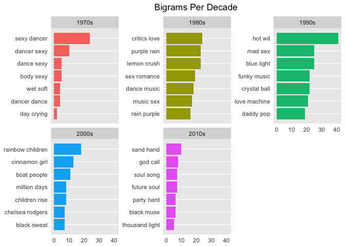
Using bigrams, you can almost see the common phrases shift from sex, dance and romance to religion and (rainbow) children. In case you didn't know, the term "rainbow baby" is sometimes used by parents who are expecting another child after losing a baby to miscarriage. Interestingly, I could not find a real review of Prince's Rainbow Children album that made note of this.
So how do bigrams affect sentiment? This time use the AFINN lexicon to perform sentiment analysis on word pairs, looking at how often sentiment-associated words are preceded by "not" or other negating words.
AFINN <- get_sentiments("afinn")

not_words <- bigrams_separated %>%
  filter(word1 == "not") %>%
  inner_join(AFINN, by = c(word2 = "word")) %>%
  count(word2, score, sort = TRUE) %>%
  ungroup()

not_words %>%
  mutate(contribution = n * score) %>%
  arrange(desc(abs(contribution))) %>%
  head(20) %>%
  mutate(word2 = reorder(word2, contribution)) %>%
  ggplot(aes(word2, n * score, fill = n * score > 0)) +
  geom_col(show.legend = FALSE) +
  theme_lyrics() +
  xlab("Words preceded by \"not\"") +
  ylab("Sentiment score * Number of Occurrences") +
  ggtitle("Polar Sentiment of Words Preceded by Not") +
  coord_flip()
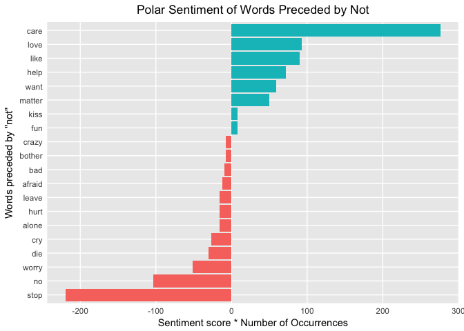
On the first line of the graph, care is given a false positive sentiment because the "not" is ignored with single-word analysis. Do the false positive bigrams cancel out the false negative bigrams?
Yet another question that I can't answer, but it's a good topic for further exploration. Tip: you can also pass the parameters of "trigrams" and "n = 3" to unnest_tokens() to look at even more consecutive words!
There are other negation words to consider as well. This time you will create a network graph using the ggraph and igraph packages. You'll arrange the words into connected nodes with the negation words at the centers. Create the first object from the tidy dataset using graph_from_data_frame() and then use ggraph() to plot it. You can highlight the main nodes with a call to geom_edge_density(). You can get more details of a similar example in Julia Silge and David Robinson's book on Tidy Text Mining.
negation_words <- c("not", "no", "never", "without")

negation_bigrams <- bigrams_separated %>%
  filter(word1 %in% negation_words) %>%
  inner_join(AFINN, by = c(word2 = "word")) %>%
  count(word1, word2, score, sort = TRUE) %>%
  mutate(contribution = n * score) %>%
  arrange(desc(abs(contribution))) %>%
  group_by(word1) %>%
  slice(seq_len(20)) %>%
  arrange(word1,desc(contribution)) %>%
  ungroup()

bigram_graph <- negation_bigrams %>%
  graph_from_data_frame() #From `igraph`

set.seed(123)

a <- grid::arrow(type = "closed", length = unit(.15, "inches"))

ggraph(bigram_graph, layout = "fr") +
  geom_edge_link(alpha = .25) +
  geom_edge_density(aes(fill = score)) +
  geom_node_point(color = "purple1", size = 1) + #Purple for Prince!
  geom_node_text(aes(label = name),  repel = TRUE) +
  theme_void() + theme(legend.position = "none",
                       plot.title = element_text(hjust = 0.5)) +
  ggtitle("Negation Bigram Network")
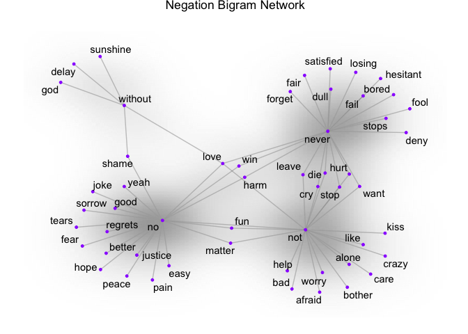
Here, you can see the word pairs associated with negation words. So if your analysis is based on unigrams and "alone" comes back as negative, the bigram "not alone" as you see above will have a reverse effect. Some words cross over to multiple nodes which can be seen easily in a visual like this one: for example, "never hurt" and "not hurt".
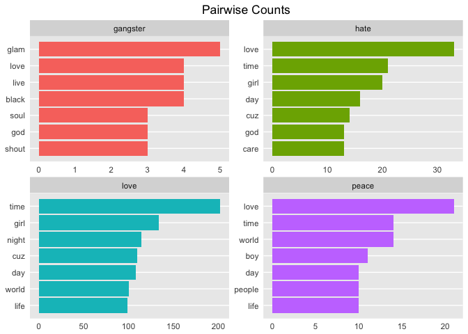
Since you've now looked at n-grams, take a look at the correlation between words. Which words are most highly correlated? Use the pairwise_count() function from the widyr package to identify co-occurrence counts. That is, you count the number of times each pair of words appear together within a song. The widyr package takes a tidy dataset, and temporarily widens it before returning it to a tidy structure for visualization and further analysis.
To keep it simple, I've chosen four interesting words in Prince's lyrics.
pwc <- prince_tidy %>%
  filter(n() >= 20) %>%  #High counts
  pairwise_count(word, song, sort = TRUE) %>%
  filter(item1 %in% c("love", "peace", "gangster", "hate")) %>%
  group_by(item1) %>%
  slice(seq_len(7)) %>%
  ungroup() %>%
  mutate(row = -row_number()) #Descending order

pwc %>%
  ggplot(aes(row, n, fill = item1)) +
  geom_bar(stat = "identity", show.legend = FALSE) +
  facet_wrap(~item1, scales = "free") +
  scale_x_continuous(  #This handles replacement of row
      breaks = pwc$row, #Notice need to reuse data frame
      labels = pwc$item2) +
  theme_lyrics() + theme(panel.grid.major.x = element_blank()) +
  xlab(NULL) + ylab(NULL) +
  ggtitle("Pairwise Counts") +
  coord_flip()
Compare that to pairwise correlation. This refers to how often words appear together relative to how often they appear separately. Use pairwise_cor() to determine the correlation between words based on how often they appear in the same song.
prince_tidy %>%
  group_by(word) %>%
  filter(n() >= 20) %>%
  pairwise_cor(word, song, sort = TRUE) %>%
  filter(item1 %in% c("love", "peace", "gangster", "hate")) %>%
  group_by(item1) %>%
  top_n(7) %>%
  ungroup() %>%
  mutate(item2 = reorder(item2, correlation)) %>%
  ggplot(aes(item2, correlation, fill = item1)) +
  geom_bar(stat = 'identity', show.legend = FALSE) +
  facet_wrap(~item1, scales = 'free') +
  theme_lyrics() + theme(panel.grid.major.x = element_blank()) +
  xlab(NULL) + ylab(NULL) +
  ggtitle("Pairwise Correlation") +
  coord_flip()
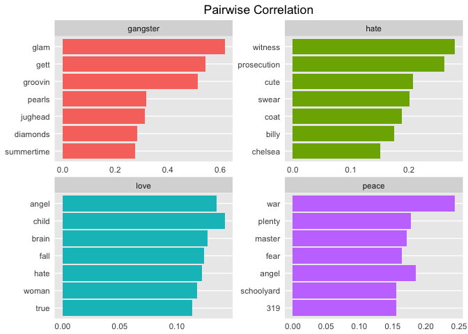
I think these are fascinating insights into the lyrics, just based on these four words alone! Looking at these results you can begin to see some themes emerge. This provides a great segue into the next tutorial on Topic Modeling!
In this tutorial, you created a tidy dataset and analyzed basic information such as the lexical diversity and song counts per release year, and you examined the relationship between release decade and whether a song hit the charts. You then explored some sentiment lexicons and how well they matched the lyrics. Next, you performed sentiment analysis on all songs in the dataset, sentiment over time, song level sentiment, and the impact of bigrams. You did this using a wide variety of interesting graphs, each giving a different perspective.
So is it possible to write a program to determine mood in lyrics? Why yes, it is! How reliable are your results? It depends on a wide range of criteria such as the amount of data preparation, the choice of lexicon, the method of analysis, the quality of the source data, and so on. Comparing real life events, both personal and societal, can illuminate the mood of any lyric. Prince's polar sentiment seemed to slightly decline over time, yet overall, joy does seem to stand out. Charted songs seem to be more positive than uncharted songs. The claims of predicting 9/11 and his own death seem to eerily match his words.
But lyrics are complex and too many assumptions can cause problems. If you take what you've learned about the lyrics into the next tutorial, Part Two-B on Topic Modeling, you will be well on your way to digging out themes and motifs. How much NLP can be performed on lyrics which appear without punctuation or sentence structure? What was Prince really singing about? Now that you understand the mood, you're more prepared to investigate the possible topics. And finally, can you apply machine learning techniques to predict the decade or chart level of a song? Join me in the next few tutorials to find out!
I hope you've enjoyed the journey so far. In Part Two-B we're going to party like it's 1999!
Learn more about R
Course
Course
Course
Tutorial
Debbie Liske
Tutorial
Debbie Liske
Tutorial
Sayak Paul
Tutorial
Hugo Bowne-Anderson
Tutorial
Moez Ali
code-along
Justin Saddlemyer