Data analytics is revolutionizing how we conduct business, and tools like Tableau are at the center of it. Tableau allows anyone to quickly analyze data, extract insights, and build interactive dashboards or other data products with an easy-to-use interface. Almost anyone with basic Excel knowledge can load up Tableau, plug in an Excel file, and supercharge their data workflows.
Despite its ease of use, there’s massive depth in becoming an expert in Tableau. This blog post shares some lesser-known tips and tricks to help Tableau practitioners streamline workflows and consistently deliver awe-inspiring visualizations and dashboards. These tips are specifically focused on saving time in the data prep and formatting process.
Five Tips to Streamline Workflows in Tableau
1. Automate and Reuse Data Prep Processes With Tableau Prep Conductor and Tableau Prep Builder
Working with the correct, most up-to-date data is critical to making accurately informed decisions. Flows built with Tableau Prep Builder allow users to automate data updates. This builder lets users visualize and manage the entire data preparation process.
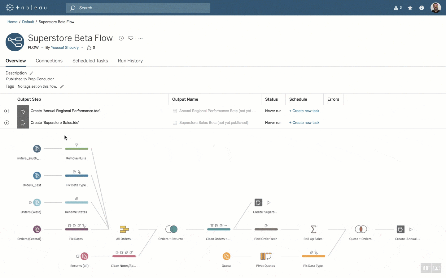
Tableau Prep Conductor works on top of Prep Builder to allow users to schedule and manage these flows. This means analysts don’t need to spend time manually running these flows and don’t have to wait for the data to be populated. These flows and processes can be shared and reused across the organization, leading to less time setting up data prep processes in the future.
Tableau provides a few best practices for working with the conductor tool to automate data prep flows:
- Automate flows during non-work hours: This allows the flows to run when fewer compute resources are being used and to work on a stable server environment rather than using desktop resources.
- Automate using the REST API: If data updates are contingent on other jobs finishing, users can leverage the REST API to trigger updates when the dependent process is completed.
- Leverage administrative views, server statuses, and alerts: The conductor tool provides a lot of functionality to monitor the performance of flows. It also allows users to send notifications when a process fails with suggestions on how to fix the errors.
- Ensure the right people can access the data: Proper documentation in any technical tool is essential to its usability throughout an organization. Users can tag flows with keywords to categorize content to make them more reusable and accessible to others in the organization. Additionally, user-specific access to the flows can be managed through permissions and authentication settings.
Tableau prep toolkit can save organizations time and eliminate workflow inefficiency by ensuring that the correct data is available to the right people.
2. Reuse Cleaning Operations and Calculations Across Multiple Flows
In any technical domain, Don't Repeat Yourself (DRY) is an essential concept for streamlining workflows. Users must not spend additional time applying the same cleaning operations and rewriting complex calculation logic across different flows. They should put their effort into ensuring the flow is correctly set up, and each step works as intended the first time. After this, they should trust this step to be plugged into other flows. It is one of the surest ways to save analysts time and reduce the error margin of rewriting the same complex logic.
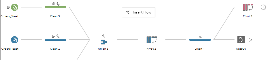
Tableau allows copying steps from one flow and placing them into another. This is done by going to the change you want to copy, pasting it into changes for the step you would like to add it to, and then dragging and dropping it to apply it.
DRY programming is a fundamental technical concept, and Tableau enables data analysts to implement it in their workflows regularly.
3. Create a Style template To save Time With Formatting Future Dashboards
Everyone has a personal style of executing creative work. This includes the way we set borders on tables, the fonts we use, the colors palette we leverage, and the placement of visualizations. For example, take a look at Pew Research Center or FiveThirtyEight’s articles. All of their visualizations have a consistent style throughout the site.
A consistent style helps others recognize your work and can be a valuable storytelling mechanism if sound design is your style. Developing a great dashboard that can be associated with your work is extremely useful for effective communication.
However, the process of designing dashboards can often be very time-consuming. If you find yourself making similar-looking dashboards, you can create a template file to significantly reduce the time and effort it takes to plan out the dashboard and make design decisions from scratch.
Although there is no dedicated “template” feature available on Tableau, it is possible to copy formatting from one sheet to another by creating a workbook with mock data. You can reference this template workbook anytime by right-clicking on the chart tab to “Copy Formatting” and going back to the current tab to “Paste Formatting’ through right-click.
Developing the original template file will be very time-consuming—but ultimately—it will lead to a more efficient and effective workflow.
4. Learn the Important Tableau Keyboard Shortcuts
Being able to work without constant mouse navigation is a huge time saver. Brainscape claims that learning keyboard shortcuts can save up to 8 days a year (64 hours) and lead to 3.3% better productivity. Tableau is a very user-input-heavy application which means that there are many opportunities to use shortcuts to speed up workflows.
Tableau supports many of the standard keyboard shortcuts in other applications and has specific shortcuts for data manipulation and dashboard designs.
Here is a complete list of available shortcuts on Tableau. While this list looks long at first, learning these will help streamline your workflow and improve productivity.
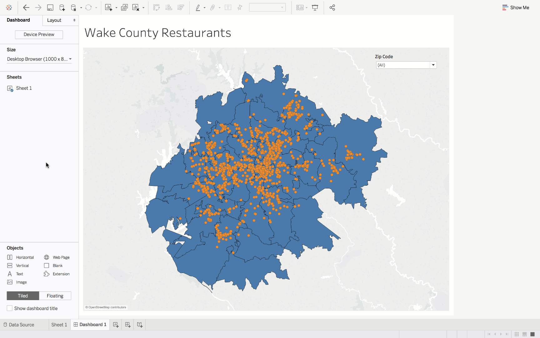
5. Layout Dashboards Using Grid Feature or Tile Feature
When creating a dashboard in Tableau, there are two different ways to layout objects: Floating and Tile. The floating option gives users a lot more freedom while the tile option swiftly compiles information in an organized way.
Floating
Laying out visualizations and text needs to be done in a precise and organized manner to look good. It’s hard to do this by just dragging and dropping visualizations onto the canvas without a system. This process can be greatly improved and streamlined by turning on the grid feature available under the Dashboard dropdown on the menu bar.
Once the grid is turned on, there are several other features to improve the grid’s utility. For example, the pixels between the grid can be changed under Dashboard in the Grid Options section. An increment of 10 works best for the available keyboard shortcuts.
Once placed as a floating object, a graph can be moved by one pixel using the arrow keys or 10 pixels using Shift and the arrow keys. Sizing adjustments can be made by using the alt key with arrow keys for 1-pixel size adjustments and alt + shift coupled with arrow keys for 10-pixel size adjustments.
Tile
If users want to create a dashboard quickly, the worksheets can be placed into the sheet in tiled mode. It adds the charts to the sheet next to each other. Tiles that fill the canvas can be quickly added by double-clicking on the sheets on the left pane. The container of these tiles can be selected by double-clicking the top of the object on the canvas.
Tableau is revolutionizing how we interact with data and create value-driven, interactive dashboards. We hope these Tableau tips and tricks help you streamline workflows by leveraging all of its available features to your benefit. For more resources on becoming a better Tableau practitioner, you can check out the following resources:
- [PODCAST] The Data Storytelling Skills Data Teams Need
- [Blog] Seven Tricks for Better Data Storytelling: Part 1
- [Blog] Seven Tricks for Better Data Storytelling: Part 2