Cours
Visualisation de données intermédiaire avec ggplot2
4 h
56.8K
Data visualization is one of the most relevant skills in data science. Bringing data to life with insightful plots and charts is one of the most effective ways to communicate insights your team might not have found otherwise. Using data visualization tools is often a key part of this process.
Data visualization is a must-have skill across data roles, from data analysts working on dashboards and reports to data stewards explaining how the company’s data warehouse is organized. Data visualization is also a central pillar of data storytelling, an approach that advocates for using visuals, narrative, and data to turn data insights into action.
Data visualization tools range from no-code business intelligence tools like Power BI and Tableau to online visualization platforms like DataWrapper and Google Charts. There are also specific libraries in popular programming languages for data science, such as Python and R. As such, data visualization is often viewed as the entry point, or “gateway drug,” for many aspiring data practitioners.
This article presents a holistic overview of the best data visualization tools in data science. Learning how to use these tools is a critical step to succeed in your data science career. If you are interested in mastering your data visualization skills, we highly recommend you check out DataCamp’s 30+ courses in data visualization.
Data science is a vibrant and rapidly evolving discipline. New software and tools, including data visualization tools, are popping up daily. Against this backdrop, deciding which tool to use can be challenging. No single data visualization tool is best in absolute terms to address all the problems and circumstances you may encounter in your data science career.
Every case is different, and you or the company you work for must balance several factors to find the best fit for your needs. Below you can find a list of factors you should always consider before choosing a data visualization tool:
The ease of use and complexity of data visualization tools range considerably. Generally, the more features and capabilities —i.e., more control over settings, customization, and functionality—the steeper the learning curve. Simpler data visualization tools are better suited for non-technical users, who will be able to get started quickly.
If you want to complete control over the configuration, parameters, and aesthetics of your plots, you should go for data visualizations with wide flexibility. It will take you more time to get familiar with the tool, even if you are an experienced data analyst, but once you are there, you will be able to produce incredibly aesthetic and customizable visualizations.
Data visualization tools can be categorized depending on whether they focus on independent plots or dashboards. The first category of tools is designed to create one visualization at a time. The second category treats applications or dashboards as the basic unit. A data dashboard is an information management tool to track and visualize multiple data points and KPIs.
The way you present your insights will vary depending on who your audience is. If you are a data engineer who mostly reports to other technical roles within the same department, a data visualization tool focused on visual analytics would be enough. By contrast, if you are a data analyst or a business consultant working hand-in-hand with management and decision-making teams, you could consider tools that, by focusing on data storytelling, incorporate additional features that allow users to tell the full story behind data.
Last but not least, price is an important factor to consider when choosing a data visualization tool. Depending on your needs and budget, some tools will function better than others. Below, you will find a list of open-source and proprietary data visualization tools across various platforms and technologies.
matplotlib is a comprehensive library for creating static, animated, and interactive visualizations in Python. Created by John D. Hunter in 2003, matplotlib provides the building blocks to create rich visualizations of many different kinds of datasets. All kinds of visualizations, such as line plots, histograms, bar plots, and scatter plots, can be easily created with matplotlib in a few lines of code.
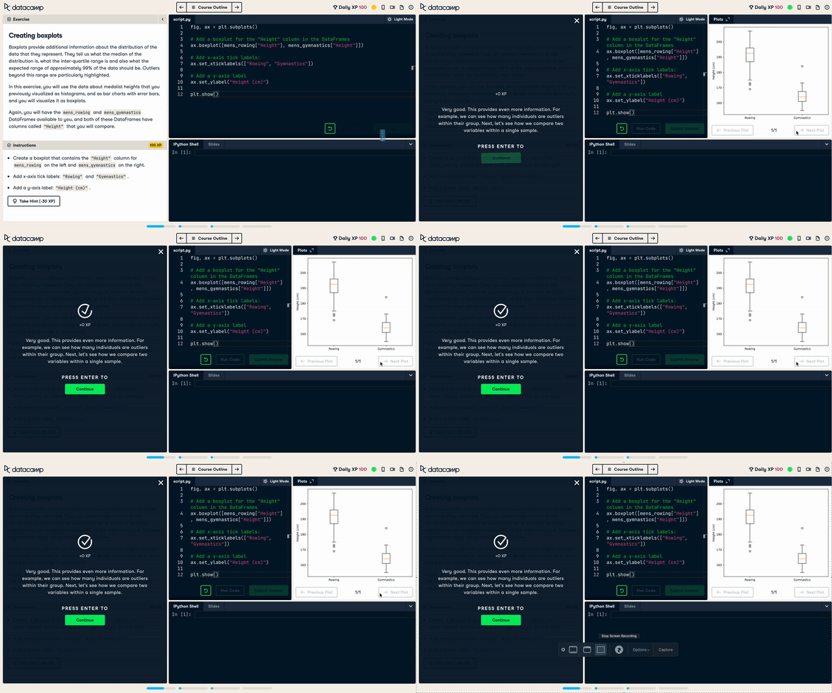
You can customize every aspect of a plot you can think of with matplotlib. This makes the tool extremely flexible, but also it can be challenging and time-consuming to get the perfect plot.
Key features:
.pdf, .png, and .svg.Pros:
Cons:
Learn it on DataCamp:
Any kind of visualization is possible with matplotlib. However, sometimes the wide flexibility of matplotlib can become difficult to master. You may spend hours in a plot whose design seemed straightforward at the outset. Seaborn was designed to address these pitfalls.
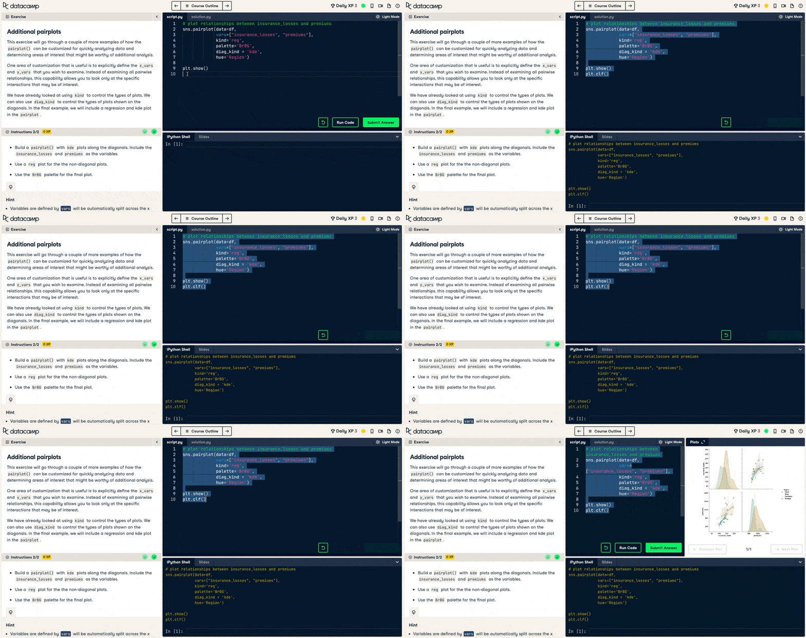
It’s a Python library that allows you to generate elegant graphs easily. Seaborn is based on matplotlib and provides a high-level interface for drawing attractive and informative statistical graphics.
Key features:
Pros:
Cons:
Learn it on DataCamp:
matplotlib and Seaborn focus mostly on static visualization. By contrast, Bokeh’s major strength is interactivity. Bokeh is a powerful Python package for interactive data visualization. It enables you to go beyond static plots and allows stakeholders to interact with your visualizations and dig for their own insights.
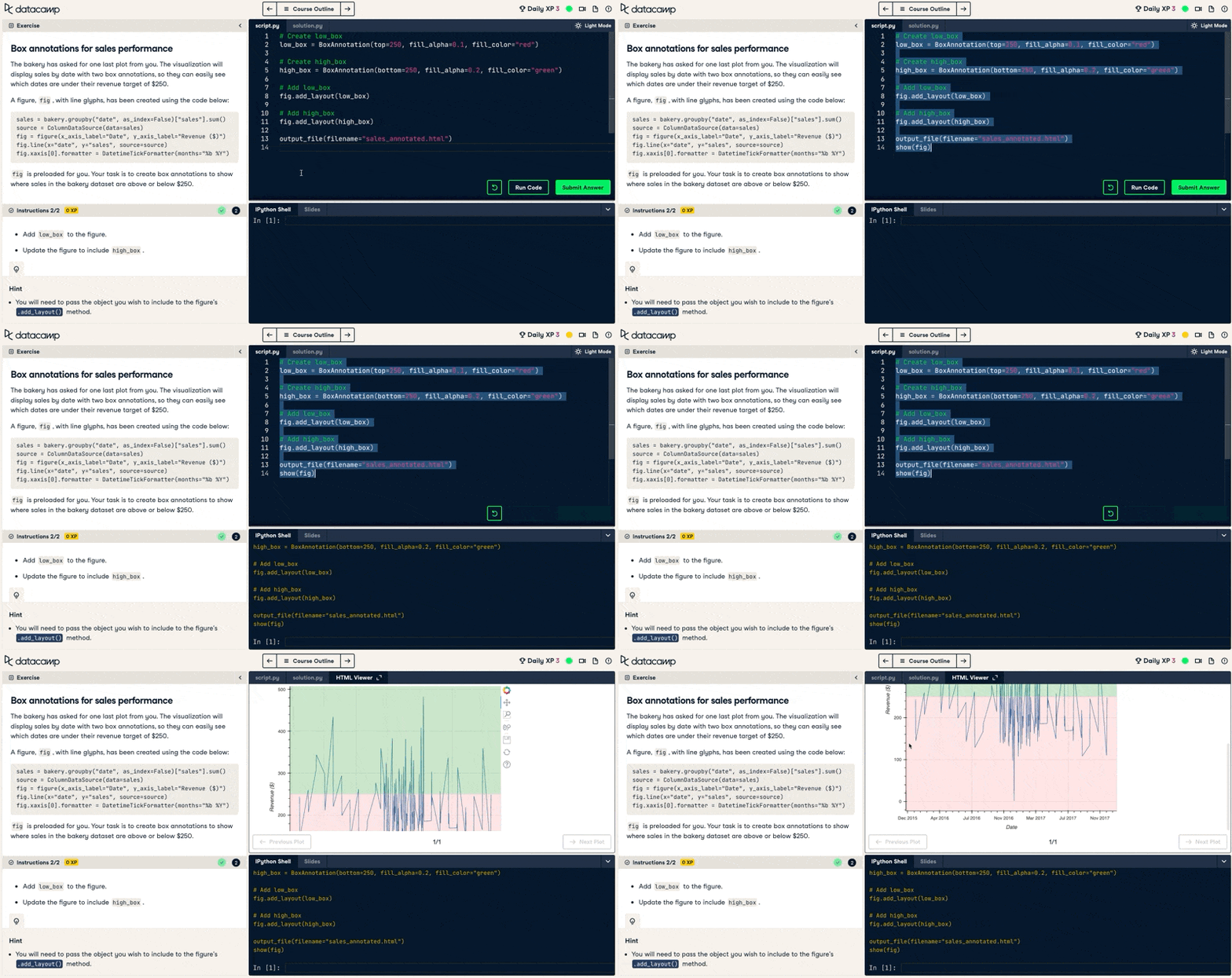
The goal of Bokeh is to provide elegant and simple graphics, ranging from simple plots to complex dashboards with streaming datasets. It allows for additional customization through JavaScript capabilities.
Key features:
Pros:
Cons:
Learn it on DataCamp:
Arguably R’s most powerful package, ggplot2 is a plotting package that provides helpful commands to create complex plots from data in a data frame. Since its launch by Hadley Wickham in 2007, ggplot2 has become the go-to tool for flexible and professional plots in R. ggplot2 is inspired by the data visualization methodology called “the grammar of Graphics,” whose idea is to independently specify the components of the graph and then combine them.
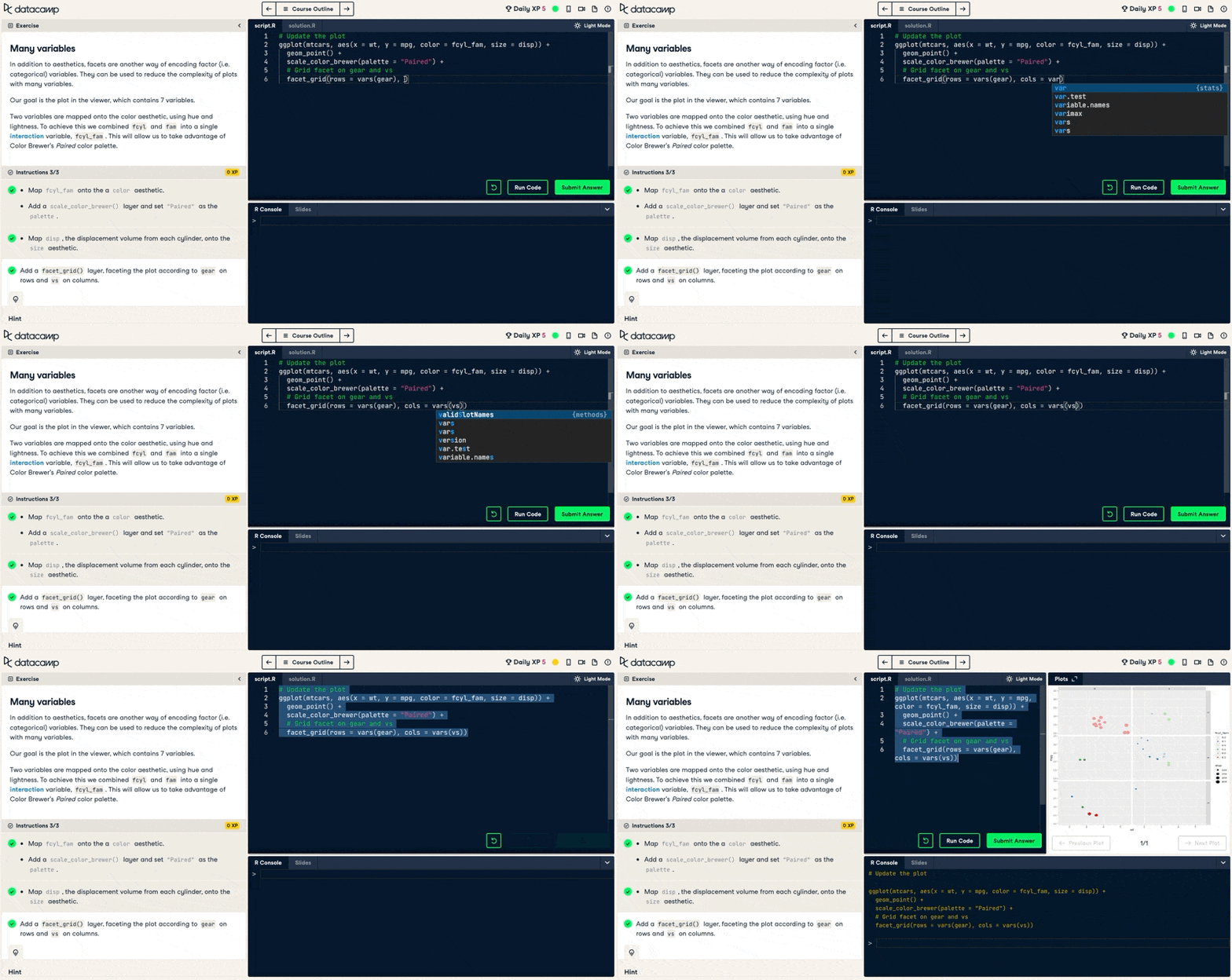
This package is included within tidyverse, which includes a set of packages for data science. ggplot2 also provides interactive and animated graphics.
Key features:
Pros:
Cons:
Learn it on DataCamp:
leaflet was launched originally as an open-source JavaScript library to create dynamic online maps. An identically named R package makes it possible to create these kinds of visualizations in R. leaflet in R is the perfect tool to make attractive and interactive web maps using spatial data.
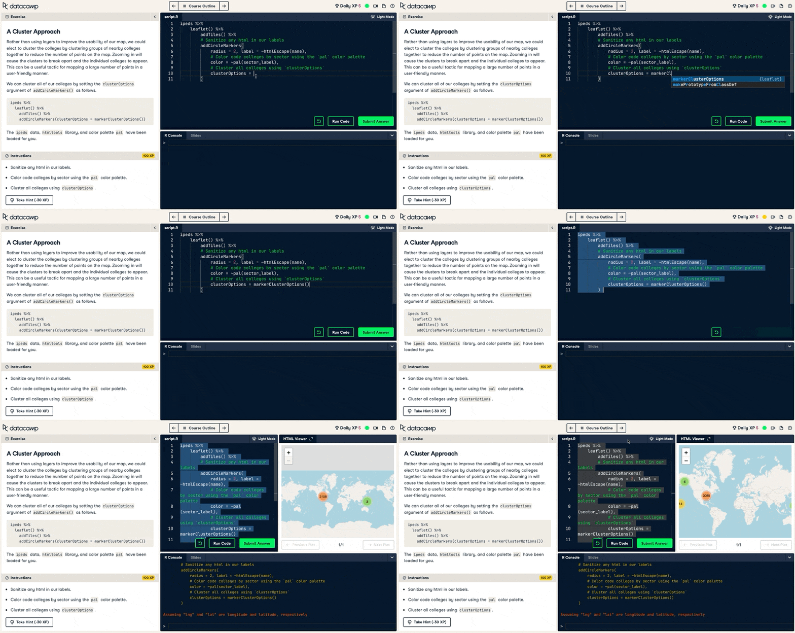
Wildly popular, leaflet is currently used by numerous websites and GIS specialists, like the New York Times and Mapbox.
Key features:
Pros:
Cons:
Learn it on DataCamp:
plotly is an R package for creating interactive, publication-quality graphs through the open source JavaScript graphing library plotly (also available for Python). Due to its simplicity and great outputs, plotly is the standard library for interactive data visualizations in many large technology companies.
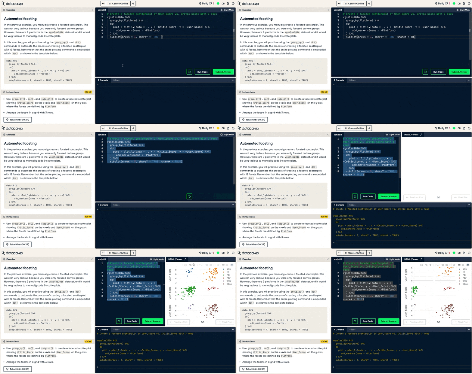
Although plotly is based on R syntax to create plots, it uses JavaScript to render the final graphics, making the visualizations well-suited for publications in modern web browsers.
Key features:
Pros:
Cons:
Learn it on DataCamp:
RAWGraphs is an open source data visualization framework built to make the visual representation of complex data easy for everyone. It launched in 2013 and is an awesome open source alternative for data visualization.
It is a free, intuitive platform that allows users to plot data quickly and comfortably without needing to code. Besides, it includes the possibility to embed those visualizations on another website, and there is no need to create an account or register your email address.
Key features:
Pros:
Cons:
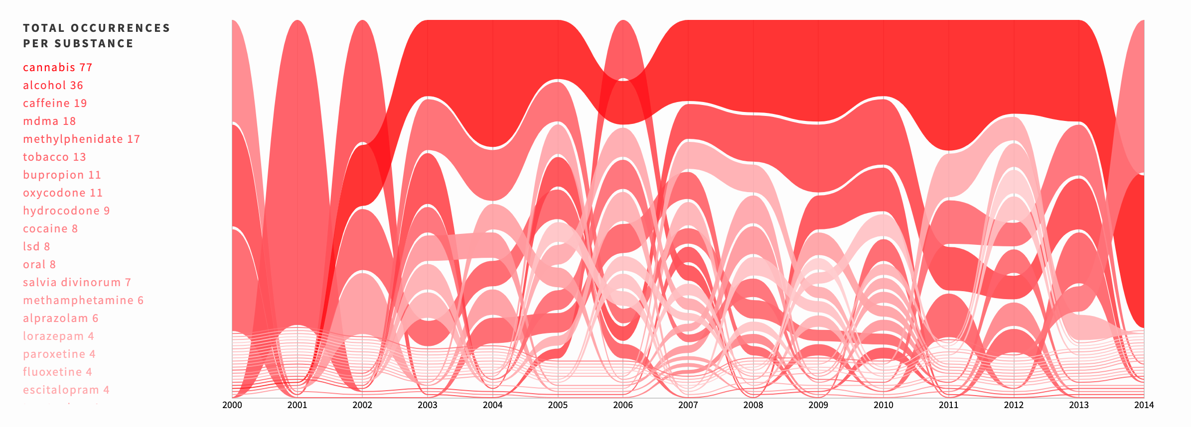
An example from the RAWGraphs data visualization tool
Google Charts is a perfect tool to visualize data on your website. It’s a JavaScript-based tool that can create simple visualizations from small and large data sets. Google Charts comes with a very nice and easy-to-use interface where you can comfortably choose what type of visualizations to use.
It provides a fairly extensive collection of interactive graphs. Although it’s not as feature-rich as other GUI-based data visualization tools, Google Charts is free forever.
Key features:
Pros:
Cons:
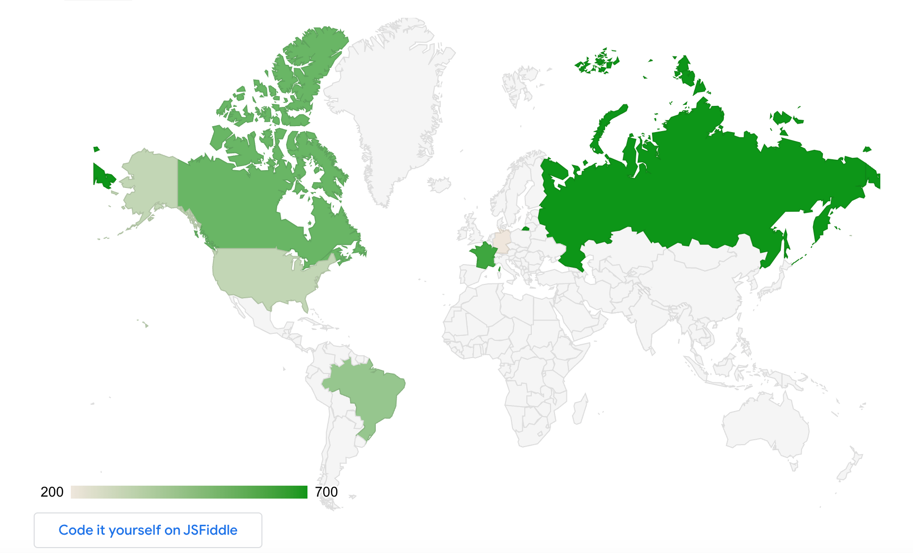 An example from the Google Charts data visualization tool
If your main area of work is journalism, DataWrapper is the data visualization tool you need. Numerous digital media outlets have adopted this wonderful tool to make their graphics, including The Washington Post, The Guardian, Vox, and The Wall Street Journal.
It is easy to use and requires no coding. With DataWrapper, we can load our dataset and transform it in a simple way into a graph or a map. It also has a wide base of templates to integrate these visualizations into your website easily.
Key features:
Pros:
Cons:
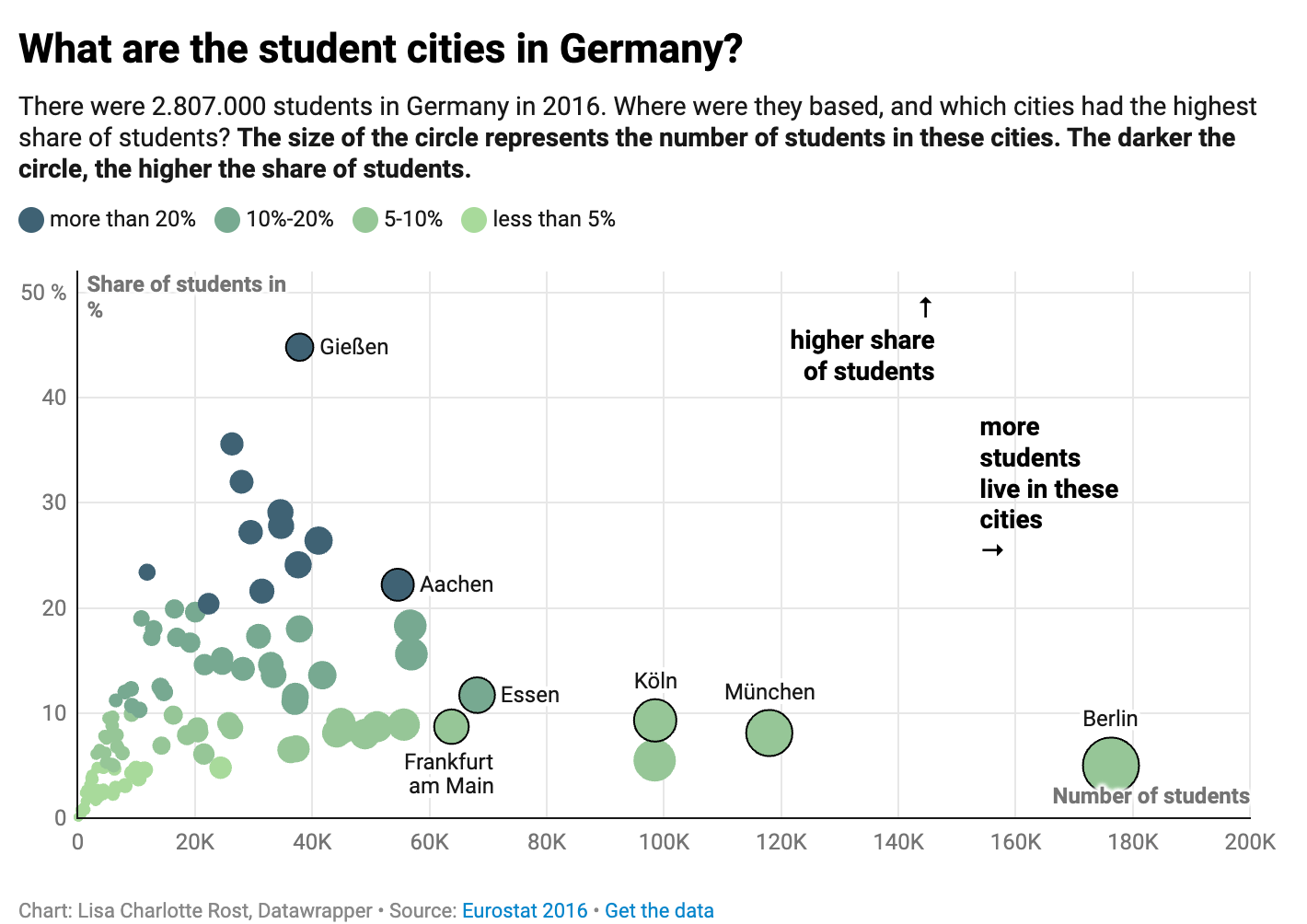
An example of a DataWrapper visualization
Tableau is a powerful and popular data visualization tool that allows you to analyze data from multiple sources simultaneously. Founded in 2003 at Stanford University, in 2019, Salesforce acquired the platform.
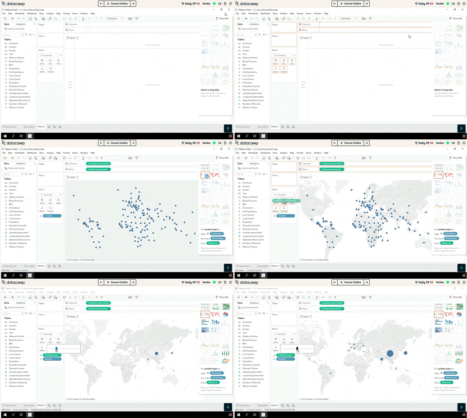
One of the best-in-class Business Intelligence tools out there, Tableau is used by top companies to extract insights from tons of raw data. Thanks to its intuitive and powerful platform, you can do anything with Tableau. However, if you are just interested in building simple charts, you should go for less robust and more affordable options.
Key features:
Pros:
Cons:
Learn on DataCamp:
Power BI is a cloud-based business analytics solution that allows you to bring together different data sources, analyze them, and present data analysis through visualizations, reports, and dashboards.
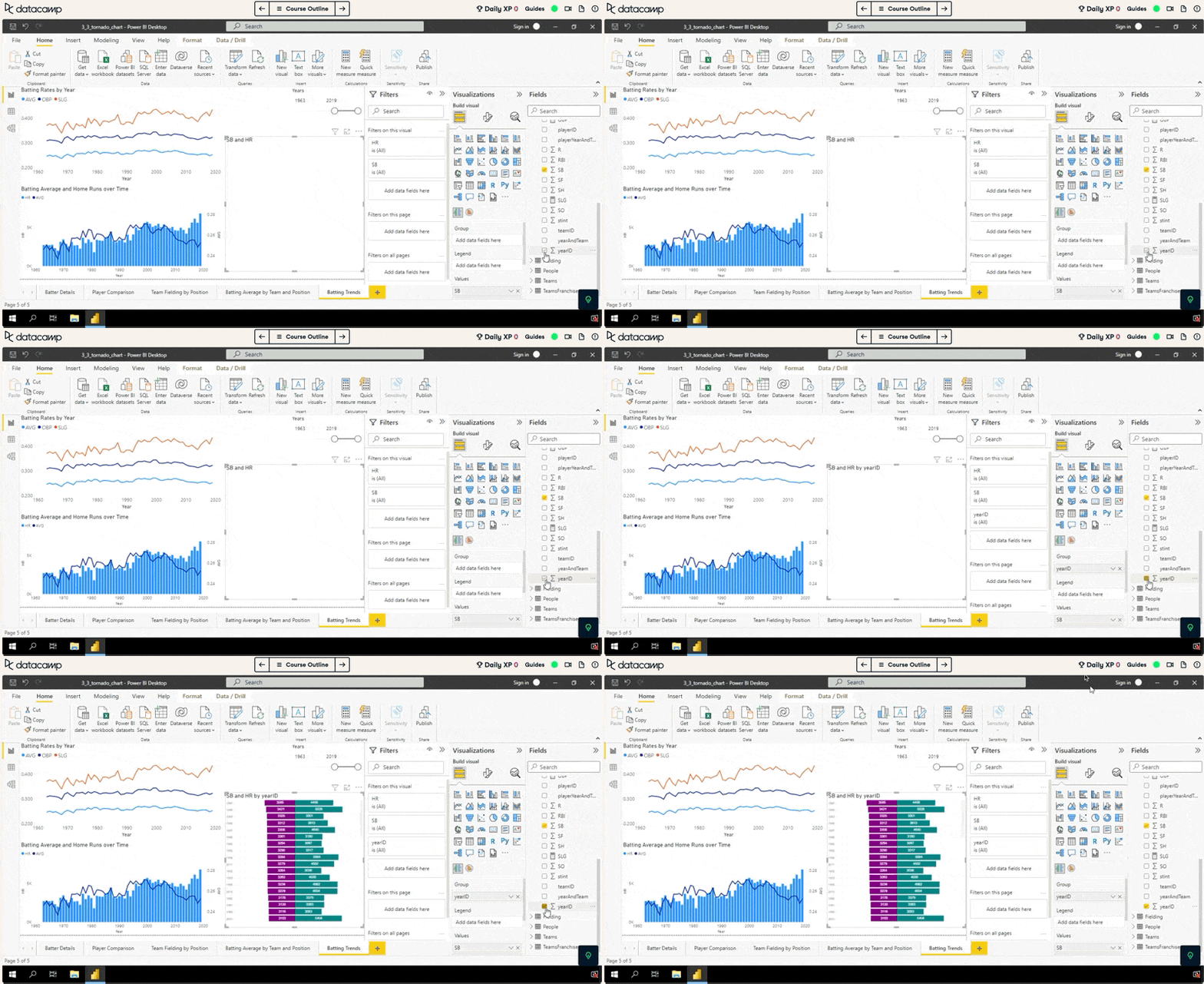
According to the Gartner Magic Quadrant, Microsoft’s PowerBI is the leader in BI solutions in the industry. Power BI makes it easy to access data on almost any device inside and outside the organization.
Key features:
Pros:
Cons:
Learn it on DataCamp:
Master the world's most popular business intelligence tool.
Qlik Sense is a data visualization tool designed for large companies and individuals who want to use augmented analytics to analyze data. Qlik Sense is the successor to "QlikView," a similar (but smaller) visual analysis tool.
Qlik Sense can be deployed on-premises or in the cloud. The company also operates a product called Data Market, which provides QlikView users access to a curated list of publicly available data sets, including census data, financial data, and business filing data.
Key features:
Pros:
Cons:
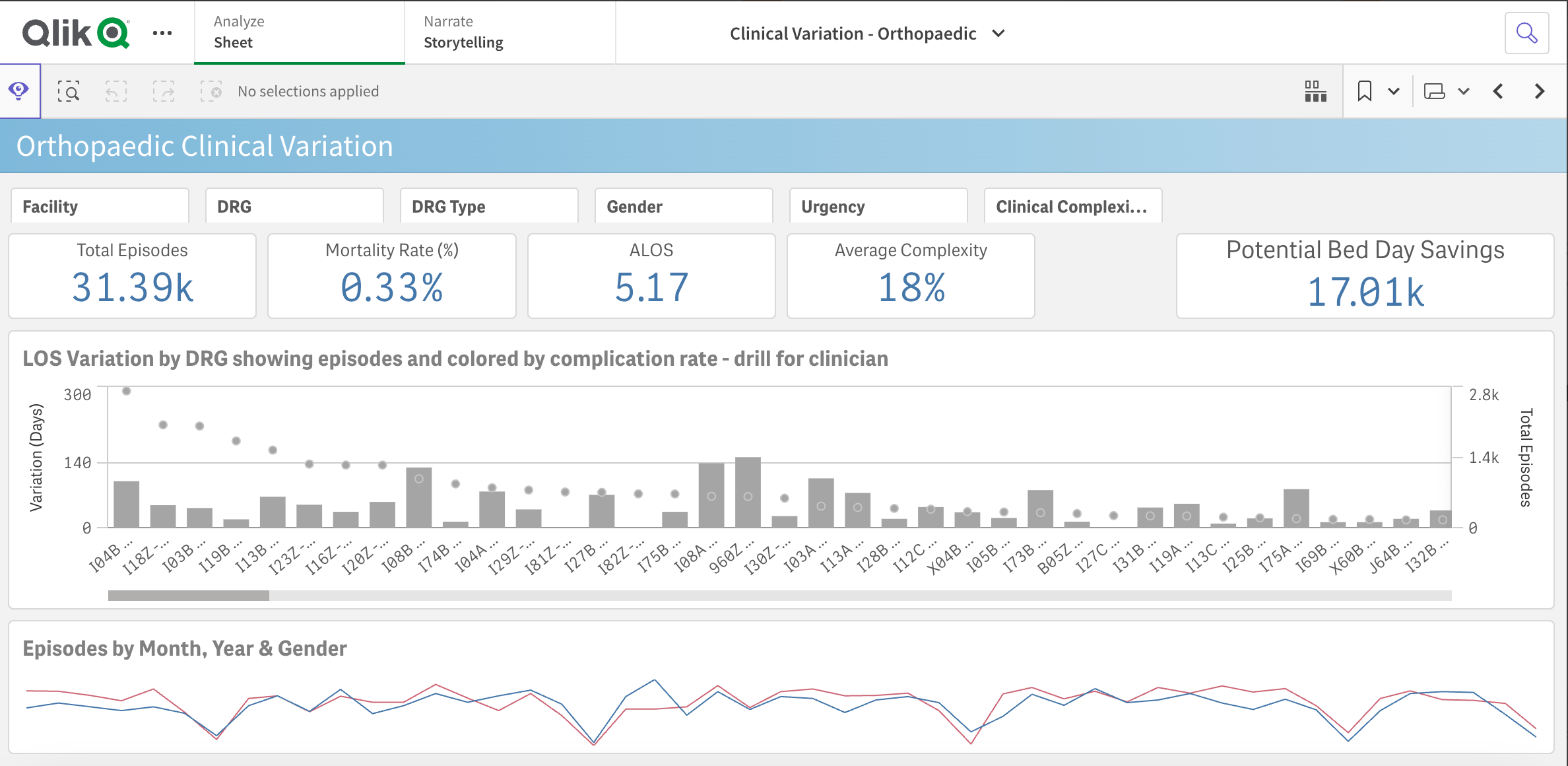
An example of a Qlik dashboard
If you are interested to see what the tools mentioned above are capable of, here is a list of examples to get inspired by:
In this dashboard on remote working, made with Tableau and published in Tableau Public, Jeremy Johnson studies the evolution of remote working and online education across European countries.
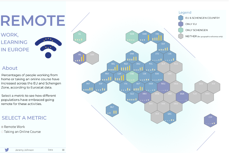
Source: Tableau Public
This Covid-19 Information dashboard is a great example to illustrate the magic of Power BI. The dashboard provides multiple information about the pandemic across the world.
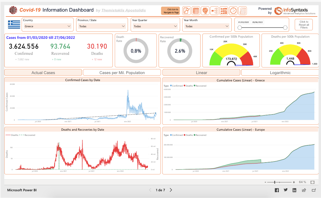
Source: Power BI Gallery
Using DataWrapper, Lisa Charlotte Muth created this insightful visualization comparing energy consumption from the IT sector and the energy budget of several countries.
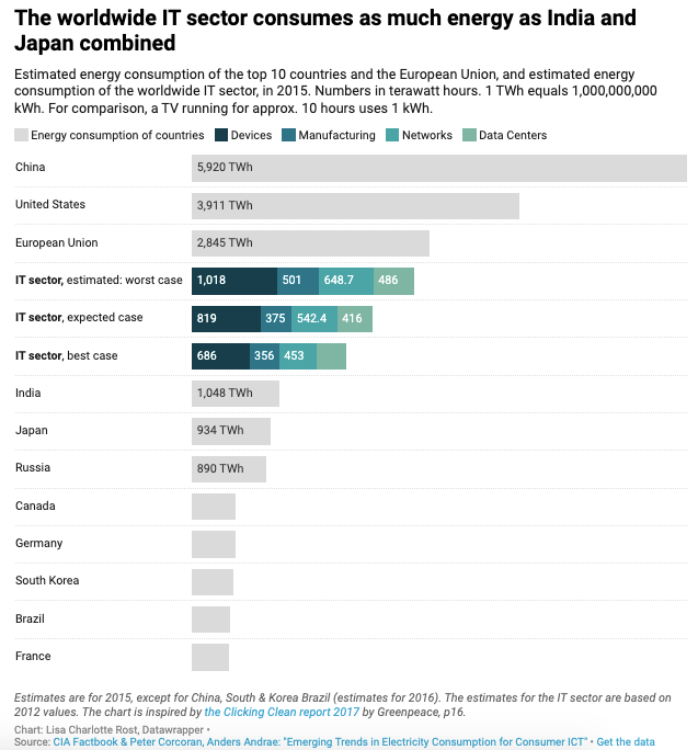
Source: DataWrapper
We hope you enjoyed this article. While it’s important to know the different options for the best data visualization tools in the market, even more, important is to know how to create data visualizations yourself. DataCamp is here to help. You can find more resources to guide you through your data visualization journey below.
Related courses
Cours
Cours
Cours
blog
Abid Ali Awan
9 min
blog
Javier Canales Luna
12 min
blog
Javier Canales Luna
13 min
blog
DataCamp Team
5 min
blog
Kurtis Pykes
15 min
cheat-sheet
Richie Cotton