Track
Data Analyst in Power BI
50 hr
Power BI has emerged as one of the most powerful business analytics tools on the market, enabling users to connect to diverse data sources and create compelling dashboards and reports. Power BI visualizations play a crucial role in simplifying complex data, identifying patterns, and communicating findings to stakeholders.
In this guide, we’ll cover a comprehensive walkthrough of Power BI visuals, exploring their types, use cases, implementation strategies, and design best practices. To enhance the learning experience, we will also use a mock finance dataset throughout this tutorial to demonstrate these visuals.
If you’re looking for a hands-on course, be sure to check out Data Visualization in Power BI Course.
Power BI visuals are graphical representations of data within the Power BI platform. They are designed to help users gain insights from data by making complex information more accessible and understandable. Visuals make it easier to digest large volumes of data in a simplified format.
Visuals in Power BI can be categorized into three main types.
Built-in visuals are helpful for quick analysis of data, while advanced visuals allow for more unique and specific analysis of data. Custom visuals provide an easy way for users to tap into the community to better make use of Power BI without manual creation of visuals.
Choosing the right visual is just as important as the data itself. A well-selected visual enhances comprehension, directs attention to critical insights, and facilitates quicker decision-making. Different visuals are suited to different kinds of data and questions, and using the wrong visual can mislead users or obscure key information.
For example, a line chart is excellent for showing trends over time, while a bar chart is better for comparing different categories. Pie charts are useful for showing proportions, but can become confusing when there are too many segments.
The goal is always to match the visual to the analytical need. Tailored visuals not only enhance clarity but also improve engagement and help tell a more compelling data story.
Power BI offers a rich array of visualization types, each suited for specific types of analysis. Knowing which visuals to use and when can greatly enhance the effectiveness of your reports.
Before we begin, to effectively demonstrate Power BI visuals, we’ll use a mock finance dataset that simulates monthly financial performance for several departments in a company. This dataset includes metrics such as revenue, expenses, and profit across a 12-month period.
Here's the Python script to generate the dataset:
import pandas as pd
import numpy as np

np.random.seed(42)
months = pd.date_range(start="2023-01-01", periods=12, freq='M')
departments = ['Sales', 'Marketing', 'IT', 'HR', 'Operations']

data = []
for dept in departments:
    revenue = np.random.randint(100000, 500000, size=12)
    expenses = revenue * np.random.uniform(0.6, 0.9, size=12)
    profit = revenue - expenses
    for i in range(12):
        data.append({
            'Department': dept,
            'Month': months[i],
            'Revenue': round(revenue[i], 2),
            'Expenses': round(expenses[i], 2),
            'Profit': round(profit[i], 2)
        })

df = pd.DataFrame(data)
df.to_csv("mock_finance_data.csv", index=False)Now that you have your dataset, let’s work on importing it into Power BI Desktop.
Here’s how you can do that:
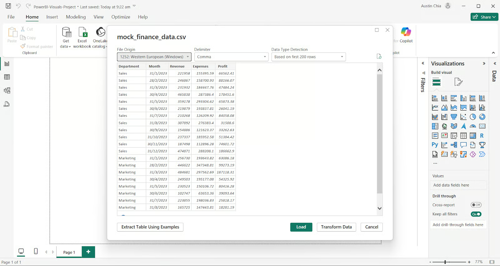
Congratulations, you have successfully imported your dataset! Now let’s move on to creating some basic charts and graphs to visualize this data.
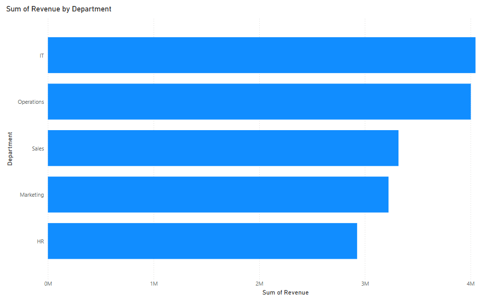
Bar charts are among the most widely used visuals in Power BI. They provide a straightforward way to compare values across different categories, such as revenue by department.
To create a Bar Chart in Power BI:
Here’s what your bar chart visual should look like:
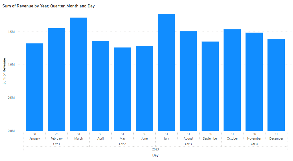
Column charts serve a similar purpose, with vertical bars offering a quick view of magnitude.
To create a Column Chart in Power BI:
Here’s what your column chart visual should look like:
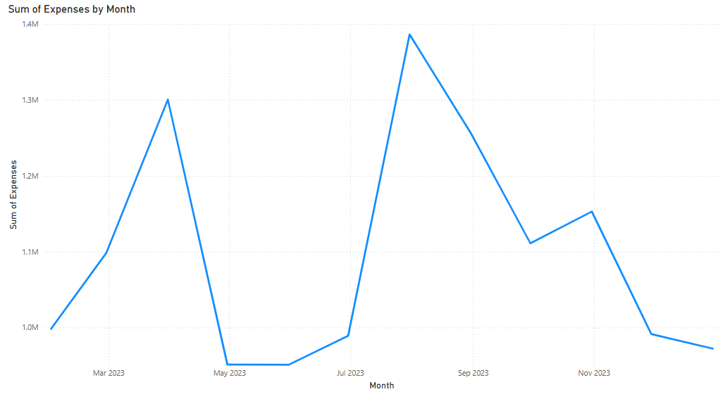
Line charts are essential for displaying data trends over time and are particularly effective for showing month-by-month changes in key metrics such as revenue or profit.
To create a Line Chart in Power BI:
Here’s what your line chart visual should look like:
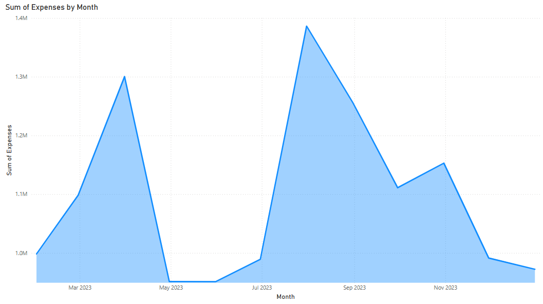
Area charts build upon line charts by shading the space beneath the line, which can help emphasize volume.
To create a Area Chart in Power BI:
Here’s what your area chart visual should look like:
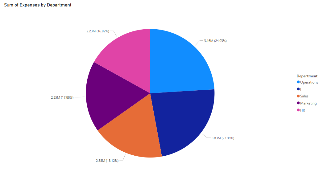
Pie and doughnut charts are best for showing proportions, like how much each department contributes to the overall profit. However, they should be used sparingly due to limitations in precision and scalability.
To create a Pie Chart in Power BI:
Here’s what your pie chart visual should look like:
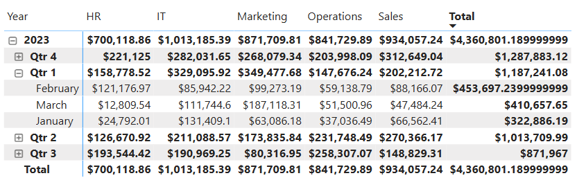
Power BI matrix visuals expand upon tables by allowing users to drill down and analyze data at different levels of granularity. They are particularly useful for cross-tabulated data, such as tracking monthly revenue by department.
To create a Matrix visual:
Here’s what your matrix visual should look like:
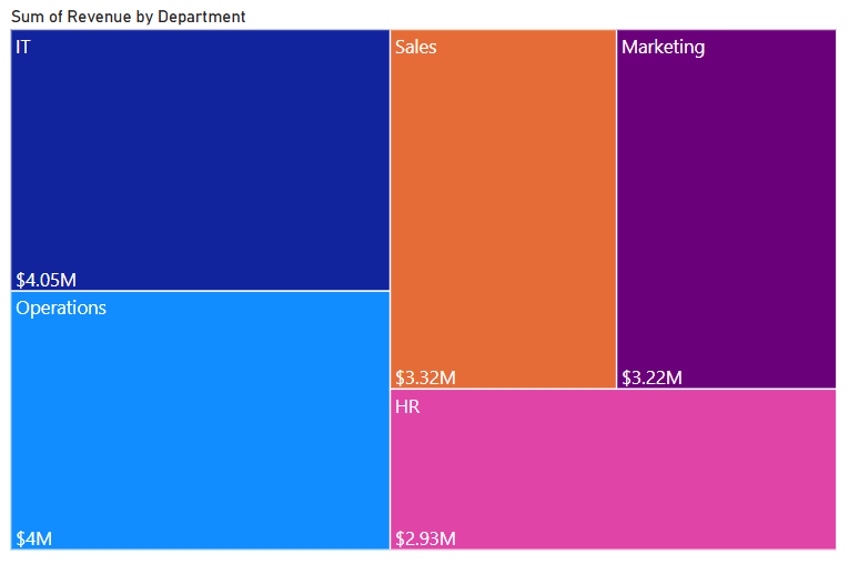
Tree maps represent hierarchical data through nested rectangles, where each box size corresponds to a value like total profit.
To create a Tree map:
Here’s what your tree map should look like:
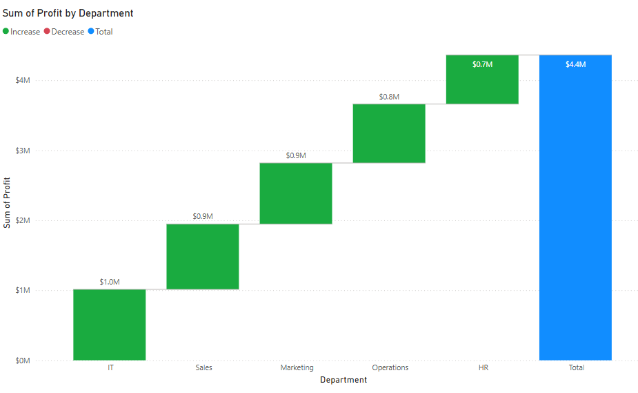
Waterfall charts, on the other hand, are ideal for illustrating how sequential values—such as revenue, expenses, and profit—build up or reduce an overall figure.
To create a Waterfall chart:
Here’s what your waterfall chart visual should look like:
Power BI’s map visuals enable you to plot geographic data. The standard map visual places data points based on latitude and longitude or geographic fields like country and city.
Filled maps color in geographical regions, allowing you to visualize metrics like sales volume or expenses by region. Azure Maps provides even more advanced capabilities, including layered location intelligence.
Power BI also includes several advanced visuals that provide deeper analytical insights and enhanced interactivity. These visuals are particularly useful for decision-makers who require multi-layered analysis and AI-powered insights.
The Power BI Gantt chart visual is ideal for project management. It displays tasks, start and end dates, and dependencies. Box and whisker charts provide a statistical view of data distribution. They’re useful when analyzing variability in financial figures across departments.
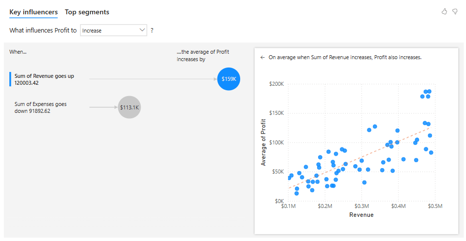
The key influencer visual leverages AI to identify drivers of selected metrics. The decomposition tree allows users to drill down into measures across multiple dimensions. KPI cards and gauge visuals help track performance against targets.
To create a Key Influencer visual:
Here’s what your Key Influencer visual should look like:
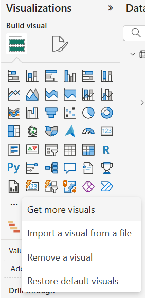
Custom visuals offer greater flexibility and can address use cases not covered by default visuals. You can import visuals from AppSource or develop your own using Power BI developer tools.
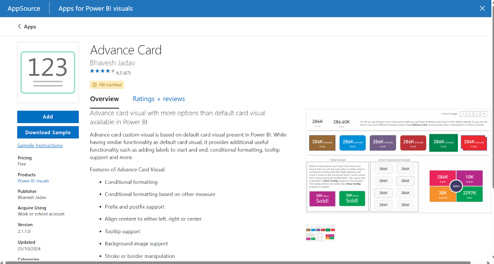
To install a custom visual from AppSource:
Once imported, configuring these visuals is similar to the built-in ones. You assign fields to specific buckets and use the Format pane for customization. Always check documentation for special formatting requirements or data structure constraints.
To develop your own visuals, use the Power BI Visual Tools (PBIViz) and the D3.js library. Tools like Deneb and Charticulator also allow non-programmers to design complex visuals using declarative specifications or drag-and-drop interfaces.
Designing effective visuals requires more than just inserting charts and putting them together.
More often than not, it involves thoughtful layout, consistent design, and user-centric functionality.
Here are some tips for better visuals:
JSON themes can help ensure design consistency across visuals. You can define fonts, colors, and backgrounds to match your organization’s branding.
Despite its strengths, Power BI has limitations you’ll need to be aware of for its visualization capabilities.
Power BI is constantly evolving as technology changes. AI-driven features are becoming more prevalent, especially with their integration with Copilot.
Some more helpful features include:
Collaborative features are also improving. Users can now comment directly on visuals, tag team members, and share reports through Microsoft Teams. This enhances teamwork and streamlines decision-making.
Custom themes are also expanding. Organizations are building theme libraries to ensure consistent visual branding across all reports. This helps maintain a unified design language and improves user trust in analytics content.
Power BI visuals are critical for effective data storytelling. Their built-in visuals make it easy for beginners to get started quickly, while offering more advanced users the ability to create custom visualizations for more unique cases.
For more on Power BI, check out our Introduction to Power BI course and Power BI Fundamentals skill track. Further reading, our Power BI Dashboard Tutorial and Power BI Tutorial for Beginners are great places to start.
Top Power BI Courses
Track
Track
Course
blog
Wendy Gittleson
12 min
Tutorial
DataCamp Team
Tutorial
Austin Chia
Tutorial
Joleen Bothma
Tutorial
Parul Pandey
code-along
Nick Switzer