
Course
Introduction to Tableau
6 hr
319.5K
Tableau is well-known for its easy-to-create and cool visualizations. Ever since I took Data Visualization in Tableau, I've loved using Tableau to present my findings.
But did you know that Tableau can also do interesting things with tables? This is great news because, when we need to report the exact figures more than anything else, showing data in text can be the best option. So in this article, I'm excited to show you one specific thing: Tableau crosstabs. Let's take a look.
A crosstab (also called a cross table or text table) is simply a way of displaying your data in a grid format. It's essentially a table view where the rows and columns show aggregated values.
Crosstabs main function is to convey the exact figures, but they can be customized and built on with visual aids to also show comparisons and place numbers within context. With customizations and visual aids, we can create complex business intelligence reports, including balanced scorecards, to report business metrics and KPIs. All of this will make sense as we work through our example.
Creating crosstabs in Tableau is easy and straightforward, as it solely depends on the software’s interactive user-friendly interface. In the following steps, we will be going through the steps of importing data and creating a simple crosstab.
Let’s use Tableau’s Superstore Sales dataset. To download the file, go to Explore sample data sets from the opening page, and download the 'Superstore Sales Excel' file.
Downloading Superstore Sales data. GIF by Author.
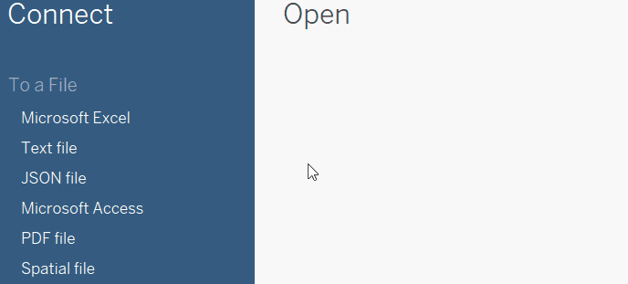
When downloaded on your device, you can import the data by choosing Microsoft Excel from the Connect pane on the left-hand-side and finding where the file is located.
As you will be able to see, the file has three sheets. For this article, we will use the Orders data. Drag the sheet from the left side and drop it in the upper middle part of the Data Source page.
Importing data into Tableau. GIF by Author.
Then, move to Sheet 1 from the bottom tabs to start building our crosstab.
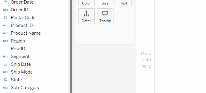
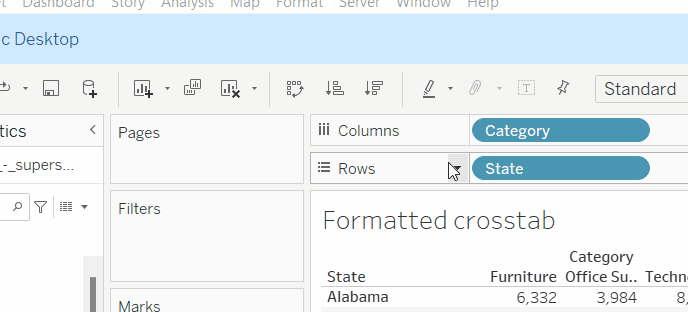
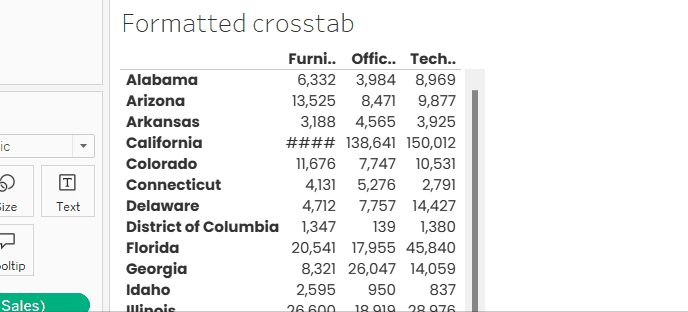
To create a crosstab, we simply need to drop a dimension into the Rows shelf, another into the Columns shelf, and add a measure in the space in between.
Let's try it for ourselves: For the Rows, we will choose the State field, which represents the state from which the orders were made. For the Columns, we will choose the Category field, which represents the categories of the Superstore products.
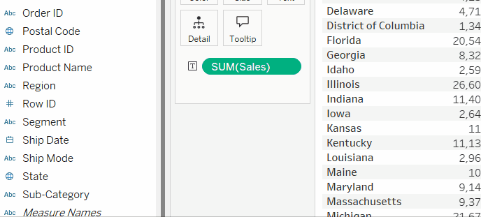
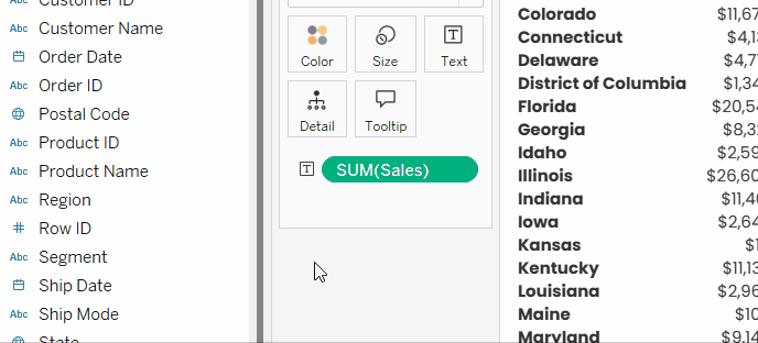
For the measure, let’s choose Sales. Now, to add a measure to a crosstab, you drag and drop it right in the view, in the space where the default text, 'Abc', is shown. Or else, you could put it on the Text card in the Marks box, as shown in the GIF below. And there we have our first crosstab!
Creating basic crosstab. GIF by Author.
We can add other dimensions on either of the axes to increase the level of detail. For example, we can add the Sub-category field to the Columns shelf. This will separate each category in our crosstab into its respective sub-categories and detail the profits accordingly.
Creating a basic crosstab with two dimensions in columns. GIF by Author.
Note that the fields in the Rows and Columns shelves follow a hierarchical order. What is placed on the left has a higher hierarchy than what is on the right. So, the order of the fields on the shelves is important.
Creating crosstabs is easy, but the challenge comes in formatting. Like all visualizations, for the crosstabs to be readable and insightful, deliberate choices of formatting need to be taken.
Crosstabs formatting can be generally split into three parts:
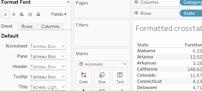
Let’s do some example formatting for each. First, let’s access the formatting pane, through which different general formatting options can be done. There are multiple ways to access the pane. Let’s do it by:
As we can see the formatting pane has options for fonts, alignment, shading, borders and lines, and for each we can specify if we want to change the respective formatting for the whole sheet, rows only, or columns only.
How to access the formatting pane in Tableau. GIF by Author.
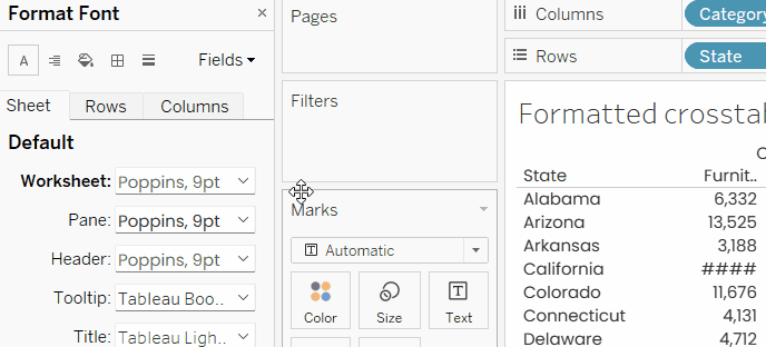
We can do two formatting changes for the whole crosstab, change the font type and clear out the default alternate row shading in the table:
Overall formatting for the worksheet. GIF by Author.
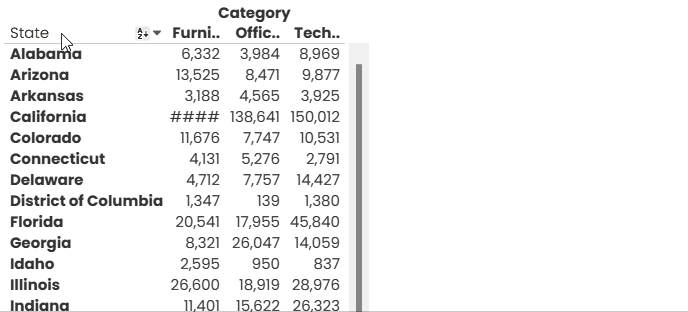
For the formatting of the headers, meaning the names of the states and the categories, we can simply make these bold. To do so, we simply change the Header font to be bold.
Crosstab headers formatting. GIF by Author.
Notice that if we want to do a formatting that is different for states than for categories, we can change the Header option for Rows and for Columns separately.
One of the other customizations on the headers that usually need to be done is to take out what Tableau calls Field Labels, and, in our case, these are basically State and Category words at the top of the table.
To remove those, we can right-click on each and choose Hide Field Labels for Rows or Hide Field Labels for Columns.
 Hiding field labels. GIF by Author.
Since we differentiated the headers with bold font, we can now clear out the grey line under the category names. This option can be found under the Sheet options of Format Borders, named as Row Divider. It will be enough to change the line of the Pane to None, and the line of the Header will be None as well.
Clearing Row Divider. GIF by Author.
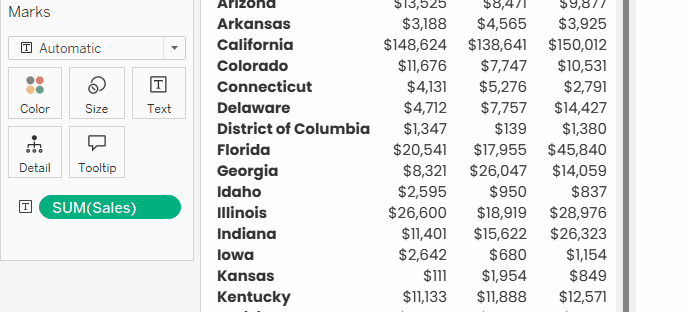
Measure values, or the numbers at the intersection of the two dimensions, can be formatted in two ways, through the formatting of the field, and through the formatting of the Text Mark.
For example, assuming that profits are in US dollars, it would be better to add a dollar sign. This can be done from the formatting of the field. To do so:
Go to the SUM([Sales]) field in the Marks, and right-click on it.
Choose Format… The formatting pane will appear on the left.
Click on the drop-down arrow right next to Numbers under Pane > Default.
Choose Currency (Custom), and set the decimal places to zero.

Formatting currency values. GIF by Author.
Meanwhile, if we want to give the measure values a different appearance (font type, color, alignment), we can click on Text under the Marks. We will have the ability to edit the alignment, orientation, and other things.
If we click on the three dots, we would be able to change the font properties, as well as rearrange how the different measure values will appear. For now, we can do just a minor change, which is to set the font color to a slightly lighter black.
Formatting Text. GIF by Author.
Note that any change in the formatting in the Text Marks will superimpose the formatting set from the formatting pane.
Like any other visualization in Tableau, crosstabs can be further customized with filters and parameters.
Suppose we are not interested in showing all US states in our crosstab. We can filter our table to include only the regions of interest.
Simply drag the Region column from the Measures pane on the left, and drop it in the Filters area. Then, we get to choose the regions of interest. Let that be 'Central' and 'West' for now.
If we want to give the viewer the ability to control the filter, we can right-click on the Region field in the Filters area, and choose Show Filter. The filter control will appear on the right side.
To customize the shape and functionality of the filter control, we can click on the small downward arrow, next to the filter control title, and choose the type of the control we want. Here, we choose Single Value (list) to transform the filter control into a dropdown menu. If we want the viewer to select more than one region at once, we can choose Multiple Values (list), as an option.
Adding filters to crosstabs. GIF by Author.
Filters are great, but they have their limitations. What if, for example, we want to give the viewer the ability to do more complex filtering and customization to the crosstab, like the ability to toggle between the top 5, top 10, and top 15 states according to total sales? Here is where parameters come to play.
If you are new to Tableau parameters, you can read through this introductory tutorial to have an overall grasp on the concept. But for now, let’s say they are like filters that are customizable by the viewer, and therefore make our views more dynamic and responsive to the viewer’s needs.
To create the needed parameter in our scenario, let’s clear out the filters, and do the following:
Adding parameters to crosstabs. GIF by Author.
As you will see in this next section, Tableau crosstabs can be enhanced to help highlight numbers, compare between values, and add context.
Heat tables (commonly known as heatmaps), are tables that highlight numbers in gradient coloring, to show the highest and lowest values displayed. Let’s see how we can easily modify our table to be a heat table.
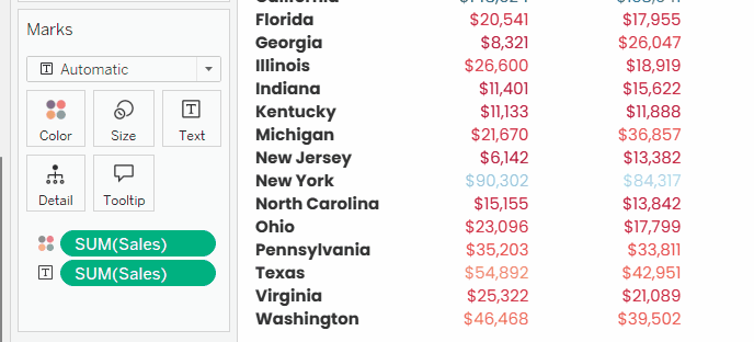
Picking up with our last view, we can simply drag and drop sales into the Color Mark.
Highlighting numbers in crosstabs. GIF by Author.
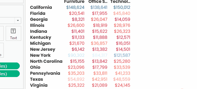
We can see this has already helped make it easier to spot that sales in California are noticeably higher across the three categories than the other top 15 states, and the same goes for technology sales in New York.
But what we did has two problems: the first is that the gradient coloring of text can often mess up the color contrast between the background and the foreground, especially when the background is white, making it hard to read some numbers; the second is that this is not a heat table.
To fix these problems, we would need to make a simple adjustment, which is to change the Marks type from Automatic (or Text) to Square. We can then change the color palette by clicking on the Color Mark, Edit Colors…, and then choose the color palette we see fit.
Creating heat tables from crosstabs. GIF by Author.
Let’s keep this sheet and call it Heat table, as we will make a use of it later in the tutorial.
Let's now consider that we need to compare our numbers not with each other, but with outside values, like thresholds or KPI targets. Here is where indicator icons are usually added.
Creating indicator icons in Tableau mainly depends on creating calculated fields that give an output of a certain icon (or emoji) based on whether the sales value is under or above a specified threshold. In other words, we create calculated fields with logical functions.
This threshold can be stated as a fixed value in the calculated field by the designer or can be better added as a parameter to give the viewer the ability to calibrate it. Since we have already seen what parameters are, we will go the extra mile and create our icons based on parameters.
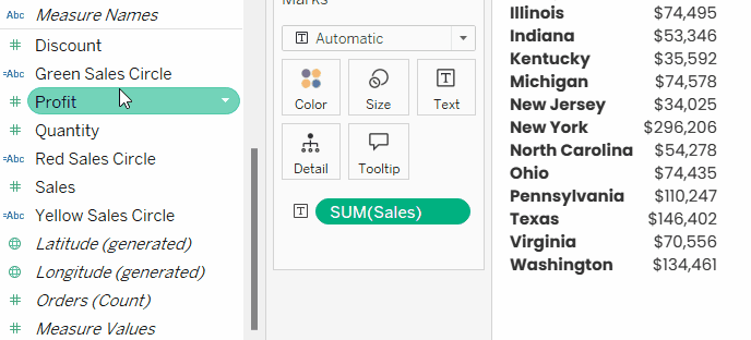
Now, let’s get back to work. We will duplicate the last view, and take Category from Columns and SUM([Sales]) from Color, resulting in the following view:
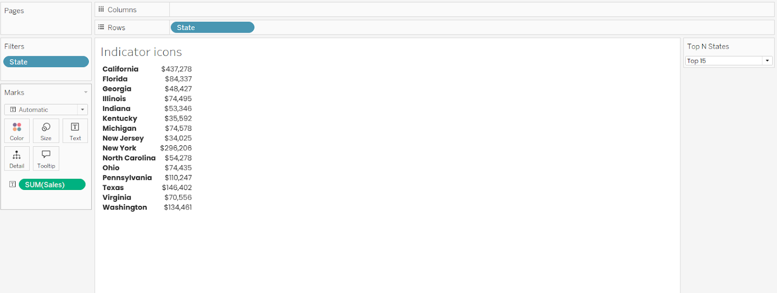
Simple crosstab with two columns. Image by Author.
We will first create two parameters, one as an upper threshold for sales (if met or above, that would be good), and the other as a lower threshold (if met or under, that would be bad).
Go to the small downward arrow next to the search bar in the Data pane.
Choose Create Parameter…
Let’s name this one Upper Sales Threshold.
We will set the Current value to 250,000.
Change the Display format to Currency (Custom) and reduce the decimal places to zero.
Click OK.
Repeat the previous steps to create the second parameter, naming it Lower Sales Threshold and setting the Current value to 70,000.
Creating parameters for icons in crosstabs. GIF by Author.
Then, we have to create three calculated fields that will give out an icon based where the sales values from our thresholds: one for the good, one for the bad, and one for the in-between (the within-tolerance, in business language).
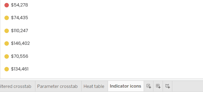
Since Tableau has occasional technical problems rendering emojis in crosstabs, we will rely here on the old-fashioned way of doing it, which is using icon fonts, like Webdings.
From the icon fonts cheat sheet, we will pick the simple filled circle, which corresponds to the letter “n”. Note that, unlike emojis, the icon fonts do not inherently have a color. So, the strategy here is to get that circle in all of the three cases of the sales metric, and then color each differently to indicate whether it is good, bad, or so-so.
For the good sales, go to the small downward arrow next to the search bar in the Data pane, choose Create Calculated Field…. Call it Green Sales Circle, write the following formula, and click OK:
IF SUM([Sales]) >= [Upper Sales Threshold]
THEN “n”
END
For the bad sales, duplicate the previous field by right-clicking on the Green Sales Circle, and choosing Duplicate. Then, right-click on the copied field, and click Edit. Rename it to Red Sales Circle, change the formula as the following, and click OK.
IF SUM([Sales]) <= [Lower Sales Threshold]
THEN “n”
END
For the in-between sales, duplicate any of the previous two fields, and edit the new copy. Rename it to Yellow Sales Circle, change the formula as the following, and click OK.
IF SUM([Sales]) > [Lower Sales Threshold] AND SUM([Sales]) < [Upper Sales Threshold]
THEN “n”
END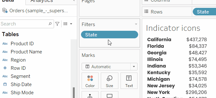
Creating conditional calculate fields for indicator icons. GIF by Author.
Now, we will drag and drop the three newly created fields, Green Sales Circle, Red Sales Circle, and Yellow Sales Circle in the Label Mark to be added to the SUM([Sales]) Label Mark.
Note that the circles are added as uncolored letter “n” and in separate lines. To fix this, click on the Label Mark, and adjust the following formatting:
Cut and paste all the fields to be on one line.
Highlight Green Sales Circle and change its color to green.
Highlight Red Sales Circle and change its color to red.
Highlight Yellow Sales Circle and change its color to yellow.
Highlight the three fields, Green Sales Circle, Red Sales Circle, and Yellow Sales Circle, and change their font type to Webdings, as shown here:
Formatting text for icons in crosstabs. GIF by Author.
And there you have your indicator icons. Now, you can show the Upper Sales Threshold and Lower Sales Threshold parameters you created, by right-clicking on them, and choosing Show Parameter. Play a bit with the values in the parameter controls to see the effect.
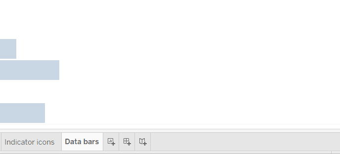
Data bars are a bar chart that fits into the rows of a cross table. Technically, Tableau’s crosstabs do not have a direct option to add data bars. Instead, we need to create a normal bar chart, do some formatting that will make it fit into table rows, and combine it with a table in a dashboard.
Here we will do data bars for the total sales in top states. Let’s see how to do that:
We will start by duplicating the last view with indicator icons. Take out everything except for State in Rows and Filters, and SUM([Sales]) in Label.
Drag and drop SUM([Sales]) into the Rows.
For the formatting: Uncheck Show Header for SUM([Sales]) into the Rows shelf, decrease the Opacity of the bars, take out gridlines, and increase the size of the bar a bit without losing the spaces in between, as shown in the GIF below.
Creating data bars. GIF by Author.
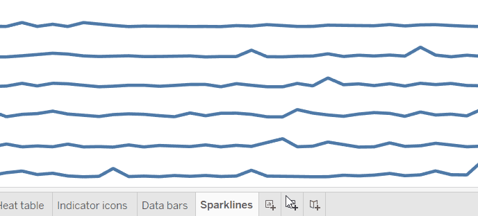
Sparklines is another visual aid for crosstabs. It is basically a small multiple=line chart with no axes or gridlines that aim to show the general trend or fluctuations over time. Like data bars, Tableau does not have a direct option to add sparklines to crosstabs, but can be done with the same workaround that we did for data bars.
To create sparklines for sales over the months available in our dataset:
Start by duplicating the data bars sheet.
Take SUM([Sales]) out of Labels and Columns. Instead drop it into the Rows shelf, on the right of State.
Add Order Date to the Columns shelf.
Right-click Order Date on the Columns shelf, and choose the second Month option.
Format the chart by taking out headers for both sales and date, as well as clearing out gridlines, zero lines, and column divider. Also, set back the opacity of the lines to 100% as shown in the GIF below.
Rename the sheet as Sparklines, and get ready to put it all together!
Now we can combine the heat table, indicator icons, data bars, and sparklines into one dashboard that will be report for sales in top states. Rather than expanding on how to design a dashboard, for the scope of the tutorial we will mention only the most relevant formatting edits to make all of the previous visuals fit together as if they are in one table. So, let’s follow these steps:
Combining visuals into one crosstab. GIF by Author.
If you have been following all along, you may have ended up with a result that looks like the following screenshot (or maybe better). Give yourself a pat on the back, because you have done some nice work!
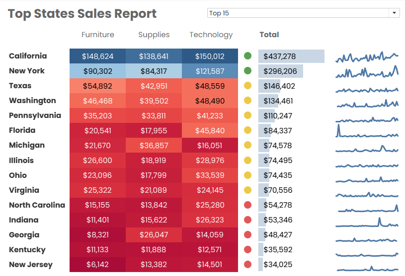
In this tutorial, we saw what crosstabs are, how to create them, adjust them with basic formatting, filters and parameters, and how to build on them to create complex reports. As examples for further customizations and applications of crosstabs, we created and combined heat tables, indicator icons, data bars, and sparklines into one report.
If you don’t want to lose the momentum you gained from this tutorial, go ahead and keep on learning Tableau with our Tableau Fundamentals skill track. If you are already more advanced, check out our Data Analyst in Tableau career track which has a certification available, and stay tuned for more Tableau tutorials to come!
Accelerate your career with Tableau—no experience required.
Learn Tableau with DataCamp
Course
Course
Course
blog
Wendy Gittleson
15 min
Tutorial
Islam Salahuddin
Tutorial
Eugenia Anello
Tutorial
Parul Pandey
Tutorial
Parul Pandey
Tutorial
Chloe Lubin