
Course
Data Visualization in Excel
3 hr
53.1K
If you work with trend lines or need to measure how closely two sets of values relate, the RSQ() function in Excel is a simple tool for the job. RSQ() tells you how much of the variation in one range can be explained by another. Essentially, it gives you the R-squared value for two series. This is useful in everything from sales analysis to scientific experiments.
RSQ(), short for “R-squared,” returns the square of the Pearson product-moment correlation coefficient between two arrays, which in this case is also the coefficient of determination. In plain terms, it shows how well the values in one range predict those in another. If the RSQ() result is 1, you’ve got a perfect linear relationship. If it’s 0, there’s no linear relationship at all.
People often use RSQ() when they want to check how well a line fits their data, like in regression analysis or when plotting trendlines.
Here’s the structure for RSQ():
=RSQ(known_y’s, known_x’s)known_y’s: These are your dependent values (the ones you’re trying to predict or explain).
known_x’s: These are your independent values (the ones you think might be doing the explaining).
Both ranges should have the same number of data points. If they don’t, RSQ() will give you an error.
Important note I should make: If you are familiar with the ideas of simple linear regression specifically and ordinary least squares linear regression more generally, you might notice that the RSQ() function only takes only set of x values. This is because RSQ() does not handle multiple linear regression.
Suppose you want to know how well advertising spend predicts sales.
Let’s say your data looks like this:
|
A |
B |
|
100 |
200 |
|
200 |
400 |
|
300 |
600 |
|
400 |
800 |
If your data is in A2:A5 for advertising, and B2:B5 for sales, you’d enter:
=RSQ(A2:A5, B2:B5)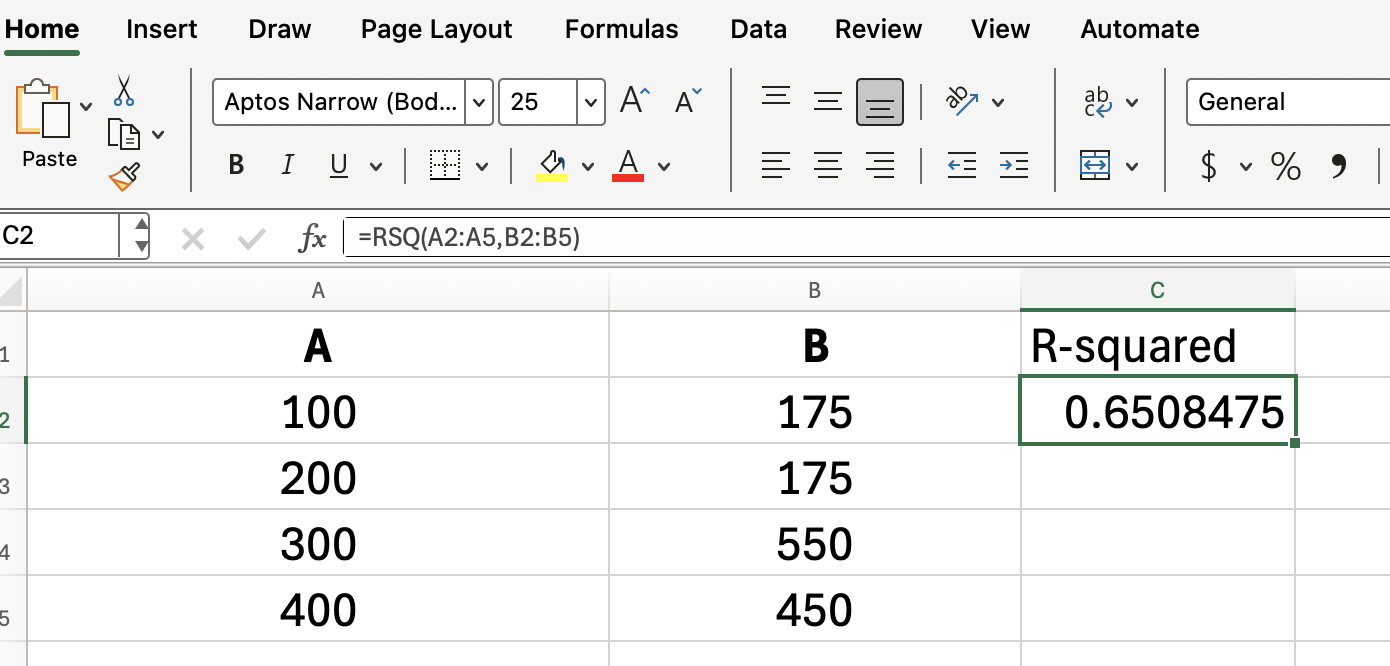
This formula returns the R-squared value, showing how much of the change in sales can be explained by the change in advertising spend.
If we imagined in the example above that every number in column B was double the corresponding number in column A, then the regression would sit on a straight line, and doubling advertising would always double sales. (How great that would be!)
Here are a few problems you might run into with RSQ():
Unequal range sizes: If your two ranges don’t have the same number of rows, RSQ() will return an #N/A error.
Empty or non-numeric cells: Blank cells or text within the ranges are ignored, but if too many are missing, results can be misleading, or errors can pop up. This one can be a more subtle error, so do be careful!
Single data point: RSQ() needs at least two pairs of numbers. If not, you’ll get a #DIV/0! error. This is because variance/covariance would be undefined with just one value.
If something looks off, double-check your ranges for typos or missing entries.
You might be wondering why you’d use RSQ() instead of CORREL(). Here’s the difference:
CORREL() returns the Pearson correlation coefficient (r), which measures the strength and direction of a linear relationship.
RSQ() returns the R-squared (R²), so it always gives you a value between 0 and 1, focusing just on the proportion of variance explained.
If you just want to see if your variables move together (positive or negative), CORREL() gives you more detail. If you’re measuring how much of the change in one variable is explained by another, RSQ() is what you want.
All that said, because we are dealing with simple linear regression, we can always find the R-squared just by squaring the result of CORREL():
=CORREL(A2:A5, B2:B5)^2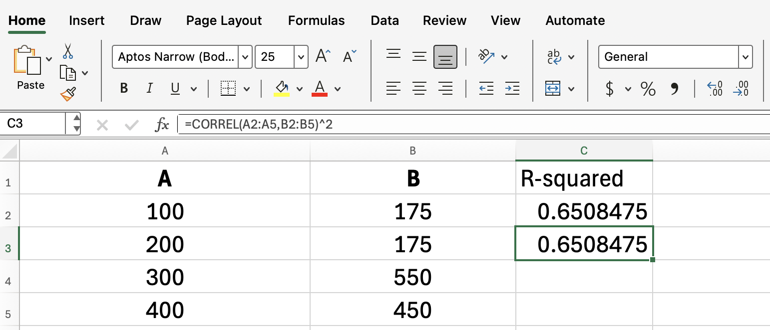
If you’ve ever added a trendline to a scatter plot in Excel, you might have seen the R-squared value displayed right on the chart. That’s the same value RSQ() returns with your data ranges.
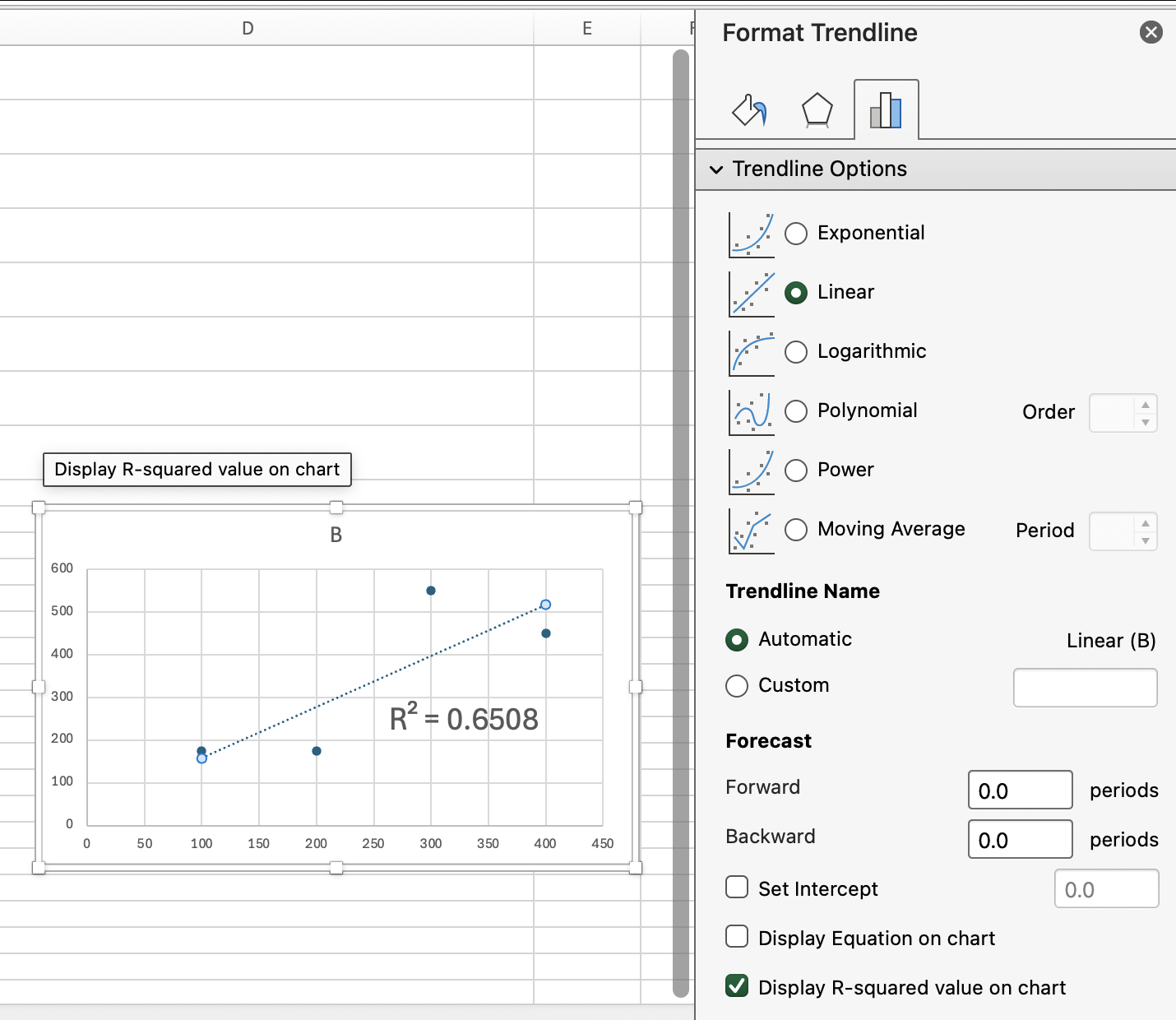
If you want to display the R-squared on your worksheet without adding a chart, just use RSQ() directly in a cell. This way, it's a number you can more easily work with.
If you're not 100% clear on how to really work with nice visuals in Excel, enroll in our Data Visualization in Excel course, which covers all the important stuff in detail.
To wrap up the technical guidance, here are some practical tips:
Clearly label your data to keep the X’s and Y’s straight.
Always double-check that your ranges are the same size before entering the formula.
If you’re looking to compare more than two variables, consider using regression analysis tools like the Data Analysis Toolpak or the LINEST() function. LINEST() also reports other model metrics, like the F-statistic and standard errors.
As you’ve discovered, RSQ() is a straightforward yet effective way to measure how well one set of values predicts another in Excel. There's a lot you can do with it, like analyzing trends or forecasting results. Don't leave it up to guesswork.
As a next step, do take our Data Analysis in Excel and Advanced Excel Functions courses to keep leveling up your Excel (and stats) skills!
Learn Excel with DataCamp
Course
Course
Course
Tutorial
Laiba Siddiqui
Tutorial
Elena Kosourova
Tutorial
Josef Waples
Tutorial
Laiba Siddiqui
Tutorial
Allan Ouko
Tutorial
Arunn Thevapalan