Not all relationships follow a straight line.
You might see that as the marketing budget increases, customer conversion tends to improve, but not at a constant rate. Or maybe, as income rises, happiness often increases, but then levels off. The pattern is clear, but it isn’t linear. What can you do to quantify that?
Correlation is used to describe how two variables move together. A common correlation you will see is the Pearson’s Correlation Coefficient, which works very well for linear relationships. However, many real-world relationships aren’t linear. They may curve, plateau, or follow a consistent trend without forming a straight line. In some cases, the exact values matter less than the order in which they occur. This is where Spearman’s Rank Correlation Coefficient comes in.
Spearman’s correlation works with ranks instead of raw values, measuring whether two variables tend to increase or decrease together in a consistent way. This makes it well suited for monotonic relationships. It also makes it more robust to certain data quirks, like outliers or uneven spacing.
What is Spearman’s Rank Correlation?
Spearman’s Rank Correlation Coefficient is a measure of the strength and direction of a relationship between two variables. It is based on the rank of their values instead of the values themselves.
To see how this works, imagine you’re analyzing songs on a streaming platform. You might compare the number of times a song is played with how it ranks on a “Top 100” chart. The relationship may not be perfectly linear, doubling the number of streams doesn’t necessarily double a song’s position. But in general, songs with more streams tend to rank higher.
Spearman’s correlation captures this kind of pattern by focusing on the order of the data instead of the exact values.
This makes it especially useful when the relationship is not linear but still follows a clear trend, the data is naturally expressed as rankings, or the data contains outliers that might distort a linear measurement.
Unlike Pearson’s correlation, which works directly with raw values, Spearman’s correlation first converts the data into ranks and then measures how closely those rankings align.
In technical terms, Spearman’s correlation measures monotonic relationships. A relationship is monotonic if one variable tends to increase as the other increases, or decrease as the other decreases, without switching direction.
Monotonic vs. linear relationships
So what exactly is the difference between linear and monotonic relationships?
A linear relationship is one where the data follows a straight-line pattern. If you plotted the data, you would see points roughly forming a line.
A monotonic relationship, on the other hand, is less strict. It simply means that the relationship moves in one direction. Essentially, both variables move together, but not necessarily in a straight line. The pattern can curve, level off, or change rate, as long as it does not reverse direction.

In the graphs above, you can see four different examples of monotonic relationships, only the first of which is linear. The last graph is not monotonic, as the pattern switches direction, starting as a positive association and ending as a negative one.
|
Relationship Type |
Description |
What It Looks Like |
|
Linear |
Variables increase or decrease at a constant rate |
Straight line |
|
Monotonic (But Nonlinear) |
Variables move in one direction, but the rate changes |
Curved, leveling off, or accelerating trend |
|
Non-monotonic |
Relationship changes direction (increases, then decreases, or vice versa) |
U-shape, inverted U, or wave-like pattern |
How to Find Spearman’s Rank Correlation Step-By-Step
At a high level, Spearman’s Rank Correlation Coefficient works by converting your data into ranks and then measuring how similar the rankings are between the variables.
Let’s work through a small example. Suppose we’re looking at the relationship between hours spent practicing a musical instrument and performance ranking in a competition.
|
Student |
Practice Hours (X) |
Performance Score (Y) |
|
Aladdin |
2 |
50 |
|
Bonnie |
4 |
65 |
|
Clyde |
6 |
70 |
|
Daniel |
8 |
80 |
|
Eloise |
10 |
78 |
|
Franny |
12 |
85 |
|
Gemma |
14 |
90 |
|
Harris |
16 |
88 |
First, let’s plot the data.
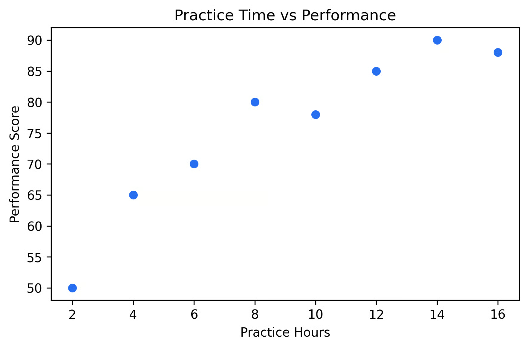
Visually, it looks like more practice results in higher performance scores, but the pattern does not appear to be perfectly linear. It looks like there may be some diminishing returns to practicing too much. Let’s try applying Spearman’s Rank to quantify this relationship.
Step 1: convert data to ranks
First, let’s assign each value its rank. Within each variable, we assign a rank to each value from smallest to largest. The smallest value within a variable gets the rank 1, the second smallest gets rank 2, and so on.
|
Student |
Practice Hours (X) |
Rank (X) |
Performance Score (Y) |
Rank (Y) |
|
Aladdin |
2 |
1 |
50 |
1 |
|
Bonnie |
4 |
2 |
65 |
2 |
|
Clyde |
6 |
3 |
70 |
3 |
|
Daniel |
8 |
4 |
80 |
5 |
|
Eloise |
10 |
5 |
78 |
4 |
|
Franny |
12 |
6 |
85 |
6 |
|
Gemma |
14 |
7 |
90 |
8 |
|
Harris |
16 |
8 |
88 |
7 |
Notice that the rankings for Y are in a slightly different order from X. This is the variation that Spearman’s correlation will measure.
Step 2: compute differences in ranks
Next, we calculate the difference between the ranks for each observation.
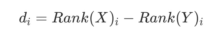
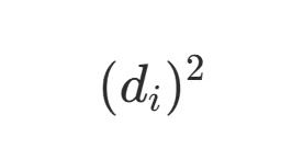
Then square each difference:
|
Student |
Rank(X) |
Rank(Y) |
di |
(di)2 |
|
A |
1 |
1 |
0 |
0 |
|
B |
2 |
2 |
0 |
0 |
|
C |
3 |
3 |
0 |
0 |
|
D |
4 |
5 |
-1 |
1 |
|
E |
5 |
4 |
1 |
1 |
|
F |
6 |
6 |
0 |
0 |
|
G |
7 |
8 |
-1 |
1 |
|
H |
8 |
7 |
1 |
1 |
Now we add up the squared differences in the last column of our table.

Step 3: apply the formula
Lastly, we need to plug the values into the Spearman correlation formula.
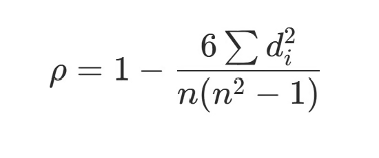
We already know that (di)2=4 from our calculations earlier. The n in the denominator is the sample size, which is 8 for us. Plugging that in, we get:

Interpreting the result
Our final result is ρ ~ 0.95. Since this value is close to +1, it indicates a strong positive relationship between practice time and performance. Even though the relationship is not perfectly linear, the rankings are very similar. This means that when the x value changes, the y value tends to change consistently along with it.
In real life situations, it’s pretty rare to compute this by hand. Most software handles ranking, ties, and calculation automatically, which is good since we generally have much larger sample sizes!
Computing Spearman’s Correlation Using Software
Most statistical software these days can handle this calculation in seconds. Let’s briefly cover some of the most common software.
Python
In Python, you’ll typically use either scipy or pandas, depending on your workflow. If you’re working with arrays or lists, scipy provides a direct way to compute Spearman’s correlation.
py
corr, p_value = spearmanr(x, y)
print(corr, p_value)
This returns both the correlation coefficient and a p-value, which is helpful if you’re doing statistical testing.
If you’re working with tabular data, pandas is often more convenient.
corr_matrix = df.corr(method="spearman")
print(corr_matrix)
This computes the correlation matrix, making it easy to compare multiple variables at once.
Alternatively, if you only want the correlation between two specific columns, it’s easy to can specify that.
corr=df["column_1"].corr(df["column_2"],method="spearman")R
In R, Spearman’s correlation is built into the core statistical functions.
For a quick calculation, you can use cor() and specify that you want to use the Spearman’s method.
cor(x, y, method = "spearman")If you also want a p-value and additional statistical details, cor.test() provides this easily.
cor.test(x,y,method="spearman")Excel
Excel doesn’t have a built-in Spearman function, but you can compute it in two quick steps: first, rank the data, then take the correlation of those ranks.
Here’s a small example:
|
A (X) |
B (Y) |
C (Rank X) |
D (Rank Y) |
|
2 |
50 |
1 |
1 |
|
4 |
65 |
2 |
2 |
|
6 |
70 |
3 |
3 |
|
8 |
80 |
5 |
5 |
|
10 |
78 |
4 |
4 |
You can create the ranks (columns C and D) using the RANK.AVG function. For example:
=RANK.AVG(A2, $A$2:$A$6,1)
=RANK.AVG(B2, $B$2:$B$6,1)
Then, simply compute Spearman’s correlation.
=CORREL(C2:C6, D2:D6)Across all of these tools, the underlying process is the same: convert values to ranks and then compute the correlation of those ranks.
How to Interpret Spearman’s Rank Correlation
If you’ve used a Pearson’s Correlation before, then you probably have a pretty good intuition for how to interpret Spearman’s Rank Correlation, since it’s basically the same interpretation.
Spearman’s Rank gives you a value between -1 and 1. This tells you both the direction and strength of a monotonic relationship.
A value of +1 indicates a perfectly increasing monotonic relationship; as one variable increases, the other always increases. This happens when the rankings of each value pair are exactly the same.
A value of -1 indicates a perfectly decreasing monotonic relationship; as one variable increases, the other always decreases. This happens when the rankings of each value pair are exactly reversed.
A value of 0 indicates no monotonic relationship. This happens when there is no consistent trend in the rankings.
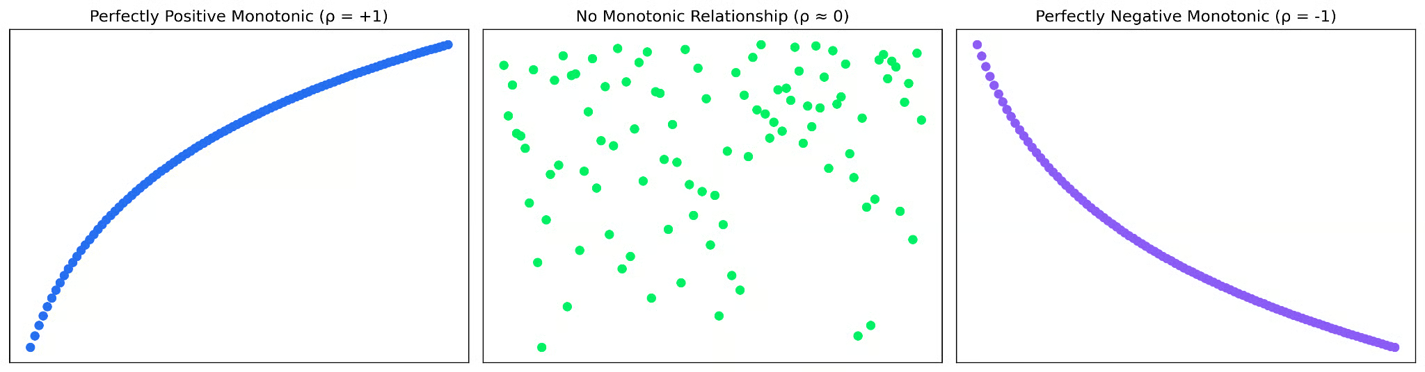
One important distinction from Pearson’s Correlation Coefficient is that Spearman’s correlation reflects how well the order of the data aligns, not how closely the actual values follow a straight line. This means that a strong Spearman correlation indicates a clear trend in rankings, and not necessarily that the relationship is linear or evenly spaced.
Because of this, it’s always a good idea to pair correlation values with a quick visualization to best understand the underlying pattern.
Handling Ties in Rankings
This sounds all well and good until you come across a dataset where multiple observations have the same value. What do you do then? These are called ties, and they require a small adjustment when assigning ranks.
For example, consider the values: 10, 20, 20, 30. The two values of 20 would normally occupy ranks 2 and 3. However, since they are the same, instead of assigning them different ranks, we assign each the average of those ranks; both 20s receive a rank of 2.5. This approach ensures that tied values are treated fairly and that the overall ranking remains consistent.
Since Spearman’s Rank Correlation Coefficient is based entirely on ranks, if ties are not handled correctly, the correlation can be distorted.
Limitations of Spearman’s Correlation
While Spearman’s Rank Correlation Coefficient is a flexible and widely used measure, it does have some limitations.
Most importantly, it can only capture monotonic relationships. If a relationship changes direction, such as a U-shaped pattern or a sine wave, the correlation may be close to zero even when a clear pattern exists. In these cases, you’d be better served using a nonlinear model, such as polynomial regression.
Also, because Spearman’s correlation is based on ranks, it ignores the actual distances between values. This makes it better at handling outliers, but it also means some information is lost. The magnitude of the relationship is more difficult to interpret with Spearman’s Correlation than Pearson’s Correlation because of this. It tells you whether variables move together in order, but not how much one changes relative to the other.
Lastly, when many values are tied, the ranking process becomes less precise. This can result in a weaker correlation value, potentially not representing the full extent of the relationship.
Spearman vs. Pearson: When to Use Each
The most commonly used correlation is probably Pearson’s Correlation Coefficient. At first glance, that seems like a very similar statistic to Spearman’s Correlation Coefficient. They even have almost identical names! But they’re answering slightly different questions.
Pearson’s asks, “Do these variables follow a straight-line relationship?”, while Spearman’s asks, “Do these variables move in the same order?”
If your data follows a roughly straight-line pattern and the actual distances between values are meaningful, Pearson’s Correlation is usually the right choice. But if the relationship curves or levels off, Spearman tends to be a better fit.
Spearman is also more forgiving. Because it works with ranks instead of raw values, it’s less sensitive to outliers and doesn’t rely as heavily on assumptions about the data. The tradeoff is that it’s not as good at capturing differences in magnitude between values.
In practice, a good rule of thumb is this: if the relationship is linear, use Pearson; if it is monotonic, but not linear, use Spearman. And as always, plot your data before making a decision.
Conclusion
Spearman’s Correlation Coefficient is a great tool for capturing monotonic patterns, especially in datasets not served well by Pearson’s Correlation. By working with ranks, it is less sensitive to outliers and more accommodating of nonlinear data.
You can read more about choosing the best correlation for your dataset in Understanding Correlation: Measuring Relationships in Data. You might also be interested in Understanding Covariance: An Introductory Guide.