
Course
Data Science for Business
2 hr
115.1K
Have you ever hosted a pizza party and noticed something interesting? I certainly have. At my last gathering, I observed that while most people grabbed one or two slices, a handful of guests devoured nearly half of the pizzas. As I watched this unfold, it struck me: I was witnessing a real-world example of one of the most fascinating patterns in data science—the Pareto distribution.
I love this example because it perfectly captures what the Pareto distribution is all about: the observation that in many situations, a small group accounts for a large portion of the outcome.
As a data scientist, I've come to appreciate how this distribution helps us understand and model situations where "the vital few" dominate "the trivial many." Think about it: 20% of a company's customers often generate 80% of its revenue, or 20% of a website's content might drive 80% of its traffic. This pattern is so common that it's become known as the Pareto principle, or the "80/20 rule," though the exact ratios can vary.
But here's what makes the Pareto Distribution truly special: it's not just a casual observation—it's a powerful mathematical tool that helps us model and predict these imbalanced patterns in data. Whether you're analyzing economic inequality, optimizing business operations, or studying natural phenomena, understanding the Pareto Distribution can provide valuable insights into why things aren't always evenly distributed—and what that means for our analysis.
The Pareto distribution's unique ability to highlight imbalances has made it indispensable in fields ranging from economics to natural sciences. If you’re eager to explore similar statistical patterns, consider diving into resources such as Foundations of Probability in Python for a grounding in probability concepts, or Multivariate Probability Distributions in R to expand your analytical toolkit. For visual learners, the Introduction to Probability Rules Cheat Sheet serves as an excellent quick reference for key principles.
When Italian economist Vilfredo Pareto looked out at his garden in 1896, he noticed something peculiar: 20% of his pea pods contained 80% of the peas. This observation led him to explore similar patterns in land ownership, where he discovered that 80% of Italy's land belonged to 20% of its population. What started as a garden observation blossomed into one of statistics' most versatile tools for understanding uneven distributions.
In the late 19th century, Vilfredo Pareto's research went far beyond pea pods and land ownership. He analyzed wealth distribution patterns across different countries and time periods, uncovering a consistent mathematical relationship. The wealthy minority, he found, owned a majority of assets in every society he studied. This pattern appeared so consistently that other researchers began applying his ideas to different fields, from economics to natural sciences.
The distribution gained prominence when management consultant Joseph Juran came across Pareto's work in 1937. Juran named the pattern the "Pareto principle" and applied it to quality control, showing that most manufacturing defects came from a small number of causes. This application helped transform industrial quality management and sparked wider interest in Pareto's ideas.
The Pareto distribution stands out from other statistical distributions through several unique features:
These characteristics make the Pareto distribution particularly good at modeling situations where resources, effects, or outcomes concentrate in a small subset of a population.
Let's break down the mathematics behind the Pareto distribution into digestible pieces. While the formulas might look intimidating at first, I'll walk you through each component step by step.
The probability density function (PDF) of the Pareto distribution takes this form:

Let's decode what each symbol means:
The cumulative distribution function (CDF) gives us the probability that a value is less than or equal to x:

To make these formulas more concrete, let's look at what different values of α mean:
|
α Value |
What It Tells Us |
Real-World Example |
|
1.5 |
Very heavy tail - extreme values are common |
City sizes in a country |
|
2.5 |
Moderately heavy tail |
Personal wealth distribution |
|
3.5 |
Lighter tail - extreme values are rare |
Height of adults |
The famous 80/20 rule emerges naturally from the Pareto distribution when α ≈ 1.16.
In data analysis, this principle helps us:
For example, when analyzing customer data, we might discover that:
These insights help businesses make informed decisions about where to focus their efforts for maximum impact.
From economic policies to natural disasters, the Pareto distribution shows up in surprising places.
Walk into any country's financial district, and you'll see the Pareto distribution at work. Banks and economists use it to track wealth concentration, model income disparities, and analyze tax policies. For instance, when economists studied global wealth in 2023, they found the richest 1% of adults owned 44% of the world's wealth. This distribution helps policymakers understand wealth gaps and design economic interventions. If you are interested in ideas of wealth distribution, we have tutorials on the Gini coefficient and the Lorenz curve.
In business, the Pareto principle helps companies work smarter, not harder. Consider an e-commerce site analyzing its customer data:
Nature follows Pareto patterns too. Scientists use this distribution to study:
Take earthquakes—their magnitude distribution follows a Pareto pattern, with many small tremors and rare devastating quakes. This understanding helps seismologists develop better prediction models and risk assessments.
Data visualization brings the Pareto distribution's unique properties to life. Let's explore how this distribution looks graphically and what its shapes tell us about the data we're analyzing.
The most common way to visualize the Pareto distribution is through its probability density function (PDF). This shows us how values are distributed across our dataset.
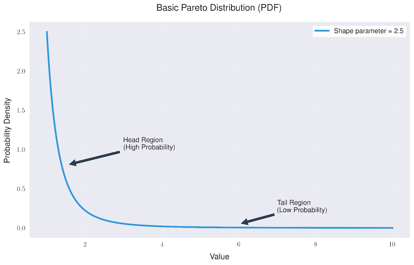
The basic Pareto distribution has a distinctive shape that tells us two important things:
What makes the Pareto distribution particularly interesting is how it changes with different shape parameters. These parameters directly influence how extreme our values might be.
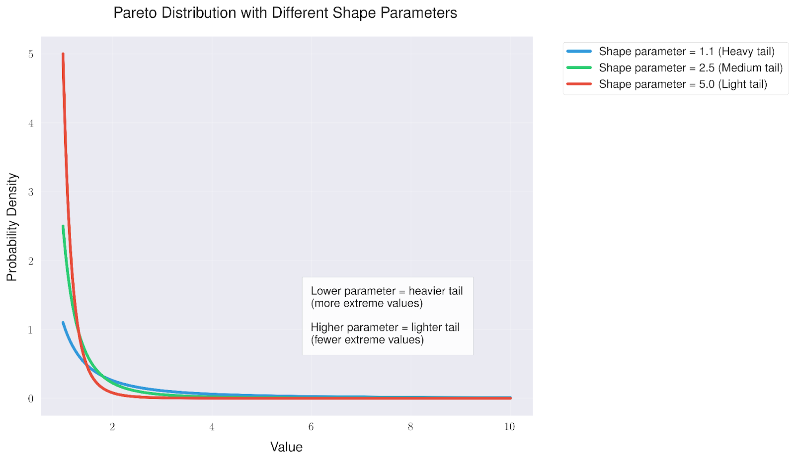
Looking at different shape parameters reveals that:
This flexibility makes the Pareto distribution useful for modeling various real-world phenomena, from wealth distribution (often heavy-tailed) to manufacturing defects (usually lighter-tailed).
Wealth distribution is often heavy-tailed and this implies a non-negligible probability of extremely large values, so rare but massive events (like billionaires) have a big impact. This makes sense because there is a compounding effect because people with money can invest. Light-tailed distributions (like some types of manufacturing defects) decay more quickly due to bounded, stable processes, meaning extreme values are much less likely since large deviations are rare.
For visualizing the Pareto distribution, we primarily rely on statistical programming languages and specialized software. Python stands out as a popular choice, offering powerful libraries like scipy.stats for calculations, alongside matplotlib and seaborn for creating clear, publication-quality visualizations. R also excels in this domain, with its robust built-in statistical functions and the versatile ggplot2 package for plotting.
While Excel is excellent for creating Pareto charts (bar charts showing the 80/20 principle), it's not the best tool for visualizing and working with the Pareto probability distribution itself. For proper statistical analysis and visualization of the Pareto distribution, we recommend using the programming tools mentioned above.
To strengthen your understanding of visualizing probability distributions, several resources can serve as valuable starting points. The Probability Distributions in Python Tutorial provides hands-on experience with implementing various distributions, including detailed examples using Python's statistical libraries. For those interested in the visual aspects, the Data Visualizations that Capture Distributions article covers techniques specifically designed to represent statistical distributions effectively. Finally, the Data Visualization Cheat Sheet serves as a quick reference for choosing and creating appropriate visualizations for different types of distributional data. These resources together provide a good foundation for both understanding and visualizing the Pareto distribution.
Every statistical tool has its boundaries, and the Pareto distribution is no exception. While it's a powerful lens for viewing certain types of data, knowing when not to use it is just as important as knowing when it fits perfectly. Let me share some key considerations that I've learned to watch for when working with this distribution.
Think of the Pareto distribution like a specialized camera lens - it works brilliantly for certain shots but can distort others. Its basic assumptions act as the technical specifications we need to respect:
First, there's the minimum value requirement. Unlike some other distributions that can handle any number, the Pareto distribution needs a clear starting point above zero. This is like having a minimum bet at a casino - you can't play with less than that amount. This becomes particularly tricky when your data includes zeros or negative values, such as when tracking profit and loss scenarios.
The distribution also assumes each event stands alone, independent of others. But real life rarely works that way. Take wealth accumulation, for instance - having money often makes it easier to make more money. These interconnections can make the Pareto distribution less accurate than we might hope.
Perhaps most intriguingly, the distribution assumes scale invariance - the idea that relative differences matter more than absolute ones. While this often holds true, real-world scenarios sometimes break this rule. The impact of doubling someone's wealth, for example, feels very different at different wealth levels.
In my experience, there are several traps that even experienced analysts can fall into when working with the Pareto distribution.
The most common is overgeneralization. Just because you see an 80/20-like pattern doesn't automatically mean you're looking at a Pareto distribution. It's like assuming every bird you see is an eagle - the shape might be similar, but the details matter. Always test your distribution's fit before drawing conclusions.
Parameter estimation presents another challenge. The shape parameter (α) can be particularly sensitive to outliers, especially with smaller datasets. It's like trying to measure the average height of a population - a few very tall or short individuals can significantly skew your results if your sample size is too small.
When it comes to predicting extreme events, the Pareto distribution's heavy tail can be both a blessing and a curse. While it's great at modeling the possibility of extreme outcomes, it can sometimes suggest they're more likely than they really are. This is particularly important in risk assessment scenarios - you don't want to overestimate or underestimate rare events.
Finally, there's what I call "context blindness" - getting so caught up in the mathematical elegance of the distribution that we forget to ask whether it makes sense for our specific situation. Remember, the map is not the territory, and the Pareto distribution is just one map among many.
When in doubt, consider alternative distributions and always validate your assumptions against real-world knowledge of your domain. After all, statistics should serve our understanding of reality, not the other way around.
In natural ecosystems, the Pareto principle reveals itself through the fascinating concept of keystone species - those few organisms that wield outsized influence over their environment. Consider how wolves in Yellowstone affect everything from elk populations to river patterns, or how coral reefs, comprising just a tiny fraction of ocean space, support nearly a quarter of all marine species. This natural 80/20 distribution appears in everything from the size of tree canopies to the distribution of rainfall across seasons.
Think of wealth distribution like an orchestra performance, where a few key instruments carry the main melody while others provide essential background support. Just as the first violin section often leads the orchestra, a small percentage of individuals hold a majority of global wealth, creating a complex economic composition. This pattern has profound implications for economic policy, raising questions about how to maintain both the dynamism that wealth concentration can drive and the social harmony that requires broader participation. Understanding this musical parallel helps us appreciate both the efficiency and the challenges of concentrated wealth.
In the realm of innovation, the Pareto principle manifests in how breakthrough ideas emerge from a surprisingly small subset of attempts. Companies like Apple and Google have found that roughly 20% of their products generate 80% of their revenue, while in scientific research, a small fraction of papers garner the majority of citations. This pattern appears across creative industries, from hit songs in music catalogs to blockbuster movies in studio portfolios.
The Pareto principle plays out in how information spreads through social networks. A select few influencers, representing perhaps 20% of users, often drive 80% of engagement on social platforms. This same pattern appears in content virality, where a small percentage of posts capture the majority of shares and interactions.
The Pareto distribution highlights how statistical tools can reveal meaningful patterns of concentration in data. To expand your understanding of such concepts, we offer valuable learning opportunities. Our Foundations of Probability in R course introduces core principles, while Introduction to Portfolio Analysis in R demonstrates how these ideas apply to financial contexts. Additionally, our Poker Probability and Statistics with Python tutorial offers a unique way to explore probability concepts in action, making learning both engaging and practical. These resources provide a solid foundation to apply statistical insights across a range of practical scenarios.
Learn with DataCamp
Course
Course
Course
blog
Josef Waples
10 min
Tutorial
Vinod Chugani
Tutorial
Vinod Chugani
Tutorial
Vinod Chugani
Tutorial
Vinod Chugani
Tutorial
Vinod Chugani