To build a heat map in Excel, use Conditional Formatting. Select your data, apply a color scale, and Excel will shade each cell based on its value.
The result will be a grid of colors instead of numbers. Darker or brighter shades mark your highest and lowest values, so you spot patterns by looking instead of reading every cell.
In this guide, you'll build a heat map from scratch, customize its colors, and apply the same technique to Pivot Tables. We'll also cover the mistakes that confuse most beginners.
What Is a Heat Map in Excel?
A heat map is a grid of cells with colors instead of plain numbers. High numbers get one color. Low numbers get another. Excel fills in every shade in between on its own. You don't do any of the coloring yourself.
This happens through a feature called Conditional Formatting, specifically the Color Scales option.
Choose a range of cells, apply a color scale, and Excel checks every value in that range. It then colors each cell based on how high or low that number is compared to the others. Change a number later, and the color updates too.
You can see patterns instead of reading for them. Once your highs, lows, and outliers are visible, you can easily compare regions or months in seconds instead of minutes.
Let’s understand this with a sample sales dataset:
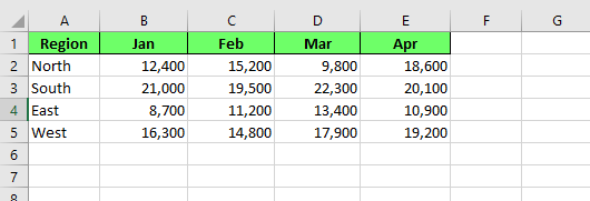
Sales dataset to create a heat map. Image by Author.
How to Create a Heat Map in Excel
To create a heat map:
- Highlight the range of cells you want to color. In our case, we’ll select the numbers only, not the region names or month headers
- Go to Home > Conditional Formatting
- Click on the dropdown menu
- Hover over Color Scales and a submenu appears showing several preset color combinations. Each one previews as a small colored grid, so you can see roughly what it'll look like before you apply
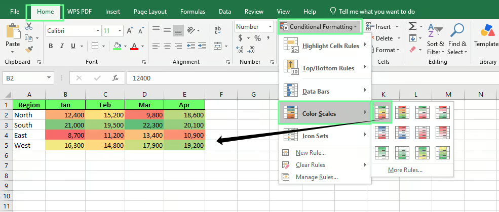
Create a heat map using Conditional Formatting. Image by Author.
Now our sales table has color. South's strong months lean green. East's weaker ones lean red or orange, and everything else falls somewhere in between.
Note: the colors will adjust based on the new highs and lows as you add new values to it.
How to Customize a Heat Map
The default color scale works, but it's rarely the best fit for every dataset. Excel gives a few ways to adjust it, and each one solves a different problem.
Change the color scale
To change the color scale:
- Select your data range
- Open the Color Scales again
- Hover over each preset to preview it on your actual data
Some scales use two colors, others use three.
- A two-color scale (for example, White to Red) is perfect when you only care about one direction, like highlighting your top performers.
- A three-color scale works better when both extremes matter, like flagging both underperforming and overperforming regions in the sales table.
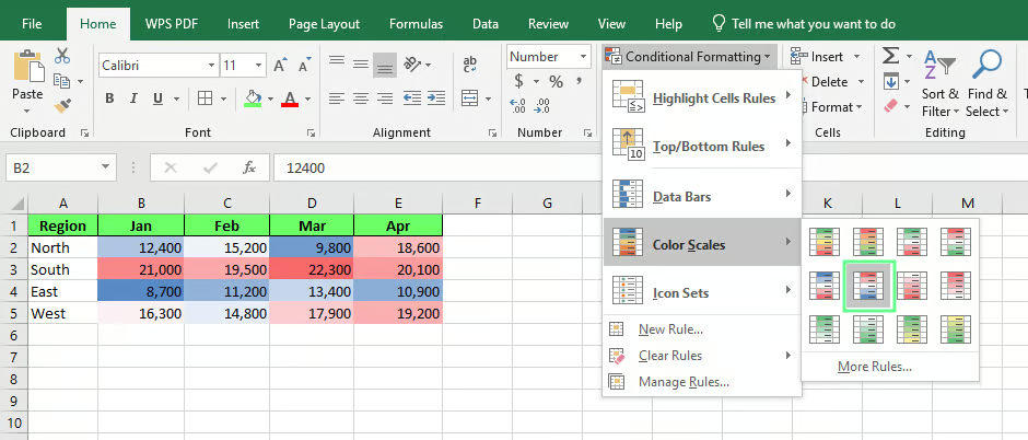
Colors from the color scales library for a heat map. Image by Author.
Reverse the colors
To reverse colors:
- Select the data range
- Go to Conditional Formatting > Manage Rules
- In the Conditional Formatting Rules Manager dialog box, select your color scale rule, click Edit Rule, and you'll see options for the minimum and maximum colors.
- Swap them, and the scale reverses. What was blue becomes red, and what was red becomes blue.
This is helpful in situations where low numbers might be good news, not bad.
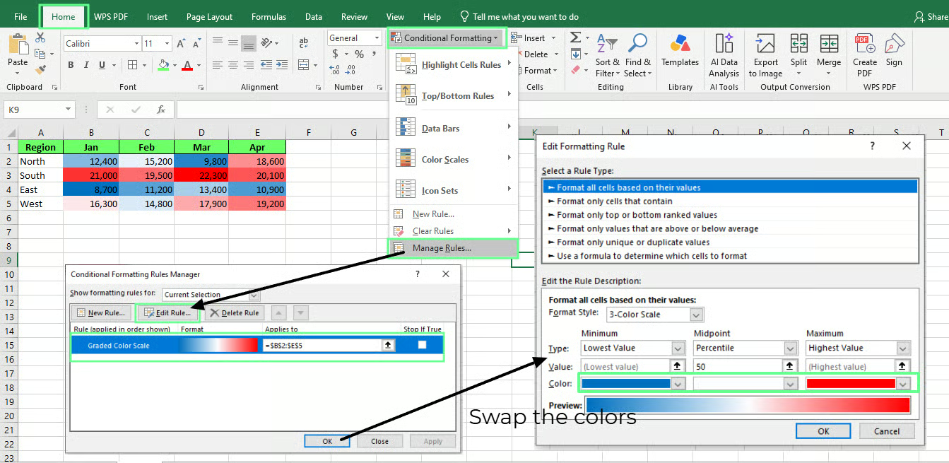
Swap the colors of the heat map. Image by Author.
Create a custom color scale
If none of the presets fit, build your own color scale. To do so:
- Select your data range
- Go to Conditional Formatting > New Rule > Format all cells based on their values
- Choose your own colors for the minimum, midpoint, and maximum, rather than choosing from a preset combination
You can use this approach for matching a heat map to a specific brand color scheme.
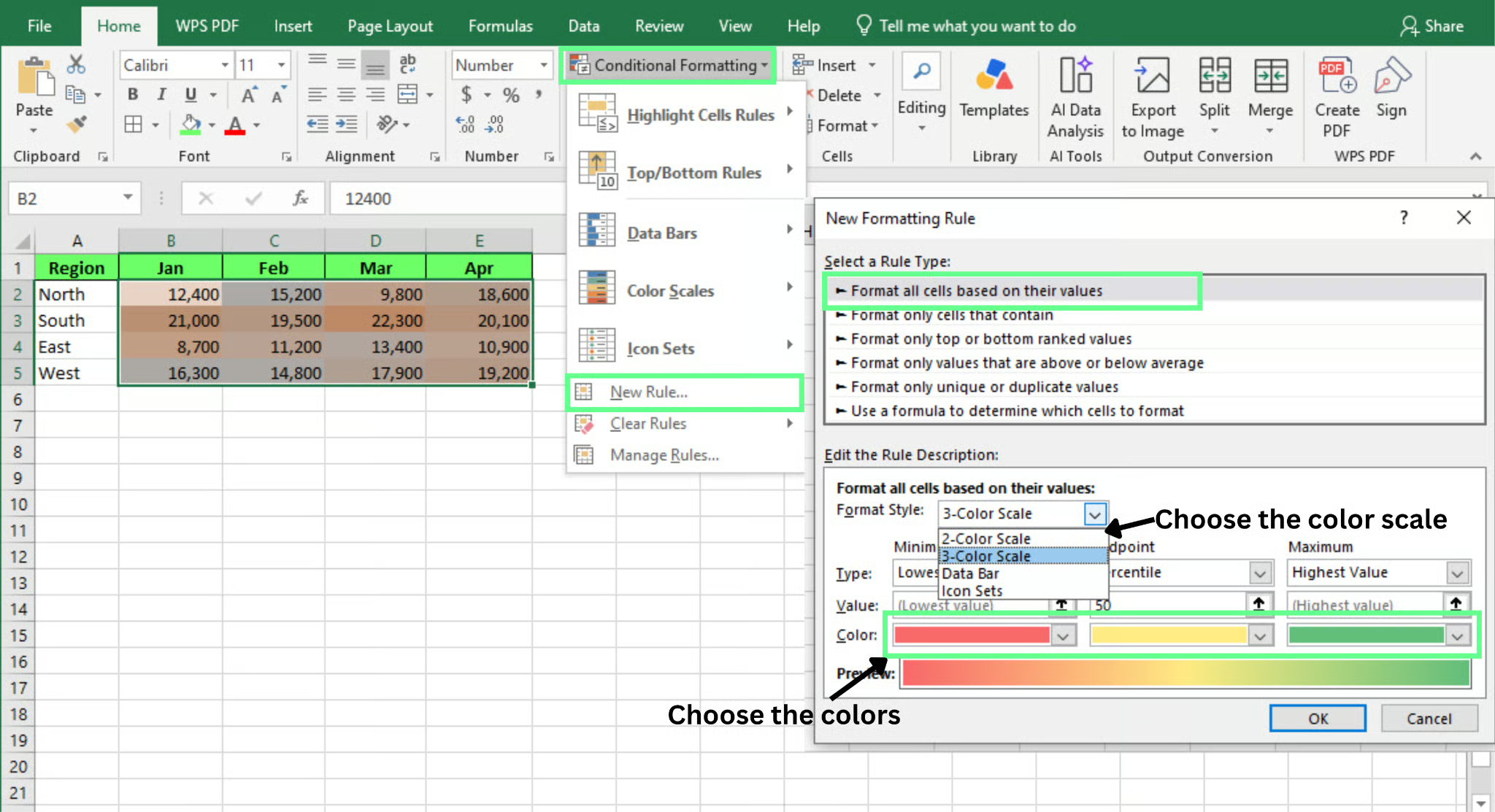
Add custom colors to your heat map. Image by Author.
Adjust the minimum, midpoint, and maximum values
By default, Excel bases the scale on the lowest and highest numbers in your selected range. That's fine most of the time, but it can distort things if you have one extreme outlier.
To adjust this:
- Select your data range
- Go to Conditional Formatting > Manage Rules > Edit Rules
- In the Edit Formatting Rule dialog box, from the dropdown, change the value type for minimum, midpoint, or maximum from Lowest Value and Highest Value to Number, Percent, or Percentile from the dropdown
- Select the minimum, midpoint, and maximum value of your choice
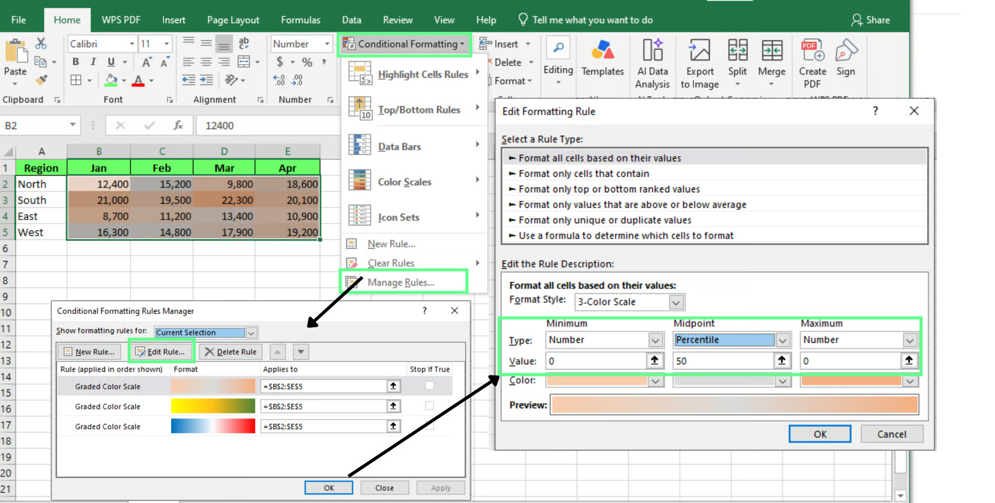
Adjust the min, max, and mid values in the heat map. Image by Author.
None of these adjustments are required to build a working heat map. But they're what separate a heat map that just applies color from one that actually makes your data easier to read.
Next, we'll apply these same tools across a few different scenarios, starting with sales data.
How to Create Different Types of Heat Maps
To create different types of heat maps, follow the same five steps every time:
- Select the data
- Head over to Home
- Go to Conditional Formatting
- Click on Color Scales
- Choose a scale
Let’s understand this across four different use cases:
Heat maps for sales data
Suppose you're tracking sales across four regions, month by month, and you want to see where the business is strongest without scanning sixteen separate numbers.
|
Region |
Jan |
Feb |
Mar |
Apr |
|
North |
4200 |
3900 |
5100 |
4700 |
|
South |
3100 |
3300 |
2900 |
3400 |
|
East |
5600 |
6100 |
5800 |
6300 |
|
West |
2400 |
2100 |
2600 |
2200 |
- Select the table
- Go to Home > Conditional Formatting > Color Scales, and pick a three-color scale
Once done, East lights up green across every month since that's your strongest region. West stays red as it's the one that needs attention.
A three-color scale works here because you want both ends visible at once: the best performer and the weakest, side by side.
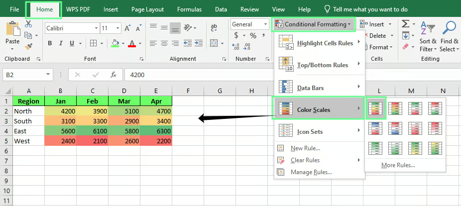
Apply a heat map to a sales dataset. Image by Author.
Heat maps for performance dashboards
Now say you're managing a small team, and instead of sales, you're looking at performance scores across a few different skills.
|
Name |
Calls |
Deals |
Follow-ups |
Response Time |
|
Ana |
88 |
92 |
75 |
60 |
|
Sam |
65 |
58 |
90 |
82 |
|
Lee |
95 |
88 |
91 |
70 |
|
Priya |
70 |
65 |
68 |
55 |
This time, apply a two-color scale because you only want to check who's strong and who's falling behind. In the results, you can see:
- Lee is green almost everywhere
- Priya is white almost everywhere
- Sam is a mix, strong in follow-ups but weak in deals
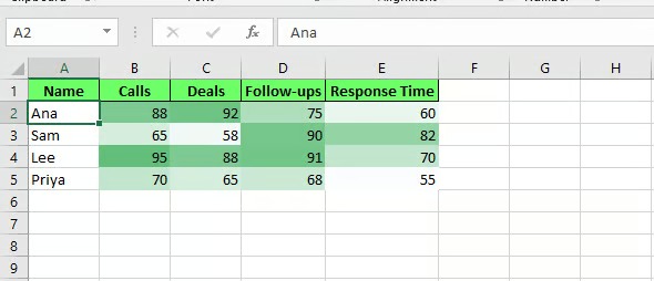
Apply heat map to track the dashboard performance. Image by Author.
Heat maps for survey results
Maybe you've just run a customer survey, and you've got average ratings on a 1-to-5 scale across a few questions and time periods.
|
Question |
Q1 |
Q2 |
Q3 |
|
Ease of use |
3.2 |
3.5 |
3.8 |
|
Support quality |
4.1 |
4.0 |
4.3 |
|
Value for price |
2.8 |
3.0 |
2.9 |
|
Likely to recommend |
3.6 |
3.7 |
4.0 |
Here, set the minimum and maximum manually — 1 and 5 — instead of letting Excel calculate them from the data.
Survey scores rarely use the full range, so an automatic scale would exaggerate small differences. With a fixed scale, "Value for price" reads as a real weak spot instead of just the lowest number in a tight cluster.
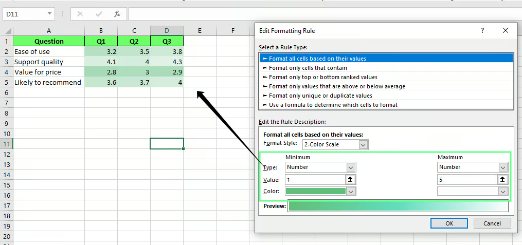
Apply a heat map to track the customer survey. Image by Author.
Heat maps for project tracking
Suppose you're tracking a project with a handful of tasks and want to know at a glance which are falling behind.
|
Task |
Planning |
Development |
Testing |
|
Design mockups |
100% |
100% |
100% |
|
Backend setup |
100% |
80% |
40% |
|
API integration |
100% |
60% |
10% |
|
Documentation |
50% |
20% |
0% |
Set the scale so low percentages are red and high percentages are white. That way, red always means "behind."
A two-color scale works here because the question is binary: on track or not.
- Documentation stays red across every phase as it's the lowest completion rate in the table at every stage
- API integration looks fine in planning, then drops fast
That's the value of the heat map here: it's showing you both the slow task and when it started falling behind.
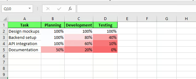
Apply a heat map to track the project tasks. Image by Author.
How to Use Heat Maps with Pivot Tables
Apply Conditional Formatting to a Pivot Table the same way you would to any regular range.
First, you need a Pivot Table to apply it to. To insert one:
- Select your table
- Go to Insert > PivotTable
- Choose New Worksheet and click OK
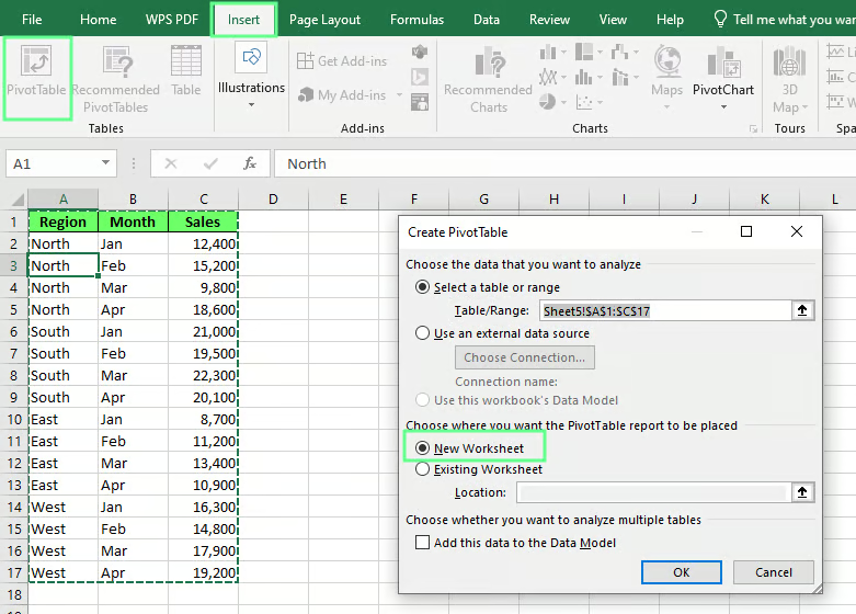
Create a Pivot Table. Image by Author.
- A blank Pivot Table area opens on the right, along with a field list showing Region, Month, and Sales
- Drag Region into the Rows box, Month into the Columns box, and Sales into the Values box
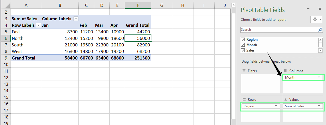
Set up the Pivot Table fields. Image by Author.
Now you have a Pivot Table to color. To color it:
- Select the values inside it, not the row or column labels
- Go to Home > Conditional Formatting > Color Scales and choose a scale like before
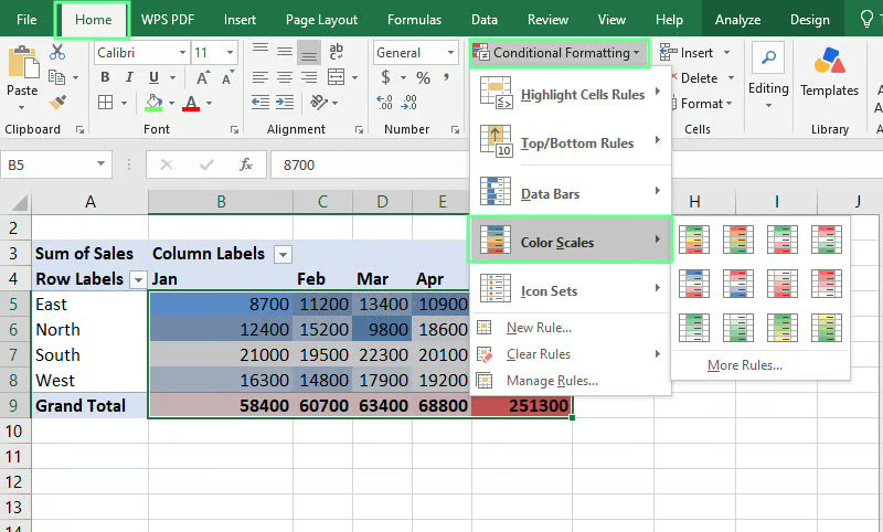
Apply conditional formatting using Pivot Table. Image by Author.
Heat Maps vs Color Scales vs Conditional Formatting
Heat maps, color scales, and conditional formatting get used interchangeably, but they're not quite the same:
- Conditional Formatting is the umbrella tool that changes how cells look based on their values, and it covers a lot more than color. Data bars, icon sets, and highlight rules all come inside Conditional Formatting.
- Color Scales are one option inside Conditional Formatting. This shades cells across a gradient based on their values. You're using one feature out of several available under that same menu.
- Heat map is the result you see. It's what the data looks like once a color scale has been applied to it.
So when someone says "add a heat map," what they actually mean is "apply a color scale using Conditional Formatting."
Common Heat Map Mistakes
Most heat maps run into the same handful of problems. Here's what causes each one and how to fix it.
Colors don't match the data
This usually happens when the color scale's minimum and maximum are left on "Lowest Value" and "Highest Value," but your dataset has one extreme outlier. That single number stretches the whole scale, so everything else compresses into a narrow band of similar colors.
To fix it: Set fixed values for the minimum and maximum instead of letting Excel calculate them automatically. Open Conditional Formatting > Manage Rules > Edit Rule, and change the value type from Lowest Value to Number.
Blank cells affect the results
Empty cells within a color scale range can skew how Excel calculates the minimum or midpoint, especially with percentiles rather than fixed numbers.
To fix it: Remove blank cells from the range, or fill them with a zero or placeholder value before applying the color scale. Check your range carefully if the data came from a report that leaves gaps for missing values.
Formatting doesn't update
Conditional Formatting applied to a fixed selection stays fixed. It doesn't expand just because you typed numbers into the next row.
To fix it: Convert your range into an Excel Table before applying the color scale. Excel Tables expand automatically as you add rows, and Conditional Formatting rules extend with them.
If you're working with a Pivot Table instead, apply the color scale directly to the values so it covers "all cells showing" that field, as covered earlier.
Too many colors make the data hard to read
This happens when multiple color scales get stacked on the same range, or when a scale uses too many sharp color transitions at once. Instead of a clean gradient, you get a cluttered mix that's harder to read than plain numbers would have been.
To fix it: Stick to one color scale per range, and keep it to two or three colors at most. If a table needs more than one kind of formatting, apply color scales to smaller, separate sections instead of layering rules on top of each other.
Best Practices for Excel Heat Maps
A heat map is only helpful if it's easy to read. These habits keep it that way:
- Use consistent color scales across related reports. Switching between red-green one month and blue-white the next makes reports harder to compare side by side, even if each one looks fine on its own.
- Avoid overly bright or distracting colors as they make it harder to focus on the data underneath.
- Choose colors that work for colorblind readers, such as a blue-orange or blue-yellow scale, and avoid red-green, as it’s the hardest combination for colorblind readers to distinguish.
- Remove stray blank cells, fix inconsistent number formats, and check for text mixed into a numeric range to keep your dataset clean before applying a heat map.
- Combine heat maps with filters or Pivot Tables for larger datasets so readers can narrow the view before the colors even become helpful.
Final Thoughts
You now know the five steps. Try them on your own data next, instead of our demo table. If you work with larger datasets, learn Pivot Tables next, as heat maps and Pivot Tables work well together, and most real datasets are too big to color by hand.
Our Data Analysis in Excel course covers both in more depth if you want to keep going.