
Kurs
Einführung in Regression mit R
4 Std.
77.6K
Imagine you’re looking at some company data and notice that as your advertising spending increases, your revenue seems to increase as well. Before making any decisions, you’ll want to be able to quantify the strength of that relationship.
The Pearson correlation coefficient is the go-to way to quantify such a relationship. It is used in a huge variety of disciplines, including data science, economics, psychology, and biology. Analysts even calculate correlations during exploratory data analysis in order to find patterns before moving on to other techniques.
Before looking at formulas or calculations, it helps to develop an intuitive understanding of what correlation describes. Very basically, correlation measures how two variables move together, as I mentioned. It answers the question, “When one variable increases, what does the other one do?”
Correlation focuses specifically on patterns of co-movement rather than on individual values. When two variables tend to increase or decrease at the same time, they have a positive relationship. When two variables tend to move in opposite directions (one increases while the other decreases), they have a negative relationship. And when the values of both variables don’t seem to have any consistent pattern, there may be no relationship.
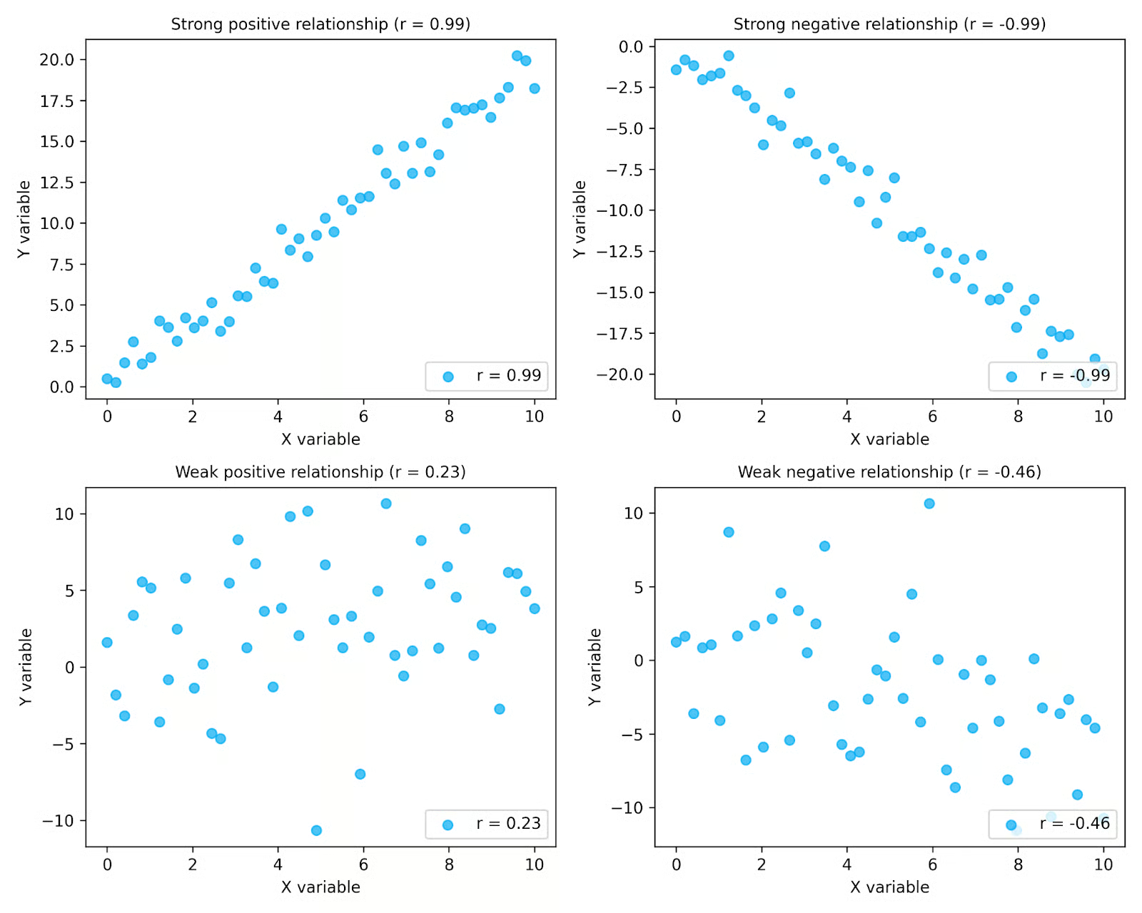
In the plots above, you can see how correlation captures both direction and strength. The top row shows strong relationships, where the points follow a clear pattern, while the bottom row shows weaker relationships with more scatter. The plots on the left show positive relationships, where values increase together, and the plots on the right show negative relationships, where one variable decreases as the other increases. The r values shown in each plot summarize these patterns.
Correlation is especially useful during exploratory data analysis, where analysts examine the relationships between variables. Plotting your data makes it easier to see patterns and determine whether a correlation measure like Pearson’s is appropriate for your data.
It is also important to remember that correlation describes relationships observed in data, not the mechanisms that produce them. Even when two variables are strongly correlated, it does not mean that one variable caused the other to change. Correlation simply summarizes the patterns that exist. Just remember the age-old adage, “correlation does not imply causation”.
The Pearson correlation coefficient provides a formal way to measure the strength and direction of a linear relationship between two continuous variables. It summarizes how closely the data points in a scatter plot follow a straight-line pattern.
The value of the Pearson correlation coefficient is always between −1 and +1.
|
Value of r |
Interpretation |
|
+1 |
Perfect positive linear relationship |
|
0 |
No linear relationship |
|
−1 |
Perfect negative linear relationship |
These values quantify the patterns we discussed in the previous section. Values closer to +1 or −1 indicate a stronger linear relationship, while values closer to 0 indicate a weaker one. The sign indicates whether the relationship is positive or negative.
A key point is that Pearson’s correlation measures linear relationships only. If two variables follow a nonlinear pattern, the correlation coefficient may be close to zero even when the variables are clearly related. In other words, r = 0 does not necessarily mean that no relationship exists; it means there is no linear relationship between the variables.
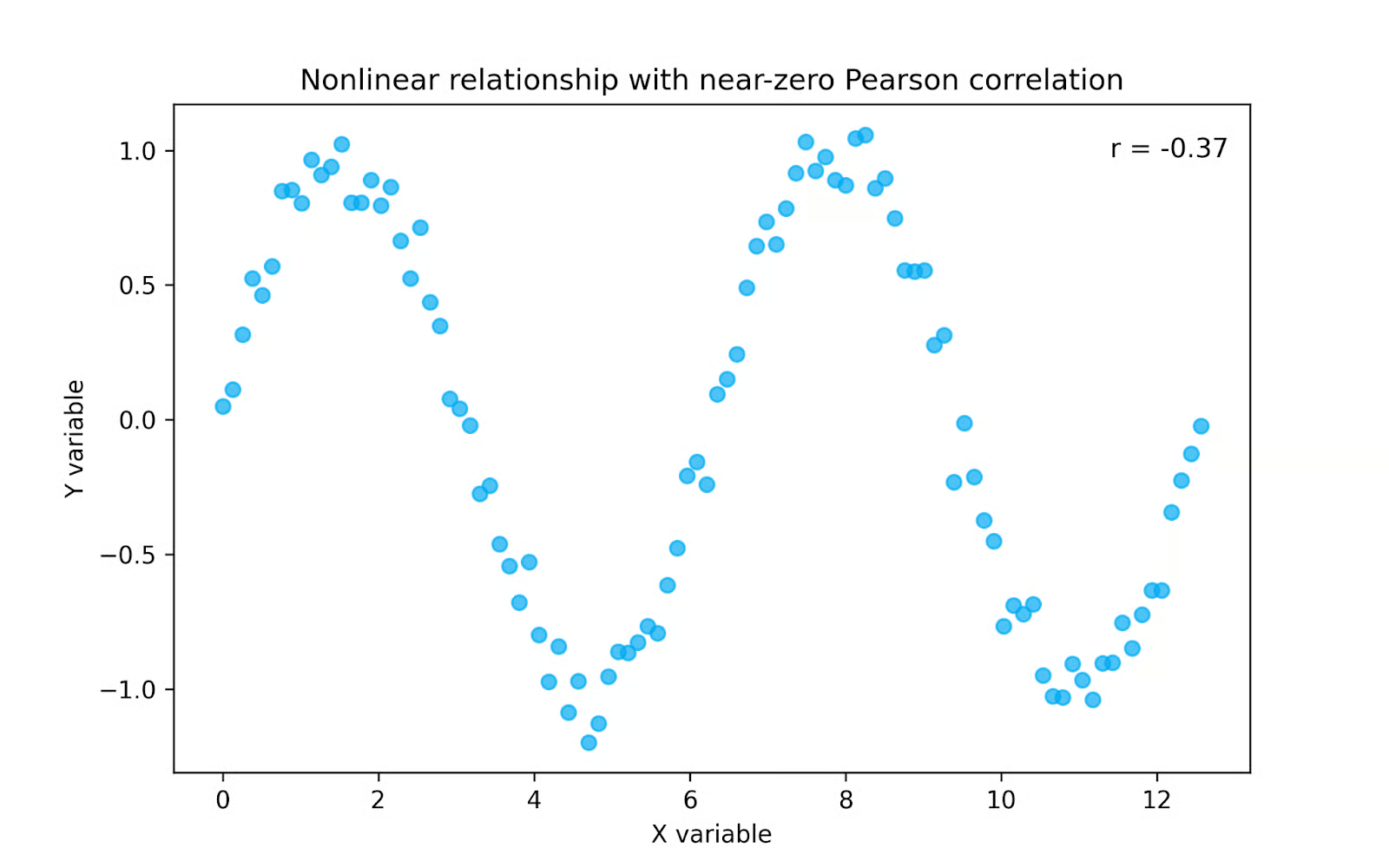
In the plot above, the variables clearly follow a pattern, but it is not a straight line. Because Pearson correlation measures only linear relationships, the value of r is close to zero even though the variables are strongly related. In cases like this, a rank-based measure such as Spearman correlation may be more appropriate, since it can capture monotonic patterns that are not linear.
Pearson’s correlation coefficient is calculated using a formula that compares how two variables change together relative to how much they change individually. It is most commonly written as:
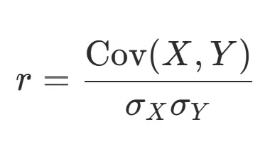
In this expression, Cov(X, Y) represents the covariance between the two variables, while σX and σY represent the standard deviations of each variable. Covariance measures whether two variables tend to increase or decrease together, but its magnitude depends on the units of the variables. Dividing by the standard deviations standardizes the result and ensures that the Pearson correlation coefficient always falls between −1 and +1. For a broader discussion of correlation and covariance, check out our tutorial on the subject.
Pearson’s correlation is essentially standardized covariance. While covariance tells us whether variables move in the same or opposite directions, correlation scales this information so that the strength of the relationship can be interpreted consistently across different datasets.
If you’ve ever had to do this calculation by hand (thank you statistics class!) you’ll likely recognize this version of the formula, which makes the steps more explicit:
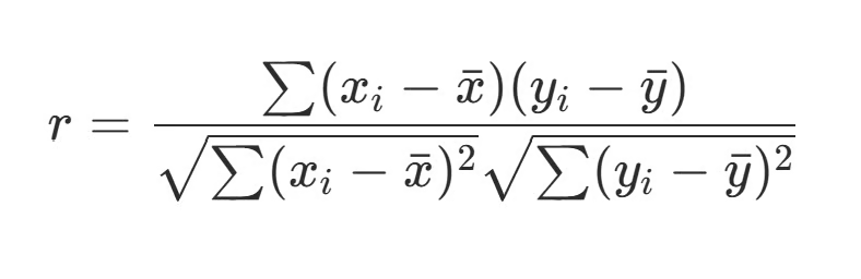
Here, each observation is compared with the mean of its variable. The terms (Xi − X̄) and (Yi − Ȳ) calculate how far each value is from the average. Multiplying these deviations together measures whether the variables move in the same direction at each observation. When both deviations are positive or both are negative, their product is positive, contributing to a positive correlation. When one deviation is positive and the other is negative, their product is negative, contributing to a negative correlation.
The underlying logic of the calculation is simple:
This structure allows the Pearson correlation coefficient to provide a standardized measure of how strongly two variables are linearly related, regardless of their original units or scales.
Let’s walk through a short example together. Suppose we want to examine the relationship between hours studied and exam scores for a group of students. Below, we have a small dataset for five students.
|
Student |
Hours Studied (X) |
Exam Score (Y) |
|
Luther |
5 |
72 |
|
Alexandra |
2 |
70 |
|
Javier |
3 |
63 |
|
Jamie |
1 |
58 |
|
Auburn |
4 |
73 |
The first step is always to plot your data. So let’s do that below.
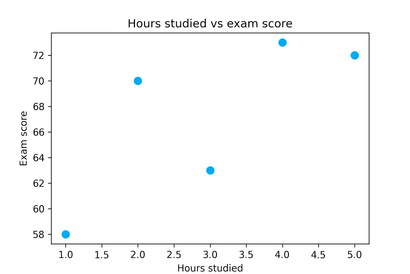
When we plot the data, we can see that exam scores tend to increase as study time increases, but we would like to quantify this relationship. So let’s calculate the Pearson correlation coefficient for this dataset.
First, we need to calculate the mean of each variable. In this example, the average number of study hours is 3, and the average exam score is 67.2.
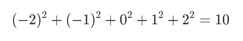
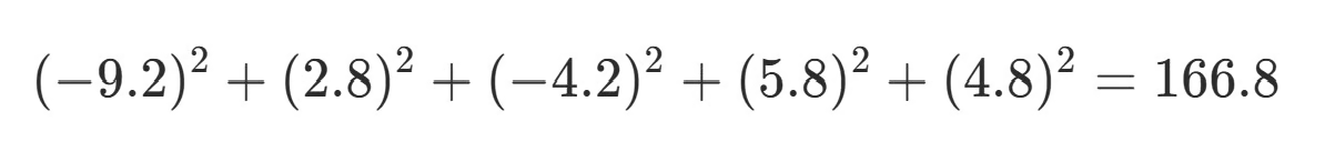
Next, we calculate how far each observation lies from its mean. These values are called deviations from the mean.
Then, we multiply the deviations to show how the variables move together at each observation. When both deviations have the same sign, their product is positive, which contributes to a positive correlation. When the deviations have opposite signs, the product is negative and contributes to a negative correlation.
|
X |
Y |
X − X̄ |
Y − Ȳ |
(X − X̄)(Y − Ȳ) |
|
1 |
58 |
-2 |
-9.2 |
18.4 |
|
2 |
70 |
-1 |
2.8 |
-2.8 |
|
3 |
63 |
0 |
-4.2 |
0 |
|
4 |
73 |
1 |
5.8 |
5.8 |
|
5 |
72 |
2 |
4.8 |
9.6 |
When we sum the products in the final column we get 31, which is the numerator of our Pearson’s correlation calculation.
Next, we calculate the variability of each variable using their standard deviations. To do this, we square the deviations in columns 3 and 4 before adding them up.
For X:
For Y:
Then we take the square root of each sum:
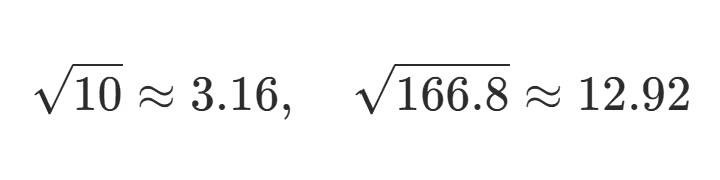
Finally, we divide the numerator by the product of the standard deviations:
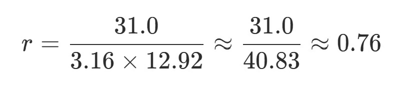
This final step gives us our Pearson correlation coefficient, which in this case is approximately 0.76, indicating a strong positive linear relationship. We can conclude from this that the number of hours a student studies is strongly and positively correlated with their test scores.
However, we cannot conclude that the hours they studied caused their test scores. To make that conclusion, we would need additional analyses or an experimental study.
You can see from the simple example above that computing Pearson’s correlation coefficient by hand is hardly practical.
Fortunately, most statistical software includes built-in functions to calculate it. Understanding the mechanics behind the calculation is helpful for intuition, but in real workflows, the coefficient is typically computed automatically. Let’s briefly look at how to calculate Pearson’s correlation coefficient using three common tools: Excel, Python, and R.
In Excel, the Pearson correlation coefficient is easy to calculate using the CORREL() function. This function takes two ranges of values representing the variables of interest and returns their correlation coefficient.
=CORREL(A1:A10, B1:B10)The function computes Pearson’s r directly from the selected ranges, making it a quick way to explore relationships between variables in spreadsheets.
In Python, the Pearson correlation coefficient is commonly calculated using the pandas or SciPy libraries. The corr() method in pandas computes correlations between columns in a DataFrame:
import pandas as pd

pearson_df['hours_studied'].corr(pearson_df['exam_score'])
Alternatively, the pearsonr() function from SciPy’s statistics module returns both the correlation coefficient and a p-value for hypothesis testing:
from scipy.stats import pearsonr

pearsonr(pearson_df['hours_studied'], pearson_df['exam_score'])
If you are new to Python-based data analysis, you can learn more about working with tabular datasets in our pandas tutorial.
In R, the Pearson correlation coefficient can be computed using the cor() function:
cor(x, y)By default, this function calculates the Pearson correlation coefficient, though you can specify other correlation methods if you’d like.
Each of these three tools makes it easy to compute Pearson’s correlation coefficient quickly. In fact, because it’s so easy, it’s common for analysts to generate a correlation matrix, which displays pairwise correlations between multiple variables at once. This helps identify patterns and relationships that may warrant further investigation in later stages of analysis.
It’s one thing to calculate the Pearson correlation coefficient, but how do you actually interpret it? Remember that the coefficient r describes both the direction and the strength of a linear relationship between two variables.
The sign of r indicates the direction of the relationship. A positive value means that the variables tend to increase together, while a negative value indicates that one variable tends to decrease as the other increases.
The magnitude of r describes the strength of the linear association, with values closer to 1 being stronger than those closer to 0. Different fields may have different traditions on what counts as a strong relationship. In highly controlled experimental settings, such as some areas of physics or engineering, strong correlations may approach 1. In fields involving complex biological or social systems, like medicine, public health, economics, or psychology, correlations in the range of 0.1 to 0.4 can still be meaningful, especially when the variables are difficult to measure or the effects accumulate at scale. Because standards vary across disciplines, interpreting r requires domain knowledge and contextual judgment.
It’s also important to note that Pearson correlation is sensitive to extreme values. A single outlier can substantially increase or decrease the value of r. This is one reason why plotting your data is so important. Examining scatter plots alongside correlation coefficients helps to identify any outliers that may be exerting undue influence.
Statistical software can often provide a p-value alongside your Pearson correlation coefficient. This p-value tests how likely it is to observe a correlation at least as strong as the one in your data if there were truly no relationship between the variables. If it’s unlikely to occur by chance alone, we say that the relationship is statistically significant.
This p-value is calculated by converting the Pearson correlation coefficient into a t-statistic and comparing it to the t-distribution. This is similar to a Student’s t-test, but here the goal is to test whether the true correlation is zero.
With large datasets, even a relatively small r value might still be statistically significant, though it might still be a weak relationship on an individual level. This is important for public health, for example, where a weak relationship can still cause significant health impacts on a population level. For this reason, it’s often useful to distinguish between the magnitude of the correlation (r) and its statistical significance (p-value).
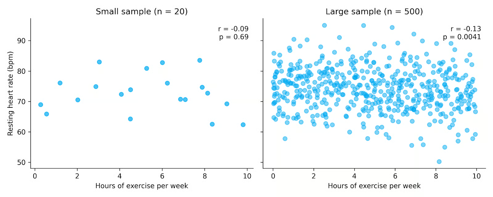
In the plots above, both datasets show a weak negative relationship between exercise and resting heart rate. However, the dataset on the right includes many more observations, making the relationship statistically significant even though the correlation remains small. This highlights how larger sample sizes increase our ability to detect relationships, and why it’s important to consider both the value of r and the p-value when interpreting results.
The Pearson correlation coefficient is widely used because it is simple to compute and interpret. However, like many statistical tools, it works best when certain assumptions about the data are reasonably satisfied.
First, the Pearson correlation assumes a linear relationship between two variables. If the true relationship follows a curved or nonlinear pattern, the coefficient may underestimate the strength of the association or even suggest that no relationship exists.
Another assumption is that the variables being analyzed are continuous. Pearson correlation is designed for variables measured on continuous numerical scales, such as height, income, temperature, or exam scores. If you’ve got ordinal or discrete data, you might be better served using Spearman correlation or Kendall’s tau.
You also generally want your data to be normally distributed. This is especially important if you are performing hypothesis tests or calculating confidence intervals for the correlation coefficient. If the distributions are strongly non-normal, the estimated correlation might still describe the sample relationship, but the p value you get will likely be less reliable.
Pearson correlation also assumes homoscedasticity, meaning that the variability of one variable is relatively consistent across the range of the other variable. In practical terms, this means the spread of points in a scatter plot should remain roughly similar as values increase or decrease. When the spread changes substantially across the range of the data, the correlation coefficient may not fully capture the structure of the relationship. As with normality, you can still calculate r if you break this assumption, but subsequent inference tests will be less reliable.
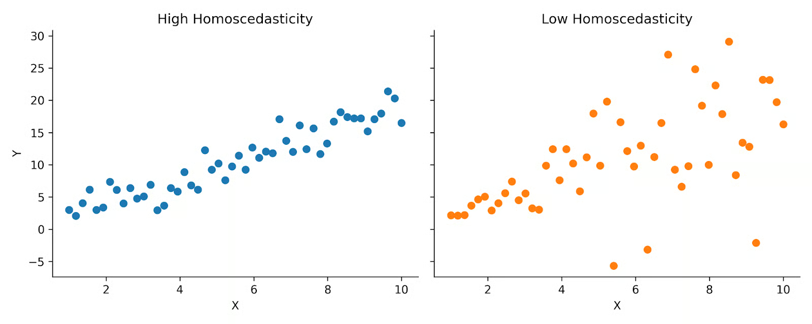
Above you can see two plots that demonstrate high versus low homoscedasticity. On the left, you can see that the data is spread fairly evenly across the distribution. But on the right, you see more of a cone shape. Pearson correlation assumes that your data looks more like the plot on the left.
Finally, as we’ve discussed previously, Pearson correlation is sensitive to outliers. Extreme values can disproportionately influence the calculation because the coefficient is based on means and standard deviations. A single unusual data point can substantially increase or decrease the correlation.
Pearson correlation and Spearman correlation sound very similar and can easily be confused. They are both measures of the relationship between two variables, but they differ in the type of relationship they capture and the assumptions they rely on.
The Pearson correlation coefficient measures the strength of a linear relationship between two continuous variables. In contrast, the Spearman correlation coefficient measures the strength of a monotonic relationship, which means the variables move in the same direction but not necessarily at a constant rate. A monotonic relationship can be linear or nonlinear, as long as it consistently increases or decreases.
Spearman correlation is calculated using the ranked values of the data rather than the raw values. By converting data to ranks, Spearman correlation reduces the impact of outliers and does not require the assumption of linearity.
Pearson correlation is considered a parametric measure because it relies on assumptions about the data distribution. Spearman correlation, however, is considered nonparametric, since it does not require the same distributional assumptions and is less dependent on normality.
When the assumptions for Pearson correlation are met, it can provide a more precise estimate of the actual linear association than Spearman correlation. However, when our data does not meet these standards, Spearman correlation can still pick up on a relationship between two variables.
|
Correlation Coefficient |
When to Use |
|
Pearson correlation |
Linear relationship; continuous variables; well-behaved data |
|
Spearman correlation |
Monotonic relationship; presence of outliers; ordinal or ranked data |
Covariance is a closely related concept, but it differs in how it is scaled and interpreted.
Covariance measures whether two variables tend to move in the same direction or in opposite directions. If the variables increase together, covariance is positive. If one increases while the other decreases, covariance is negative.
However, the magnitude of covariance depends on the units of the variables. For example, the covariance between height measured in centimeters and weight measured in kilograms will differ numerically from the covariance between height measured in inches and weight measured in pounds. This makes covariance difficult to compare across datasets.
The Pearson correlation coefficient addresses this limitation by dividing covariance by the product of the standard deviations of the two variables. Because of this normalization, Pearson correlation is unitless and always falls between −1 and +1. This bounded range makes it much easier to interpret.
In simple terms:
Although the Pearson correlation coefficient is widely used and easy to interpret, it has several important limitations.
Pearson correlation is best used as part of a broader exploratory and analytical workflow. Visualize your data, check that all assumptions are met, and consider the context of your problem when using and interpreting Pearson’s correlation coefficient.
The Pearson correlation coefficient is a fundamental statistical measure used in a wide variety of disciplines. If you’re interested in how correlation fits into real-world workflows, explore our tutorial on exploratory data analysis in Python. If you’d like to explore correlation in practice, check out our pandas tutorial to see how correlations are used in real datasets.
Learn with DataCamp
Kurs
Kurs
Kurs
Blog
David Woods
13 Min.
Tutorial
Josef Waples
Tutorial
Josef Waples
Tutorial
Josef Waples
Tutorial
Javier Canales Luna
Tutorial
Arunn Thevapalan