Share this webinar
Close your data and AI skills gap
We're the only platform uniquely engineered to advance data and AI skills across your entire organization. Let's explore a tailored program.
Book an Enterprise DemoUpskilling a small team?Get started today
Data Visualization
RADAR: The Analytics Edition - The Art of Data Storytelling: Driving Impact with Analytics
March 2024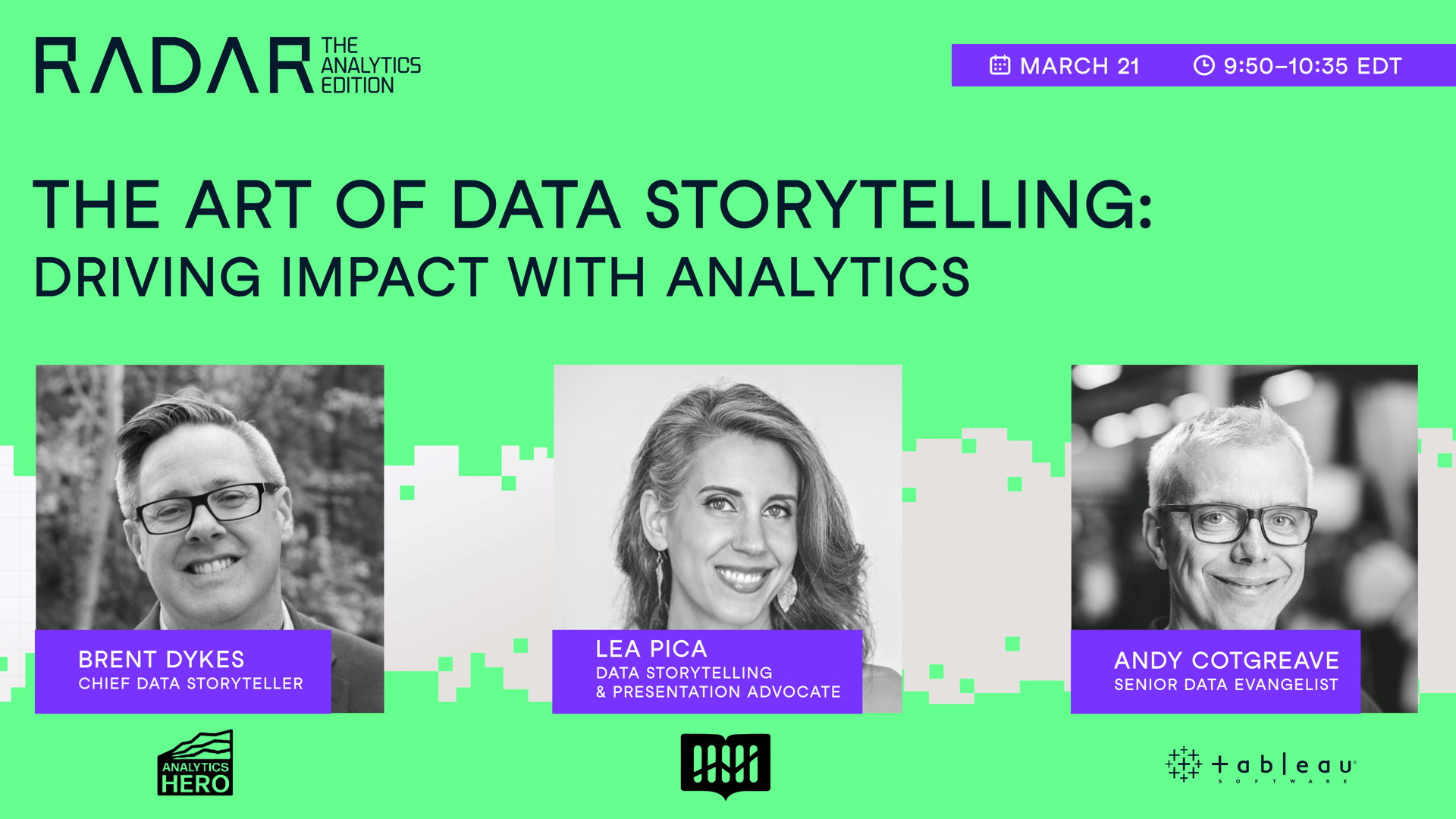
Your Presenter(s)

Brent Dykes
Chief Data Storyteller & Founder at Analytics Hero

Lea Pica
Founder, Story-Driven Data

Andy Cotgreave
Senior Data Evangelist at TableauData Communication Expert
Có liên quan
webinar
The Art of Data Storytelling: Driving Impact with Analytics
In this session, three industry leaders will shed light on the art of blending analytics with storytelling, a key to making data-driven insights both understandable and influential within any organization.webinar
Radar Data & AI Literacy Edition: From Insight to Impact with Data Storytelling
In this session, join Gary Wolf, Lea Pica and Jason Forrest as they delve into the world of data stories and how they play out in our lives.webinar
RADAR: The Analytics Edition - From Data Governance to Data Discoverability: Building Trust in Data Within Your Organization
In this session, industry leaders share strategies for improving data quality, fostering a culture of trust around data, and balancing robust governance with the need for accessible, high-quality data.webinar
RADAR: The Analytics Edition - Building a Learning Culture for Analytics Functions
In the session, Russell Johnson, Denisse Groenendaal-Lopez and Mark Stern address the importance of fostering a learning environment for driving success with analytics.webinar
RADAR: The Analytics Edition - Scaling Data ROI: Driving Analytics Adoption Within Your Organization
In this session, Laura Gent Felker, Tiffany Perkins-Munn, and Omar Khawaja will explore best practices when it comes to scaling analytics adoption within the wider organization.webinar