Data Visualization courses
Data visualization courses focus on techniques and tools for representing data graphically to communicate information clearly and efficiently. Build your visualization skills with tools such as Python, R, Tableau, Power BI and Excel.
Create Your Free Account
Continue with GoogleShow more optionsor
By continuing, you accept our Terms of Use, our Privacy Policy and that your data is stored in the USA.
Training 2 or more people?
Try DataCamp for BusinessRecommended for Data Visualization beginners
Build your Data Visualization skills with interactive courses, curated by real-world experts
Course
Data Visualization in Power BI
BasicSkill Level
4.8+11,284 reviews
3 hr
Track
Data Analyst in Power BI
4.7+
Co-created with Microsoft—gain the Power BI skills you need to prepare, model, and visualize data for the PL-300 Data Analyst certification.222 reviews
50 hr
Not sure where to start?
Take an AssessmentBrowse Data Visualization courses and tracks
Course
Introduction to Power BI
BasicSkill Level
4.8+23,020 reviews
4 hr
Course
Data Visualization in Power BI
BasicSkill Level
4.8+11,284 reviews
3 hr
Course
Introduction to Tableau
BasicSkill Level
4.8+5,911 reviews
6 hr
Course
Understanding Data Visualization
BasicSkill Level
4.8+13,231 reviews
2 hr
Course
Data Visualization in Excel
BasicSkill Level
4.8+4,871 reviews
3 hr
Course
Introduction to Data Visualization with ggplot2
BasicSkill Level
4.7+2,745 reviews
4 hr
Course
Case Study: Analyzing Customer Churn in Power BI
BasicSkill Level
4.8+7,760 reviews
3 hr
Course
Introduction to Data Visualization with Seaborn
BasicSkill Level
4.8+1,966 reviews
4 hr
Course
Introduction to Data Visualization with Matplotlib
BasicSkill Level
4.8+1,271 reviews
4 hr
Course
Reports in Power BI
IntermediateSkill Level
4.7+3,428 reviews
3 hr
Course
Analyzing Data in Tableau
BasicSkill Level
4.8+1,879 reviews
8 hr
Course
Report Design in Power BI
IntermediateSkill Level
4.7+3,320 reviews
3 hr
Course
Dashboard Design Concepts
BasicSkill Level
4.8+1,237 reviews
2 hr
Course
Creating Dashboards in Tableau
BasicSkill Level
4.8+1,632 reviews
3 hr
Course
Data Visualization in Google Sheets
BasicSkill Level
4.8+726 reviews
4 hr
Course
Data Visualization in Tableau
BasicSkill Level
4.7+917 reviews
6 hr
Course
Intermediate Data Visualization with ggplot2
IntermediateSkill Level
4.7+1,027 reviews
4 hr
Course
User-Oriented Design in Power BI
IntermediateSkill Level
4.7+553 reviews
2 hr
Course
Data Visualization in Databricks
BasicSkill Level
4.8+719 reviews
3 hr
Course
Communicating with Data in the Tidyverse
BasicSkill Level
4.8+219 reviews
4 hr
Course
Case Study: Analyzing Customer Churn in Tableau
BasicSkill Level
4.8+1,087 reviews
3 hr
Course
Calculations in Tableau
AdvancedSkill Level
4.7+760 reviews
6 hr
Course
Introduction to Data Visualization with Plotly in Python
BasicSkill Level
4.8+521 reviews
4 hr
Course
Visualization Best Practices in R
BasicSkill Level
4.8+363 reviews
1 hr
Course
Intermediate Data Visualization with Seaborn
IntermediateSkill Level
4.8+495 reviews
4 hr
Course
Visualizations in Sigma
BasicSkill Level
4.8+290 reviews
2 hr
Course
Time Series Analysis in Power BI
IntermediateSkill Level
4.7+300 reviews
5 hr
Course
Case Study: Analyzing Job Market Data in Tableau
BasicSkill Level
4.7+623 reviews
3 hr
Course
Case Study: Supply Chain Analytics in Power BI
BasicSkill Level
4.8+209 reviews
4 hr
Course
Case Study: Analyzing Healthcare Data in Power BI
IntermediateSkill Level
4.8+303 reviews
4 hr
Related resources on Data Visualization
blog
The Best Data Visualization Tools for Dashboards and Business Reporting in 2026
Power BI and Tableau lead our guide to the 15 best data visualization tools for building dashboards and business reports, with a pick for every skill level.

Javier Canales Luna
12 min
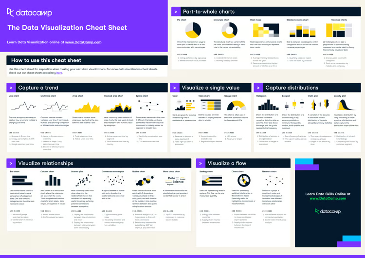
cheat sheet
Data Visualization Cheat Sheet
In this data visualization cheat sheet, you'll learn about the most common data visualizations to employ, when to use them, and their most common use-cases.

Richie Cotton
5 min
Tutorial
Visualizing Data in Excel: A Complete How-To Guide
Learn about Excel's various data visualization options that can help you analyze and interpret your data.

Jess Ahmet
12 min
Ready to apply your skills?
What is data visualization used for?
Are data visualization skills in demand?
Do I need to know Python to be good at data visualization?
What are the most popular data visualization tools?
Do I need to download data visualization software to learn on Datacamp?
Other technologies and topics
technologies
Grow your data skills with DataCamp for Mobile
Make progress on the go with our mobile courses and daily 5-minute coding challenges.