Share this webinar
Close your data and AI skills gap
We're the only platform uniquely engineered to advance data and AI skills across your entire organization. Let's explore a tailored program.
Book an Enterprise DemoUpskilling a small team?Get started today
Data Storytelling
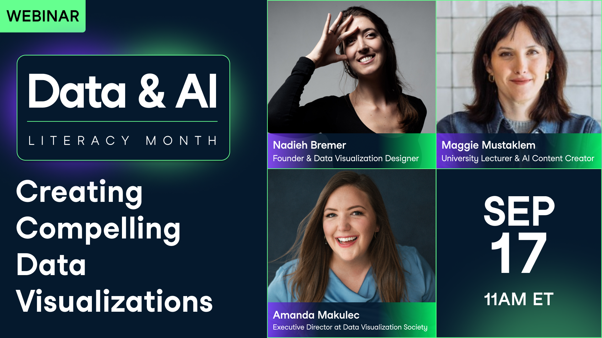
Creating Compelling Data Visualizations
September 2024
Your Presenter(s)

Nadieh Bremer
Founder & Data Visualization Designer at Visual Cinnamon

Maggie Mustaklem
Lecturer at Stanford University, AI Content Creator at NYU Langone Health

Amanda Makulec
Executive Director at Data Visualization Society
Related
webinar
How to Write Effective Data Stories
In the second of three data storytelling sessions, a leading data journalist will teach you how to write about data.webinar
The Art of Data Storytelling: Driving Impact with Analytics
In this session, three industry leaders will shed light on the art of blending analytics with storytelling, a key to making data-driven insights both understandable and influential within any organization.webinar
How to Build a Data Storytelling Culture
In the third of three data storytelling sessions, Paulina Davila, and Lee Feinberg teach how how to make use of data storytelling across your organization.webinar
From Insight to Impact with Data Storytelling
In this session, join Gary Wolf, Lea Pica and Jason Forrest as they delve into the world of data stories and how they play out in our lives.webinar
Creating Effective Graphs
In this session, you'll learn key principles of data visualization, from understanding which plot to draw in common situations, to design techniques to improve your audience's comprehension.webinar