Data Visualization courses
Data visualization courses focus on techniques and tools for representing data graphically to communicate information clearly and efficiently. Build your visualization skills with tools such as Python, R, Tableau, Power BI and Excel.
สร้างบัญชีฟรีของคุณ
ดำเนินการต่อด้วย Googleแสดงตัวเลือกเพิ่มเติมหรือ
การดำเนินการต่อหมายความว่าคุณยอมรับข้อกำหนดการใช้งาน และนโยบายความเป็นส่วนตัวของเรา รวมถึงการจัดเก็บข้อมูลของคุณในสหรัฐอเมริกา
ฝึกอบรม 2 คนขึ้นไป?
ลอง DataCamp for BusinessRecommended for Data Visualization beginners
Build your Data Visualization skills with interactive courses, curated by real-world experts
คอร์ส
การสร้างภาพข้อมูลใน Power BI
Basicระดับทักษะ
4.8+10,152 รีวิว
3 ชม.
แทร็ก
นักวิเคราะห์ข้อมูล ใน Power BI
4.7+
ร่วมสร้างกับ Microsoft—พัฒนาทักษะ Power BI ที่คุณต้องใช้เพื่อเตรียมข้อมูล สร้างแบบจำลอง และแสดงผลข้อมูลสำหรับการรับรอง PL-300 Data Analyst204 รีวิว
50 ชม.
ไม่แน่ใจว่าจะเริ่มต้นที่ไหน?
ทำการประเมินเรียกดูคอร์สและเส้นทางการเรียน Data Visualization
คอร์ส
Visualizing Geospatial Data in Python
ระดับกลางระดับทักษะ
4.7+342 รีวิว
4 ชม.
คอร์ส
การแสดงภาพข้อมูล Time Series ด้วย Python
ระดับกลางระดับทักษะ
4.7+96 รีวิว
4 ชม.
คอร์ส
กรณีศึกษา: การวิเคราะห์อีคอมเมิร์ซใน Power BI
ระดับกลางระดับทักษะ
4.8+205 รีวิว
4 ชม.
คอร์ส
การแสดงผลข้อมูลเบสบอลใน Power BI
Basicระดับทักษะ
4.8+196 รีวิว
1 ชม.
คอร์ส
กรณีศึกษา: Supply Chain Analytics ใน Power BI
Basicระดับทักษะ
4.8+184 รีวิว
4 ชม.
คอร์ส
กรณีศึกษา: การวิเคราะห์ยอดขายคู่แข่งใน Power BI
ระดับกลางระดับทักษะ
4.7+158 รีวิว
4 ชม.
คอร์ส
กรณีศึกษา: การวิเคราะห์สินค้าคงคลังใน Power BI
ระดับกลางระดับทักษะ
4.7+170 รีวิว
5 ชม.
คอร์ส
Visualizing Time Series Data in R
ระดับกลางระดับทักษะ
4.8+182 รีวิว
4 ชม.
คอร์ส
การสื่อสารด้วยข้อมูลใน Tidyverse
Basicระดับทักษะ
4.8+197 รีวิว
4 ชม.
คอร์ส
Visualizing Geospatial Data in R
ระดับกลางระดับทักษะ
4.5+87 รีวิว
4 ชม.
คอร์ส
Interactive Maps with leaflet in R
Basicระดับทักษะ
4.7+96 รีวิว
4 ชม.
คอร์ส
การสร้างกราฟิกแบบโต้ตอบด้วย plotly ใน R
Basicระดับทักษะ
4.8+85 รีวิว
4 ชม.
คอร์ส
Time Series Analysis in Tableau
ระดับกลางระดับทักษะ
4.7+158 รีวิว
2 ชม.
คอร์ส
Data Visualization in KNIME
Basicระดับทักษะ
4.8+199 รีวิว
2 ชม.
คอร์ส
กรณีศึกษา: Supply Chain Analytics ใน Tableau
ระดับกลางระดับทักษะ
4.7+71 รีวิว
4 ชม.
คอร์ส
กรณีศึกษา: HR Analytics ใน Tableau
ระดับกลางระดับทักษะ
4.8+76 รีวิว
3 ชม.
คอร์ส
กรณีศึกษา: การวิเคราะห์ข้อมูลด้านสุขภาพใน Tableau
ระดับกลางระดับทักษะ
4.7+68 รีวิว
3 ชม.
คอร์ส
กรณีศึกษา: การวิเคราะห์สินค้าคงคลังใน Tableau
ระดับกลางระดับทักษะ
4.7+64 รีวิว
2 ชม.
คอร์ส
กรณีศึกษา: การวิเคราะห์อีคอมเมิร์ซใน Tableau
ระดับกลางระดับทักษะ
4.7+64 รีวิว
3 ชม.
คอร์ส
Visualizing Big Data with Trelliscope in R
Basicระดับทักษะ
4.7+43 รีวิว
4 ชม.
คอร์ส
การสร้างภาพข้อมูลแบบอินเทอร์แอกทีฟด้วย Bokeh
ระดับกลางระดับทักษะ
4.7+42 รีวิว
4 ชม.
คอร์ส
การสร้างภาพข้อมูลด้วย Julia เบื้องต้น
ระดับกลางระดับทักษะ
4.8+31 รีวิว
4 ชม.
คอร์ส
การสร้างภาพข้อมูลเชิงโต้ตอบด้วย plotly ใน R ระดับกลาง
ระดับกลางระดับทักษะ
4.8+40 รีวิว
4 ชม.
แหล่งข้อมูลที่เกี่ยวข้องเกี่ยวกับ Data Visualization
บล็อก
Exploring 12 of the Best Data Visualization Tools in 2023 With Examples
There are many data visualization tools available. In this article, we have prepared a comprehensive list of some of the most useful data visualization tools in data science.

Javier Canales Luna
13 นาที
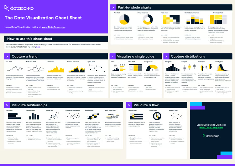
cheat sheet
Data Visualization Cheat Sheet
In this data visualization cheat sheet, you'll learn about the most common data visualizations to employ, when to use them, and their most common use-cases.

Richie Cotton
5 นาที
บทแนะนำ
Visualizing Data in Excel: A Complete How-To Guide
Learn about Excel's various data visualization options that can help you analyze and interpret your data.

Jess Ahmet
12 นาที
Ready to apply your skills?
What is data visualization used for?
Are data visualization skills in demand?
Do I need to know Python to be good at data visualization?
What are the most popular data visualization tools?
Do I need to download data visualization software to learn on Datacamp?
เทคโนโลยีและหัวข้ออื่นๆ
เทคโนโลยี
พัฒนาทักษะด้านข้อมูลของคุณด้วย DataCamp for Mobile
พัฒนาทักษะได้ทุกที่ทุกเวลาด้วยคอร์สเรียนบนมือถือและแบบฝึกหัดเขียนโค้ดประจำวัน 5 นาทีของเรา